-
Ever wanted an RSS feed of all your favorite gaming news sites? Go check out our new Gaming Headlines feed! Read more about it here.
-
We have made minor adjustments to how the search bar works on ResetEra. You can read about the changes here.
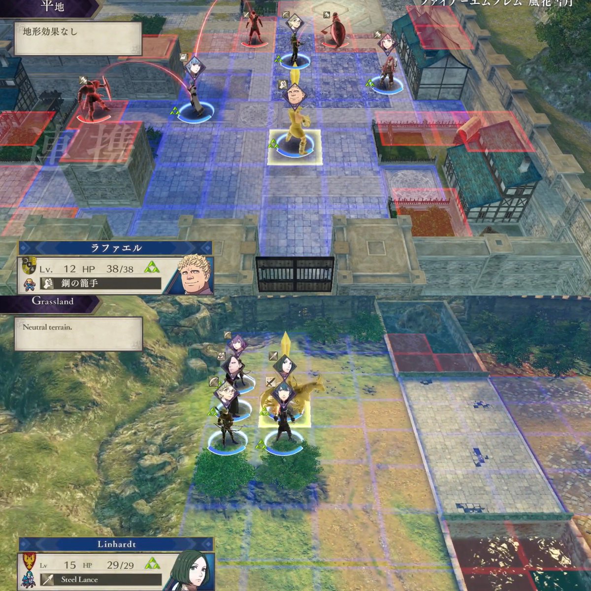
Fire Emblem Three Houses has ridiculously small Text (Update: Kotaku Article)
- Thread starter 60fps
- Start date
You are using an out of date browser. It may not display this or other websites correctly.
You should upgrade or use an alternative browser.
You should upgrade or use an alternative browser.
Threadmarks
View all 17 threadmarks
Reader mode
Reader mode
Recent threadmarks
#1 In Depth insight on what is wrong with the font by fontguy #2 In Depth insight on what is wrong with the font by fontguy #3 In Depth insight on what is wrong with the font by fontguy #4 In Depth insight on what is wrong with the font by fontguy #5 In Depth insight on what is wrong with the font by fontguy Comparison with Fire Emblem GBA for the giggles Comparison with Fire Emblem Radiant Dawn (Gamecube) Small Type in a Big Game - Great, detailed blog post on what is wrong with the font and how to fix it
#1 In Depth insight on what is wrong with the font by fontguy
The thing is, they maybe could've gotten away with text of that size if they had used a more legible font. But they used an old style one with moderate stroke contrast and a really low x-height. And the Switch's low pixel density only compounds the issue. Just terrible.
The entire medium is drowning in awful typographic decisions and I hate it.
The entire medium is drowning in awful typographic decisions and I hate it.
It's hard to tell in screens or videos as it's not quite the same as having the Switch in front of you - is this a "less-than-ideal" level of small, or a DQB2 "i-can-barely-read" level of small? With DQB2 some of the pop-up text I actually have to squint and bring the screen closer.
Glad someone made this comparison

The thing is, they maybe could've gotten away with text of that size if they had used a more legible font. But they used an old style one with moderate stroke contrast and a really low x-height. And the Switch's low pixel density only compounds the issue. Just terrible.
The entire medium is drowning in awful typographic decisions and I hate it.
And when somebody uses a good, readable font, people complain that "it looks like a shitty mobile game", etc. Complaining about widely accepted readable standards is unfortunately criticized, which leads to developers trying to re-invent the wheel.
Larger fonts should at least be an accessibility option. I've missed out on numerous games in the past because I just can't read it.
Nintendo's almost maliciously anti-accessibility options. It's insane, especially with their whole "games for everyone" stance.Nintendo loves to make games accessible*
Unless you have a disability
Nintendo's almost maliciously anti-accessibility options. It's insane, especially with their whole "games for everyone" stance.
Games are meant to be fun, fun for everyone!*
*Unless you have a disability
#2 In Depth insight on what is wrong with the font by fontguy
And when somebody uses a good, readable font, people complain that "it looks like a shitty mobile game", etc. Complaining about widely accepted readable standards is unfortunately criticized, which leads to developers trying to re-invent the wheel.
I admit that there is a dissonance I can't shake when I see characters in medieval games speaking in Arial. But there are a billion ways to achieve legibility while maintaining stylistic consistency—and I never see them in games. It feels like UI designers all either care about the aesthetics to a fault or not at all.
Here is a comparison of Japanese vs English gameplay.
Notice how they made the "Lv" and "HP" font smaller and less readable in the English version?
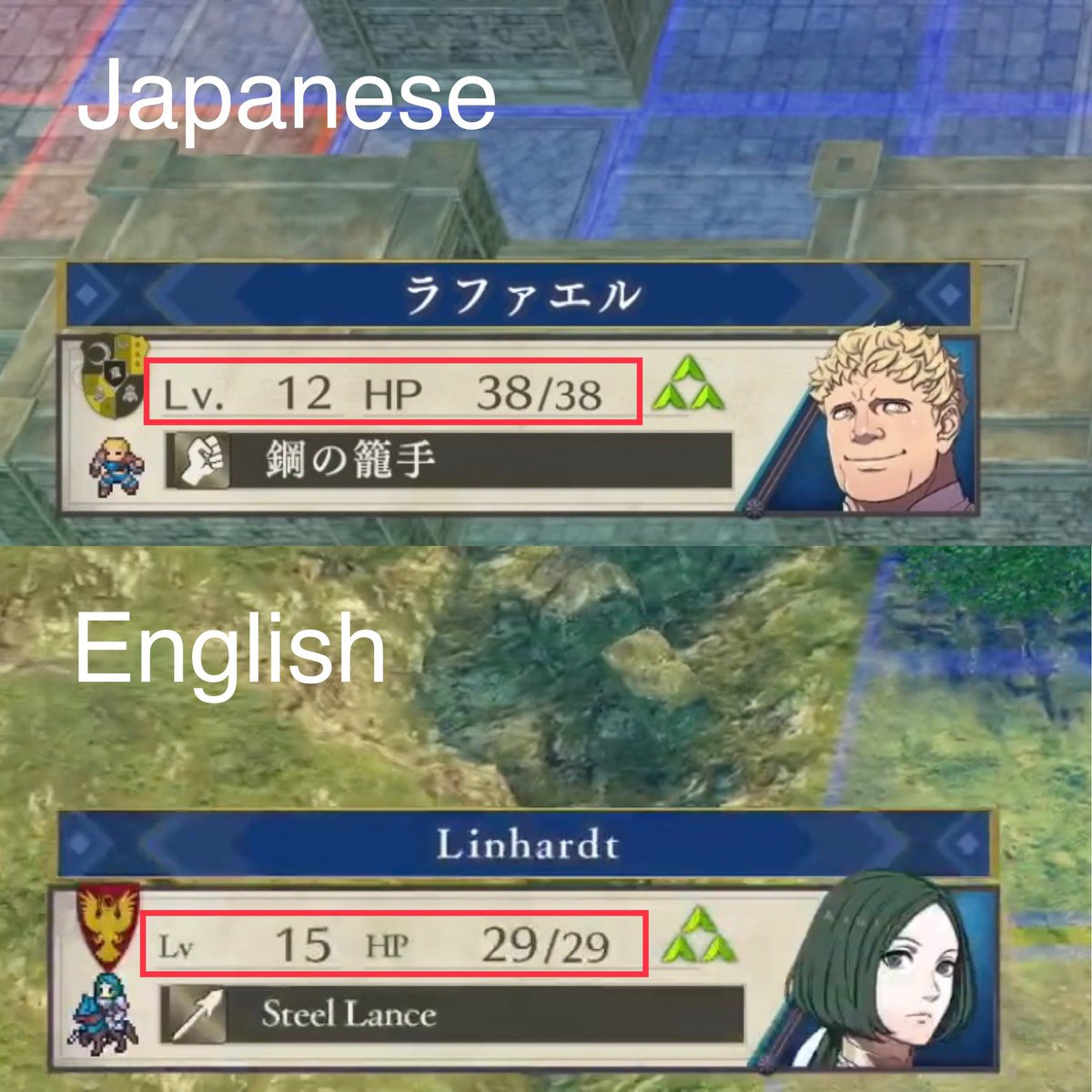
Japanese version had it perfect, but no, Western localization staff always knows best. "Let's make the text smaller and use a serif font on top of that, to make it even less convenient to read!"
This is a common issue with Japanese games localized into English by the way. It's exactly the same with Dragon Quest 11 for example. Instead of going with the classic, simple Japanese font they had to choose a serif font.
(Sorry for somewhat bad quality)
It was a bad decision, but I get the thought process behind decreasing the size of the labels in your first example.
The font size of the HP and level is almost the same as that of their labels. This might not be a problem if it weren't for the fact that there's a vast ocean of empty space between the labels and the values they're labeling; there's no hierarchy to that text.
Differentiating that text does more to let the player know that these are labels, and better visually emphasizes the important info (the level and HP). Though obviously it would be better if the level, 12, were closer to its label than to HP, a totally unrelated one. I don't know enough about the technical aspects of game localization, but the spacing issue strikes me as something the localizers were aware of but were for some reason unable to change.
Seriously, what the hell with some people. "I have a huge ass TV so there's no issue"An even worse trend here is the lack of empathy towards people who might struggle with things that you don't struggle with.
I'm glad I' probably won't have this problem playing handheld but I'm sorry for the people that will do and I hope media will point it out and it gets patched at some point.
It's freaking huge when docked. Even in handheld mode it's quite large (but acceptable for the format).Yea, but funny thing is, it's successor, Xenoblade 2, has perfect text size in both TV and handheld mode.
That 3H font seems pretty small though. Thank god I play on a projector :p
Don't forget, less than ideal solution, but the switch OS has an option where you can double tap home at any time and then use the touch screen to zoom the screen in etc. Bit of a crutch but could be useful if you're ok with most text but some is too small every now and then.
You won't be able to do it dude. Unless your eyes are super good.I hope this isn't the case but it looks like it's gonna be a nightmare on tabletop mode.
Who did the translation on this? Has there been any word?
Can we contact them via Twitter or something?
Unfortunately, I only like playing on tabletop mode.You won't be able to do it dude. Unless your eyes are super good.
Thank goodness this is a turn-based RPG, but it's still a bad situation.
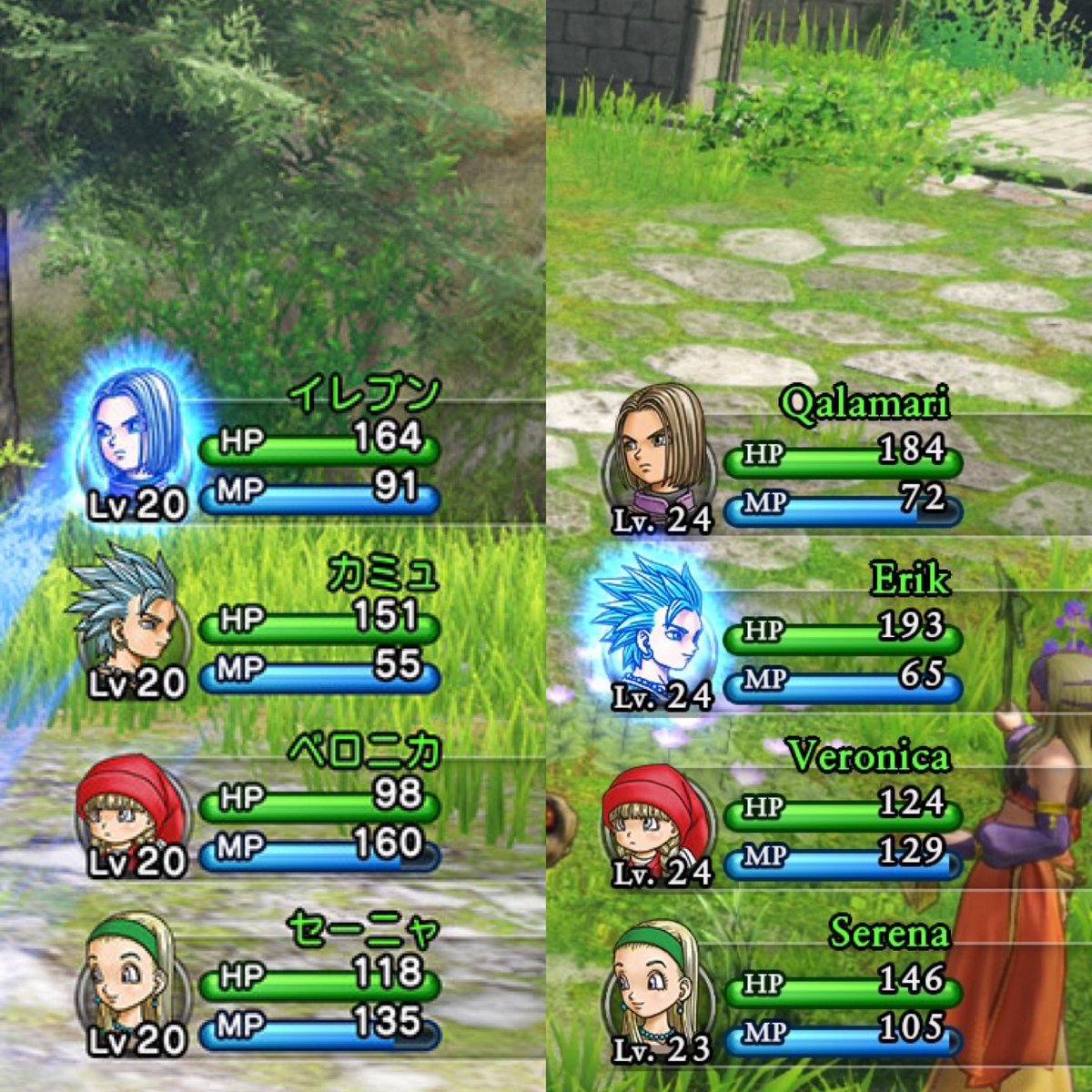
Regarding DQXI, which font does the japanese version use in comparison?Here is a comparison of Japanese vs English gameplay.
Notice how they made the "Lv" and "HP" font smaller and less readable in the English version?
Japanese version had it perfect, but no, Western localization staff always knows best. "Let's make the text smaller and use a serif font on top of that, to make it even less convenient to read!"
This is a common issue with Japanese games localized into English by the way. It's exactly the same with Dragon Quest 11 for example. Instead of going with the classic, simple Japanese font they had to choose a serif font.
(Sorry for somewhat bad quality)
OP
OP
Come on, all I can do in this matter is try to bring as much attention to this problem as possible and that's exactly what I do.I mean he literally hasnt said anything yet, the op is doing little more than patting themselves on the back at the moment
I don't know, but at least it's not serif.Regarding DQXI, which font does the japanese version use in comparison?
Just keep tweeting to the various Nintendo channels (@NintendoAmerica, @NintendoEurope, @NintendoUK) and media outlets like IGN, Gamespot, Kotaku, Gameinformer, Polygon... Gain as much attention as possible.You won't be able to do it dude. Unless your eyes are super good.
Who did the translation on this? Has there been any word?
Can we contact them via Twitter or something?
Also individual media people, like Tim Rogers or Jason Schreier. Maybe also John Linnemann Dark1x who isn't located too far from NoE's headquarter if I'm not mistaken and should definitely pay them a visit ;D
What I do is; whenever Nintendo tweets something Fire Emblem related I link them the tweet from this OP.
Thanks for your input! Interesting read, and it seems you know what you are talking about.I admit that there is a dissonance I can't shake when I see characters in medieval games speaking in Arial. But there are a billion ways to achieve legibility while maintaining stylistic consistency—and I never see them in games. It feels like UI designers all either care about the aesthetics to a fault or not at all.
It was a bad decision, but I get the thought process behind decreasing the size of the labels in your first example.
The font size of the HP and level is almost the same as that of their labels. This might not be a problem if it weren't for the fact that there's a vast ocean of empty space between the labels and the values they're labeling; there's no hierarchy to that text.
Differentiating that text does more to let the player know that these are labels, and better visually emphasizes the important info (the level and HP). Though obviously it would be better if the level, 12, were closer to its label than to HP, a totally unrelated one. I don't know enough about the technical aspects of game localization, but the spacing issue strikes me as something the localizers were aware of but were for some reason unable to change.
I definitely agree on the stylistic consistency - the font change in Fire Emblem really messed this up. You can clearly tell which is the new font used for localization and which is the original font. The new font is not just smaller and harder to read but also looks completely out of place ("Lv 15" in above screenshot).
What do you say about the movie subtitles comparison mentioned earlier? I would guess there is a reason professional movie subtitles are big, simple and readable with no-nonsense fonts - game fonts in comparison look incredibly amateurish to me.
UI design and text font/size is something you shouldn't even think about when playing a game. I find bad game fonts/subtitles more and more annoying.
Especially so after reading this:
Last edited:
I dont disagree the intent is well intentioned, but I dont agree with how we are getting there right now. This just seems self aggrandizing to me to make a whole update that you got a retweet off of what essentially isnt fully disclosing what you are showing. Point being was Tim Rogers hasnt done anything of substance thoughCome on, all I can do in this matter is try to bring as much attention to this problem as possible and that's exactly what I do.
I watched the Treehouse gameplay demo on my TV and it's perfectly readable on a 4K TV that is a bit too small for the distance I'm sitting at. Even the tiny text was readable without any problems.
But yeah, it's super tiny and there should at least be options for those who aren't able to read it, or have smaller TV's. A friend of mine has his TV at the other end of the living room and he won't be able to read any of it.
But yeah, it's super tiny and there should at least be options for those who aren't able to read it, or have smaller TV's. A friend of mine has his TV at the other end of the living room and he won't be able to read any of it.
OP
OP
At least we are getting somewhere.I dont disagree the intent is well intentioned, but I dont agree with how we are getting there right now. This just seems self aggrandizing to me to make a whole update that you got a retweet off of what essentially isnt fully disclosing what you are showing. Point being was Tim Rogers hasnt done anything of substance though
The "Tim Rogers" update was just done to give readers here at least some feel of relevance and progression on this topic, and to gain more attention, which seems to work.
We have gotten exactly nowhere thoughAt least we are getting somewhere.
The "Tim Rogers" update was just done to give readers here at least some feel of relevance and progression on this topic, and to gain more attention, which seems to work.
OP
OP
You keep complaining, I keep trying at least.
I think there is something to be said about moderation, but A for effort
Fair enough.
#3 In Depth insight on what is wrong with the font by fontguy
What do you say about the movie subtitles comparison mentioned earlier? I would guess there is a reason professional movie subtitles are big, simple and readable with no-nonsense fonts - game fonts in comparison look incredibly amateurish to me.
A big part of why subtitles are much more consistent in their prioritization of legibility over style is down to time.
A single line of text is on screen for maybe a few seconds. If you misread a word or struggle to complete the sentence, you just lost that information. There are no second chances. Like road signs, aesthetic consideration should be near 0. They are there to deliver information and nothing else. It's also so brief a time that you don't even get a chance to notice or ponder the details of a typeface, so a pretty one isn't even likely to be appreciated.
We've all the seen the SNL Avatar Papryus skit, and it shits all over the logo—but Avatar's biggest crime (aside from being an ugly and uninteresting piece of crap) is that it uses Papyrus for its subtitles.
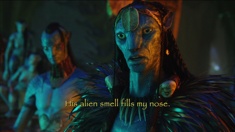
Absolutely disgusting.
I definitely agree on the stylistic consistency - the font change in Fire Emblem really messed this up. You can clearly tell which is the new font used for localization and which is the original font. The new font is not just smaller and harder to read but also looks completely out of place ("Lv 15" in above screenshot).
I meant that it looks weird when characters in far back, historically inspired settings speak in text that uses "grotesque" sans serifs type, which wasn't a thing prior to the 1800s. The font in my avatar, Franklin Gothic, for example, wasn't created until 1902. It sticks out like a sore thumb when set against a world of kingdoms and crusades. The type they chose for the localization is, in terms of style, much more appropriate than something like Franklin Gothic. But functionally, it's a mistake.
The reason FE's english text kind of sticks out isn't because of the typeface itself, but because the new typeface is being squeezed into a space meant for Japanese type. It's just visibly making poor use of all the space in those text boxes.
Japanese glyphs are roughly square. Put them inside a perfect square box and they fill most of that space. Western upper case letters are mostly the same way, but the majority of the text you're reading is lower case, a thing that doesn't exist in Japanese text, and therefore was not accounted for during development.

You'll notice that the upper case letters in FE's text boxes are roughly as tall as the glyphs in the Japanese version. I suspect this is another technical limitation the localization team had to work with. Increasing the amount of vertical space required to achieve legible lower case letters might have required more tinkering with the game's code than they could manage.
This could have been remedied by choosing a typeface with a taller x-height (the height of the lower case letters in relation to the capital letters), but they didn't do that. Mistakes were made, but I think those mistakes are almost entirely functional, not aesthetic.
I wonder if they chose that typeface primarily with character dialogue in mind, and then just applied that choice to the UI as an afterthought in the name of uniformity. In that regard, I think it's reasonable to give more consideration to aesthetic consistency when choosing a typeface for dialogue boxes because they are less removed from the actual story, setting, and content. In a game with dialogue boxes, the typeface is a key component of the voice in which the characters speak. It can directly impact the way you perceive their words.
In fact, you're statistically a tad more likely to believe a statement is true if it is written in Baskerville vs Times New Roman.
In contrast, HP meters, gauges, stat sheets, etc., are abstractions totally divorced from the game's fiction (you don't ever hear the characters say the words "hit points"), so players will likely be less conscious/more accepting of stylistic inconsistencies.
Though, depending on what type of game youre dealing with, you might have more room for aesthetic considerations in UI elements. For example, when playing an ultra difficult, fast-paced action game, the action on screen requires your constant attention, so you want a simple glance to be enough to register whatever info the UI has for you.
A turn based RPG OTOH hand gives you all the time in the world to evaluate the situation—and more time to notice stylistic inconsistencies in the game's UI. I presume Fire Emblem is turn based, so that might be another motivating factor in their decisions.
I'm having difficulty reading the text in docked mode on my TV and it's really upsetting me. I was actually thinking about getting an eye exam done to see if I needed a stronger prescription for my glasses and I'm glad to see there's a thread about this. I have the same issue with Vampyr on PS4, to the point where I don't even want to play the game because if I can't read the text to enjoy the story, then what's the point? Having to scoot way the hell close to the TV to be able to read anything is ridiculous.
I've got nothing to add to the topic, but instead just want to express that your posts are awesome. I appreciate them and love the insight you provide. Thanks!A big part of why subtitles are much more consistent in their prioritization of legibility over style is down to time. (...)
I've got nothing to add to the topic, but instead just want to express that your posts are awesome. I appreciate them and love the insight you provide. Thanks!

The font itself is horrible and makes me tired when i play this game for longer.
and yes, it is too small
and yes, it is too small
I played plenty of this in handheld mode and I don't remember having any issues with it.
Really? I remember some fonts literally being too small for 480p and just being a blur haha.I played plenty of this in handheld mode and I don't remember having any issues with it.
#4 In Depth insight on what is wrong with the font by fontguy
The font itself is horrible and makes me tired when i play this game for longer.
and yes, it is too small
The font itself isn't bad (I personally think it's quite attractive). But fonts are tools, and this one is a screwdriver when what they needed was a hammer.
Really? I remember some fonts literally being too small for 480p and just being a blur haha.
That's to be expected. The typeface they used is called Futura. It has a really low x-height and a handful of ambiguous characters (the lower case A and O are very hard to distinguish at smaller sizes). It's a very popular choice for video games (I assume because it's gorgeous and very modern-looking despite being nearly a century old), but that x-height means the lower case letters (which are most of the letters on screen) don't occupy most of the space available to them.
Additionally, in that screenshot there's very little space between individual letters, so it's hard for human eyes to sort of "untangle" them. At small sizes, letters need a lot of breathing room.
And maybe it's just the low resolution and compression of that screenshot, but it looks like there's a subtle glow added to the colored text. This decreases contrast and erases a lot of the small details your eyes need to distinguish one letter from another.
They did a bad and not a good.
Avatar's biggest crime (aside from being an ugly and uninteresting piece of crap) is that it uses Papyrus for its subtitles.
lmao what
What a strange and random thing to throw in the thread.
OP
OP
Add me to the list of people who find your posts incredibly interesting and informative. Much appreciated!A big part of why subtitles are much more consistent in their prioritization of legibility over style is down to time.
A single line of text is on screen for maybe a few seconds. If you misread a word or struggle to complete the sentence, you just lost that information. There are no second chances. Like road signs, aesthetic consideration should be near 0. They are there to deliver information and nothing else. It's also so brief a time that you don't even get a chance to notice or ponder the details of a typeface, so a pretty one isn't even likely to be appreciated.
We've all the seen the SNL Avatar Papryus skit, and it shits all over the logo—but Avatar's biggest crime (aside from being an ugly and uninteresting piece of crap) is that it uses Papyrus for its subtitles.
Absolutely disgusting.
I meant that it looks weird when characters in far back, historically inspired settings speak in text that uses "grotesque" sans serifs type, which wasn't a thing prior to the 1800s. The font in my avatar, Franklin Gothic, for example, wasn't created until 1902. It sticks out like a sore thumb when set against a world of kingdoms and crusades. The type they chose for the localization is, in terms of style, much more appropriate than something like Franklin Gothic. But functionally, it's a mistake.
The reason FE's english text kind of sticks out isn't because of the typeface itself, but because the new typeface is being squeezed into a space meant for Japanese type. It's just visibly making poor use of all the space in those text boxes.
Japanese glyphs are roughly square. Put them inside a perfect square box and they fill most of that space. Western upper case letters are mostly the same way, but the majority of the text you're reading is lower case, a thing that doesn't exist in Japanese text, and therefore was not accounted for during development.
You'll notice that the upper case letters in FE's text boxes are roughly as tall as the glyphs in the Japanese version. I suspect this is another technical limitation the localization team had to work with. Increasing the amount of vertical space required to achieve legible lower case letters might have required more tinkering with the game's code than they could manage.
This could have been remedied by choosing a typeface with a taller x-height (the height of the lower case letters in relation to the capital letters), but they didn't do that. Mistakes were made, but I think those mistakes are almost entirely functional, not aesthetic.
I wonder if they chose that typeface primarily with character dialogue in mind, and then just applied that choice to the UI as an afterthought in the name of uniformity. In that regard, I think it's reasonable to give more consideration to aesthetic consistency when choosing a typeface for dialogue boxes because they are less removed from the actual story, setting, and content. In a game with dialogue boxes, the typeface is a key component of the voice in which the characters speak. It can directly impact the way you perceive their words.
In fact, you're statistically a tad more likely to believe a statement is true if it is written in Baskerville vs Times New Roman.
In contrast, HP meters, gauges, stat sheets, etc., are abstractions totally divorced from the game's fiction (you don't ever hear the characters say the words "hit points"), so players will likely be less conscious/more accepting of stylistic inconsistencies.
Though, depending on what type of game youre dealing with, you might have more room for aesthetic considerations in UI elements. For example, when playing an ultra difficult, fast-paced action game, the action on screen requires your constant attention, so you want a simple glance to be enough to register whatever info the UI has for you.
A turn based RPG OTOH hand gives you all the time in the world to evaluate the situation—and more time to notice stylistic inconsistencies in the game's UI. I presume Fire Emblem is turn based, so that might be another motivating factor in their decisions.
This is a bit off topic but what is your take on the following font?
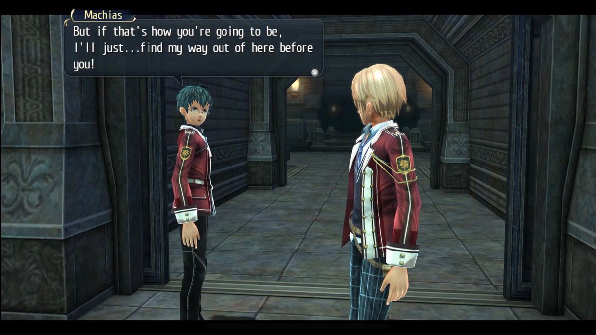
I was viewing gameplay of Trails of Cold Steel for PS4 the other day to decide if I should buy it on sale right now, but the game's font(s) completely turned me off for now. You can tell this is a Japanese game localized into English just by looking at the font (which I think has been used for other Japanese games as well).
I find it plain ugly and uncomfortable to read. Poor spacing between characters and words is just one of the reasons why.
The font also changes its width depending on how much horizontal room it has, which looks completely jarring and unprofessional to me. (A lot of Japanese games do that. Tales of Berseria comes to my mind) Like, it doesn't give my eyes enough breathing room.
Would be really interesting to see your opinion on this.


ok yeah, I change my mind from my post on the first page, the font is a tad tiny even in docked mode.
Think this is bad? Try Dragon Quest Builders... even on a TV the text is too small in tutorial boxes... in handheld it's impossible.
The text is too small for TVs too. Dragon Quest Builders 2 is fucking ridiculous with some of its UI text.One of the drawbacks for the switch design. Games wont be made truly with handheld in mind anymore because they're designed to work with TVs primarily.
I'm not having any difficulty reading either the normal dialogue or the tooltips in handheld. I could see how docked might be more difficult, depending on TV size / sitting distance. The font seems like a bigger problem for legibility than the text size — or at least, a major exacerbating factor. Text size is more-or-less on par with most games.
If it's super bad for people, the Switch does have a magnifying feature that could at least help, even if it doesn't solve the issue.
If it's super bad for people, the Switch does have a magnifying feature that could at least help, even if it doesn't solve the issue.
The text is too small for TVs too. Dragon Quest Builders 2 is fucking ridiculous with some of its UI text.
I tried the demo only in handheld mode and my fucking god this is true. I could not believe how small some of the text was. How could someone design and implement that and think "yeah this looks good, let's go with that".
Can't wait to see some of this shit on the Switch Mini, by the wayI tried the demo only in handheld mode and my fucking god this is true. I could not believe how small some of the text was. How could someone design and implement that and think "yeah this looks good, let's go with that".
Threadmarks
View all 17 threadmarks
Reader mode
Reader mode