-
Ever wanted an RSS feed of all your favorite gaming news sites? Go check out our new Gaming Headlines feed! Read more about it here.
-
We have made minor adjustments to how the search bar works on ResetEra. You can read about the changes here.
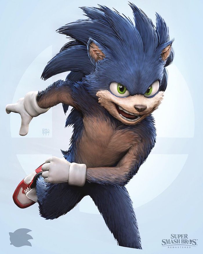
Raf Grassetti, art director at Sony Santa Monica, is doing a series of fan art for Smash Bros. characters (UPDATE: Waluigi is here, post #1,399)
- Thread starter Deleted member 10737
- Start date
You are using an out of date browser. It may not display this or other websites correctly.
You should upgrade or use an alternative browser.
You should upgrade or use an alternative browser.
Threadmarks
View all 20 threadmarks
Reader mode
Reader mode
Recent threadmarks
Ganondorf Dark Samus Wario Bowser Jr. Pac-Man Luigi Mario WaluigiHoly shit I see it.
I mean, do we have to provide an "actual critique" for it? Can't we just say that we dislike it and that's that? Do we really need to feature a paragraph length criticism every time we see something that we don't like and state it as so? It's just unappealing to me to look at, personally, do I really need to make point by point argument about why I feel that?
Additionally, can't we say that "we don't like how it looks" is a criticism in itself?
No one is asking for a critique, I was simply stating that using the guise of a critique is not an excuse to call something garbage. I have no problems with saying you don't like it. But saying something is garbage/atrocious is going to call into question why that person is so offended especially over just an art style. The intentionally negative comments are just obnoxious.
For the record I stated I disliked some of it. I understand this is for fun/practice and done in an hourish give or take and wasn't meant to be a master piece, it's more of a 3d quick sketch. This additude of acting like people are getting upset that they like something so everyone else must is way off point.
If people chose to use extreme words to convey how they feel they should be surprised if some asks why they are hot and bothered.
I'm reminded of when Yusuke Murata drew his take on Beerus. There's nothing wrong with the art but I just dislike the take on the character compared to how they originally look.

Yeah despite the obvious skill, this misses a lot of charm in the original design. It's all about those ribs, man.I'm reminded of when Yusuke Murata drew his take on Beerus. There's nothing wrong with the art but I just dislike the take on the character compared to how they originally look.
I actually like this much better than the the offical designI'm reminded of when Yusuke Murata drew his take on Beerus. There's nothing wrong with the art but I just dislike the take on the character compared to how they originally look.
Off topic at this point, but why? Genuinely curious, would be interesting to contrast our points. I think the original not only offers a welcome change to what would otherwise be another set of bulging muscles, but the more skeletal proportions not only help to bring out the silhouette (particularly the shape of the neck and the way that's balanced by the ears) but also communicates the cat that the design is heavily based on more clearly.
Gonna just repeat my post because you missed this: I might not understand it (and I'd actually love someone to expand on their views about it - but maybe you only have to do that if you dislike something, and not if you like something?) And in the case of the ue4 stuff I really don't understand why someone likes it, but I have zero problem with them doing so. I actually really like seeing why someone thinks the way they do, and seeing how it's articulated. It's much more interesting if it's a view that I don't share. I've already explained twice why I don't like this fan art on this thread, I agree that a simple "I don't like it" and vanishing isn't really a great input.But you were literally posting that you can't comprehend someone liking that OOT remake.
I like the over the top beef cakes of dbz and this depiction reminds me of those characters. Its why i like Jiren so much. Beerus's og design is good, one of the few good ones in super (i feel a lot of super's designs are pretty basic looking, the most offensive ones being the sayians of universe 6. Not all of them are bad tho, the wolf trio and Hit (minus the penis head) are great)Off topic at this point, but why? Genuinely curious, would be interesting to contrast our points. I think the original not only offers a welcome change to what would otherwise be another set of bulging muscles, but the more skeletal proportions not only help to bring out the silhouette (particularly the shape of the neck and the way that's balanced by the ears) but also communicates the cat that the design is heavily based on more clearly.
now we know who designed the sonic movie.this is the next one he'll be posting. get ready for hunky sonic.
Agreed that beerus has one of the few good designs in super. You're right that so many of them felt pretty uninspired and just generally lacking. Anyways I can't derail this further lolI like the over the top beef cakes of dbz and this depiction reminds me of those characters. Its why i like Jiren so much. Beerus's og design is good, one of the few good ones in super (i feel a lot of super's designs are pretty basic looking, the most offensive ones being the sayians of universe 6. Not all of them are bad tho, the wolf trio and Hit (minus the penis head) are great)
OP
OP
"hang out"
;)
Her suit was always bulky. This just has somewhat more realistic proportions all around.Wow, not sure how you got that out that comment! It's just too bulky for the kind of maneuvers Samus is known for, and as a few others have pointed out, the visual identity behind it makes her look more like one of the faceless Federation troopers from the Prime games.
And I don't see how masculinity is an issue when designing highly protective futuristic combat gear. Other than to people who think armor needs to have boob sockets if women are wearing them.
All of those in the opening are actually ERA avatar materials.
Just Photoshop, crop/cut, & add transparency PNG.
Just Photoshop, crop/cut, & add transparency PNG.
Being negative requires more explanation more than being positive, yes. Ive never heard of positive trolling or positive driveby posts.
I don't know why it needs explaining that if you're going to be nasty there needs to be more of a reason than being appreciative...
Being negative isnt inherently trolling. Grow up.
Well, seeing as I don't think it needed boob sockets, as she's never had to worry about them in other incarnations, nor did I ever even remotely imply that to ever be what was missing from this interpretation, I'm not sure I appreciate the implication that I somehow did.Her suit was always bulky. This just has somewhat more realistic proportions all around.
And I don't see how masculinity is an issue when designing highly protective futuristic combat gear. Other than to people who think armor needs to have boob sockets if women are wearing them.
It's inherently more likely to cause discourse and spread toxicity. This is basic Internet experience.
This should be obvious. After all, banning exists, and is used to punish specific negative behavior. There's no punishment for positive behavior.
Also, my own Internet experiences (or heck, even my real life ones) say that whenever someone goes "grow up" to another, they're the ones who need to mature a bit. It's literally justifying their stupid posts by calling the other poster a child instead of using an actual argument to explain their point of view.
You're not helping your case.
Last edited:
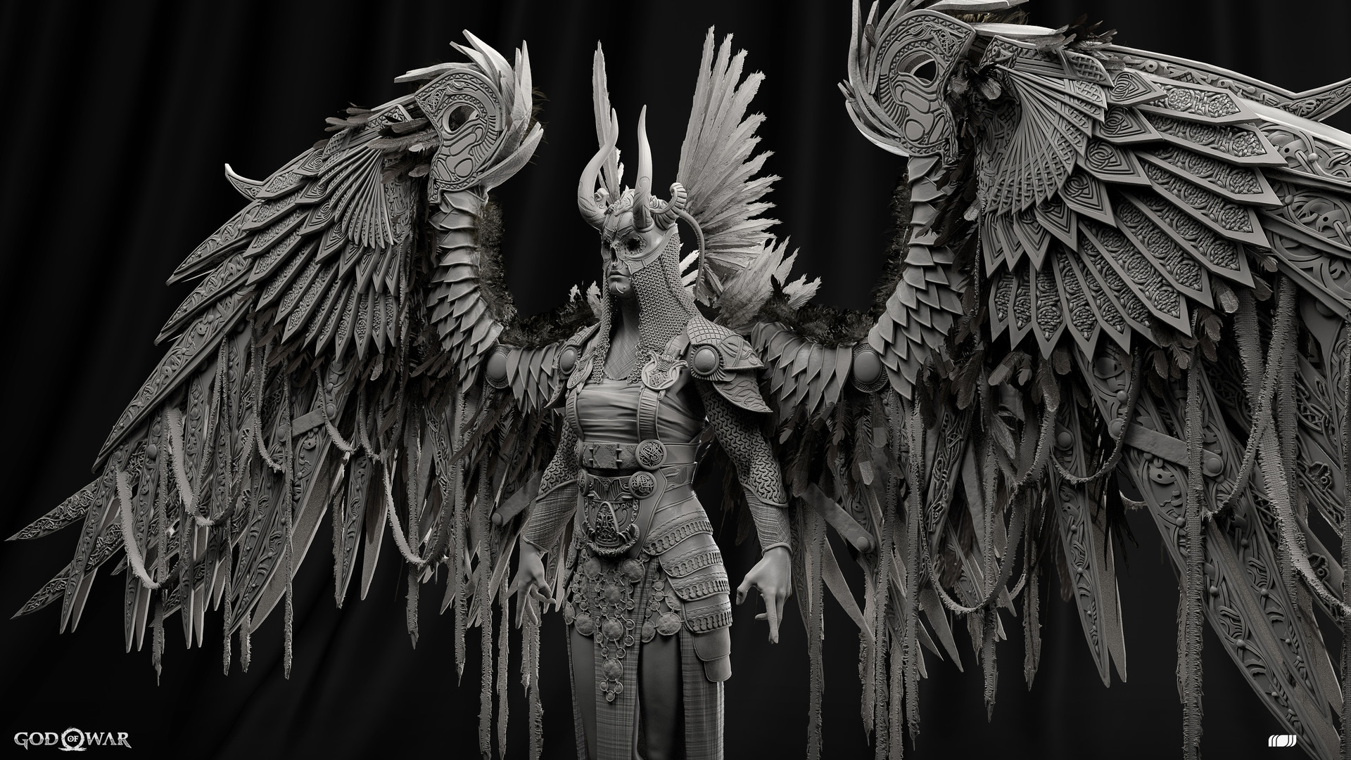
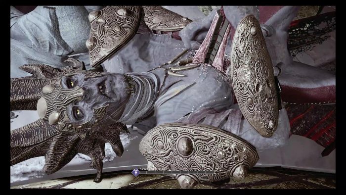
Do you remember my thread about a dark, sinister looking Bowser in Mortal Kombat 11? This is not too far off from what I was thinking!
I'd be down. That things looks HORRIFYING.
The fact that some people think this looks amazing will always boggle my mind.
That looks amazing. What is it about it that you find so unbelievably unappealing?
It's inherently more likely to cause discourse and spread toxicity. This is basic Internet experience.
This should be obvious. After all, banning exists, and is used to punish specific negative behavior. There's no punishment for positive behavior.
Also, my own Internet experiences (or heck, even my real life ones) say that whenever someone goes "grow up" to another, they're the ones who need to mature a bit. It's literally justifying their stupid posts by calling the other poster a child instead of using an actual argument to explain their point of view.
You're not helping your case.
Of course it's more likely to cause toxicity. This is the result of the other person being salty and not having the maturity to deal with opinions to disagree with.
A normal non trolling negative opinion does not need any more of an explanation than a positive one. The people who say otherwise just need to grow a spine.
Sonic
OP
OP
The thing that bothers me about Samus is that I've grown accostumed to her suits having gigantic shoulderpads.
Shoeless Yoshi exists officially at least.
Oh boy, not sure if I want to see that, I'd like to see his take on Mr. Game & Watch.
The work put into it is very impressive, i like the Samus one.
Seeing hyper realistic Nintendo characters though, reminded me when people drew shoeless Yoshi and Kirby, a little disturbing.
Link looks like he's from The Witcher. lol
Shoeless Yoshi exists officially at least.

Oh boy, not sure if I want to see that, I'd like to see his take on Mr. Game & Watch.
Color me shocked, Sonic's head design is actually pretty decent and while I don't think it suits Sonic himself, I could see a more cartoonish version show up in a new IP platformer. Furry pecs is rather silly, though.
Definitely the weakest one so far
It'll surely look better than what the movie design is sure to be going by the silhouette.
OP
OP
Wanna bet that Sonic looks better than what we'll get for the film?
for sureIt'll surely look better than what the movie design is sure to be going by the silhouette.
These look great. :O I always like to see Nintendo characters in different styles! Hope he gets around to pokemon trainer!
OP
OP

I never realised how ridiculously good some of this guys sculpts and models are. He's insanely talented.


Almost unfortunate how much of that detail disappears from the final product.
Heck yeah!
Now I'm just sad:I was just coming to post, the pics in the OP and these are extremely good.
Extremely good. This guy is very talented.
Level of Detail on typical Elf model:
This guy's work is so incredibly impressive. Shame the console couldn't handle it.
This is off topic, but you asked. On a purely technical level I feel like so much of it is effects for effects sake. They've pushed the roughness maps so low, killing any real tangible feeling to the materials, in favour of prioritising reflections. There's a distinct lack of texture, go look at any good substance materials on artstation and it should be clear what I mean. Marble shouldn't have a pronounced normal map or anything, but everything is so artificially flat and lacking.That looks amazing. What is it about it that you find so unbelievably unappealing?
All of that is based around what I imagine the artist was going for, which is a realistic material interpretation of the temple of time. I think if you're willing to rebuild the temple from a design standpoint, that could look cool (referencing something like Westminster abbey or whatever you wanted) but what they seem to have done is gone halfway and ultimately stopped, retaining the vast majority of the N64 layout, and more than that, it's detailing. Naturally the N64 environment was designed to adhere to the platform limitations, and is therefore a really boxy space - so rendering all of this up with "realistic" materials without adding significant geometry changes or additional details feels like it's just giant slabs of marble cubes. Because that's exactly what it is. There's a wonderful example of "temple of time" architecture in a ruin in Tintern in Wales, the kind of thing that would look amazing if realistically rendered as a temple of time. If your comeback is "it's just a fan art project, don't overthink it." Or "not everyone is a professional artist", then what's even the fucking point. I think that's such a poor, patronising way to treat amateur work, like it's made by kids and put on fridges. Nobody is going into some students portfolio and shitting on them personally. These ue4 works have been shared millions of times and champion led as "the way the next Zelda should look". If people are "allowed" to make positive comments to the point of suggesting it should lead the franchise, people are allowed to say why it really shouldn't, if that's how they feel.
I think that illustrates why I don't like those works, and if you're looking for a "justification" of my opinion on the artwork in the thread, I've done that twice, I'm not doing it again. If you disagree, not only am I okay with that, I encourage you to explain why you like these things. I encourage anyone to talk about art to whatever level they feel able to, and criticise whatever they want, celebrate whatever you want, and simply bring discussion to the table. In my opinion, "lol I hate this" and "lol Nintendo hire this guy" are both as equally empty as one another.
His version of Sonic is my favourite of these so far, it's what the movie one should look like.
Could potentially be better than how he'll look in the movie :P