-- Now with Threadmarks! --
Fire Emblem Awakening (2013) vs Fire Emblem Three Houses (2019).
Notice how the dialogue boxes of both games are almost the same size? Yet the text on Switch is tiny compared to 3DS.
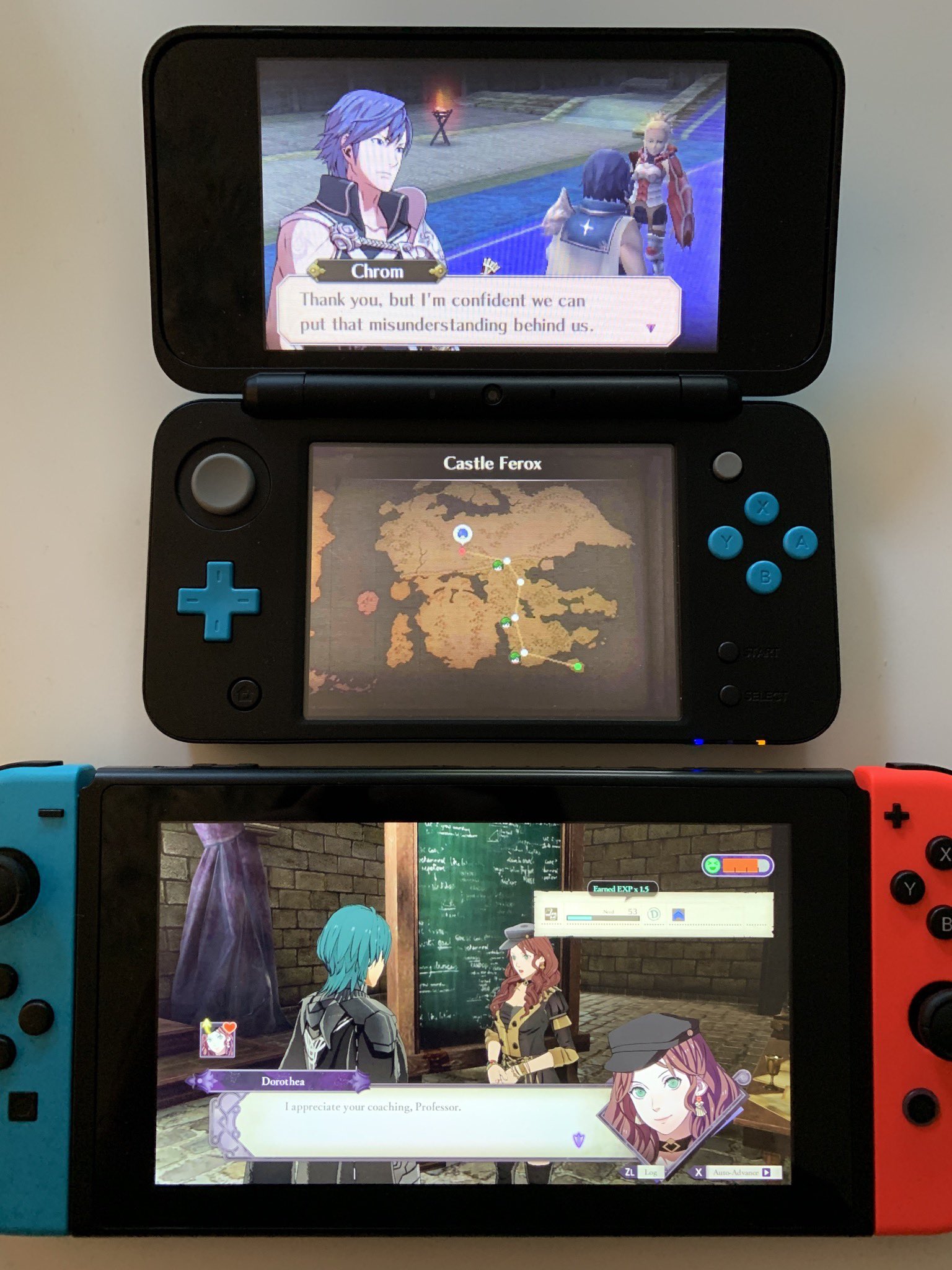
Look at the amount of blank space in the textbox.
When the textbox (not the text itself, but the box surrounding it) fills almost the entire width of the screen already, why not just make the text big enough to properly fill the box to begin with?
The Battle UI is also harder to read now because the text is smaller and less vibrant and even uses a serif font.
This is ridiculous. The screen got bigger but the text got smaller.
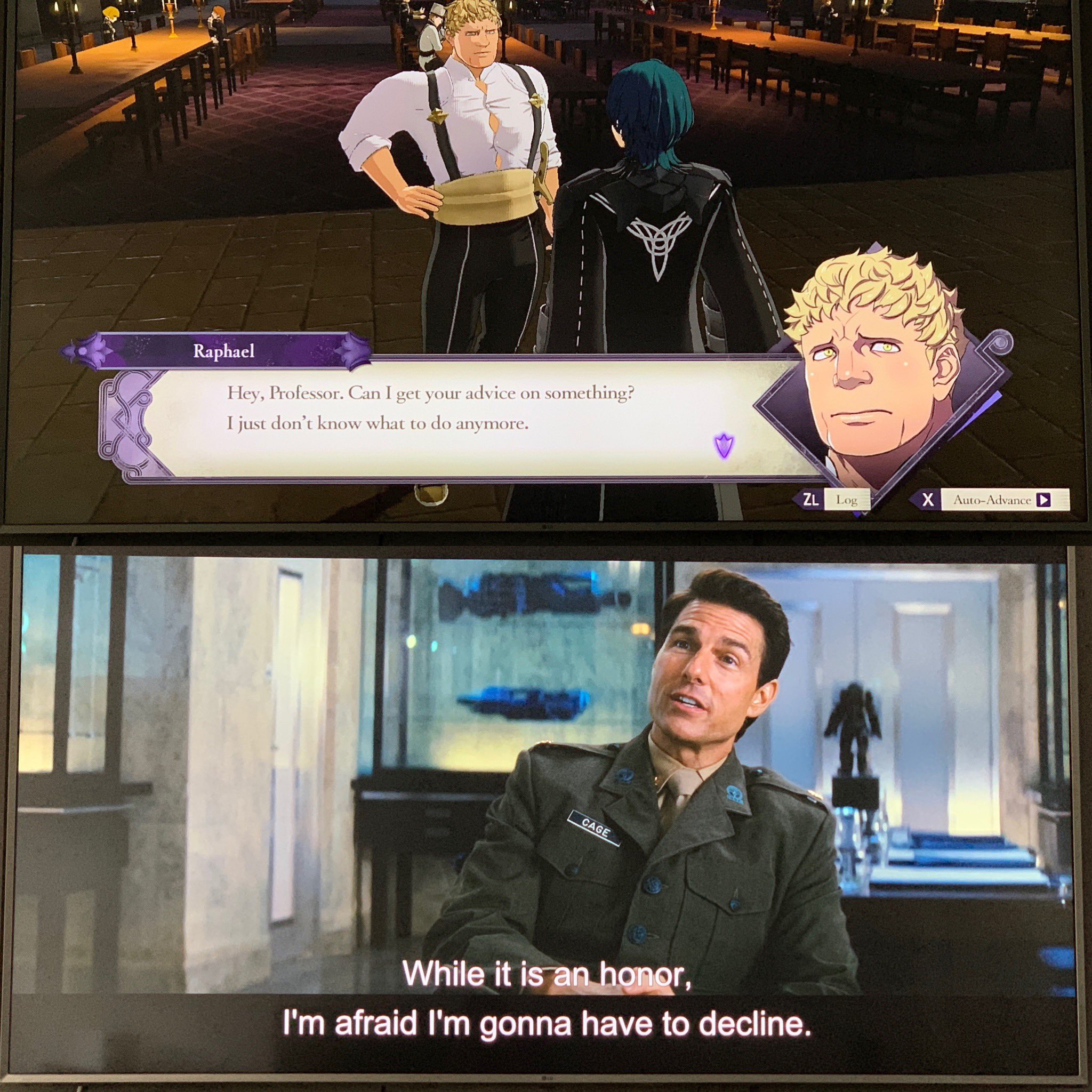
TV Comparison of Treehouse gameplay vs Edge of Tomorrow:
They even made text from the Japanese version of the game smaller:
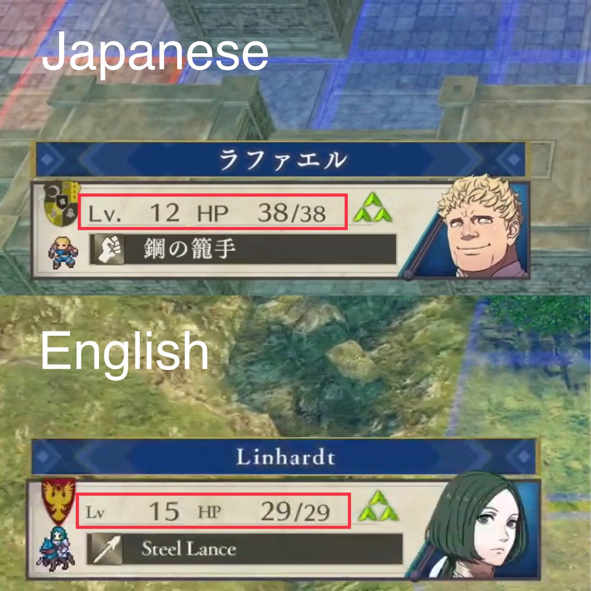
The font is even too small and flimsy to be properly displayed on the Switch screen:
Why do videogame subtitles have to be so freaking small?
I hope this gets fixed.
Proof that this is text for ants:
/Edit:
This has got Tim Rogers' attention now (he writes for Kotaku). It's a start:
/Edit 2:
We finally have an article from Kotaku:
/Edit 3:
The comparison I did above gained a lot of traction on Twitter now:
PS:
Remember to keep tweeting this problem to Nintendo:
@NintendoAmerica @NintendoDE @NintendoEurope @NintendoUK @ADrakeWasHere @trintran @EditingEntropy
Fire Emblem Awakening (2013) vs Fire Emblem Three Houses (2019).
Notice how the dialogue boxes of both games are almost the same size? Yet the text on Switch is tiny compared to 3DS.
Look at the amount of blank space in the textbox.
When the textbox (not the text itself, but the box surrounding it) fills almost the entire width of the screen already, why not just make the text big enough to properly fill the box to begin with?
The Battle UI is also harder to read now because the text is smaller and less vibrant and even uses a serif font.
This is ridiculous. The screen got bigger but the text got smaller.
TV Comparison of Treehouse gameplay vs Edge of Tomorrow:
They even made text from the Japanese version of the game smaller:
The font is even too small and flimsy to be properly displayed on the Switch screen:
Why do videogame subtitles have to be so freaking small?
I hope this gets fixed.
Proof that this is text for ants:
LMAO. I was just out playing this game on my porch. I'm looking through a list of students when an ant crawls onto my screen.
The ant itself was literally bigger than some student's whole names. If the ant had crawled over Hubert's name, it could have covered his name entirely with its body.
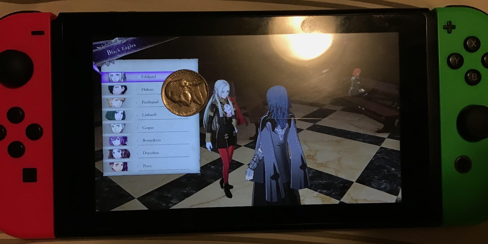
This is my Switch. I put a US 5 cent piece on the screen.
Note how the text on the damn coin is larger than the text on the screen. I didn't even notice until I was taking the picture.
See Hubert, Caspar, and Petra on that list there? Any of their names names could fit entirely onto the Switch's tiny tiny face buttons, at that font size. That is not a joke, just look.
It's l i t e r a l l y tiny text for ants.
It's really cool that you've got 20/10 vision, I'm pretty jealous. Unfortunately, for all too many of us non-Kryptonians, text that's smaller and less legible than what you'd find on a US coin ain't gonna cut it.
/Edit:
This has got Tim Rogers' attention now (he writes for Kotaku). It's a start:
/Edit 2:
We finally have an article from Kotaku:
/Edit 3:
The comparison I did above gained a lot of traction on Twitter now:
PS:
Remember to keep tweeting this problem to Nintendo:
@NintendoAmerica @NintendoDE @NintendoEurope @NintendoUK @ADrakeWasHere @trintran @EditingEntropy
Last edited: