-
If you have been following the news, you should be aware that the people of Lebanon have been under a violent bombardment that has recently escalated. Please consider donating to help them if you can or trying to spread word of the fundraiser.
-
Asheville and Western North Carolina at large are in crisis after Helene, please consider contributing to these local organizations and helping the people whose lives have been destroyed.
Era, let's settle this. Which is Zero's best design?
- Thread starter Lant_War
- Start date
You are using an out of date browser. It may not display this or other websites correctly.
You should upgrade or use an alternative browser.
You should upgrade or use an alternative browser.
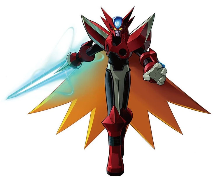
I wouldn't be surprised if that was the original intention, or at least considered, but was dropped due to time constraints or other reasons (like deciding it just wasn't worth it to go that extra mile).Thats true, just an explanation. Honestly this is what Omega should have looked like.
Would have been fucking awesome though.
I also voted X. But I love Giro's design, too.
Thats true, just an explanation. Honestly this is what Omega should have looked like.

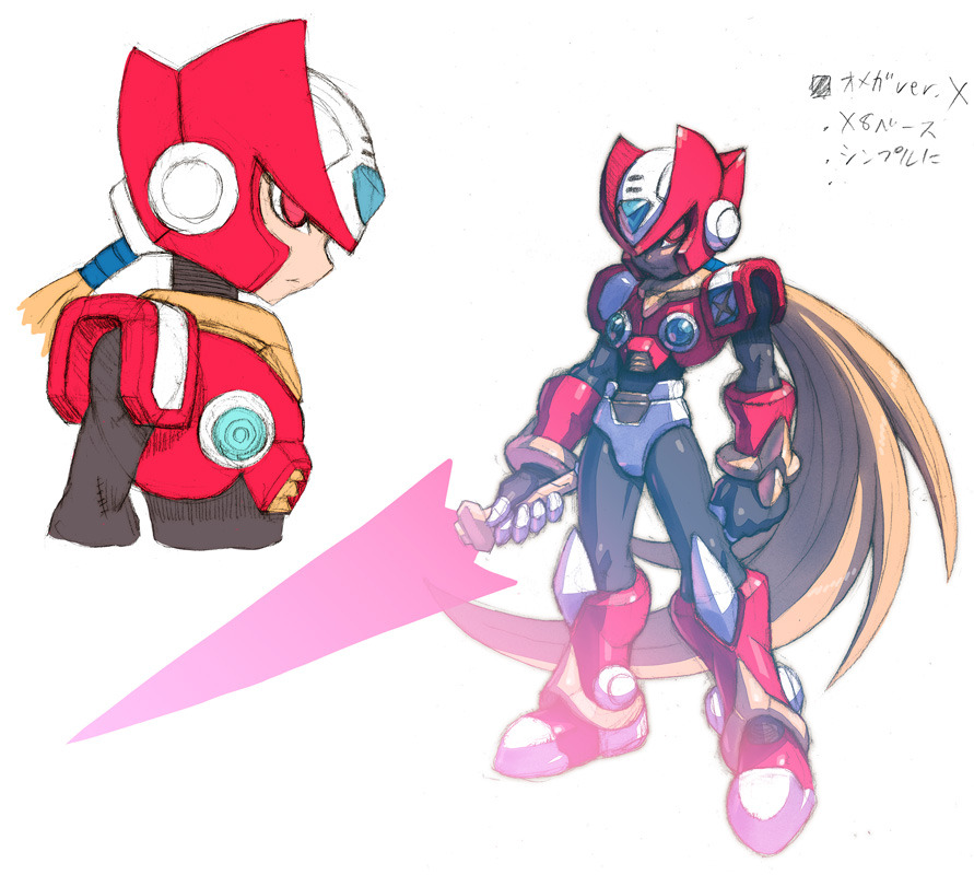
ever since i found this fanart it was instantly the best design for me! The best of two worlds!
Thats true, just an explanation. Honestly this is what Omega should have looked like.

I like MMZ Zero, but this should have been his normal design from the get go.
I'd take the other two over original Zero design with green orb boobs and Depends diaper.MMZ Zero uses a bikini bottom so that disqualifies it for me. MMZX's design has a chastity belt so it's a no from me, too.
Original design is the best by default.
OG Zero is the one and only. All the others are abominations. One of the reasons I'm not a big fan of the Zero series is because of the redesign.
The original from the X Series. No contest.
I don't like the chibi look of the Zero series, where they appear to be wearing vests or something instead of actual armor.
I don't like the chibi look of the Zero series, where they appear to be wearing vests or something instead of actual armor.
I definitely preferred the original Zero design (from the X games) and wished that the Zero games had used it.
Then I bought the NX Edgestyle Zero figure and noticed his green orb breasts for the first time (I guess I never paid that close of attention).
Now I am torn.
Then I bought the NX Edgestyle Zero figure and noticed his green orb breasts for the first time (I guess I never paid that close of attention).
Now I am torn.
There's a reason there's millions more artwork for MMZ Zero despite the relative lower popularity of the series, cause he's simply the more dynamic design by far.
Ya'll can be nostalgia-driven all you want for the OG but this design is damn top tier

Ya'll can be nostalgia-driven all you want for the OG but this design is damn top tier

Having only played the first three Megaman X games and having just found out about these other designs by looking at this thread, I will say i prefer the X Zero by a lot.
I also think this is another cool interpretation of MMZ Zero (its from the limited edition soundtrack cover)
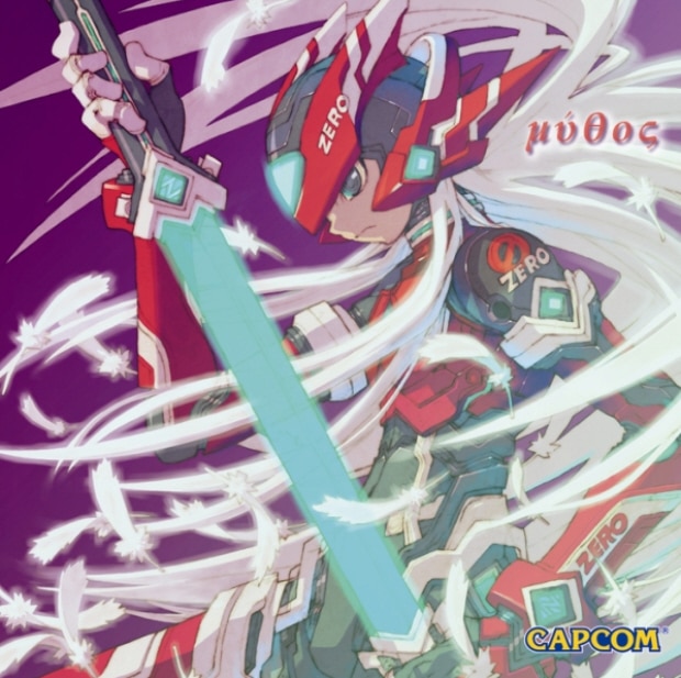

Glad someone beat me to posting this image cause WHEW.
MMZero design for me
Mega Man X's hands down, especially with the black armor.

MMZ's version makes him look like a baby. ZX's one is alright, but that's because you are technically playing as a kid.

MMZ's version makes him look like a baby. ZX's one is alright, but that's because you are technically playing as a kid.
Last edited:
That was my phone wallpaper for a good 2 years.Glad someone beat me to posting this image cause WHEW.
MMZero design for me
Thats some real whack looking art. What the fuck is up with his torso?
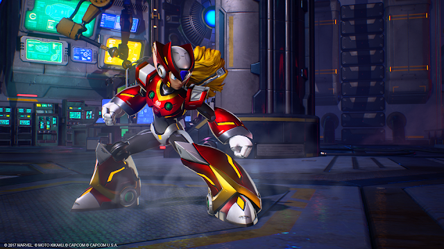
I don't like how the Mega Man X characters are rendered in MvCI but that design is aces:
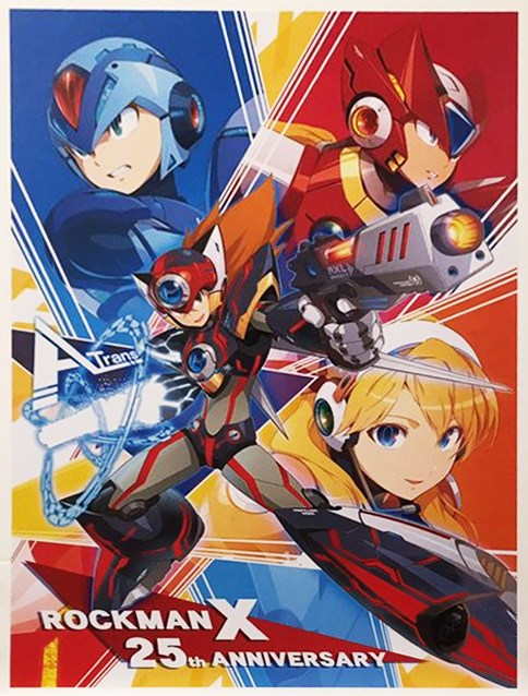
And given this, it's probably going to be the design moving forward.
Last edited:
All the non-X designs make him look like a little child, so OG wins for me.
The amount of hours it took to unlock that motherfucker... but it was worth it.
The amount of hours it took to unlock that motherfucker... but it was worth it.
I'm glad this got brought up sooner rather than later. Too bad it's been largely ignored.
All of the posters who voted for Gem Boobie X Zero are awful people and must be banned
(Voted for the superior MMZ franchise representative)
(Voted for the superior MMZ franchise representative)
That was my phone wallpaper for a good 2 years.
Thats some real whack looking art. What the fuck is up with his torso?
A (failed) attempt at a dynamic pose. Trying to do the MMZ poses with MMX Zero doesn't work period.
Yeah hes too top heavy, its like trying to bend an action figure.A (failed) attempt at a dynamic pose. Trying to do the MMZ poses with MMX Zero doesn't work period.
Yeah, the Mythic soundtrack design for Zero is the best. I wish that design would appear in an actual game.I also think this is another cool interpretation of MMZ Zero (its from the limited edition soundtrack cover)

I think the slimmer MMZ/ZX designs suit Zero better than his bulkier X design. Gameplay wise, Zero has always relied more agile movements compared to X's power and armor.
Better version
Voted for MMZ but MMX is still cool especially the black armor, other ones are meh to me


