-
If you have been following the news, you should be aware that the people of Lebanon have been under a violent bombardment that has recently escalated. Please consider donating to help them if you can or trying to spread word of the fundraiser.
-
Asheville and Western North Carolina at large are in crisis after Helene, please consider contributing to these local organizations and helping the people whose lives have been destroyed.
Zelda Tech Demo (Wii U) - Will we ever see a Zelda with a similar visual style?
- Thread starter MilesQ
- Start date
You are using an out of date browser. It may not display this or other websites correctly.
You should upgrade or use an alternative browser.
You should upgrade or use an alternative browser.
Nah, almost all of the MM art looks that way, it's not just the piece with the moon.

The hard shadows look that way because the artist wanted that atmosphere, it's not about emulating the way light works.
Obviously, I'm not disputing what the artist meant to show in their art. My point is that a hypothetical game trying to emulate this style wouldn't look exactly like this at all times, the same way BotW doesn't look exactly like its artwork because 3D graphics don't work the same way as a 2D picture. Unless people actually expect an action adventure in a style similar to Killer7 rather than something with a more modern lighting engine.
Obviously, I'm not disputing what the artist meant to show in their art. My point is that a hypothetical game trying to emulate this style wouldn't look exactly like this at all times, the same way BotW doesn't look exactly like its artwork because 3D graphics don't work the same way as a 2D picture. Unless people actually expect an action adventure in a style similar to Killer7 rather than something with a more modern lighting engine.
I think it could. Killer7 is going a bit far, but I don't see why a game that were to emulate that style faithfully couldn't still utilize a modern lighting engine while making use of that level of shadows and contrast on its character models. It doesn't have to be accurate to how real world lighting works to be feasible, otherwise you wouldn't get stuff like BotW's cell shading at all. It'd be heavily stylized, yeah.
It'd make for a very moody game for sure tho, so it'd have to be appropriate. I'm sure they could pull it off if they wanted to.
What I will say is that Zelda has never aimed to translate the look of its artwork to the in-game graphics to that extend, you're right about that. So by no means am I ever expecting what I want here, I just think it'd look absolutely wonderful if it did happen.
Hopefully never.
The cartoony art style they have adopted plays into the strengths of their creative team and also masks the limitations of Nintendo's hardware.
Imagine how bad a realistic Zelda for the Switch would look like next to Horizon.
The cartoony art style they have adopted plays into the strengths of their creative team and also masks the limitations of Nintendo's hardware.
Imagine how bad a realistic Zelda for the Switch would look like next to Horizon.
Wind Waker HD looked so off compared to the original, those clouds were brighter than the sun
I much prefer the original color palette and style. The Gamecube version looked more like a cartoon while the Wii U version went for a CGI look.Wind Waker HD looked so off compared to the original, those clouds were brighter than the sun
I don't think all future Zelda games have to stay in the path of Wind Waker and BOTW's cel shaded visuals. If I had to guess, the next Zelda game after BOTW2 will do something completely different that might be closer to Twilight Princess or Ocarina.
Well, maybe it was supposed to be, but by the time the GCN version finally released the 360 had been out for a year and the PS3 had been out for a few weeks :pYeah you could argue they wanted to flex TP with the Gamecube, being it was the most powerful console at the time.
I would kill for them to take another spin with Twilight Princess's art style. It's by far the best art style Zelda has ever had. I love the intricate detail in the designs.
Honestly, the cartoony cel-shaded look has been done to death. I like BotW's art style but a TP style is actually quite fresh for Zelda. TP isn't even realistic. It's more naturalistic and stylized than anything. It's only realistic compared to the more cartoony Zelda's like Wind Waker.
Honestly, the cartoony cel-shaded look has been done to death. I like BotW's art style but a TP style is actually quite fresh for Zelda. TP isn't even realistic. It's more naturalistic and stylized than anything. It's only realistic compared to the more cartoony Zelda's like Wind Waker.
Probably not. And I'm glad.
It's real bog-standard compared to where they went with Breath of the Wild
It's real bog-standard compared to where they went with Breath of the Wild
Never.
Nintendo will never give you what you want. Nintendo only tells you what to want.
Then you buy it.
Exactly, ive learned this lesson the hard way these past 20 years
people saying no, but like most have mentioned, this isnt nintendo proper.
if NINTENDO did this with their team, itd fucking be amazeballs, and its not like you wont get artsy zelda again, theyve been pretty good with switching the art style around a lot, and it's one of the best things about the series lately
if NINTENDO did this with their team, itd fucking be amazeballs, and its not like you wont get artsy zelda again, theyve been pretty good with switching the art style around a lot, and it's one of the best things about the series lately
Fuck. I'd finally taken out BoTW to play something else, but I guess it's going back in.
You're a real piece of work, fam.
Wind Waker HD looked so off compared to the original, those clouds were brighter than the sun
What? The clouds you see don't burn with the intensity of a mushroom cloud?
Yeah I'd really like that art style.
BOTW is a mixed bag in terms of it's visuals. On one hand, all the characters are celshaded and lit with that in mind. Then there's a lot of the environment (rocks/terrain/cliffs) that's very repetitive somewhat realistic textures with normal mapping.
Felt the Wind Waker style was more consistent.
BOTW is a mixed bag in terms of it's visuals. On one hand, all the characters are celshaded and lit with that in mind. Then there's a lot of the environment (rocks/terrain/cliffs) that's very repetitive somewhat realistic textures with normal mapping.
Felt the Wind Waker style was more consistent.
I mean, it really just feels like Twilight Princess run through one of those "Zelda in Unreal 4 HD!" videos.
It looks decent, but really uninspired. I wouldn't mind playing it but I'm certainly not mourning its loss.
It looks decent, but really uninspired. I wouldn't mind playing it but I'm certainly not mourning its loss.
artstyle in the context of an actual game (UI, camera perspective, optimization 'downgrade') would look nowhere near as impressive. maybe on the Switch 3 or whatever we're playing years later
still it'd look good but pretty "vanilla" for a series known to shake up its aesthetic
still it'd look good but pretty "vanilla" for a series known to shake up its aesthetic
The overly negative response to this thread is pretty interesting. I can totally understand not liking or wanting this visual style but the hate feels almost aggressive.
I would settle for this.
I would settle for this.
I'd prefer if we never get one that looks like this. I'm not a fan of the Twilight Princess aesthetic, and this looks even less appealing. Maybe it's because I've seen too many of those "Zelda in Unreal Engine" videos and that's tainting my views, but the entire look of it comes off as a little amateurish. Like the tech driving it is the art direction, rather than merely contributing to it.
BotW art style is probably the best in the series, but it is hurt by the lack of hardware power. There are times where it looks astonishing, full with detail and life, and then there are times where it looks completely flat and lifeless. It's ultimately very uneven and a bit jarring. Hopefully this will be adressed in the sequel. I'm especially hoping for more advanced mountain modelling and texture work.
I hope not. The standard semi-realistic look most AAA games seem to be going for is one of the safest and blandest imaginable. They tried and failed with TP.
/edit: as others have said: a full-on OoT remake could work with that style. OoT already had a pretty vanilla look.
/edit: as others have said: a full-on OoT remake could work with that style. OoT already had a pretty vanilla look.
Last edited:
I don't know, I'm satisfied with the BotW style, just need a stronger hardware so we don't get the ugly textures at places next time.
The Wii U tech demo style could be used for Ocarina/Majora/Twilight remakes. But I wouldn't mind seeing those remade in BotW style either.
The Wii U tech demo style could be used for Ocarina/Majora/Twilight remakes. But I wouldn't mind seeing those remade in BotW style either.
The issue with that tech demo is that it is only meant to demonstrate some of the graphical features of the WiiU. There wasn't a huge lot done in terms of art direction, so it's just using more detailed existing assets.
Personally I want them to try and replicate 3D graphics based on illustrations and concept art. That would be a far more unique and interesting use of more eventual powerful hardware.
I'm wish they tried to replicate the original wind waker concept art.
Going with a more realistically rendered look is pretty boring and has been done so many times.
I like the artstyles they have. I just don't like how little power they have to really make it as great as it could be on. Still too much jaggies and artifacts and limitations. too blurry and messy often times. TP looked like shit imo. Not the art-style but what it turned out to be due to hardware limitations.
But in the future that won't be such a problem anymore i think.
Wouldn't mind a Zelda looking like that either. But i prefer a more unique artstyle.
But in the future that won't be such a problem anymore i think.
Wouldn't mind a Zelda looking like that either. But i prefer a more unique artstyle.
Last edited:
For me it's not about the TP art per se, such as the design of the spider, Link's clothes, the building architecture etc. that does it, however I do love the popping colors, gorgeous visual effects of the fire, water and the fairy sparkles, and overall super clean and plastic-y look of the demo that reminds me of typical EDP games. BotW has a nice art style, but the actual visuals of the game with this weird green filter and overall washed out look due to the fog effect is very unappealing. The game lacks that striking visual clarity which constitutes the trademark Nintendo graphics style:

Notice in particular the coins resting on the bench underwater. This is what I mean by visual clarity. The point is BotW looks like a blurry, ugly mess compared to this super clean look, and the TP HD tech demo is more "Captain Toad like" in that regard, which is why I prefer that style. Also notice how glossy the floor is in the demo. That effect is so damn appealing to me.
Notice in particular the coins resting on the bench underwater. This is what I mean by visual clarity. The point is BotW looks like a blurry, ugly mess compared to this super clean look, and the TP HD tech demo is more "Captain Toad like" in that regard, which is why I prefer that style. Also notice how glossy the floor is in the demo. That effect is so damn appealing to me.
Last edited:
I really want to see something like How to Train Your Dragon in terms of art style for Zelda or Tangled.
I never really liked that style, TP, I appreciate that they keep trying new things though and switching it up. The LA remake is not something I would've actively wanted, but it's beautiful.
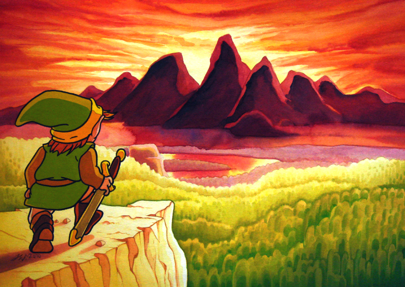
My biggest want is just a game that looks like the original artwork 1:1
My biggest want is just a game that looks like the original artwork 1:1
Nah
What i want to see however, is BOTW style in a console as powerful as the ps4 pro
If they milked BOTW from a wii u, i cannot imagine what that would look like
BotW at 1440p/4k already looks phenomenal on PC. The simple act of improving environmental textures, shadows, aa, af and increasing foliage density would improve the visuals so much nevermind building the game from the ground up for a console 20x the power of WiiU. I'm surprised there's no mods that do this on Cemu.
For me it's not about the TP art per se, such as the design of the spider, Link's clothes, the building architecture etc. that does it, however I do love the popping colors, gorgeous visual effects of the fire, water and the fairy sparkles, and overall super clean and plastic-y look of the demo that reminds me of typical EDP games. BotW has a nice art style, but the actual visuals of the game with this weird green filter and overall washed out look due to the fog effect is very unappealing. The game lacks that striking visual clarity which constitutes the trademark Nintendo graphics style:

Notice in particular the coins resting on the bench underwater. This is what I mean by visual clarity. The point is BotW looks like a blurry, ugly mess compared to this super clean look, and the TP HD tech demo is more "Captain Toad like" in that regard, which is why I prefer that style. Also notice how glossy the floor is in the demo. That effect is so damn appealing to me.
You're describing the difference between a top down game with a limited view and a open world game with a free camera i guess


