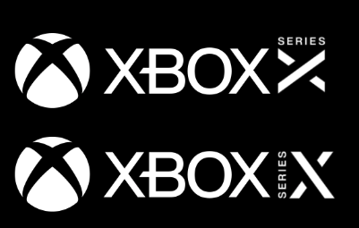
Xbox Series X Logo Seemingly Revealed
- Thread starter Jawmuncher
- Start date
You are using an out of date browser. It may not display this or other websites correctly.
You should upgrade or use an alternative browser.
You should upgrade or use an alternative browser.

The name is Xbox.Series X is just a bad name so no logo will change that. Is there any chance they have a different name they are waiting to reveal later?
It's in the X Series of Xbox.
I still don't know how people aren't getting this. On a site like this. Gaming enthusiast.
Suxxxxx
Actually, here it looks pretty good. Helps that it is shrunk down and not so prominent.

Actually, here it looks pretty good. Helps that it is shrunk down and not so prominent.
Same goes for Sony using numbers is so early 2000s.Series X is just a bad name so no logo will change that. Is there any chance they have a different name they are waiting to reveal later?
Seeing as it's the usual suspects from PlayStation threads saying the logo is trash, I'd say that no, you can't have a normal opinionated discussion here.To the general public. The green slanted Xbox logo is instantly recognizable. this, on the other hand, won't be.
I don't know why everything comes to fan vs fan.? can't we have a normal opinionated discussion
McDonalds Logo Seemingly Revealed:
Era:
"Fucking hell that looks disgusting"
"Really? Just an M? How does that imply burgers?"
"To imagine that someone was paid thousands to generate two arches lol"
"Looks like boobs lmao"
No I'm not saying the two logos are in any way close to each other in terms of quality, but it's kind of funny to see so many arguments like that here when so many logos of many other brands would definitely be considered 'bad' by Era
The name is Xbox.
It's in the X Series of Xbox.
I still don't know how people aren't getting this. On a site like this. Gaming enthusiast.
If a forum of gaming enthusiasts can't untangle the naming convention, that's a marketing failure.
I wonder if on a site full of phone buffs, they get confused at iphone or galaxy names.If a forum of gaming enthusiasts can't untangle the naming convention, that's a marketing failure.
The name of the console is Xbox.
Xbox One S and Xbox One X already exist and are simple to understand, so unless people are acting dumb on purpose (wouldn't surprise me since some don't like other people's favorite plastic boxes) then there is no reason not to understand this. You just replace the word "One" with the word "Series" and you are basically done. It's impossible not to understand unless you are doing it on purpose.If a forum of gaming enthusiasts can't untangle the naming convention, that's a marketing failure.
It really does. Xboxx.
I must have missed that Sony revealed the PS5 logo. I googled it and is this accurate? It's literally the same logo as the PS4 but with a 5 instead? LOL
I mean, whether you like the XSX logo or not, give it to Microsoft for being creative. I guess Sony just sticks with what works.
They can. They're just being unnecessarily obtuse.If a forum of gaming enthusiasts can't untangle the naming convention, that's a marketing failure.
That's bad.
Maybe if one of the lines was green, or even the top portion of the divided line was green it would be passable but still not good.
Maybe if one of the lines was green, or even the top portion of the divided line was green it would be passable but still not good.
Dude... Chill for a bit lol.I swear, something about the Xbox brand and this forum causes some serious short circuiting.
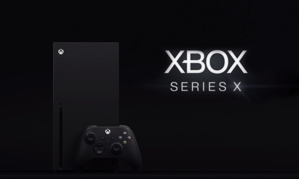
Its still the Xbox Series X.
The Nexus is still the actual logo for the family of devices and services, it appears on the damn box and on the console itself.
This is just a logotype just like we had logotype for the Xbox One, Xbox Live, Xbox One S, Xbox One X and Xbox 360.
Ugly?
Its literally just text and a letter...where are you even extrapulating enough information to get to its Ugly.
The font is a non offensive sanserif font....if you said boring id be fully on board.
But Ugly?
Im guessing you think the QLED logo is also ugly?
Or are logotypes only ugly if they are from Microsoft?

It's perfectly reasonable for even a single letter on a not flattering font to look bad. The letter and the side "Series" just don't gel well with me.
And believe you me, this has nothing to do with me being biased against Ms or Xbox.
XboX XerieX X
Just go all in.
That isn't even close to a Era exclusive thing. Seems like most new logos get bad reactions or meme'd to death (the Ubi turd or the unbelievable PS5 logo come to mind). It's definitely mostly meaningless, people get over it or just don't care much either way and are talking about because it's just something to talk about.McDonalds Logo Seemingly Revealed:
Era:
"Fucking hell that looks disgusting"
"Really? Just an M? How does that imply burgers?"
"To imagine that someone was paid thousands to generate two arches lol"
"Looks like boobs lmao"
No I'm not saying the two logos are in any way close to each other in terms of quality, but it's kind of funny to see so many arguments like that here when so many logos of many other brands would definitely be considered 'bad' by Era
The only one I've never been able to get over is the Juventus logo change, everytime I see that "JJ" logo I just cringe.
That looks clean and sharp and sexy as hell !!!!
This. I could see it in box art in the corner.Personally i don't see this getting much play in marketing materials. They already have the standard xbox logo as a power button and the Series X logo thats been used since December. Maybe this is a new smaller logo thats used to denote wether a game is compatible with Series X on game boxes.
I think something that's the same shape as the big one but 70-80% each dimension might be more likely, I'm not convinced they could do a gamecube shape without radically different internals to the One X. With a scaled down one they could copy all the concepts straight across, but with a smaller radius fan and smaller heatsink.
You know what, it looks good like this. All the other mockups in the thread are kinda blegh, but this one is nice.
That logo is 1000% better though.
So many Xs lol
XXXbox.
A/O only games finally getting their time in the sun.
Haha XD, you're wrong tho.