-
Ever wanted an RSS feed of all your favorite gaming news sites? Go check out our new Gaming Headlines feed! Read more about it here.
-
We have made minor adjustments to how the search bar works on ResetEra. You can read about the changes here.
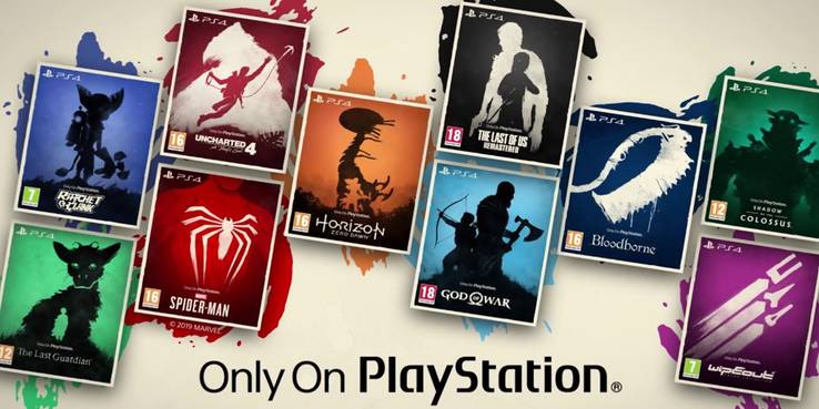
Why is the Boxart for Playstation Exclusive Games so abysmal?
- Thread starter TheChungusAmongUs
- Start date
You are using an out of date browser. It may not display this or other websites correctly.
You should upgrade or use an alternative browser.
You should upgrade or use an alternative browser.
I was just going to post this! I love them!
No I purchase them like a normal person and not get angry over the look of something that doesn't even matter when playing a game.
Why just a close up of Ellie? The original looked more inspired at least.
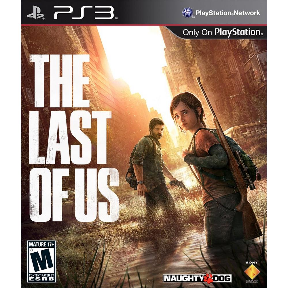
I still remember when ND was told to put Joel up front from focus testing and ND refused.
They vary in quality. The only ones I would call "abysmal" (at least off the top of my head) are the covers for Detroit and Death Stranding. Particularly the latter, which is so utterly godawful that I'm amazed someone was paid the big bucks to sign off on it.
On the other hand, you have the covers for Gravity Rush Remastered and 2, Concrete Genie and MediEvil, all of which are varying degrees of good. GR:R for my money has one of the best cover arts of all time.
I guess the general rule of thumb is - the bigger the game, the bigger the chance that it'll have a crappy boxart.
This problem isn't exclusive to Sony. 90% of box art is boring and repetitive because marketing departments are still stuck in the era of retail where you have to have a close up shot of the main character to be visible on a shelf from a distance (even though an increasing majority of people buy online or digitally where the cover is directly in their face). This means any other type of interesting or abstract cover probably isn't going to happen, and it means more than likely they're not going to pay a concept artist to draw a cool stylized version of the main character cause it's cheaper to just slap a close up of the in game render on there and call it a day.
Eh, I think the Spiderman boxart is great. It's clean and very eyecatching. Horizon is pretty striking as well even if the composition could be better.
But yeah, the rest are trash. Especially Death Stranding, woof.
But yeah, the rest are trash. Especially Death Stranding, woof.
You really should... otherwise you're no better than the guys from the focus groups :P
Yup username working as intended. Struck a nerve and you resort to using it instead of using valid argument points or posting in a discussion. Some of you are really need to just not be angry and mad all the time over the littlest things. Be mad and fight for stuff that matter.
Shinkawa should redraw every single cover. I would buy a box set with every rerelease.
or get the guy doing the japanese Uncharted 2 art.
or get the guy doing the japanese Uncharted 2 art.
That's a sweeping generalization of an opinion that by many will countered by saying at least they have exclusives.
Agree 100%.Eh, I think the Spiderman boxart is great. It's clean and very eyecatching. Horizon is pretty striking as well even if the composition could be better.
But yeah, the rest are trash. Especially Death Stranding, woof.
Spider-Man is a simple boxart, but it is awesome.
Horizon is great too. You see Aloy, her bow and a huge robo T-Rex.
Liked U4 too.
Death Stranding is bad (they have Shinkawa, he is so talented). Detroit was horrible too... it's the face of a TV celebrity, thats it....
I honestly can't get anyone defending the spiderman one, especially over uncharted's or gow's. Those aren't the best ever, but wtf even is spiderman's?
None of them too remarkable. The Spider-Man cover I find to be the only one I personally dig. It's Spider-Man, all that needs to be said. It's the first Spider-Man game in years and you gotta show it. The amount of time spent in Photoshop is irrelevant if the end result works. And the Spider-Man cover very much works.
Most of them are perfectly fine.
I love the Spider-Man one, it's very catchy. I dislike Death Stranding though.
I love the Spider-Man one, it's very catchy. I dislike Death Stranding though.
Any idea of high res versions of these are available? Would love a couple for phone wallpapers lol
It is really simple as to why...
The percentage of people who are purchasing a video game solely based on the box art alone is a very small percentage. What I mean by this is the majority of gamers already know about a game from all of the other resources out there. Social Media, Streaming, Etc. Etc. Most gamers are going to buy a game regardless of the box art.
Those who are purchasing a game strictly on just the box art and do not know anything about the game itself tend to be parents, grandparents, and generally speaking people older in age.
So the box art is kept simple and as "relatable" as possible for those people who are buying the game "blind" as a gift for someone and or in the rare instance, for themselves.
Otherwise most gamers already know they want the game regardless of the box art. So it needs to appeal to those who know little or nothing about the game. Hence the simpler, more vague, approach.
Unfortunately I don't but I'm interested in the same thing hehAny idea of high res versions of these are available? Would love a couple for phone wallpapers lol
Seeing the positive mentions of Bloodborne let's me think that everyone remembers the flip cover art. This is the actual one that was used in stores when it came out:
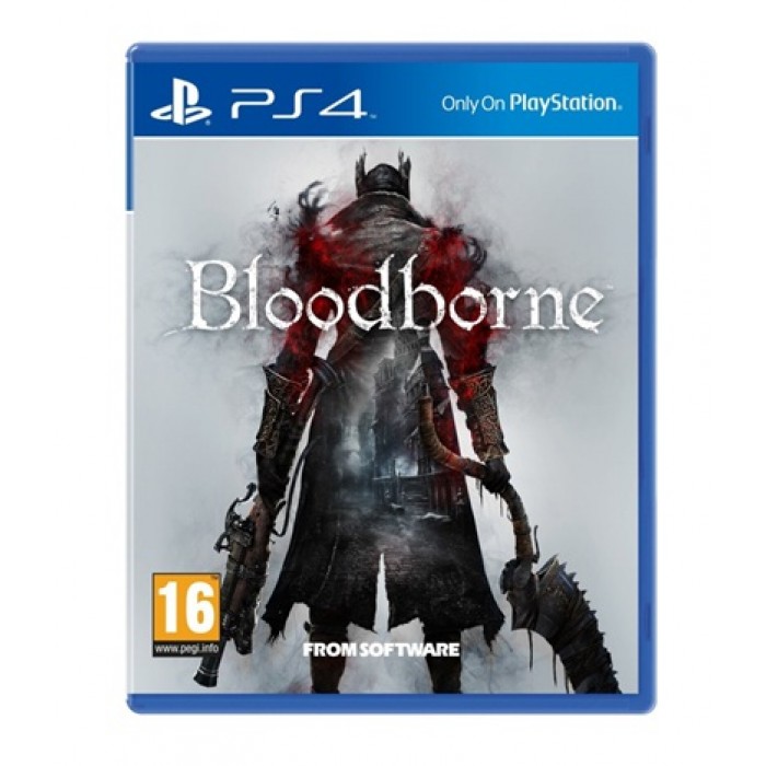
That grey background and the blend of a street that not only is rather difficult to recognize, it also isn't a good representation of the environment design of the game. The vanilla Bloodborne cover is one of the worst of this gen. The GOTY cover, the original flip cover and the cover for Old Hunters are miles better.
On TLOU2: Yes, the (hopefully actual temp) cover sucks major ass and is the reason why I ordered the special edition today.
That (placeholder) cover reminds me of those anime DVD covers that use scenes from the series. Not a fan.
Always prefer artworks that don't look like they could come straight from the series/game.
Always prefer artworks that don't look like they could come straight from the series/game.
OP:
"Aloy's position towards the machine doesn't make any sense."
Also OP:
"The way Deacon is chilling in front of his bike while a stampede of zombies is approaching him is perfectly fine and sensible".
OP pls.
lol seriously.
Deacon: What you lookin' at PS4 user?
I saw these in-store the other day and they just seem to be cardboard slips with the old boxart underneath? Unless they're reversible covers but I was disappointed by what I saw.
Yeah that's what someone else said too. Its times like these I wish I had a nice printer with proper gloss paper and the means to make my own cover art. I know people have been doing that for decades.I saw these in-store the other day and they just seem to be cardboard slips with the old boxart underneath? Unless they're reversible covers but I was disappointed by what I saw.
I didn't have any strong opinions one way or the other for this topic as I just think some of them are good and some of them are bad... but then I went to The Game Collection and saw TLOU2.
What were/are they thinking. A person's face is mobile games territory of boring. Even if it is best video game person Ellie.
What were/are they thinking. A person's face is mobile games territory of boring. Even if it is best video game person Ellie.
That is foreshadowing for the Rom fight. It actually works on a lot of level.Seeing the positive mentions of Bloodborne let's me think that everyone remembers the flip cover art. This is the actual one that was used in stores when it came out:
That grey background and the blend of a street that not only is rather difficult to recognize, it also isn't a good representation of the environment design of the game. The vanilla Bloodborne cover is one of the worst of this gen. The GOTY cover, the original flip cover and the cover for Old Hunters are miles better.
yep, most of them are ugly. That Kratos one looks like a tourist photo.
Oh, and the Detroit cover is a sin.
Oh, and the Detroit cover is a sin.
I don't mind most of them, but I actually love The Last of Us 2 boxart!
I like that it's simple/minimalist and different.
I like that it's simple/minimalist and different.
the final fantasy vii remake box art is great and that's a playstation exclusive.
