-
Ever wanted an RSS feed of all your favorite gaming news sites? Go check out our new Gaming Headlines feed! Read more about it here.
-
We have made minor adjustments to how the search bar works on ResetEra. You can read about the changes here.
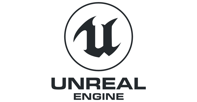
Unreal Engine's logo is an outdated abomination
- Thread starter AtomicShroom
- Start date
You are using an out of date browser. It may not display this or other websites correctly.
You should upgrade or use an alternative browser.
You should upgrade or use an alternative browser.
back in the early 90s the local distributor for Electronic Arts kept using "ECA" as a abbreviation for Electronic Arts, thinking that the sphere stood for the C. I hated every press release they sent in.
I can still hear the sound effect in my mind :(
My man
This will forever be linked to NFSIII Hot Pursuit for me. Particularly given I still play that game lol

As do I. So many fond memories of games with that logo.
Their current logo is just a more boring version of the old EA sports logo (the A in the original was different).
OP isn't right because that's not the logo they use anymore anyway
god i miss those times when logos had personality and didn't follow the same flat template
Yeah, I agree with this. other than it being a big pile of nothing to complain about, at least it's not following the exact same template as all the others in the OP.
Stop using that hateful meme.
Do they? Got any examples? I know Unity and YoYo Games are super strict with that kind of stuff and get mad if you mess around with it (admittedly I tried doing so with my own game which is why I know so much about this).
It's probably handled on a case by case basis with them having to approve it.
Not sure if this counts, from Rime:

Oh that definitely counts. Looks dope.
This logo screams "What if AT&T merged with a video game developer?"

And as such it has its' place.
OP isn't right because that's not the logo they use anymore anyway
okay OP is wrong
Graphic Designer here, so heres just my personal 2 cents,,,, I am so fed up of seeing the same ''modern re brand'' logos, I have worked on a bunch, even some for my own games studio and others, I dislike it when they become sterile and lose all the essence of the original just to look modern, I believe many of the newer rebrands will look very dated in 10 years (In the way concrete architecture of the 60's was cool and minimal at the time but often looks ugly and lifeless now) . In the newer flat color variant of the logo posted, at least they kept the original gothic font shape of the U... so it still has some of the personality but flattened off the gradients so that you can use it in more cases / shrink it etc. I think that people should understand that there is a balance to be achieved, keeping the essential elements of the original, but giving it more options to scale large or small, different textures applied etc is all good. So in this case I feel like they did a good job of bringing it up to date but not losing what make it the logo .... I hope that they stick with the U in the font that it is for the future.
Yeah that and Konami's second logo are among the best gaming logos ever.

Not fucking cool. At all.
When they were hot shit, instead of just shit!
P.S: Do you
I didn't get that memo.
What year is it? 2003? If anyone posts anything of course it's their opinion, not others

Why are we doing this meme on this forum now? Eww.
Also I like minimalist logos as much as the next person but I also wish there was a bit more variation involved between companies. There's a lot of trend following going on and not enough innovation. I guess that makes sense, in a way.
yeah, it's kind of glorious isn't it?
It's a bit ugly and outdated maybe, but it is iconic. The weird super edgy serifs have been around since the early days.