-
Ever wanted an RSS feed of all your favorite gaming news sites? Go check out our new Gaming Headlines feed! Read more about it here.
-
We have made minor adjustments to how the search bar works on ResetEra. You can read about the changes here.
The Switch Icon Watch Thread [~] No Logo, No Buy
- Thread starter Kyuuji
- Start date
You are using an out of date browser. It may not display this or other websites correctly.
You should upgrade or use an alternative browser.
You should upgrade or use an alternative browser.
OP
OP
DAAAAAMN... I saw South Park: stick of truth on sale and I couldn't resist.
Such a disappointment after seeing the game icon 😭
For sure you were all aware about it considering how old is the game... why no text whyyyyy
''tis a sad day, my commiserations friend.
May your gameplay be fun and your delete be swift.

Please tell me that's not the Switch icon.
No, it's the Xbox One icon.
(I really don't like that a recent update plastered the Game Pass logo on all the GP games)
No, it's the Xbox One icon.
(I really don't like that a recent update plastered the Game Pass logo on all the GP games)
I'm sure the Switch icon is still whatever it originally was that got this whole thing started then?
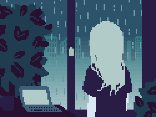
That looks like shit, not arty and mysterious enough. Take the title out, fill the silhouette in black and make the background red, then we're talking.
I'm a bit confused. I thought I saw earlier in this thread that Deadly Premonitions Origins received a new icon, but when I try updated the game it says I'm using the most recent form of the software and the icon is the old one. 🤔
I'm a bit confused. I thought I saw earlier in this thread that Deadly Premonitions Origins received a new icon, but when I try updated the game it says I'm using the most recent form of the software and the icon is the old one. 🤔
Apparently only the digital version got a new icon as the digital and physical were published by two separate publishers
Apparently only the digital version got a new icon as the digital and physical were published by two separate publishers
Oh, great. I wonder if the physical version will ever receive the update then. I'm doubting it at this point.
Just noticed that Octopath Traveler recently got updated to v1.0.4...but still no icon change -_-
they will never change that icon. patch or no patch. just like RE4 or some other big publisher game. those ships have collectively sailed, even if they update teh games still.Just noticed that Octopath Traveler recently got updated to v1.0.4...but still no icon change -_-
i assume you had the physical version published by aksys. the update for that is out now (1.0.2 with the new icon). now all three SKUs are updated.I'm a bit confused. I thought I saw earlier in this thread that Deadly Premonitions Origins received a new icon, but when I try updated the game it says I'm using the most recent form of the software and the icon is the old one. 🤔
User banned (2 weeks): platform warring and attempted thread derail, long history of infractions

Nowhere Prophet dev: "Our opening weekend sales on PS4 were 5% of our Switch opening weekend sales"
Oof, that's a hard bomba. Here's the game in question if you haven't heard about it:
 www.resetera.com
Devolver Digital said:
🤣🤣🤣 New one is great!
With Deadly Premonition Origins being finally fixed, there's only Resident Evil 4 and Sonic Mania ruining my Switch logo grid. Goddammit, Capcom and Sega.
skyrim will be the last holdout, i know it.
edit: the games on my switch that need their icons fixed
- octopath traveler
- gris
- crash trilogy
edit: the games on my switch that need their icons fixed
- octopath traveler
- gris
- crash trilogy
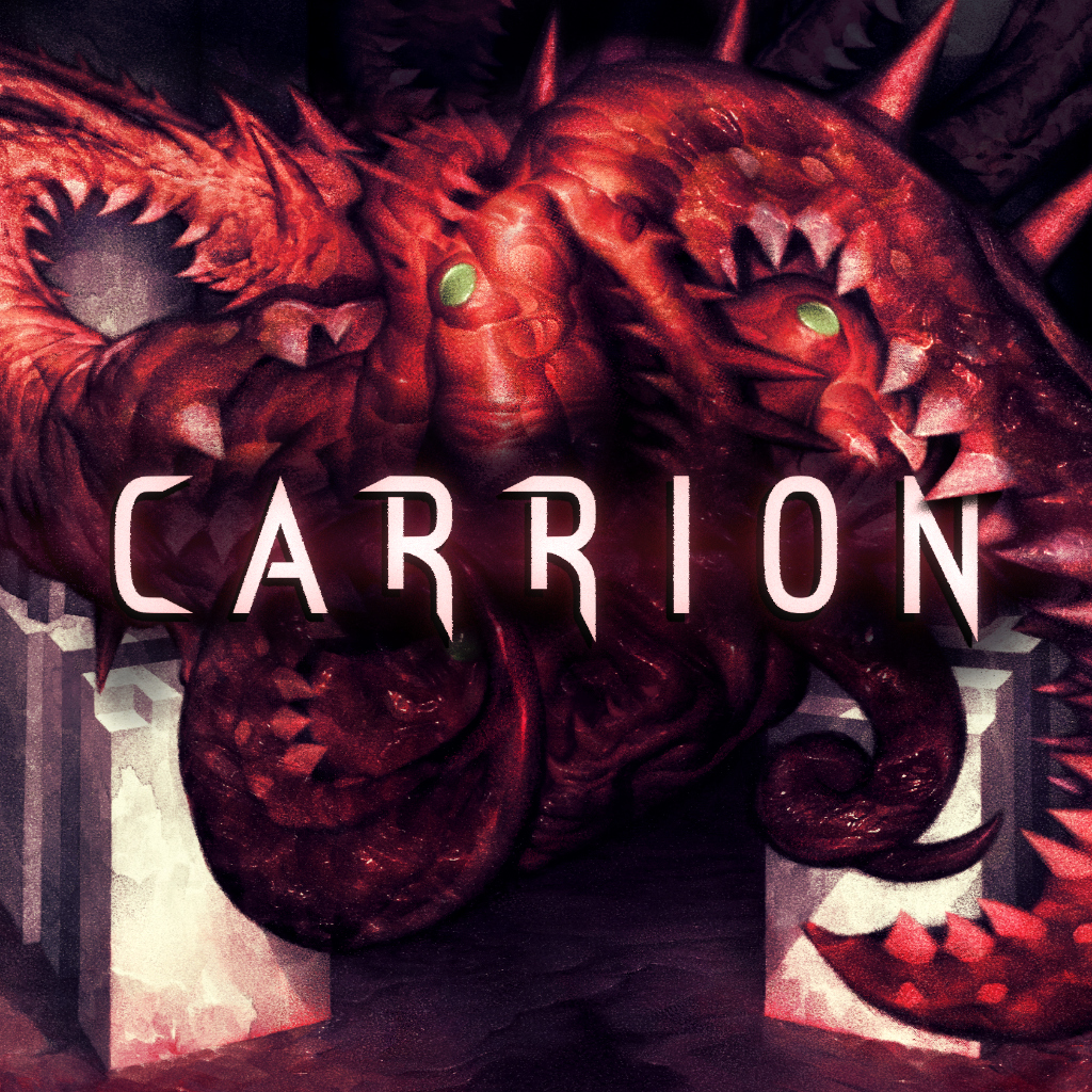
Updated Carrion icon is nice indeed. Love the text popping under the monster on the right 👍
Yeah, that's a good touch, and shows you can do more than "title slapped on top of an image" while still having the title.
OP
OP
Definitely. Though I can understand why time isn't poured into them beyond ensuring they're nice, there's a lot of scope for creativity within that square and it's place on the home screen. Like the Death Squared team and having that and OTTTD line up when next to each other. Much of design is caring about the minutiae and it's nice to see when people get those smaller more subtle details in.Yeah, that's a good touch, and shows you can do more than "title slapped on top of an image" while still having the title.
imo it's pretty clear that icons are meant to replace box art. I know some people never cared about box art either, but it.'s easier to explain than just calling it an icon. People associate "icon" with phone apps, while on the Switch they're massive, and for digital releases they're effectively the cover for the game.
I know I'm preaching to the choir on this but I'm still frustrated about that one dude
I know I'm preaching to the choir on this but I'm still frustrated about that one dude
OP
OP
I'm with you, had a similar thought to that soon after the launch of the Switch. Used to call them tiles before icon became the dominant word, because of how large they were and that it was a step removed from app and software icons. As you say though; I don't think the distinction would dampen those that don't see the icon/tile as a considered element and thus see the nuance to it as being superfluous. Nice to share a thought in common all the same. Have a cheeky feel-good illustration I stumbled upon recently to help bump a smile onto the face.imo it's pretty clear that icons are meant to replace box art. I know some people never cared about box art either, but it.'s easier to explain than just calling it an icon. People associate "icon" with phone apps, while on the Switch they're massive, and for digital releases they're effectively the cover for the game.
I know I'm preaching to the choir on this but I'm still frustrated about that one dude
I'm with you, had a similar thought to that soon after the launch of the Switch. Used to call them tiles before icon became the dominant word, because of how large they were and that it was a step removed from app and software icons. As you say though; I don't think the distinction would dampen those that don't see the icon/tile as a considered element and thus see the nuance to it as being superfluous. Nice to share a thought in common all the same. Have a cheeky feel-good illustration I stumbled upon recently to help bump a smile onto the face.
haha, I appreciate it. And "tiles" definitely suits them better imo
OP
OP


Not centered = terrible
That's the title track for my next album.
Nice. Contender for biggest improvement?
Uh-oh, now I can't unsee it...
OP
OP
Was literally just about to ask if the icon was live.
Wonderful!
Nintendo never disappoints on the icon art front.
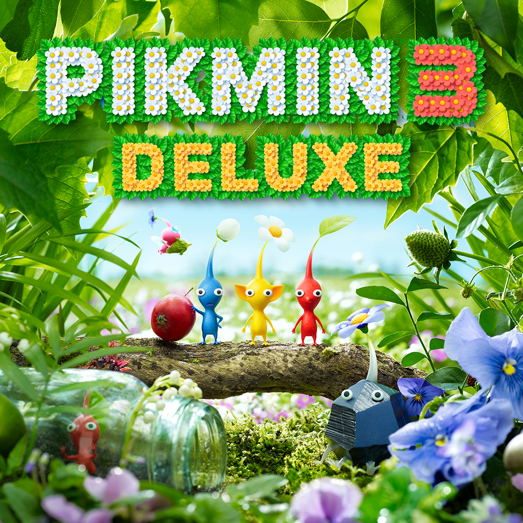
Yes! I can finally buy the game now!
11/10 would listen
1) take the good keyart you already have
2) reformat to a square
3) ...
4) profit (literally cause 10 people won't buy if ugly)
2) reformat to a square
3) ...
4) profit (literally cause 10 people won't buy if ugly)
1) take the good keyart you already have
2) reformat to a square
3) ...
4) profit (literally cause 10 people won't buy if ugly)
That seems to be way too hard for many companies.
sorry, got a lot on my plate rn
Your user name. Was it fate?
No worries! Please don't think I was expecting something, I only meant to ask :)
I can't imagine the western icon will be any different to the existing Japanese one.
