Kamen Rider Odin looks way cooler than purple man wearing a bed sheet tbh
He's supposed to be really intimidating when he first appears in SMT4A and his OG design wouldn't have sold it
Yeah well, feast your eyes on Soul Hackers Odin
Kamen Rider Odin looks way cooler than purple man wearing a bed sheet tbh
He's supposed to be really intimidating when he first appears in SMT4A and his OG design wouldn't have sold it
Goddamn it, now I got to preorderThey have the fucking audacity to hide the better look behind a pre-order bonus

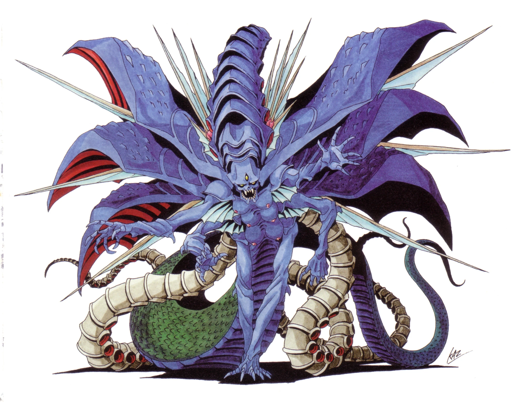
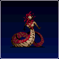
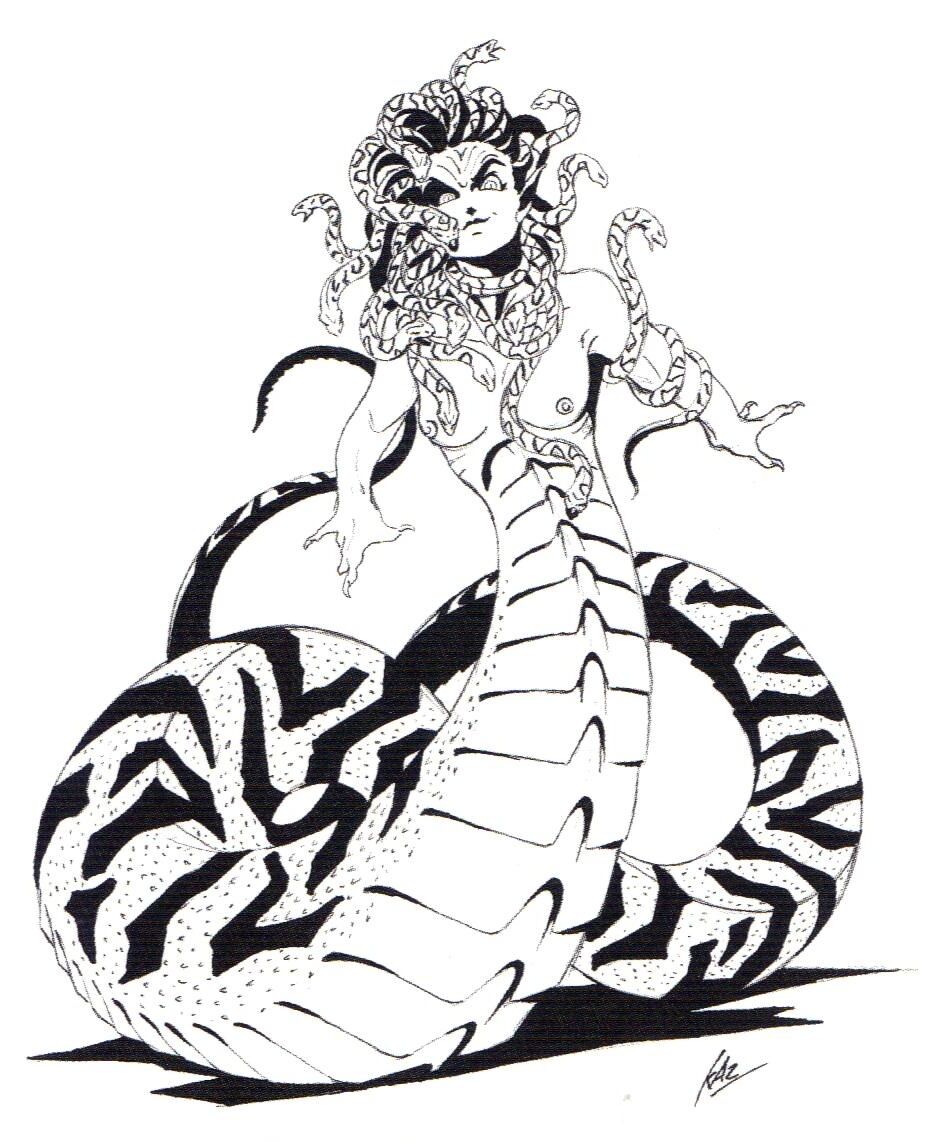
The first image is a dead ringer for snake girl from ninja scroll which I'm assuming is some kind of an arch type


Hot take: These are good actually.Castlevania Judgement and Dawn of Sorrow anime twist go here

Going for Takeshi Obata's art was a good idea on paper, but the results are a complete misfire for the most part.
Though Mummified Grant and armoured Cornell I kinda low key dig.
He looks significantly better in the redesign. SorryFire Emblem 3, I like you, but I think that ultimately, you giving Marth a pair of pants was a mistake.
Original:
FE3:
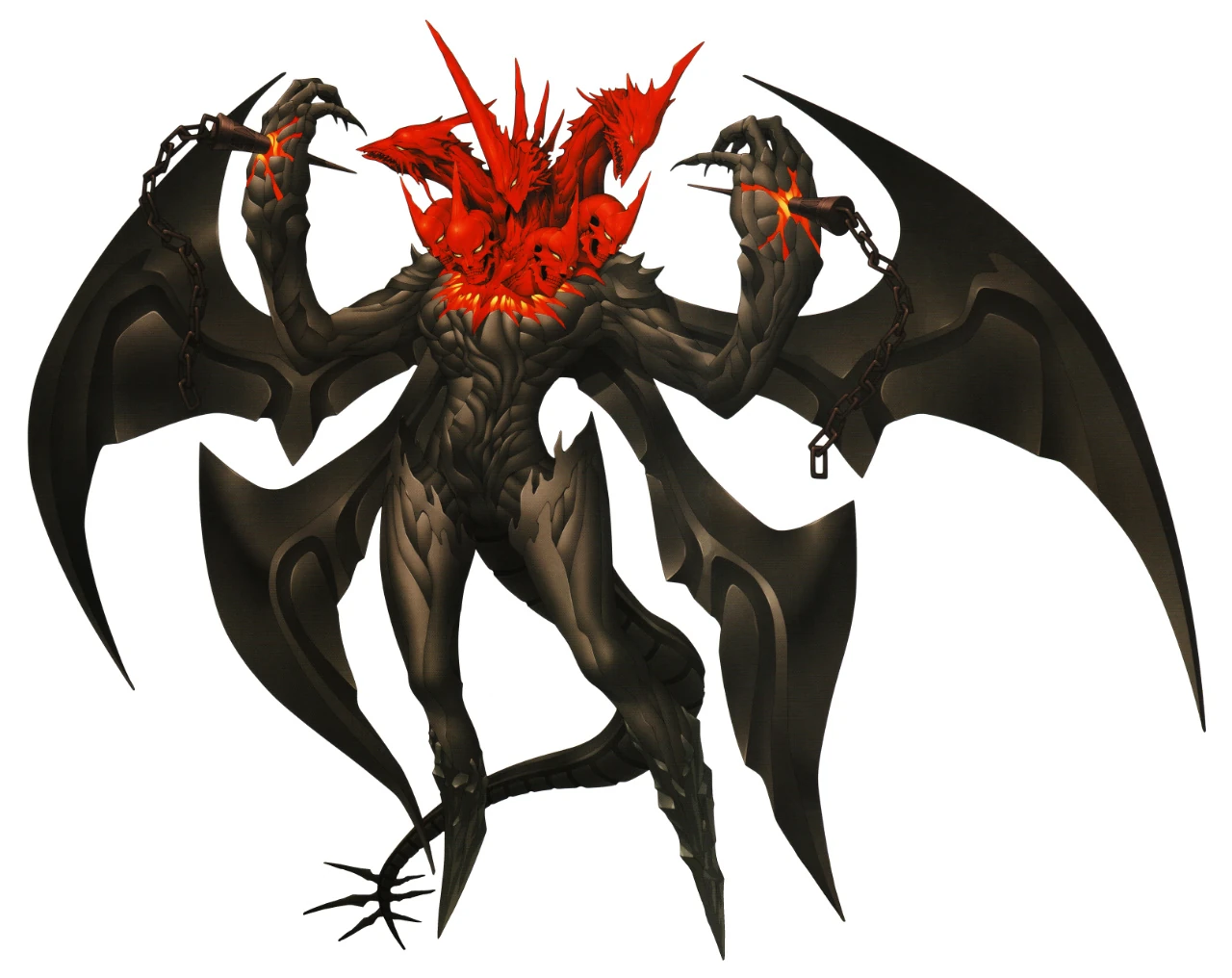
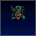
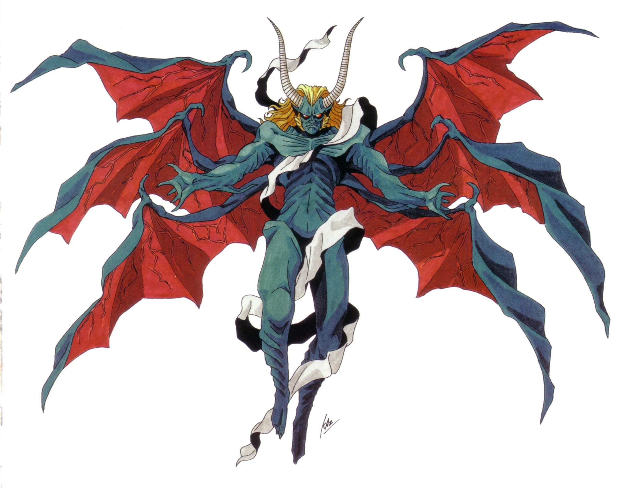
I actually like this change. Old Lucifer is way in the nose and cliché (fallen six wing angel + regular demon). I very much appreciate the series nonstandard takes in mythical Abrahamic creatures, like the archangels in SMT IV.I love SMT ,but what were they thinking with Lucifer when they were doing SMTIV/A:
From this:
To this:
This I'll agree is a step down. The original had something going for it with that mother Alien look. New one isn't bad but should be a new demon entirely.
Why does he have the 7 heads/10 crowns motive anyway? That's not Satan, that's his pet Beast.
Fire Emblem 3, I like you, but I think that ultimately, you giving Marth a pair of pants was a mistake.
Original:
FE3:
Typhlosion is still in my top 5 favorite Pokemon, but I never used him in the 3D games for this very reason. Very dumb decision by GF's design team.
I thought this design was hilarious and a throwback to the god-awful box art of the older Mega Man games. (Specifically MM1)
I love SMT ,but what were they thinking with Lucifer when they were doing SMTIV/A:
From this:
To this:
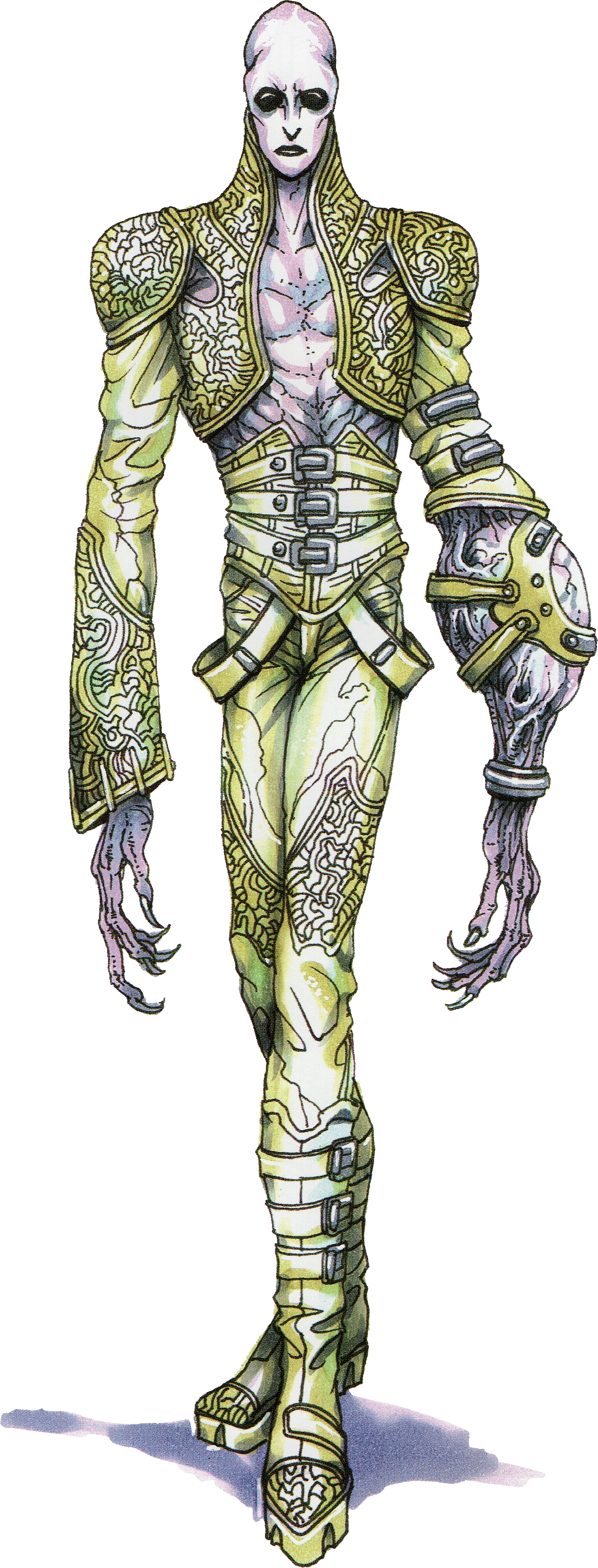
All of these designs are good though.
They're good designs, but not good redesigns
IIRC wasn't this more of a bad timing & planning sort of thing? This probably would have made way more sense if Mega Man Universe actually came out which was the first to acknowledge US Boxart Mega Man as a Capcom character proper. Glad they committed to the joke despite the complaints and had RE3 show off in-universe merchandise featuring this version (well, a much more idealized version of this version anyway).
They're not really good examples of redesigns imo as they span different narratively unconnected games, right? A design for "god" or "satan" wouldn't ever cross over between unrelated titles like this.
I agree. The original look is just a generic demon.While the Lucifer redesign could have been better in execution i still prefer the idea over stupid horned fabio demon.
Kinda bummed we got old lucifer back in SMTV. Lucifer should be either strike fear or be a charmer and not looking for the nearest gym.
I don't consider them actual redesigns though either, as reasoned above.The Satan redesign, while lame, is not that bad but I really don't like the Lucifer one , to me it looks lame.


Lol, I was going to say the old one looks straight out of Zelda 64, right down to the color paletteNaw, i prefer the remake design here. That old one looks like some goofy Final Fantasy enemy that doesn't belong in a horror game.
Eh, probably not. Lucifer's back to normal and the only redesign from Apoc that's carried over has been Odin, seemingly.
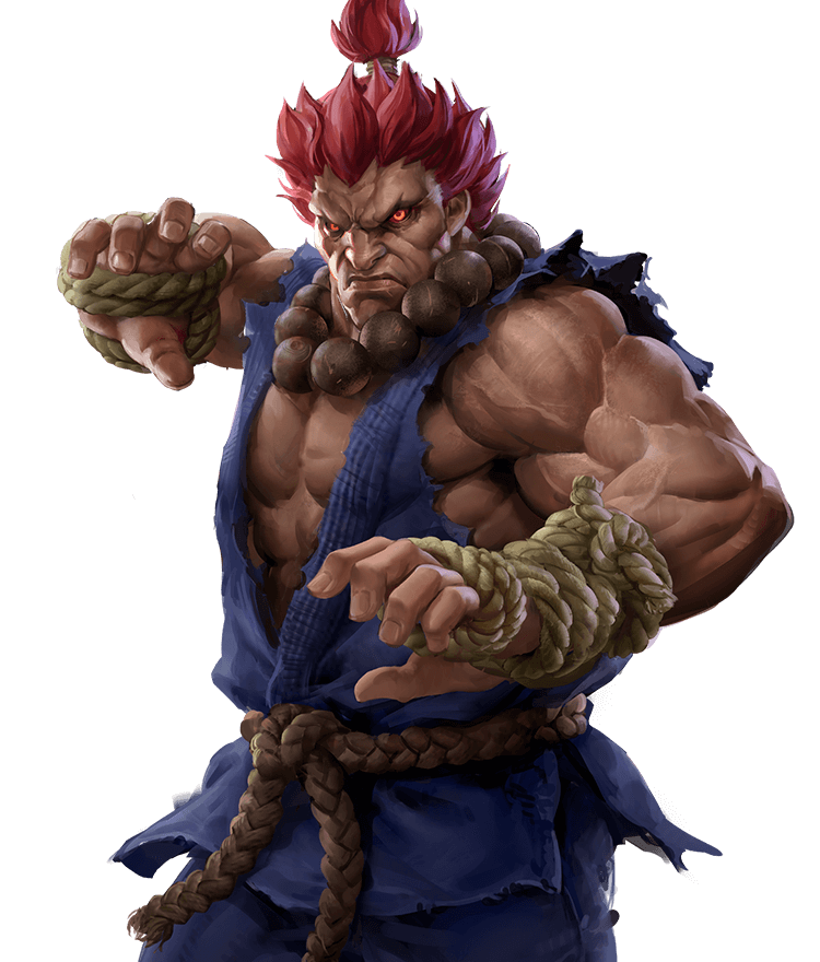
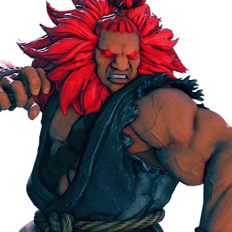
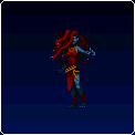
Speaking of which, holy shit Odin sucks.

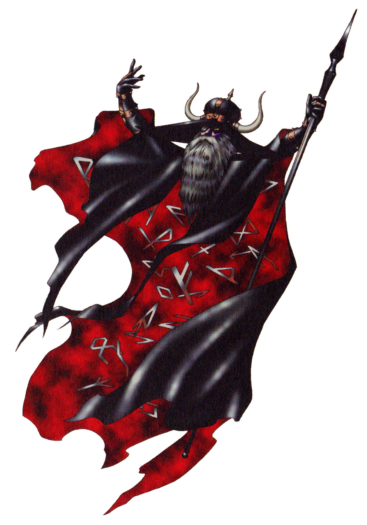
Kaneko Odin is nice and simple. He's got Gungnir, he's got the eyepatch, really the only problem is that he's got the horned helmet but that's the kind of embellishment attached to Vikings. SMT Odin is a super streamlined view of Odin down to his core essentials.
AND THEN THERE'S THIS ASSHOLE
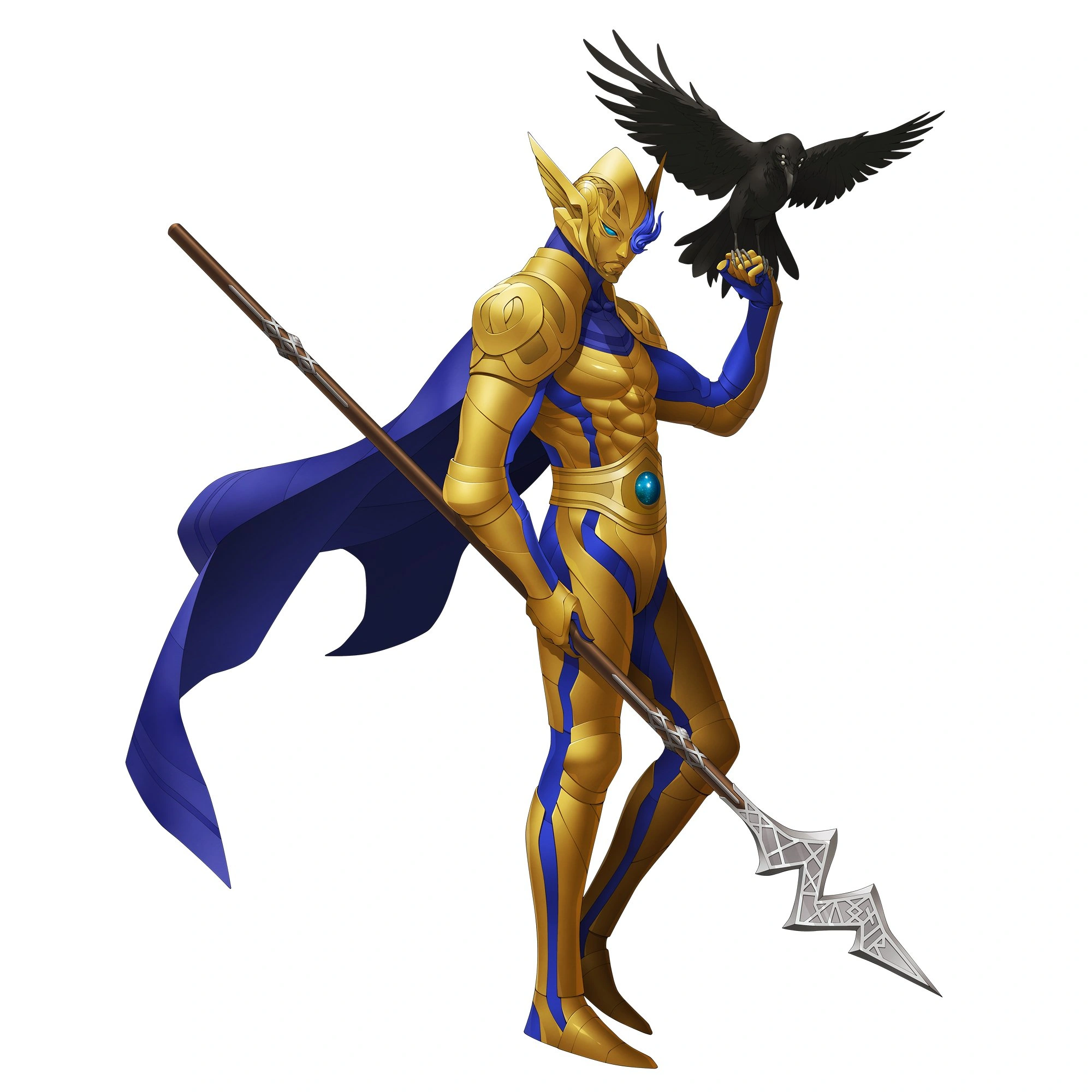
Having a raven with him is nice but come the fuck on, they turned him into Kamen Rider.
This is one of the worst character redesign to date. It's gets even worse when there's concept art of a more faithful recreation...
Are you speaking of the Tyrant? Because he has one of the derpiest face I ever saw.

She looks fine? Also, better "off looking" than continuing the trend...

Demon Lucy is meant to be seen in contrast with Angel Lucy
Which I personally think is better as a Lucifer design.
But that's another demon right? Helel. I know it's just pre-Heresy Lucifer but I rather have both of them.
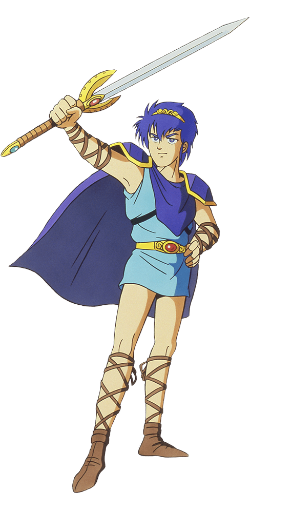
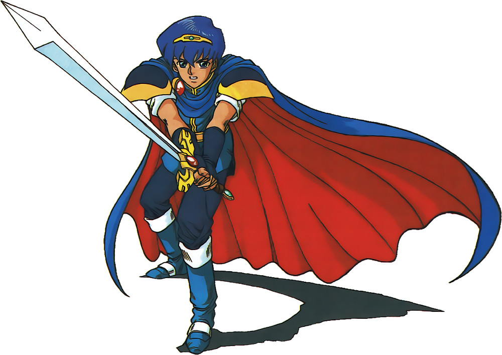
No idea what game this is but the second pic looks better to me? They gave him an actual neck and his hair doesn't look like a helmet anymore.Surprised no one mentioned him yet:

He thankfully has been redeemed now. :)
From high schooler to savvy business woman who's so busy she forgets her underwear and dresses 5 sizes too small.
Eh. It's a good design still. Just different. Granted, not as great as the SMT2 one, but not bad.
Old Odin sucks. Get that Wagner shit outta here. I'll handily take the new one.
This ain't too bad. Minus the horns.
The bottom art is still not that great. While the design is more faithful, the style isn't as great, the face looks somehow more infantilized, the pose is more passive, and there's increased focus on her legs, hips and butt. In some ways that unused concept is worse than the actual redesign.