Just because you are Sherlock Holmes, doesn't mean it's a crap fake. It does mean it's fake though, but to me it's a very good fake.Even the fonts are wrong. Come on now this is a crap fake.
vs
For those not typographically aware
- See horrible default kerning between letters R and Y, P and A. It's nice and tight in the real thing, there is an amateur hour gap in the fake
- See the shapes of O, P and S for example
- Look at M middle bar, it goes all the way to the bottom in the real thing
This is a bad fake and mods should lock this
Possible leak of the N64 Mini?
- Thread starter Meelow
- Start date
You are using an out of date browser. It may not display this or other websites correctly.
You should upgrade or use an alternative browser.
You should upgrade or use an alternative browser.
From the way it is framed, it looks like that Wiimote plug is connected to the 64 port as well (like an adapter) which threw me off.
Last edited:
tbh if it's fake the real thing is gonna look almost exactly like this anyway so
*shrug*
EDIT: The way the front panel looks actually makes it look like it's non flexible and instead comes out COMPLETELY. I'd believe it
*shrug*
EDIT: The way the front panel looks actually makes it look like it's non flexible and instead comes out COMPLETELY. I'd believe it
Surface finish looks way too good for this to be 3d printed.
If it's fake it's a really good render
If it's fake it's a really good render
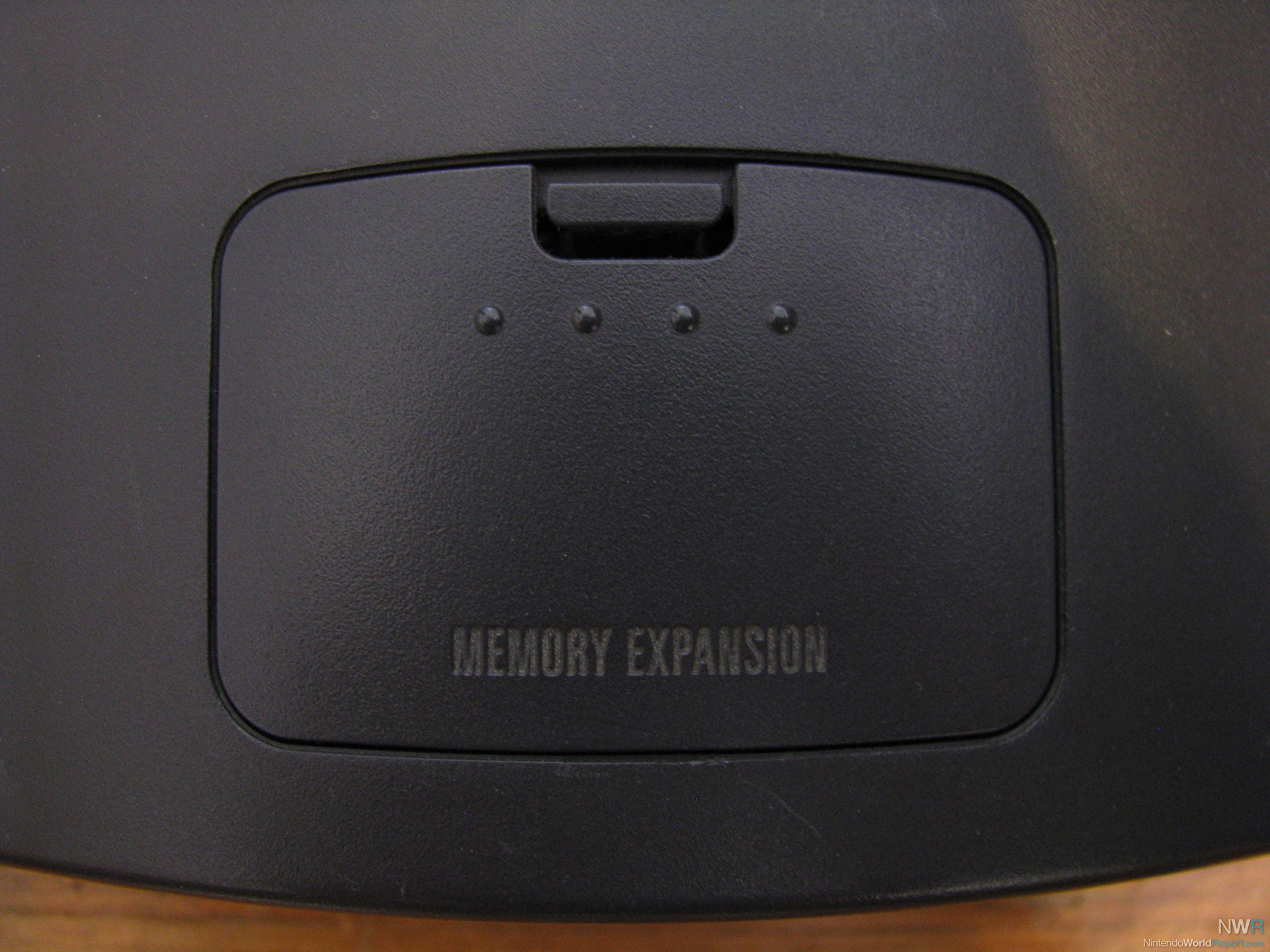
The memory expansion cover looks like it could actually come off instead of being cosmetic. I don't think a real N64 mini will look that detailed.
I predict that this is real, announcement is imminent (as in this week or next week), will be casually annnounced on a Tuesday morning or something, for release in December.
They look like press kit shots. Someone at some retailer probably grabbed the pictures on their computer monitor. This is my theory.
They look like press kit shots. Someone at some retailer probably grabbed the pictures on their computer monitor. This is my theory.
It's true, we need a poll up!
I'm really feeling that surface finish on the plastic, looks injection molded and I don't think someone would commision a die for a fake. Port covers on a slide seems very Nintendo. I just want it to be real so I can pass this one up and hype up for a GCN classic.
What were you expecting ?
Pikachu edition
At least the purple see-through one.
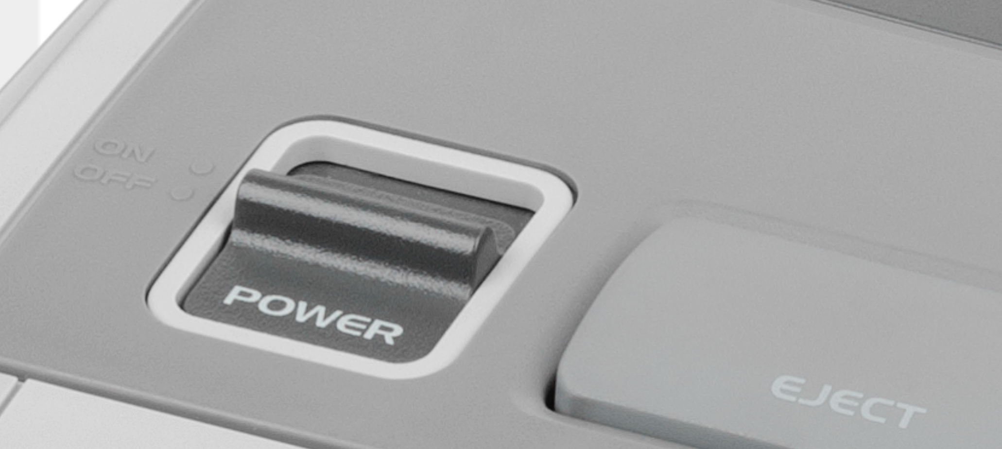
Just to follow up on the wrong fonts and poor kerning in the fake, Nintendo's attention to detail is flawless when it comes to replicating the power buttons, typefaces and kerning:
It is entirely unplausible that they would mess that up.
It is entirely unplausible that they would mess that up.

I don't see them make more than one model but it would be nice to have some see-through N64. Make those in limited quantities and see the internet explodes :D
There are dozens of us but people poo poo that.Its quite obviously CGI
Can nobody else tell that its CGI? Like.. it's not real
Its quite obviously CGI
Can nobody else tell that its CGI? Like.. it's not real
Yeah, reflections and shadows doesn't make any sense, is a pretty weak render but people doesn't pay attention to s**t like that, nothing new.
sorry nothing from me
Yeah. I work with KeyShot every day and it looks exactly like the default lightning of the renderer.Its quite obviously CGI
Can nobody else tell that its CGI? Like.. it's not real
Even the fonts are wrong. Come on now this is a crap fake.
vs
For those not typographically aware
- See horrible default kerning between letters R and Y, P and A. It's nice and tight in the real thing, there is an amateur hour gap in the fake
- See the shapes of O, P and S for example
- Look at M middle bar, it goes all the way to the bottom in the real thing
This is a bad fake and mods should lock this
As someone who does design work like this every day, this is the first thing that caught my eye.
Thanks for pointing it out in detail!
Yeah. I work with KeyShot every day and it looks exactly like the default lightning of the renderer.
Why couldn't you have let us be happy believing a lie.As someone who does design work like this every day, this is the first thing that caught my eye.
Thanks for pointing it out in detail!
I mean... did the N64 truly have enough hits to justify this?
Mario 64
Zelda 64
GoldenEye
BioFREAKS
And Turok basically
Mario 64
Zelda 64
GoldenEye
BioFREAKS
And Turok basically
I mean... did the N64 truly have enough hits to justify this?
Mario 64
Zelda 64
GoldenEye
BioFREAKS
And Turok basically
Nah. Try again. There's plenty more.
...
Ah shit! That Star Wars game!
Yes, we've been over this already. There's a list of 20+ games in each thread.I mean... did the N64 truly have enough hits to justify this?
Mario 64
Zelda 64
GoldenEye
BioFREAKS
And Turok basically
The fact that you didn't even bother adding Smash, Mario Kart, Majora's, or Mario Party, makes me think this is bait.I mean... did the N64 truly have enough hits to justify this?
Mario 64
Zelda 64
GoldenEye
BioFREAKS
And Turok basically
It is bait.The fact that you didn't even bother adding Smash, Mario Kart, Majora's, or Mario Party, makes me think this is bait.
You left out Chameleon Twist.I mean... did the N64 truly have enough hits to justify this?
Mario 64
Zelda 64
GoldenEye
BioFREAKS
And Turok basically
Other than that, you're right. Can't think of any other hits on the 64. Maybe that Star Wa...
..bingo!
I mean... did the N64 truly have enough hits to justify this?
Mario 64
Zelda 64
GoldenEye
BioFREAKS
And Turok basically
Even if you don't include the stuff tied up in licensing hell you have:
Super Mario 64
Pilotwings 64
Zelda OoT
Zelda MM
Mario Party
Paper Mario
Wave Race 64
FZero X
Smash Bros
Mario Tennis
Mario Golf
Donkey Kong 64
Yoshi's Story
Pokemon Snap
1080
Star Fox 64
Pokemon Puzzle League
Mario Kart
Diddy Kong Racing
and I imagine they could fairly easily strike a deal with MS/Rare to include a couple of Banjo Kazooie, Banjo Tooie, KI Gold, Perfect Dark, Blast Corps, Jet Force Gemini). You could also surprise everyone with Goldeneye 007 or an english translated Sin and Punishment as sort of the "Star Fox 2" or this thing.
There's plenty of substantial titles to choose from.
I guess I'm on team "doesn't matter if it's real or fake" here because even if this is fake, the N64 Mini is surely being made anyway... and it will probably look just like that picture.
Pick your poison (sales of nintendo publushed games for n64, in million units)I mean... did the N64 truly have enough hits to justify this?
Mario 64
Zelda 64
GoldenEye
BioFREAKS
And Turok basically

Even the fonts are wrong. Come on now this is a crap fake.
vs
For those not typographically aware
- See horrible default kerning between letters R and Y, P and A. It's nice and tight in the real thing, there is an amateur hour gap in the fake
- See the shapes of O, P and S for example
- Look at M middle bar, it goes all the way to the bottom in the real thing
This is a bad fake and mods should lock this
Damn. Party is over!
Until the next one.
I guess I'm on team "doesn't matter if it's real or fake" here because even if this is fake, the N64 Mini is surely being made anyway... and it will probably look just like that picture.
I am in the same team. Trying to spot mistakes in this specific render to prove that this is fake is kinda funny considering we know how the end product will look like lol.
There are some interesting details on this. On the bottom left picture notice that the controller ports are numbered by indented dots. Also what is that oval in the centre directly beneath the N64 logo and above the rubber strap?
Also what is that oval in the centre directly beneath the N64 logo and above the rubber strap?
Power LED.