Why is there a dude with a lightsaber in that pic? New Kotor by Bioware confirmed?
It's from their Star Wars MMO.
Why is there a dude with a lightsaber in that pic? New Kotor by Bioware confirmed?
Do you also see the toilet roll holder?
It fits EA's corporate white walls. And this was an EA initiative too, it sounds like, so it's just the next step in the "EA BioWare" assimilation.Meh
These "new, plain, clean" logos look so much alike
It lacks personality
An "A" would work.Just screams "B grade", "B quality", "B team". I don't think the huge emphasis on the letter following A is a good idea for marketing in the video game sector where big games are qualified as AAA expériences.
You say this as if "gamers" were not, you know ... their audienceThose comments are fun. Pretty easy to tell the ones who understand branding vs the gamers apart.
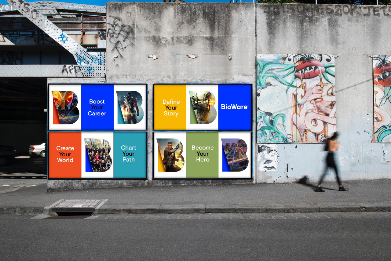
At least put a picture of a bee at the end so we can say "boo.... B..... Bees? Boobees!"
I like the logo.
It kind of highlights that they need better character design though. The characters in the design sheets are clumsy nothings.