-
Ever wanted an RSS feed of all your favorite gaming news sites? Go check out our new Gaming Headlines feed! Read more about it here.
-
We have made minor adjustments to how the search bar works on ResetEra. You can read about the changes here.
Is the original PS3 hardware design underrated?
- Thread starter jett
- Start date
You are using an out of date browser. It may not display this or other websites correctly.
You should upgrade or use an alternative browser.
You should upgrade or use an alternative browser.
I'd put it above the 5 but below the 4. Aesthetically speaking.
It was an expensive ticking time bomb otherwise.
It was an expensive ticking time bomb otherwise.
spidermanfont.ttf
This is the version I ended up settling on for my permanent console collection. Definitely the best looking PS3. The original fat boy console was too shiny and scratched super easy
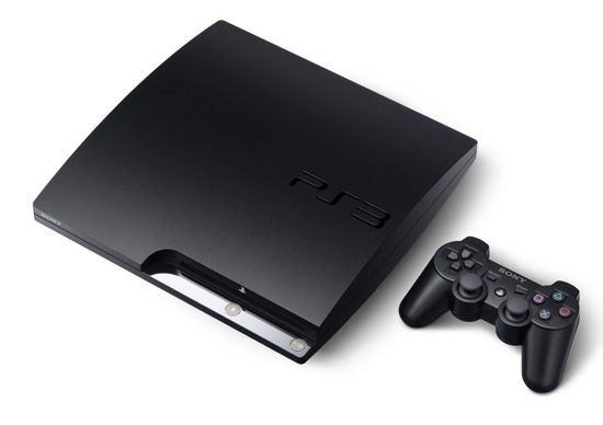
Getting the same basic controller design for the third generation in a row was super underwhelming.
Now that console though. It was PERFECT. Looked like some sort of premium, exclusive device. And the XMB OS just sealed the deal. And how about the SD to HD TV jump, enhancing the "premium device" feel even further.
Now that console though. It was PERFECT. Looked like some sort of premium, exclusive device. And the XMB OS just sealed the deal. And how about the SD to HD TV jump, enhancing the "premium device" feel even further.
I associate the slim with the loud noises the plastic would make when it would heat up. I'd say any version besides the slim is better.
Hahahaha good oneI'd put it above the 5 but below the 4. Aesthetically speaking.
It was an expensive ticking time bomb otherwise.
spidermanfont.ttf
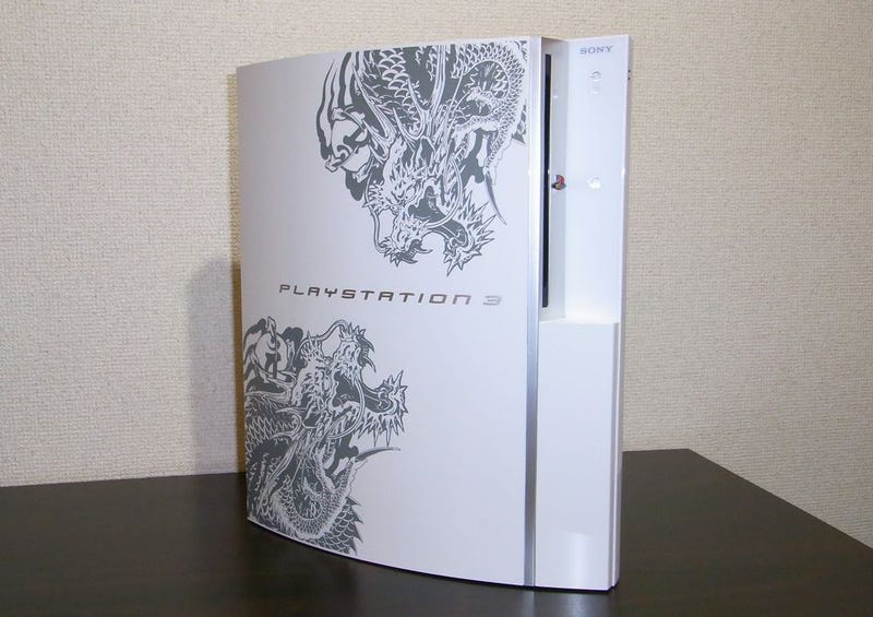
From that angle that Yakuza version looks awesome.Never owned an OG PS Triple and I imagine it was a dust, scratch and fingerprint magnet but I always thought it looked classy and premium. That Yakuza 3 limited edition in particular is the sexiest console of all time:
I loved this thing, but mine eventually crapped out and they sent me the redesigned one without the BC :(
This was my only PS3 and I liked it, I think the plastic felt cheap though.Always thought it was ugly AF. Only good looking PS3 is this beauty:

This is the mostly hilariously accurate comparison. The PS5 looks like Jaffar from Aladdin at a day party, and I think it's going to be similarly polarizing (especially when we see the $650 price tag).It's without question their ugliest design. Like everything else from the mid-2000's (fashion, design, and overall aesthetics), it was an ugly transition period as we escaped the 90's and approached the 2010s. I see that PlayStation 3 design and it evokes memories of stuff like this:


It got dusty but nothing cleaning wouldn't fix. It got really hot, but never got loud like my 360. It matched well with my original psp. I do prefer the look of the slim Ps3 over it though. The phat 20gb Ps3 looked really good as well, I never did see it in person, but in pictures it looks better than the 60gb model.

You must be kidding xDAlways thought it was ugly AF. Only good looking PS3 is this beauty:
I've always liked it. Never got the refrigerator or grill jokes.
It looks like a piece of tech combined with a piano.
I still use it everyday. Whether that's playing games, or streaming video.
PSX, PS2 games. It's one of the best videogame consoles I've ever bought. Except for a brief YLOD incident around 2010 it's been kicking rock solid ever since.
I don't know what's going on in the lives of the people that designed PS5.
I loved it. Everything about that design screams top-quality product and power. I was blown away at the time, specially coming from the ps2
The only good looking PS3.
Fucking terrible. Large, bulbous with unnecessary juxtaposition between the curves and the lines. Touch points should have been a less glossy plastic. The touch buttons were trying to be upscale, but combining multiple functions into one button (power) feels like you are doing nothing with no feedback. Cooling was problematic. The terrible font that stylistically matched nothing the PS brand had presented to that point. For something so expensive, it flexed a lot and felt cheap. Chrome plastic that looks nothing like chrome. The toned down, slightly more matte chrome on the 40/later 80s look better, and the all black 20GB helps the console a lot IMO, but the original design is from a company who felt they had to answer to no one, including good taste. The physical dimensions are beyond repair. The Slim is the best looking one but they went too far in the cheap direction material wise.
For context, I fucking love the PS2 design. A vertical console was daring at the time, with only the PC-FX iirc touching that. The black monolith as a testament to Sony's domination in the previous gen was a certified Big Dick move. The split surface design to emphasize verticality even when horizontal: the top towers over in another hint to Sony's place in the market at the time. The grills hiding the memory card and controller slots. The disc drive like a PC! Multifunction buttons. The beautiful dash of blue in the logo and the USB/Firewire ports. The rotating PS logo. The gradient in the stand. The engraved PS2 word mark. The actual power switch, similar to a stereo. It was (at least from my eyes) a system designed to fit into an entertainment rack. The screen content must be a priority, and PS2 was designed to be something that could fit anywhere yet had its flourishes of personality. PS2 looked expensive, felt expensive, while maintaining a price status quo. A wonderful compromise of industrial design.
For context, I fucking love the PS2 design. A vertical console was daring at the time, with only the PC-FX iirc touching that. The black monolith as a testament to Sony's domination in the previous gen was a certified Big Dick move. The split surface design to emphasize verticality even when horizontal: the top towers over in another hint to Sony's place in the market at the time. The grills hiding the memory card and controller slots. The disc drive like a PC! Multifunction buttons. The beautiful dash of blue in the logo and the USB/Firewire ports. The rotating PS logo. The gradient in the stand. The engraved PS2 word mark. The actual power switch, similar to a stereo. It was (at least from my eyes) a system designed to fit into an entertainment rack. The screen content must be a priority, and PS2 was designed to be something that could fit anywhere yet had its flourishes of personality. PS2 looked expensive, felt expensive, while maintaining a price status quo. A wonderful compromise of industrial design.
No. I never liked the PS3 design. I don't even like the PS3 Slim much either. It claimed to be slim, but it's just a big square as opposed the wider rectangle of the original. Sony knew it wasn't slim either, so they made the Super Slim, which was too late for me cuz I already had the Slim...
The PSOne Slim is the best design.
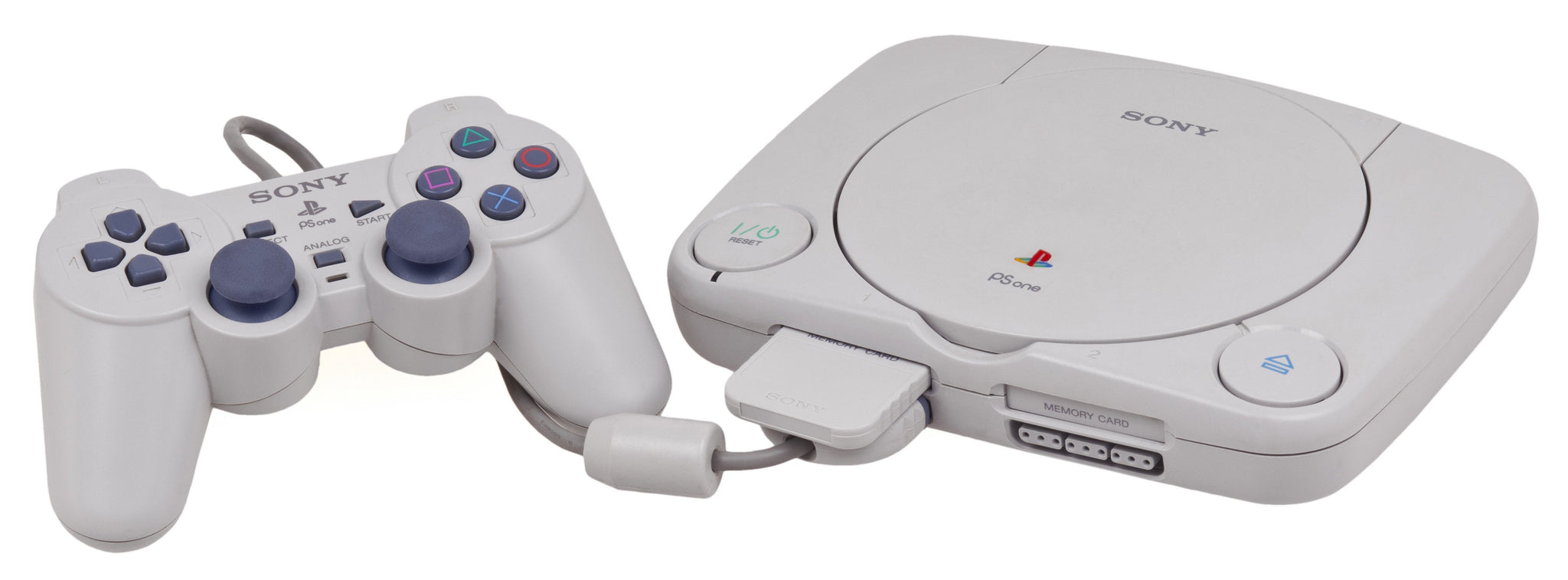
The PSOne Slim is the best design.
I think it's a pretty cool design. The slim revision and re-branding was for the best though besides losing the colorful PS logo :(
Lmaaaaaaaooooo, we not about to shit on the chopper suit era 😠It's without question their ugliest design. Like everything else from the mid-2000's (fashion, design, and overall aesthetics), it was an ugly transition period as we escaped the 90's and approached the 2010s. I see that PlayStation 3 design and it evokes memories of stuff like this:
It looks tacky as hell. The font, the chrome, the bloat, it is stuck in 2005. The follow up 2nd PS3 model design was much more timeless
I loved mine. It was a beast indeed. We will never get a premium product like that again. In terms of functionality, touch sensitive buttons, a plethora of ports, built in WiFi, a built in blu ray drive. It cost me 425 GBP and it was the best 425 pounds I've ever spent.
I loved this thing, but mine eventually crapped out and they sent me the redesigned one without the BC :(
This is a thread hijack, but: I have one of the OG models with hardware BC. It died after a few years of light use and the "repair" done by a local shop only lasted a couple of months. I've had it sitting in the box ever since but I remember reading here a year or so ago about a new or new-ish fix that is apparently a lot more effective. Did I imagine it? Googling just turns up the usual old fixes about reballing and whatnot.
It's ugly as fuck. Huge (almost as big as the original Xbox), big bulge over the top that looks terrible in an entertainment centre, attracts dust and fingerprints like you wouldn't believe, what-were-they-thinking Spider-Man font, and the glossy accents are extremely tacky. But then I regularly see people online who think the Panasonic Q looks classy, so 🤷♂️
And I haven't touched the non-aesthetic issues it has, like how loud and unreliable they are.
But it did standardise slot-loading disc drives on consoles, so I'll give it credit there.
The slim model is the best-looking PS3 by miles.
And I haven't touched the non-aesthetic issues it has, like how loud and unreliable they are.
But it did standardise slot-loading disc drives on consoles, so I'll give it credit there.
The slim model is the best-looking PS3 by miles.
It's too bulky looking and the chrome was garish. The Slim was a big improvement.
Of course we are in a different universe of "garish" now with the PS5...
Of course we are in a different universe of "garish" now with the PS5...

Still got mine in the attic (along with original PS1 and original PS2). Launch day 60GB (think it's got a 320GB drive in it) with the card readers. UK launch models had the software BC, which wasn't great (no PS2 chipset sadly).
I remember being surprised at the mass of the thing when I unboxed it. I like the combination of the big curved structure sitting on a rectangular foundation, but there's no denying it's a big unit.
I'd probably rate the original two-tone PS4 as being nicer than either the PS3 or the PS4 Pro. I'll pass judgement on the PS5 when I see one.
The aestethic of the PS3 was my least concern with this thing. I liked the premium look of it, and unpacking the PS3 it felt more sturdy than the old 360. That old sixaxis was a joke though.
My phat died after 3 years. I didn't even bother, as I moved out at the time and wanted a Slim anyway.
The best part was that a copy was stuck in the console. So I took a crowbar and fucked it up. Got my game back though.
My GOAT Sony console is the old PS2. I loved its design.
My phat died after 3 years. I didn't even bother, as I moved out at the time and wanted a Slim anyway.
The best part was that a copy was stuck in the console. So I took a crowbar and fucked it up. Got my game back though.
My GOAT Sony console is the old PS2. I loved its design.