julian

Member
Oct 27, 2017
17,696
Z-Buffer isn't Nintendo marketing, though. It refers to the depth axis in a coord system.

No, it was a hardware feature not present in the Saturn or PS1 that made making games in 3D environments much easier.

http://shmuplations.com/mario64/

Yajima: The N64 hardware has something called a Z-Buffer, and thanks to that, we were able to design the terrain and visuals however we wanted. It gave us, as designers, a chance to play around with Mario in a diorama world, in a very free way. We could do a lot of experimenting—like, we'd make a ghost house course, and then drop Mario in there and see how it felt to move him around there. It was very fun.

—I know it's a bit off-topic, but could you explain what the Z-buffer does?

Tanimoto: To explain it simply, when using it for 3D CG, it helps visually distinguish between foreground and background objects. If you have Mario and an enemy, and they move in front of or behind each other, the Z-buffer is what does the calculations and allows them to appear at the correct distances, with no weird flickering or overlapping.

Edit: also, this thread is great. I honestly never gave the N64 logo that much thought beyond being a cool 3 dimensional N.
 

Deleted member 176

User requested account closure
Banned
Oct 25, 2017
37,160
N64 and the Gamecube both had amazing logos. Switch is trying to bring back that magic but its not close.
 

DeeDogg

Banned
Oct 29, 2017
4,509
Florida
main-qimg-53c1390f7975d309add40f9cdc7b81fd-c
HEY! this is a Christian server!
 

julealgon

Banned
Feb 5, 2018
48

Well I just had an "oh shit" moment so you are not alone.

My reaction as well. This is crazy.

Tails ...... Miles "Tails" Prower ...... Miles Prower ........ Miles Per Hour

What the? Is this for real? It looks too good to have been invented on the fly like that LOL.

I still hate the N64 though

Agreed. Even after learning these crazy facts, it still looks hideous. Now the GameCube logo, that's a true work of art.

The "faces" here would be tris, not quadrilaterals

This makes a lot of sense. For some reason, when "faces" were mentioned, I actually thought about triangles first.


Can't unsee. You should mark this as NSFW lol.
 

Daouzin

Member
Oct 28, 2017
1,269
Arizona
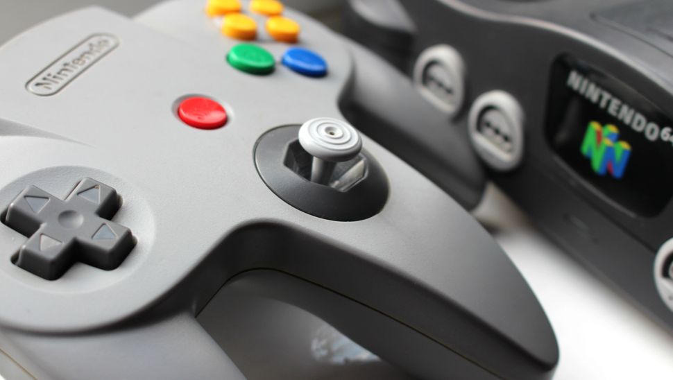
The console doesn't offend me, just the controller. I loved the games on the N64, but the controller itself always bothered me and today it deeply offends me. I would never play with it ever again.
 

JuicyPlayer

Member
Feb 8, 2018
7,783
If that logo was modernized today it would just be solid white or gray. Companies are afraid to have lots of colors in their corporate logos today.
 

TheBeardedOne

Banned
Oct 27, 2017
22,189
Derry
I somehow never noticed it was all of the colours of the controller's buttons. Now I feel dumb.

I also didn't notice Diddy's Kong Quest, but I was a kid at the time.

Oh, to go back to those days.
 

PtM

Member
Dec 7, 2017
4,104
No, the sideways Zs are upright Ns.

Perhaps the controller wouldn't have been so utterly shit if they hadn't tried to make it look like the logo.

The console doesn't offend me, just the controller. I loved the games on the N64, but the controller itself always bothered me and today it deeply offends me. I would never play with it ever again.

I agree with you so I always use the superpad 64

https://goo.gl/images/sfTgJf
I guess you guys have been playing like this?
imagefbueo.jpeg

The controller always felt super comfortable to me.
 

D.Lo

Member
Oct 25, 2017
4,352
Sydney
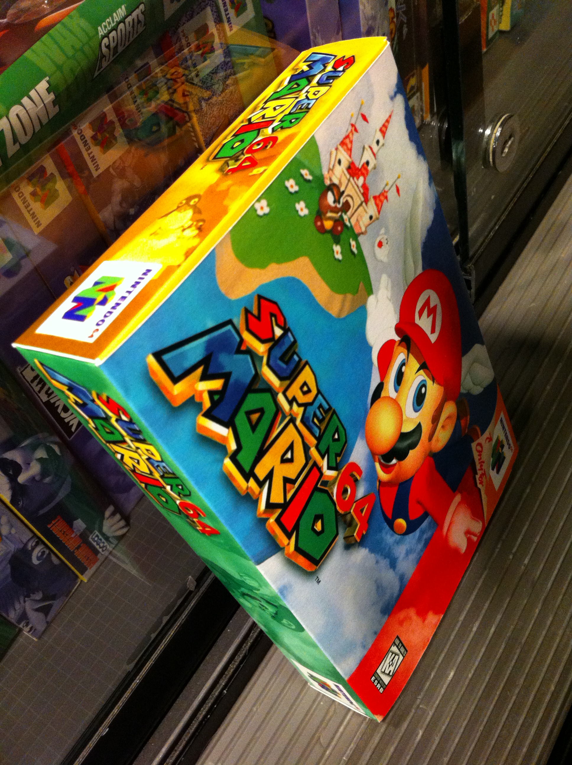
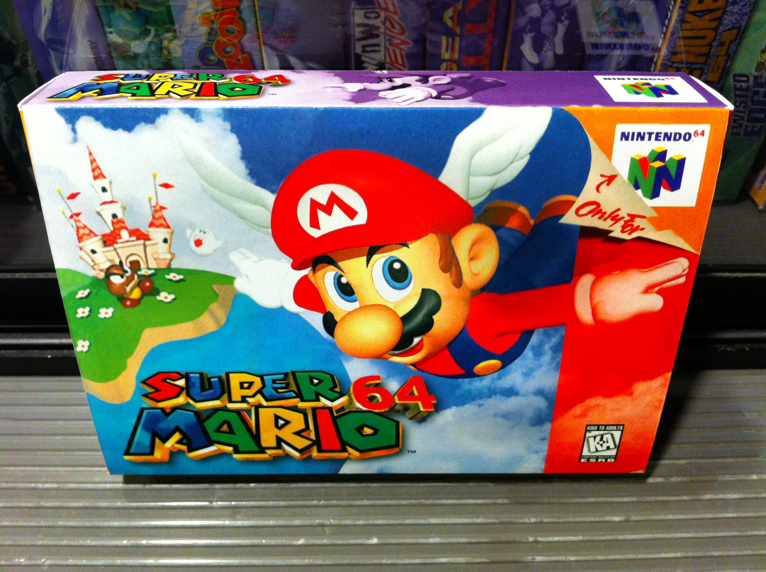
The motif went further.

The four colours were represented on the sides of product boxes as well

Super-Mario-64.jpg

Super-Mario-64-3.jpg

SuperMario64_N64-Box_AME(en)_72198.jpg

P1150975-700x700.JPG

(apologies for using pics of a crap repro boxes, they were just the best photos to show the sides)

Controllers also originally only came in those colours, plus grey and black:

858658410450641a4d70db.jpg


That said, they managed to top it with the Gamecube logo. Its a G, and a C, and a Cube. Absolute design genius.