Fire Emblem Three Houses (Switch) JP Boxart + Music Samples. UPDATE: NA boxart added
- Thread starter Hero of Legend
- Start date
You are using an out of date browser. It may not display this or other websites correctly.
You should upgrade or use an alternative browser.
You should upgrade or use an alternative browser.
Oh god it's worse up close. What the heck is going on with the perspective on the weapons?
I liked it at first but upsidedown Claude and this is grinding my gears.
Boxart looks straight basura but it's good to know that Three Houses continues the tradition of great soundtracks.


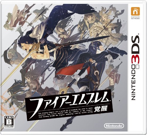
Fire Emblem: Awakening had a fantastic cover, but Path of Radiance is my favorite:

I do not like the cover of Three Houses. It is too simple, and that reversed character - I do not know what he is called - does not appeal to me.
I do not like the cover of Three Houses. It is too simple, and that reversed character - I do not know what he is called - does not appeal to me.
Path of Radiance had a great cover. I also think Radiant Dawn had a great cover too -Fire Emblem: Awakening had a fantastic cover, but Path of Radiance is my favorite:
I do not like the cover of Three Houses. It is too simple, and that reversed character - I do not know what he is called - does not appeal to me.

I am surprisingly okay with someone being upside down. The purpose is to preserve the "4 diamond" motif, I presume.
Agreed, of course the upside down guy is the most noticeable thing, but it's far from being the only problem with it.Everything clashes, the harsh primary colors, the weird poses, the art style, the background colors and art, that top dude's face.
It's an assault on the eyes.
Path of Radiance had a great cover. I also think Radiant Dawn had a great cover too -
Not THIS one.
Wait, looking at this the bow makes less sense. He pulls his arm in one direction but the tip of the bow goes the other way?

I remember being discontent with a Nintendo cover. It was Animal Crossing New Leaf because the western logo felt like something they made in a couple of minutes with photoshop's blending options and the leaf shape, but somehow it stuck. I felt alone on that, though.
Nintendo continues to create songs with lyrics for their first party games.
This is the battle theme
Not too hot on the battle theme but the main theme is great.
Disclaimer: I actually like these, but...
why does so much anime music sound 15 years dated?
It's JPOP, how is it suppoed to sound?
First thought: "Oh they're depicting Edelgard with an axe, finally an axe user in Smash Bros"
Second thought: "The axe is more or less shaped and wielded like a sword, she's going to be another Marth/Ike clone"
Third thought: "That dude's upside down"
Second thought: "The axe is more or less shaped and wielded like a sword, she's going to be another Marth/Ike clone"
Third thought: "That dude's upside down"
NOPE!
The upside guy isn't even as bad as how poorly the two characters at the bottom (female and male versions of the main character?) fit into the art.
Takeru Kanazaki, who have worked on multiple FE entries including Fates and Echoes.
Character designer, Kurahana Chinatsu. The page in the OP indicates it.
Last edited:
Boy, I already thought the art direction was bland but this indicates bigger problems.Character designer, Kurahana Chinatsu. The page in the OP indicates it.
Battle theme is good, reminds me of Path of Radiance. Box art won't be the western one for sure.
I don't see what you see. This is just a blend of different shades of blue. Also needs more saturation.
They're angry enough for NA so there is a chance.Battle theme is good, reminds me of Path of Radiance. Box art won't be the western one for sure.
Wake up, Sheeple.
There is no way Nintendo is this amateurish. You have all played directly into their hand. By unveiling ghastly box art today, they will generate literally millions of unit sales. By the time plans are announced to "correct" this monster, Fire Emblem: Three Houses will be a watercooler topic in every corporate office in the world. Expect 947.9 million units sold during its first quarter on the market all because people will be gullible to manipulative marketing campaigns. It's sad...
There is no way Nintendo is this amateurish. You have all played directly into their hand. By unveiling ghastly box art today, they will generate literally millions of unit sales. By the time plans are announced to "correct" this monster, Fire Emblem: Three Houses will be a watercooler topic in every corporate office in the world. Expect 947.9 million units sold during its first quarter on the market all because people will be gullible to manipulative marketing campaigns. It's sad...
Please tell me this is just placeholder or fanart lol.
Either way Imma go digital. Hopefully the Switch icon looks a little better.
Either way Imma go digital. Hopefully the Switch icon looks a little better.