-
If you have been following the news, you should be aware that the people of Lebanon have been under a violent bombardment that has recently escalated. Please consider donating to help them if you can or trying to spread word of the fundraiser.
-
Asheville and Western North Carolina at large are in crisis after Helene, please consider contributing to these local organizations and helping the people whose lives have been destroyed.
Choose 4 new face button symbols
- Thread starter Tregard
- Start date
You are using an out of date browser. It may not display this or other websites correctly.
You should upgrade or use an alternative browser.
You should upgrade or use an alternative browser.
I feel like the PS buttons fell into that roll though, while moon phases feel like it's trying to overly be about branding out of the gate.Well they aren't only about function. I think the PS symbols have served as pretty good brand identifiers / marketing tools for years now, which is why things like 1/2/3/4 (even if in some unique font and colours or whatever) seem more bland to me.
Well like I said, least worst lol.I feel like the PS buttons fell into that roll though, while moon phases feel like it's trying to overly be about branding out of the gate.
Game: "To do a combo press Red Red Green"

That'll keep em on their toes
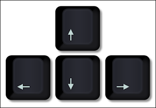
Arrow keys from the keyboard is fine for me.

Where's the heart button? :)

I'm personally quite fond of the symbols for the classic elements:

Get creative, go wild, have fun, just one rule!
Where's the heart button? :)
Pay (Symbol for money, general button for ingame shops to make fast and easy ingame transactions)
Loot (Symbol for lootbox aka Overwatch, cause every game needs lootboxes for a sense of accomplishment)
Win (Symbol for trophies, cause every game with ingame transactions needs an shortcut to win if the user paid enough)
Interaction (Symbol for a textbox, cause every live service even if its P2W should at least have an button to interact with some things to feel like a game)
The simpler the better. One of the things I hate about QTEs is it isn't intuitive to show the letter/symbol/colour used for a button, you have to memorize the buttons. There's no reason I can see why triangle is top, square is left etc. Arrows like <, >, ^ could work, but obviously it could be confused with the d-pad. What about numbers like on a clock face, or as I saw on page 1 someone said the compass points. They are far more intuitive and use already existing points of reference.
I audibly howled with laughter. Goddamnit.
Wow sh*t, mind blown! I have never been a huge fan of PlayStation buttons (I'm not used to them and find them unwelcoming each time I hold a PS controller) but that suddenly makes sense. And the layout honours Nintendo's legacy: ABXY => 1234. Beautiful.You know, this thread made me realize that the Playstation symbols, intentionally or not, are actually numbered in addition to being symbols and colors.
- O = 1
- X = 2
- ⃤ = 3
- ⃞ = 4
Fun fact, they actually have even deeper meaning and relate to the function each button serves. Circle means yes, X means no, Triangle refers to one's point of view, and Square is shaped like a piece of paper to represent it being a menu button.Wow sh*t, mind blown! I have never been a huge fan of PlayStation buttons (I'm not used to them and find them unwelcoming each time I hold a PS controller) but that suddenly makes sense. And the layout honours Nintendo's legacy: ABXY => 1234. Beautiful.
I honestly don't think you can beat the Playstation's symbols, they're brilliant.
Fun fact, they actually have even deeper meaning and relate to the function each button serves. Circle means yes, X means no, Triangle refers to one's point of view, and Square is shaped like a piece of paper to represent it being a menu button.
I honestly don't think you can beat the Playstation's symbols, they're brilliant.
And then you baka gaijins making X as yes.
And then Japanese senpai also making triangle as menu button.
Wah da faaahk
Lol, nice reference.Arrow keys from the keyboard is fine for me.

Where's the heart button? :)
And yea, arrow keys are probably the best because button prompting is much more intuitive if we're being honest.
Chevrons of some such would probably look better though.
Isn't one of the theories explaining why we have the east-west buttons flip is that back in the SFC/SNES days, the A/B buttons were flipped for the respective console? And that's why even with circle and x, we still go for the A position for confirm, and B for cancel?Lol, nice reference.
And yea, arrow keys are probably the best because button prompting is much more intuitive if we're being honest.
Chevrons of some such would probably look better though.
Going by that, why are down and right the intuitive confirm/cancel buttons?
Colours are what I would go with. Cyan, Magenta, Yellow and Black.
Holy shit
This
, this is actually perfect.
This
Blank buttons, you assign the buttons to the function you want like steam controller's touch pads. I don't even consider Steam Controller's face buttons AXYB anymore.
I wish all consoles had steam's controller input total customization. Thankfully though I mainly game on PC and can use steam's system with any game even Windows Store stuff with a tool.
Steam Input Thread | Comfy Couch Would Be Perfect On PC
I wish all consoles had steam's controller input total customization. Thankfully though I mainly game on PC and can use steam's system with any game even Windows Store stuff with a tool.
Steam Input Thread | Comfy Couch Would Be Perfect On PC
I think that can easily be explained simply by ergonomic finger position/response/down time. When players hands are resting, and shift to the the bottom button is the easiest/quickest. As for the right button I'm not exactly sure on that one. The easiest to reach button makes the most sense to confirm though. I imagine that's in large part why in the west X has become synonymous with confirm.Isn't one of the theories explaining why we have the east-west buttons flip is that back in the SFC/SNES days, the A/B buttons were flipped for the respective console? And that's why even with circle and x, we still go for the A position for confirm, and B for cancel?
Going by that, why are down and right the intuitive confirm/cancel buttons?
Colours are what I would go with. Cyan, Magenta, Yellow and Black.
Or maybe it's because X=
I have no idea of the eytomology beyond gaming at least lol.
My point being the symbol matters less than the positioning.
Having the symbols be
^
< >
V I can't find the alt code.
Just makes sense from a referencing point of view. I mean I think directional cue's are pretty widely shared across languages.
Last edited:
S A L T, would be really popular in the competitive scene. Seriously though, I can think of few options cause usually the best way to go about these buttons is easy interpretation, and that rules out over complicated symbols, it needs to read easily like a good serif font in a book to me. Maybe the card suits would be a somehow nice~ idea, even though it looks themed, and themed is not good in a product, themed reminds me of user input/customization.
You know, this thread made me realize that the Playstation symbols, intentionally or not, are actually numbered in addition to being symbols and colors.
- O = 1
- X = 2
- ⃤ = 3
- ⃞ = 4
Surprisingly this also works with the usual PC movement keys:
- W = 4
- A = 3
- D = 2
- S = 1
They're not brilliant. They're stupidly different for the sake of different. All that wank means nothing when you have to explain 30 times to your friend playing 'Triangle - the top one, Square - the left one. There's no immediately graspable logic, as opposed to two rows of alphabetical symbols (BA/XY or Saturn's ABC/YXZ) which is easy for people to get hold of. Even better when the buttons have colours like the Super Famicom/N64/Dreamcast where the on screen prompts are in the right colour to assist with rapidly finding the button.Fun fact, they actually have even deeper meaning and relate to the function each button serves. Circle means yes, X means no, Triangle refers to one's point of view, and Square is shaped like a piece of paper to represent it being a menu button.
I honestly don't think you can beat the Playstation's symbols, they're brilliant.
Not to mention typing them out is a pain.
Hit B, A, Y, X
or
Hit X, O... Square Triangle
The only thing I find unacceptable is that Nintendo and Microsoft's buttons are flipped. Nintendo A is Microsoft's B and so on. That is plain evil.
But, when someone says "push down to crouch", people could be confused because there are 4 different down on their controllers, from the analog sticks to dpad and face buttons, because when we say it out loud, we wouldn't have button prompts floating in air.I think that can easily be explained simply by ergonomic finger position/response/down time. When players hands are resting, and shift to the the bottom button is the easiest/quickest. As for the right button I'm not exactly sure on that one. The easiest to reach button makes the most sense to confirm though. I imagine that's in large part why in the west X has become synonymous with confirm.
Or maybe it's because X=
I have no idea of the eytomology beyond gaming at least lol.
My point being the symbol matters less than the positioning.
Having the symbols be
^
< >
V I can't find the alt code.
Just makes sense from a referencing point of view. I mean I think directional cue's are pretty widely shared across languages.
Diamond, Spiral, N Cube, X Sphere

Honestly, it doesn't really matter what the symbols are but they should be easy to remember and placed. They should also be easy to reference in language. This is why X Y A B are great because they are on the keyboard. The problem here is that they are placed differently depending on controller. Realistically North, South East, West makes the most sense with colour to help remember.

Honestly, it doesn't really matter what the symbols are but they should be easy to remember and placed. They should also be easy to reference in language. This is why X Y A B are great because they are on the keyboard. The problem here is that they are placed differently depending on controller. Realistically North, South East, West makes the most sense with colour to help remember.
Last edited:
"Press the BLEARGH button to confirm"Four identical buttons that make different noises when pressed
I think that can easily be explained simply by ergonomic finger position/response/down time. When players hands are resting, and shift to the the bottom button is the easiest/quickest. As for the right button I'm not exactly sure on that one. The easiest to reach button makes the most sense to confirm though. I imagine that's in large part why in the west X has become synonymous with confirm.
Or maybe it's because X=
I have no idea of the eytomology beyond gaming at least lol.
My point being the symbol matters less than the positioning.
It's cultural actually. All consoles used A to confirm until PS1, which didn't have an "A" button. If you played PS1 games made in America, X confirmed, because we use X like a check mark here. If you played games made in Japan, Circle confirmed because it is used for "positive" or "yes" there. There was no standard. I'll hazard a guess that they intended Circle to be confirm as they placed it where the "A" button was on the SNES layout.
Sony created a standard for PS2, games released in Japan required Circle to confirm. Games released in America required X to confirm.
The PS3 actually handled this regional requirement in firmware. If you pop an American disc in a Japanese PS3, circle will confirm in menus, and vice versa. I believe this is the same on PS4.
Xbox - A confirm (reversed location because Americans read left to right, or possibly avoiding patents)
Nintendo - A confirm (Japanes read right to left)
Sega - A button
simple shapes that symbolize animals
fish
chicken
mouse
turtle
edit:
Actually, I have a better Idea:

five buttons because yeah, I always hated the limitations of having only 4.
Love your idea and your great taste in games.


