So I've been looking to fill some holes in some obscure ports of Donkey Kong, Donkey Kong Jr, and Mario Bros, in an effort to know more about Nintendo's rather lax licensing in the early 1980s. During this search, I came accross something rather cursed...
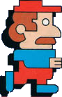
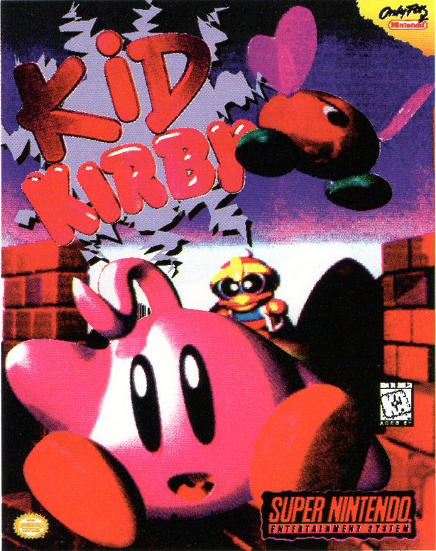
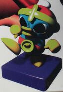
See, Nintendo gave Ocean the license to Donkey Kong and Mario Bros for computer ports in the UK due to a Donkey Kong knock off of their own (named Kong, it wasn't even subtle lol) selling pretty well. So when they made their Commodre 64 port of Mario Bros... we got THESE abominations
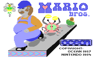
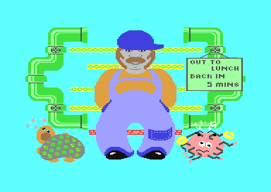
Holy shit this is BEYOND cursed. Why the fuck is Mario so thicc?? What the hell is wrong with the Sidewinders? Why is there a heart in the Mario logo?
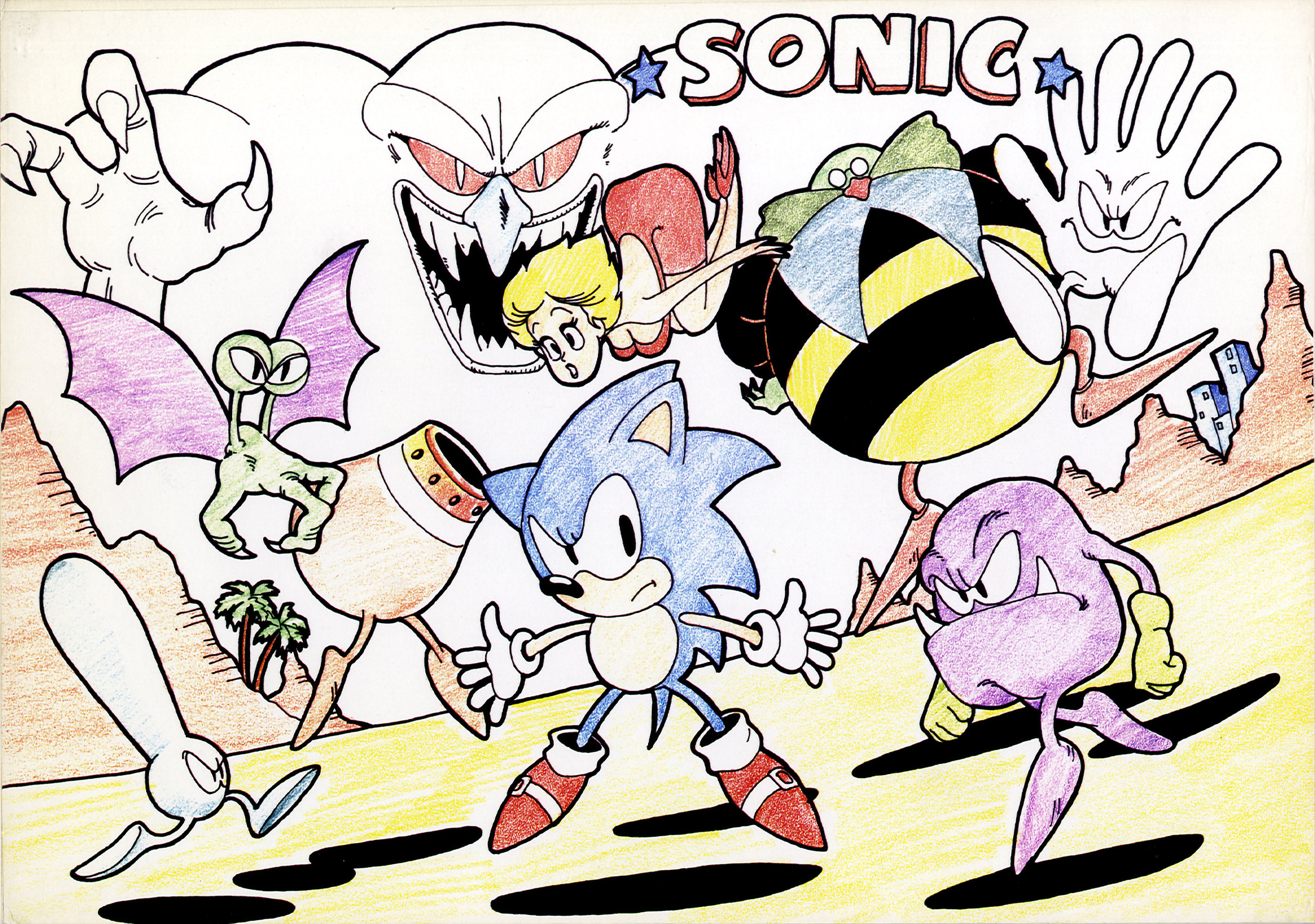
There clearly wasn't a ton of quality control with these images! So, this has me wondering... what other games suffered similar fates to this one? I'd love to see other examples of offical video game art gone terribly wrong!
See, Nintendo gave Ocean the license to Donkey Kong and Mario Bros for computer ports in the UK due to a Donkey Kong knock off of their own (named Kong, it wasn't even subtle lol) selling pretty well. So when they made their Commodre 64 port of Mario Bros... we got THESE abominations
Holy shit this is BEYOND cursed. Why the fuck is Mario so thicc?? What the hell is wrong with the Sidewinders? Why is there a heart in the Mario logo?
There clearly wasn't a ton of quality control with these images! So, this has me wondering... what other games suffered similar fates to this one? I'd love to see other examples of offical video game art gone terribly wrong!