-
Ever wanted an RSS feed of all your favorite gaming news sites? Go check out our new Gaming Headlines feed! Read more about it here.
-
We have made minor adjustments to how the search bar works on ResetEra. You can read about the changes here.
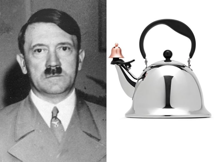
Amazon changes app logo that 'resembles Adolf Hitler'
- Thread starter whatsinaname
- Start date
You are using an out of date browser. It may not display this or other websites correctly.
You should upgrade or use an alternative browser.
You should upgrade or use an alternative browser.
It's because we are all secretly national socialists.It clearly looks like a toothbrush mustache. What I don't understand is why people in this thread seem so bothered about the change.
It's supposed to be tape, to get the icon to look like one of their boxesI don't even get why that blue part is part of the app logo. it's ugly.
which yeah is stupid as fuck lol. Also all the Amazon packages I get have black tape? So did they try it with black, went no that looks like Hitler, made it blue because ??? painter's tape??, and people still thought it looked like Hitler? And now it looks like Aang from Avatar lol
How the fuck this ain't gettin more lulz
This thread is DONE.
I was getting worried that everyone on this site had me blocked or something.
That's true, he died 43 years ago, so until we invent time travel, no one born after his death could have met and personally got to know him.
But I'm pretty sure his likeness is still very recognisable to ton of people under 40. Things like The Great Dictator and many of his other works still appear fairly often in TV.
would you want your company to have any association with hitler? quietly changing it is the best course of action for themThat makes it even worse. So they caved to people doing stupid ass trolly jokes on Twitter? That makes me face palm even more.
anyway now that the tweet pointed it out to me, I see it clear as day lmao

I don't think anyone is freaking out.Why are you all freaking out about this? They adjusted their logo so there's no potential hidden meaning that white supremacists could co-opt. Okay? Big deal? Get over it.
It's more a general exasperation with people and the state of things.
It's like you wake up tomorrow and people are boycotting Pillsbury doughboy because the mascot is white with blue eyes, clearly a supremacist icon. Like why
Who is boycotting Amazon?It's like you wake up tomorrow and people are boycotting Pillsbury doughboy because the mascot is white with blue eyes, clearly a supremacist icon. Like why
Logo designers (and the companies that pay big money for them) go to great lengths to ensure their logos don't have unanticipated hidden meanings. I think it's fair to say this logo looked A LITTLE BIT like a Hitler moustache above a mouth. Of course it makes sense to adjust it.
You have to be looking pretty damn hard to see Hitler on that icon.
pretty much
That doesn't remind me of Hitler at all.
Looking at it now, it's a stretch to say I'd think the blue tape part on the original icon was hair with a smile.
Looking at it now, it's a stretch to say I'd think the blue tape part on the original icon was hair with a smile.
Same. I think people are just out there looking for this shit.
What? no one is boycotting it was an example lolWho is boycotting Amazon?
Logo designers (and the companies that pay big money for them) go to great lengths to ensure their logos don't have unanticipated hidden meanings. I think it's fair to say this logo looked A LITTLE BIT like a Hitler moustache above a mouth. Of course it makes sense to adjust it.
They are only changing the logo because people are making a fuss about it which is bad for business. It looks nothing like Hitler, people will see what they want to see.

lol, stop making things up.It clearly looks like a toothbrush mustache. What I don't understand is why people in this thread seem so bothered about the change.