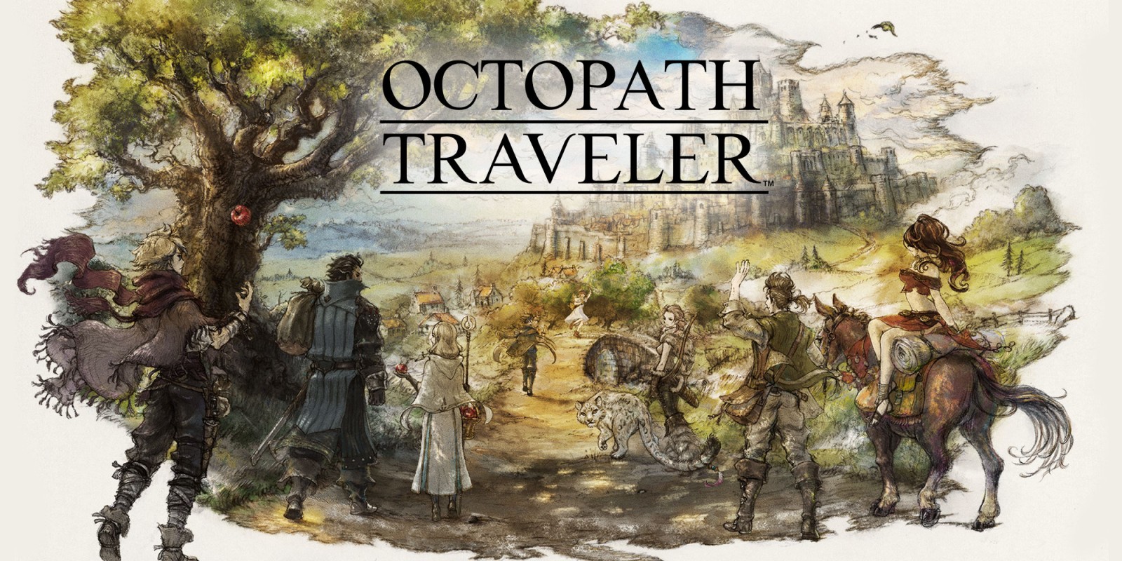
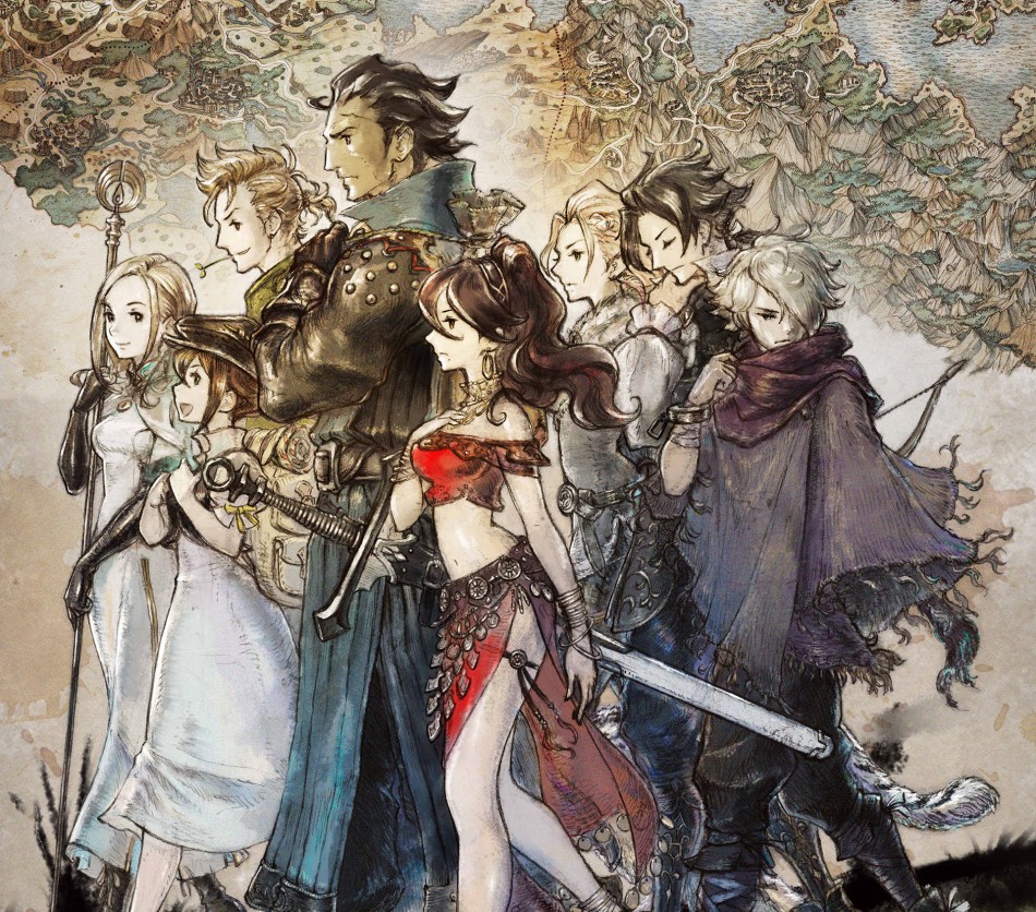
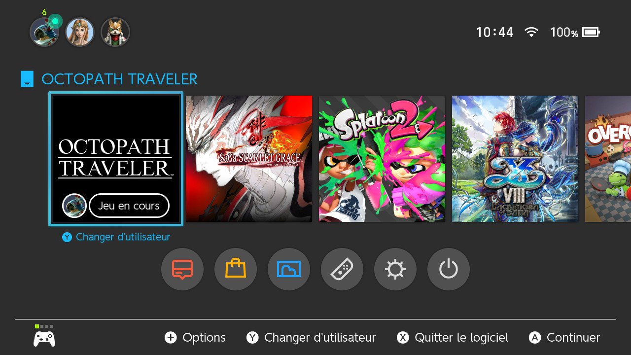
This. I have made my peace with it. Game is too good. =)At least Octopath has the name on it. I'll take that any day over a floating head.
Plus, I do feel bad at some level about stifling creator choice. Different people have different tatses and while I prefer the rubric of art + title, maybe the Octopath team feels differently. There is nothing wrong with that. Ideally, we could set our own icons as a compromise. That would be fun.