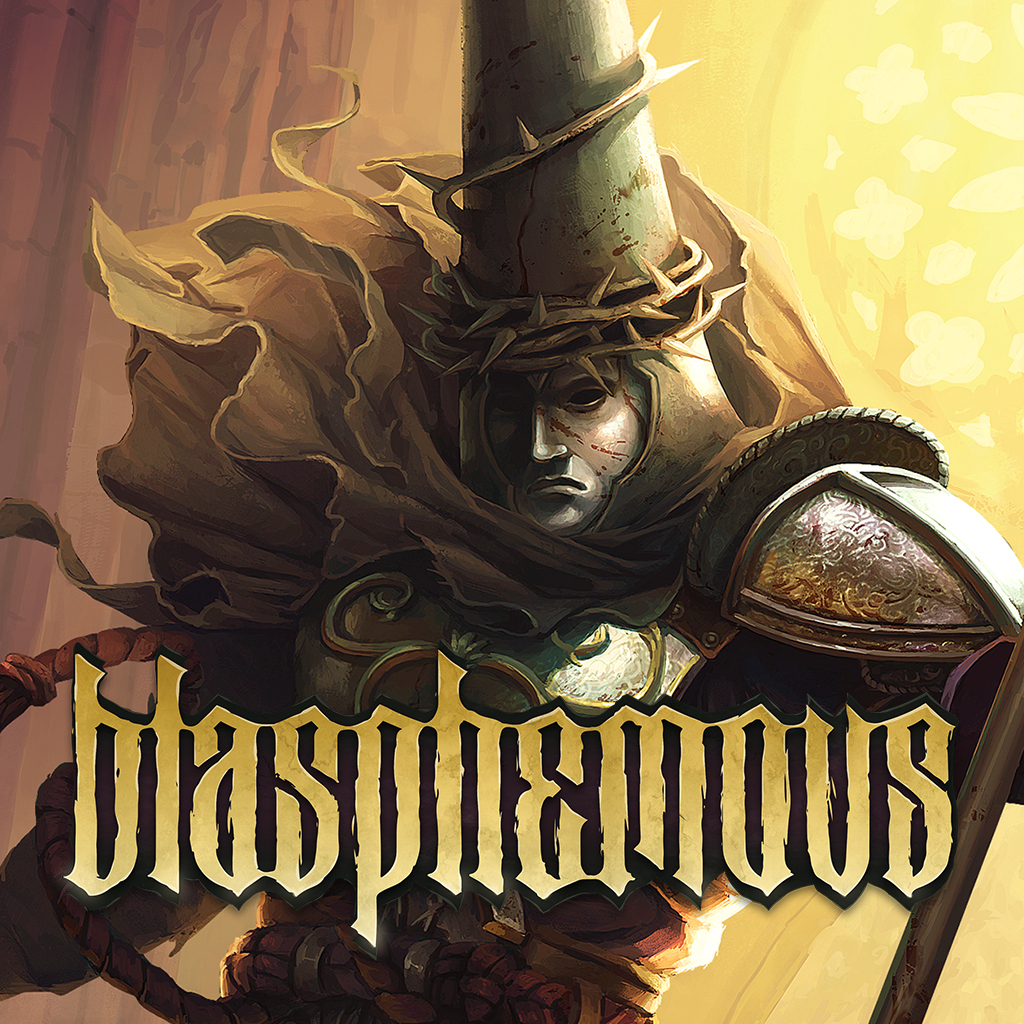
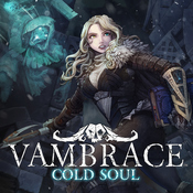
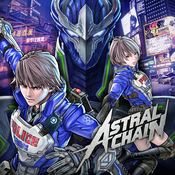
Blasphemous is the one I'm interested in. This looks great!I wouldn't expect River City Girls to be up until the last minute. Blasphemous is up though.
Here's my (cautious) hype thread:
Blasphemous is the one I'm interested in. This looks great!I wouldn't expect River City Girls to be up until the last minute. Blasphemous is up though.
God. Damn.I wouldn't expect River City Girls to be up until the last minute. Blasphemous is up though.
Wow, they graded their icon IN the icon. How meta.
"Not good." -my wife (a non-gamer)
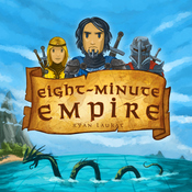
When do you think the icons for Blasphemous and River City Girls will go up?
Good news!
I like the new one, but my eyes keep going to the bottom left.
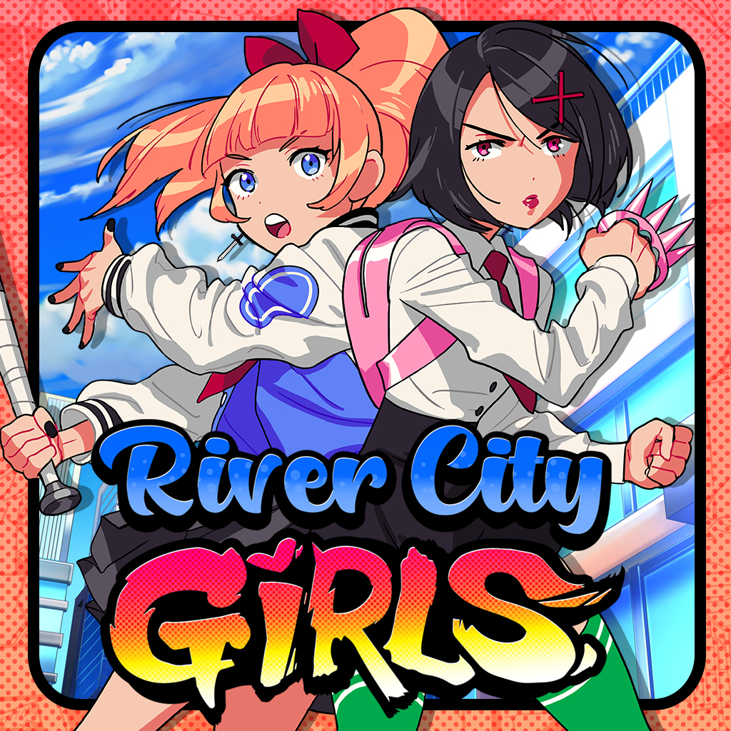
Its better. River City Girls is one of the best I've seen; that is really going to look beautiful.


- Japan
- No Logo


FUZE4 Nintendo Switch
Deadlings
ESport Manager
Boku to Kanojo no Kenshuu Nisshi (Japan)
Tonari ni Kanojo no Iru Shiawase ~Two Farce~ (Japan)
I secretly love it too. Reminds me of the goofiness of the Slam Land icon.Guys, the Wuppo icon is perfect, what are you talking about. I'm not even kidding.
It's the default Gmail profile icon for people with their first name starting in F.
From bad (although I enjoy seeing my beautiful SA) to pretty great.
F... That Overwatch Icon is the same as the PS4 version right? Doubt they'll change it.Blizzard didn't learn their lesson from Diablo III's initial icon and subsequent change.


I actually think they both look nice.
I bought Deadly Premonition without checking here first and I instantly regretted it.
As well as the (intentionally) out-of-focus image giving it the impression of being low-res/quality it both fails to communicate what the game is/about and isn't evocative of its distinctive visual style in the slightest.The one with the characters is better for sure, but the one they chose is fine too.