-
Ever wanted an RSS feed of all your favorite gaming news sites? Go check out our new Gaming Headlines feed! Read more about it here.
-
We have made minor adjustments to how the search bar works on ResetEra. You can read about the changes here.
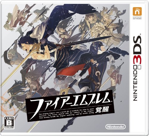
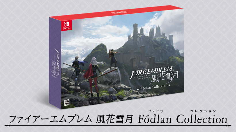
Fire Emblem Three Houses (Switch) JP Boxart + Music Samples. UPDATE: NA boxart added
- Thread starter Hero of Legend
- Start date
You are using an out of date browser. It may not display this or other websites correctly.
You should upgrade or use an alternative browser.
You should upgrade or use an alternative browser.
Ah you're right. That's what happens when you turn the cover upside down you bakas
Nintendo continues to create songs with lyrics for their first party games.
This is the battle theme
Disclaimer: I actually like these, but...
why does so much anime music sound 15 years dated?
No Sir, don't like it.
Let's hope the limited edition in Europe gets the same art as the japanese one (and that i'm able to get that one). I understand they wanted to highlight this "trinity" of the houses ... but man, having one Lord upside down is just so freaking bad looking.
Make the Lords go from bottom to top, pointing the weapons upwards and have the Byleth's be on top. Bam, same scenery, better execution.
This box art is bad but what hyperbole with this game and other nintendo titles recently its really over blownFor me it's the artwork. It looks like a budget PSP JRPG.
Oh god it's worse up close. What the heck is going on with the perspective on the weapons?
I wonder if people still hate Kozaki now. The poor guy even retweeted the annoucement.
First it was PS2, now its worse than a PSP game?
For me it's the artwork. It looks like a budget PSP JRPG.
Oh god it's worse up close. What the heck is going on with the perspective on the weapons?
First it was PS2, now its worse than a PSP game?
It's so disappointing when Nintendo has had a hot streak with their switch boxarts
And heroes has had so many good artists, why do they have to do this for their next mainline game after the series has gained some ground in popularity
Not that the artist is incapable of producing good work, she has before, but this is not it. Not at all
And heroes has had so many good artists, why do they have to do this for their next mainline game after the series has gained some ground in popularity
Not that the artist is incapable of producing good work, she has before, but this is not it. Not at all
He's not even working on this game or at least isn't the character designer for this game. Don't know if this artwork was made by himI wonder if people still hate Kozaki now. The poor guy even retweeted the annoucement.
First it was PS2, now its worse than a PSP game?
First and only game I played.
This box art is bad but what hyperbole with this game and other nintendo titles recently its really over blown
They're talking about the box art.
I wonder if people still hate Kozaki now. The poor guy even retweeted the annoucement.
I don't really understand what the design of the cover has to do with the Three Houses main artist. It's likely that some higher ups gave the ok for that, after all.
And while i will never bash Kozaki, simply because of his No More Heroes designs (especially Shinobu), some of his FE designs were strange. Any armor in Awakening for example.
But it doesn't show weapons or angry faces. Too peaceful for mainstream audience.Uhmm, nope. I really liked the previous tone the art for this game had…
I know that, im simply referring to how people wanted Kozaki to get booted off the franchise after Fates. Its disappointing to have this amateur art design after Kozaki and Hidari.He's not even working on this game or at least isn't the character designer for this game. Don't know if this artwork was made by him
Edit: Honestly, its a hit n miss with Chinatsu Kurahana. Edelgard is my favorite design of the bunch so far, but then you have Dimitri who has shitty looking hair, and just looks generic.
Last edited:

Holy crap that boxart is horrible.
Oh lord, I wanna play that game again, it was soo good!
Oh lord, I wanna play that game again, it was soo good!
Lmao, my exact thought. Awakening and Fates boxart are amazing.
—-
Dope OST though.
I clicked on this thread going, FE games always have nice boxart, this will be --- oh.
...
Wow.

That's gorgeous! Goddamnit, Nintendo, why.
...
Wow.
That's gorgeous! Goddamnit, Nintendo, why.
The steel book is far better than others (looking at you Super Smash Bros Ultimate)
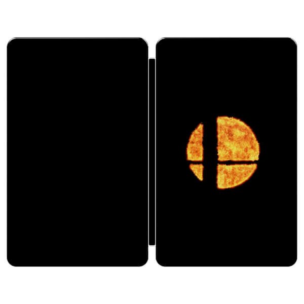
Oh my god is it actually that plain....
She totally is compared to Kozaki and Hidari, it is easy to see the level gap between them.
The perspective seems kinda weird. Edelgard is reaching behind her, and Dimitri is reaching forwards, but Claude is ahead of (seemingly?) both of them. So I'm not sure the weapons colliding even makes sense unless Claude's weapon is arched backwards severely or some weird other thing.
Edit: Maybe only the 2d projection of the weapons onto the boxart 'face' are supposed to cross ¯\_(ツ)_/¯
Edit: Maybe only the 2d projection of the weapons onto the boxart 'face' are supposed to cross ¯\_(ツ)_/¯
Last edited:
the gamecube controller is similarly plain with an outline of the smash logo. both are going for some kind of minimalism but the steelbook doesn't go far enough. the finished product looks like they forgot the rest of the design.
Gets a not good from me. Surely you have better ways to represent having all those characters on the box without flipping one upside down. Unless this is high level foreshadowing and they'll be the traitor or something like that? Maybe im giving too much credit and it's just plain all bad.
Somebody photoshop the dude rightside-up and see if it looks better. The collector edition boxart looks great, so at least there is that.
Seriously, this is a giant step down from Echoes. I thought an artist needs to come up with multiple drafts before deciding which is the best? No sane person would think a character in reverse position being a good idea.
Yep, they're going to fight.
Everything they've shown this year has been a red flag for this game. I'm worried it'll be bad. Not "Fire Emblem Fates" bad - which just means a bad story with unbalanced gameplay. Series worst bad is what I'm worrying about.
Everything they've shown this year has been a red flag for this game. I'm worried it'll be bad. Not "Fire Emblem Fates" bad - which just means a bad story with unbalanced gameplay. Series worst bad is what I'm worrying about.
That's really bad box-art. Which is a shame, because I feel like Nintendo has been doing really well in this area for a pretty good while now.
Me not liking the mc designs don't help either. Hopefully Europe will use a different one. But I might get the collectors edition anyway.
Me not liking the mc designs don't help either. Hopefully Europe will use a different one. But I might get the collectors edition anyway.
First time in a while i hope the west get's a different cover, really. It's not really hard to have the same effect without a Lord playing bat from above.
Nah, you're just biased. ^^
Nah, you're just biased. ^^