Wow. There's a
lot going on here. I'm gonna take this out of order.
Simply stretching a typeface distorts the letters and completely messes up the intended thickness of the individual strokes that form the letter. If you stretch a letter horizontally x2, the vertical strokes will double in width, but the horizontal strokes will be unchanged. It looks like crap and it severely harms legibility.
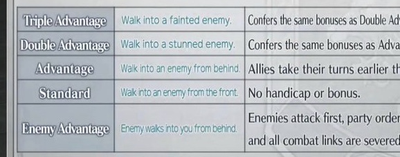
They chose a nice font for the larger text (strikes a good balance between style and legibility), like the headers, but they also used it for the smaller, more space-limited segments, like the table containing more technical information in the third screenshot. The smaller and more constrained your text becomes, the less room you have for aesthetic considerations.
Here, using a second, ultra simple font, narrow enough to fit in the tightest spaces without being squished, would be my call. It would lose a little personality and leave a lot of unused space in the boxes that require only a few words, but the alternative is total visual chaos. There's just no room for anything but the absolute most legible typefaces here.
But it's weird—they
did use a second, more legible font, but only for one column of text in that table.
Dumb.
They also centered text in the first column, which is a no-no. Most of the time you want to left-align text in tables, though there are situations where right-aligning might be appropriate. But almost never centered.
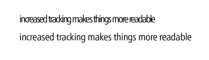
You're spot on, here. Your eyes absolutely need breathing room.
With normal tracking (the space between letters), that sentence is perfectly readable. With really low tracking, some of those words start to look like gibberish. And I used a very simple, very legible sans serif font here. With such little tracking, it can very easily devolve into totally meaningless scribbles depending on choice of font.
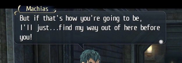
We've covered how letters need space, but just having space isn't enough. The space between letters needs to be visually uniform to maintain a rhythm. Just as you'd struggle to play a rhythm game where the button prompts don't match the beat, your eyes struggle to parse words with uneven spacing. And this dialogue box
really wanged that up.
It almost looks like that font is monospaced (meaning every character occupies the same amount of space). Look at the upper case i's and lower case L's. All the thin letters consistenly exist in these wide open spaces, and the wide letters are all just crashing into eachother.
In fact, it kinda looks like the font was not originally monospaced, but was sort of retrofitted to make each letter occupy the same amount of space. But even then, the characters in each line don't quite line up with those in the adjacent lines, so I have no idea.
Nothing here makes any sense, so I again have to imagine there's some arcane technical limitation being dealt with here.
And of course, stylistically, it just looks completely out of place. It reminds me a lot of the fonts typically used for flip phones in the 2000s. The strokes that make up those letters are all very straight/flat. For example, the descender (the hook-shaped portion) of the lower case G doesn't curve back up towards the circular portion, it jutts straight out. Everything looks like it was constructed using straight lines and right angles, and then the sharp edges were just rounded off afterwards.
Almost as though it was made to conform to a pixel grid. Like that of a small, low resolution screen on a flip phone.
In designer parlance, "This shit's all fucked up."