brainchild

Independent Developer
Verified
Nov 25, 2017
9,534
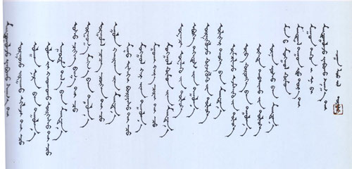
I've always enjoyed looking at the different visual designs of writing systems around the world, and now I'm kinda curious as to which writing system you believe is the most beautiful.

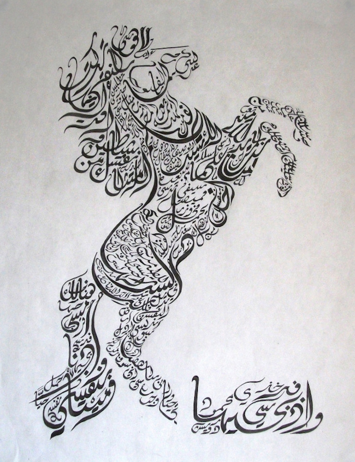
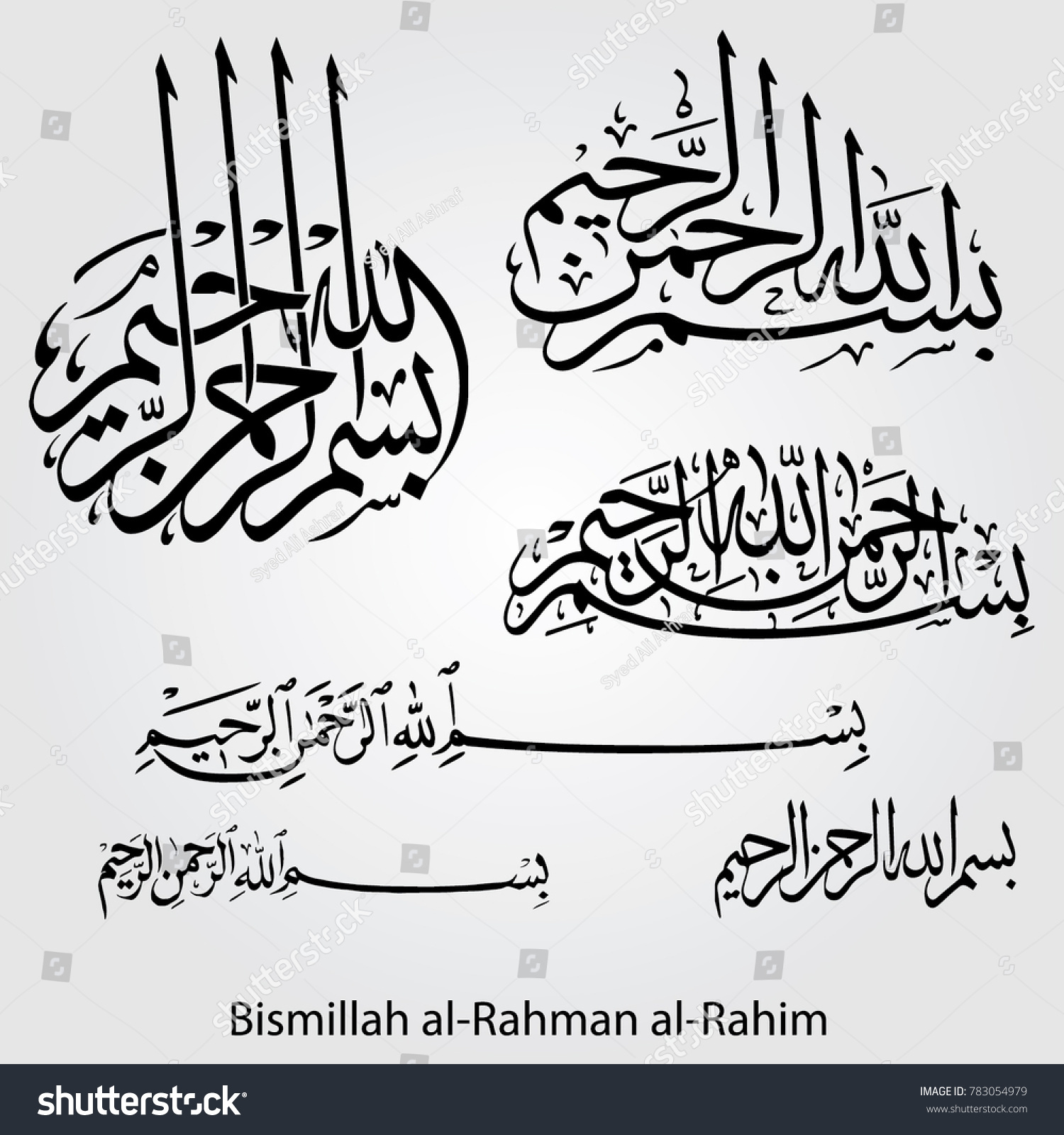
For me, it has to be Arabic Calligraphy

The-common-Arabic-calligraphy-scripts.jpg


I mean, just look at that! Those curves and lines are mesmerizingly simple! I'd love to get physical hand-written letters in the mail just to look at the characters again.

So what are your picks, ERA?!
 

Deleted member 20284

User requested account closure
Banned
Oct 28, 2017
2,889
I'd have to go with Japanese calligraphy, especially when using a brush. The written form is precise and beautiful but when the art is painted it's another aesthetically pleasing element altogether.

Japanese-Calligraphy-art.jpg
 

Jakenbakin

"This guy are sick" and Corrupted by Vengeance
Member
Jun 17, 2018
12,654
Courier New. I'm not a font-ist so forgive me if this is a faux pas to the community but I legitimately love that shit.
 

Chittagong

Member
Oct 26, 2017
1,793
London, UK
I remember when I did a bespoke corporate typeface for a big brand in a ton of different scripts. We did Naskh for Arabic as it worked best and Saudis and UAEs seemed to like it. Persians were like 'we can't read that shit'. They needed Kufi, so we had to do two Arabic typefaces. Might have been the other way around.

I think the most aesthetic scripts are Hebrew and Katakana, both can be very beautifully geometric.

eafed916548283.56315f09adc49.png

images
 

Gundam

Banned
Oct 25, 2017
12,801
I don't know that I have a favorite writing "system", but I'll never not love the RuneScape font.

runescape-bold-font-regular_4.png


runescape_uf_specimen.jpg


ROFL.jpg

jkyvq9.png


Just super nostalgic, and a really pleasing hard-pixel font with loads more A E S T H E T I C packed in than most "retro game" fonts.

I think you mean Chinese calligraphy.

My 1000x folded steel calligraphy can cut through pretty much everything.
 

finfinfin

The Fallen
Jul 26, 2018
1,384
Korean and Arabic have some of the nicest-looking scripts, as someone who can read neither.

I have a perverse fondness for that one weird German style. Sütterlin? Apparently learning to read that shit is suffering for historians who have to read sources written in it. You just seem to zigzag the pen for a bit when you get bored of your current word.
 

NekoFever

Member
Oct 25, 2017
4,009
As impressive as Chinese or Arabic calligraphy are, I love a nice serif font designed for long-form text like novels. Something like Palatino, or Amazon's Bookerly, that's designed to be read for hours on end. Even on websites, it automatically puts me into reading mode and feels all cosy.
 

bagandscalpel

Member
Oct 25, 2017
701
It's half background bias and half aesthetic taste, but I'd have to vouch for Chinese calligraphy, especially the more blocky styles.
 

boris_

Member
Mar 19, 2018
463
Korean alphabet.

Not just aesthetically.
Incredibly easy to learn and very sensical.
 
Oct 31, 2017
10,436
I'm with you OP. Nothing beats Arabic script - it's incredibly versatile and I'm always amazed by its decorative uses in architecture.
 

nib95

Contains No Misinformation on Philly Cheesesteaks
Banned
Oct 28, 2017
18,498
Arabic and Japanese for sure.
 

Lunaray

Member
Oct 27, 2017
1,731
Arabic calligraphy is beautiful. I also want to say Ge'ez is a beautiful abugida and everything written in it is so pretty.
 

LogicAirForce

Member
Oct 25, 2017
953
I've always thought Japanese looked really beautiful, and I don't just mean the Chinese characters but Hiragana and Katakana as well.
 
Oct 26, 2017
6,798
I always liked the karolingian minuscule. It isn't overly playful, but written by a master it creates an amazing body of text that is both very easy to read and pleasing to look at.

800px-9th_century_Beinecke_MS_413_fol._165.jpg


When I had to translate various latin manuscripts for a class, I started to learn to write the letters in the corresponding style. That helped increasing my reading speed immensely. And it produced a few cool looking scraps of paper for my textbooks.
 
Oct 26, 2017
6,798
Sütterlinschrift. More info : http://www.suetterlinschrift.de/Englisch/Sutterlin.htm

You can still see it in Germany on buildings

Some of my family's documents (like marriage/death records) from this time are in this script.

Alphabet.gif


RAnSGhU.gif


BlQED8j.jpg
I transcribed a few WW1 and WW2 Feldpost letters, and at one point could read this fluently... man I'm out of practice. And yeah, some of the letters were pieces of work. You could tell the care and love that was put into every single letter. Magnificent.
 

Morrigan

Spear of the Metal Church
Member
Oct 24, 2017
35,253

Pixel Grotto

Member
Oct 27, 2017
894
I can't read or write either but when I was in Japan we sat in on some writing and art sessions explaining the strokes, order etc. Just incredible.

If my Google image was Chinese instead then my bad. My mandarin is poor at best.

It's both - Japanese, Korean and pretty much every East Asian language were influenced by Chinese characters at one point. The kanji used in Japanese calligraphy are basically just Chinese characters.

The character in the image you posted looks a little odd to me though - the three strokes on the lower right side seem to be backwards. Should be 修 (pronounced xiu in Chinese, shu in Jaopanese)

images


Going back to the topic at hand, I find both Chinese and Korean calligraphy to be especially beautiful.

824px-LantingXu.jpg

Modern-Hangeul-Korean-alphabet-calligraphic-work.jpg
 

hobblygobbly

Member
Oct 25, 2017
8,005
NORDFRIESLAND, DEUTSCHLAND
That looks so harsh and primitive compared to the lovely Arabic calligraphy haha. No offense meant, I understand it has meaning for you.
It's ok no offence taken, I like a lot of the German scripts (if you think this looks bad you should see some of the older cursive types :P). Both my grandparents could (and the ones still living) write in such a way. The Nazis ended up banning a lot of these scripts though, initially they promoted some of the blackletter scripts, but once they discovered that some German Jews at some point had been involved in creation of some of them over time... yeah.

I transcribed a few WW1 and WW2 Feldpost letters, and at one point could read this fluently... man I'm out of practice. And yeah, some of the letters were pieces of work. You could tell the care and love that was put into every single letter. Magnificent.
Yeah the various scripts in German actually make it difficult to read a lot of history that was recorded in German, both German history and of other parts of Europe, even though German language has changed very little compared to many other European languages - most German speakers should be able to understand written German throughout the centuries but the scripts make that very difficult. My grandparents went through school at the time this was introduced, so they could write it.
 

Lynd

Member
Oct 29, 2017
2,493
Some really nice examples here. Lovely.

I'm going to throw out my love of Tolkien's Elvish. I know it's fictional, but I do like how it looks.
 
Oct 26, 2017
5,720
Not to weeb out, but the writing is my favorite thing about Japanese. A single sentence will usually have at least two alphabets and up to four is normal. Just a nice diversity to it that I enjoy seeing. Also, two different directions it can be read
 
Oct 26, 2017
6,798
That looks so harsh and primitive compared to the lovely Arabic calligraphy haha. No offense meant, I understand it has meaning for you.
Having learned to write this, it is far from primitive. Calligraphy isn't just about who can make the most intricate signs. There is a serene beauty in well structured and well written text. It is strict and almost monolithic. Different design philosophy.
And completely different application. Sütterlinschrift was introduced for everyone to read and write. From a farmhand to academics.
To call it primitive displays ignorance on your part.
 

Dyle

One Winged Slayer
The Fallen
Oct 25, 2017
30,739
I like late English manuscripts, because they developed a complex mixture of Greek, Roman, and Uncial characters, beautiful initials, and various colors and sizes for notes. It's a wild mess compared to some of the beautiful order of Arabic and Chinese writing systems, but that's what makes it interesting to me. The Eadwine Psalter is one of the best examples of this gorgeous disaster

Eadwine_psalter_-_Trinity_College_Lib_-_f.243v.jpg
 
Oct 26, 2017
6,798
I like late English manuscripts, because they developed a complex mixture of Greek, Roman, and Uncial characters, beautiful initials, and various colors and sizes for notes. It's a wild mess compared to some of the beautiful order of Arabic and Chinese writing systems, but that's what makes it interesting to me. The Eadwine Psalter is one of the best examples of this gorgeous disaster

Eadwine_psalter_-_Trinity_College_Lib_-_f.243v.jpg
What I love about this example is that you can see it's a Palimpsest. They scraped off the original text on this parchment and wrote this over it. Parchment was extremely expensive and so pagan texts, greek philosophy and science treaties were erased to make space for codices etc.
If I'm not mistaken the underlying script is in greek?