Oct 26, 2017
13,669
D1KN4MDUwAAENGy.jpg:orig
81ko4L6tptL.jpg


https://twitter.com/NintendoAmerica/status/1104124634696421377
https://topics.nintendo.co.jp/c/article/5c9bd56d-3e21-11e9-b104-0a6d14145cb1.html

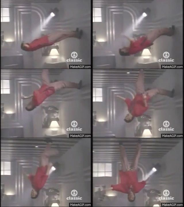
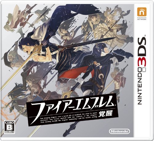
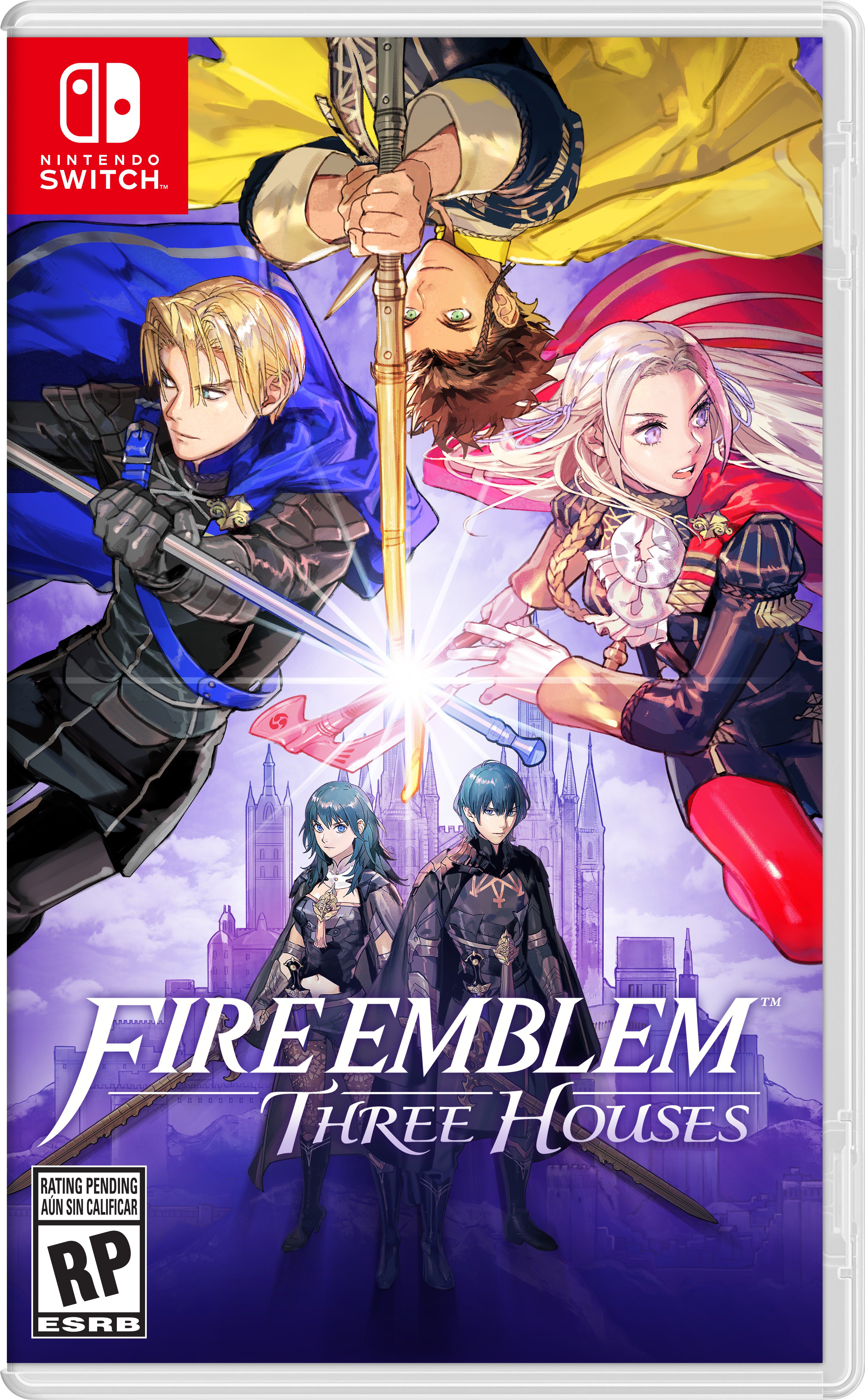
I like the colors... but one why is Claude upside down, and two... BlazBlue Cross Tag Battle anyone? :P

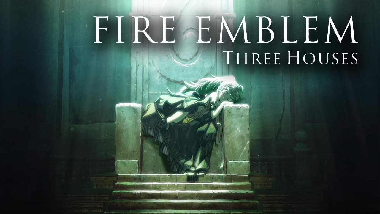
Nintendo continues to create songs with lyrics for their first party games.


This is the battle theme

 
Last edited:

Error_404

Member
Nov 12, 2017
518
Not really impressed, Awakening's box was dope, but this seems kinda amateur by comparison
 

Byakura

Shinra Employee
Avenger
Oct 25, 2017
1,721
Canada
I liked it until I noticed Claude upside-down at the top of the cover there. Just looks really weird lol

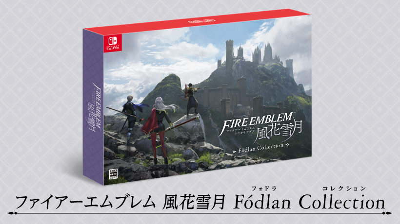
the collectors edition box art is really cool tho.
 

Jahranimo

Community Resettler
Member
Oct 25, 2017
9,119
When you zoom in it actually looks cool. Yeah this design screams BBTAG. That's what brings it down a little for me.
 

Xlad

Member
Oct 19, 2018
1,004
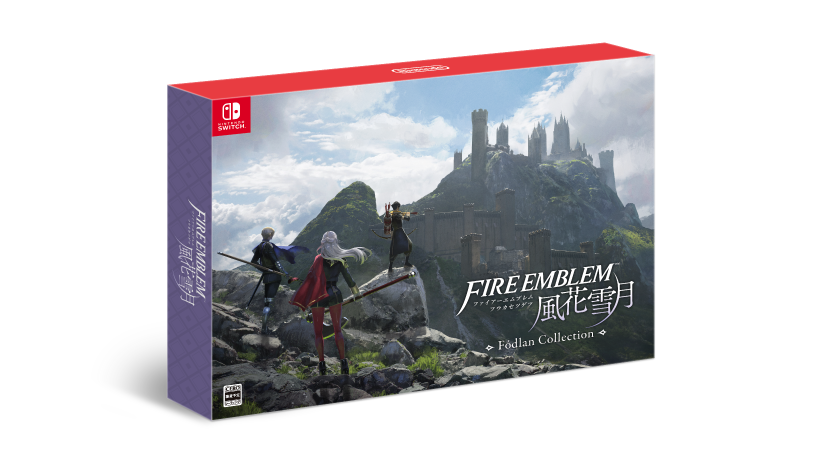
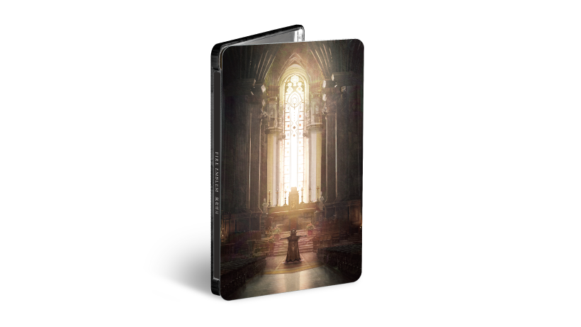
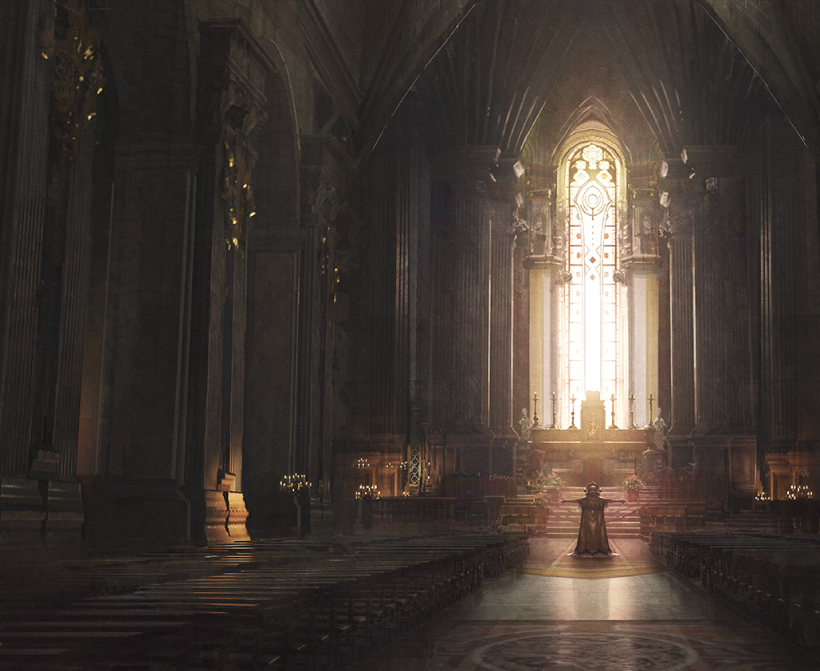
Fodland Collection & Steel book cover art.
00001503_8_box.png

00001503_6_case.png
00001503_7_illust.png


Main boxart is alright(in positive way). same feeling when I see KH3 boxart.
 
Last edited:

Maxina

Banned
Oct 28, 2017
3,308
I really like the Japanese logo. Looks more pleasing to the eyes then "Three Houses".
 

ChaosBladeEX

Member
Nov 6, 2017
103
No one is looking at where they are swinging their weapon except Claude and he's upside down what in the world is this.
 

hibikase

User requested ban
Banned
Oct 26, 2017
6,820
Assuming it's real, is this the worst ever Japanese boxart for a Nintendo game?

(I mean it probably isn't, but please post examples)
 
Last edited: