there is a big main level on each continent but also small caves and secret small areas around each continent. Sometimes you will have to solve puzzles out on the continent to unlock the path to the big levels
-
Ever wanted an RSS feed of all your favorite gaming news sites? Go check out our new Gaming Headlines feed! Read more about it here.
-
We have made minor adjustments to how the search bar works on ResetEra. You can read about the changes here.
You are using an out of date browser. It may not display this or other websites correctly.
You should upgrade or use an alternative browser.
You should upgrade or use an alternative browser.
- Status
- Not open for further replies.
Ha, there sure is something similar here. I'd guess our character is just a bit younger.
The captain is probably a bit closer when it comes to age:

Also, what do you think of the basic 3-hit combo? We will be still boosting up at least the effect of the last hit, but I feel like the whole combo could use some work still in some places, even if it works pretty well as is.
This looks great! I'm downloading the demo and I'll try to provide my trademark detailed criticism, but I don't have a clue when that'll be.
As for the character in a wheelchair, there's quite a bit of stuff you could do depending on the mood you want to convey:
- Have him lean his head on his hand / stroke his chin pensively (with the elbow on the chair armrest).
- Look around, or even to the camera (but don't overdo it or he'll look overexcited).
- Pull out a handheld device and use it to run diagnostics on the robot body remotely.
Basically, think of the situation, and think of what you'd do if you were him. Does he expect to spend a lot of time idling? Is something he could be doing while waiting?
Here's final trailer for Best Rally. Everything is set for the release on 5th of July... So what do I do now?!
Anyways the trailer:
And Preorder link for those with Apple Devices: https://itunes.apple.com/app/id1062844836
Wow, this looks great! For some reason I thought it was a multiplayer, straight lap racing game like Super Off Road, rather than a level-based single player racer. It looks really fun. How is it controlled on phones?
As a little baby noob, should I start out messing around with Unity or Unreal? I'm learning C# right now.
Also, my roommate is an awesome artist and is interested in translating that to video game art in some way. I see Aseprite recommended above, anything else that would be a good first step?
If you're already learning C#, then Unity is a no-brainer, since it's all C# :) It's perfect for beginners: user-friendly, but powerful enough to let you do whatever you want. Also I strongly, strongly recommend checking out the couple of online courses by the University of Michigan that I talk about in this post, they're super comprehensive, entertaining and easy to follow:
https://www.resetera.com/posts/5908836/
I'm probably one of the people you mention recommending Aseprite, but if not, I 120% recommend it; my game is entirely drawn in it. You can get a free, older version to give it a try.
Okay finally got back to coding on my game. Felt I was paralyzed by life as of late but working on it everyday again will probably help. I need to remember I actually like doing this stuff sometimes lol.
Started basic work on a main menu including a keyboard which was fun to code.
Started basic work on a main menu including a keyboard which was fun to code.
Also, what do you think of the basic 3-hit combo? We will be still boosting up at least the effect of the last hit, but I feel like the whole combo could use some work still in some places, even if it works pretty well as is.
My man there is just sliding in place with his legs. Maybe his body is too stiff? It's not 100% selling me
My man there is just sliding in place with his legs. Maybe his body is too stiff? It's not 100% selling me
Yep, he's kind of sliding forward. I'd either make him stay in place, or if you need to make him advance as he attacks for gameplay reasons, make him take a step forward each time.
I'm also not feeling the last attack. The first two have pretty clear animations but for the last one it's a bit confusing what's happening, from both the body and the leg movement.
My man there is just sliding in place with his legs. Maybe his body is too stiff? It's not 100% selling me
Yah, the slide is due gameplay reasons. Right now the only thing explaining the forward movement is the feet, which are kinda pushing him forward a bit. Feels pretty good when playing, but doesn't look too awesome. I think a good first-aid trick to try initially would be just making him jolt forward faster, like Jobbs mentioned. Might work. The slight stiffness of the body is something we don't want to completely get rid of, as he is a robot:P
About the last attack: We actually had an animation for him to step forward before swinging the sword, but that took the player too much forward. That's probably also the reason for confusion, as now he just switches his legs from side to side immediately before the attack. Something that will be fixed eventually, but for the purposes of our pre-alpha demo that was good enough. We are also planning on having the last hit be kind of power-attack and require a slight charge-time before execution.
These are all great ideas, I passed them to our animator. And thanks! Would be great if you tried the demo at some point. Criticism and feedback are just what we are in need right now:)This looks great! I'm downloading the demo and I'll try to provide my trademark detailed criticism, but I don't have a clue when that'll be.
As for the character in a wheelchair, there's quite a bit of stuff you could do depending on the mood you want to convey:
- Have him lean his head on his hand / stroke his chin pensively (with the elbow on the chair armrest).
- Look around, or even to the camera (but don't overdo it or he'll look overexcited).
- Pull out a handheld device and use it to run diagnostics on the robot body remotely.
Basically, think of the situation, and think of what you'd do if you were him. Does he expect to spend a lot of time idling? Is something he could be doing while waiting?
And I guess it would be good to also tell what I'm doing with the project. Mainly I'm a programmer and level designer, but basically I do bit of everything other than graphics.
Last edited:
If you're already learning C#, then Unity is a no-brainer, since it's all C# :) It's perfect for beginners: user-friendly, but powerful enough to let you do whatever you want. Also I strongly, strongly recommend checking out the couple of online courses by the University of Michigan that I talk about in this post, they're super comprehensive, entertaining and easy to follow:
https://www.resetera.com/posts/5908836/
I'm probably one of the people you mention recommending Aseprite, but if not, I 120% recommend it; my game is entirely drawn in it. You can get a free, older version to give it a try.
Thank you so much for your post and goddamn, your game looks great. I love the gameplay mix, awesome premise.
Thank you so much for your post and goddamn, your game looks great. I love the gameplay mix, awesome premise.
Thanks a lot for the kind words! :)
So do I have to pay for a subscription to coursera to take this course? If I try to enroll it wants me to sign up for a free trial with my cc information. For some reason I thought you could do the course for free just without getting the certificate for it.
So do I have to pay for a subscription to coursera to take this course? If I try to enroll it wants me to sign up for a free trial with my cc information. For some reason I thought you could do the course for free just without getting the certificate for it.
Yeah, as I mention at the end of my post, their business model seems to have changed between the time I took the courses and now. I should probably edit the post to make this more visible, since I end up linking it everywhere. I think you can enroll, download the materials, and cancel your subscription; if you try that, please let me know if it worked, so I can add that to the post as well.
Hi folks, I'm still here! I've been super busy (In the process of buying my first flat!) so I haven't made nearly as much progress as the rest of you, but I've managed to get some work done:
As always, feedback is very much appreciated, particularly in regards to colouring. I have tried to use a more consistent (and brighter) palette, but I feel there is still work to be done. As an experiment in the next couple of weeks I might try replacing the one I am currently using (Which I made myself) with one of the premade options from Lospec.
Here's some of the older versions for comparison if you're interested:
Version 1
Version 2
Version 3
Wow, this looks great! For some reason I thought it was a multiplayer, straight lap racing game like Super Off Road, rather than a level-based single player racer. It looks really fun. How is it controlled on phones?
Thanks, yeah, we started with car physics, once we had those down we tried creating a "pure" racing game with AI and laps and all, but it just wasn't fun at all. After some trial and error gameplay variants we figured out that timetrial/level based of gameplay fitted this perfectly, from then on the the game practically designed itself. That's always nice when that happens :D
Controls are simple "press left right sideof the screen" type of a thing, acceleration is automatic.
Hi folks, I'm still here! I've been super busy (In the process of buying my first flat!) so I haven't made nearly as much progress as the rest of you, but I've managed to get some work done:
As always, feedback is very much appreciated, particularly in regards to colouring. I have tried to use a more consistent (and brighter) palette, but I feel there is still work to be done. As an experiment in the next couple of weeks I might try replacing the one I am currently using (Which I made myself) with one of the premade options from Lospec.
Here's some of the older versions for comparison if you're interested:
Version 1
Version 2
Version 3
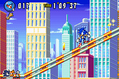
I've said this before, but I can't tell the foreground from the background, and that's a dealbreaker in a game like this, sorry. In videogames the priority list should be readability first, then readability second, readability after that, and aesthetics as a distant fourth.
Thanks, yeah, we started with car physics, once we had those down we tried creating a "pure" racing game with AI and laps and all, but it just wasn't fun at all. After some trial and error gameplay variants we figured out that timetrial/level based of gameplay fitted this perfectly, from then on the the game practically designed itself. That's always nice when that happens :D
It really does! A lot of the best and most original games in the world were designed with this kind of evolutive / accidental / "let's see where this takes us" design. Hell, arguably the most successful game in the world right now is an example; fortnite was going to be an strictly cooperative game against zombie hordes until PUBG gave them the idea to repurpose it as a battle royale, and the rest is history.
Controls are simple "press left right sideof the screen" type of a thing, acceleration is automatic.
I see, I expected as much. It's great that it doesn't need anything more complicated, haha.
After release, would it be hard to add an actual four-player versus mode, to release it on, say, the Switch? With your clean visuals, already solid single player content, and a multiplayer mode on top, I think this could be an extremely complete package and sell like gangbusters!
To add to this: I see two options to relatively easy solve this isse: Used the vibrant colours in the foreground, duller colours in the background, or use a slight unclarity effect for the background.I've said this before, but I can't tell the foreground from the background, and that's a dealbreaker in a game like this, sorry. In videogames the priority list should be readability first, then readability second, readability after that, and aesthetics as a distant fourth.
To add to this: I see two options to relatively easy solve this isse: Used the vibrant colours in the foreground, duller colours in the background, or use a slight unclarity effect for the background.
Problem is, I don't really understand how to do this whilst using a limited colour palette. In many pixel-art games that I have seen, the background is relegated to various shades of blue which solves this issue, but this really doesn't work in my case. As my character will never be stuck to a floor, or any surface for that matter, the majority of the time you want to exist within the "empty space". Having all of the backgrounds be a single shade means that the game (in these external levels) will seem primarily that colour, which goes against the idea of it being vibrant and diverse.
I suppose what I'm trying to achieve is a similar feel to the vibrancy that appeared in this sonic game:
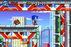
So the foreground/terrain is much more saturated than the background, and (IMO) there isn't any issue with readability even in the "busy" first image.. Do you think they're using different palettes for this, or are they just being more clever with their use of colours? (Both may be true. Im sure the latter definitely is.)
Yes, I think they use different palettes: The only vibrant colour they use for the background is skyblue, which they, in turn they do not use in the foreground. The other colours are matte, just take a look at the red, yellow and green of the buildings. Strong lines on the outside of objects and a slightly different (art) style for fore- and background help as well.So the foreground/terrain is much more saturated than the background, and (IMO) there isn't any issue with readability even in the "busy" first image.. Do you think they're using different palettes for this, or are they just being more clever with their use of colours? (Both may be true. Im sure the latter definitely is.)
That being said, I think your video was borderline readable, but if the level gets busier and more difficult, you'd not want to be at borderline here.
Yes, I think they use different palettes: The only vibrant colour they use for the background is skyblue, which they, in turn they do not use in the foreground. The other colours are matte, just take a look at the red, yellow and green of the buildings. Strong lines on the outside of objects and a slightly different (art) style for fore- and background help as well.
That being said, I think your video was borderline readable, but if the level gets busier and more difficult, you'd not want to be at borderline here.
Thanks! I'll spend the next week trying to sort out some palettes and see how it turns out!
Thanks! I'll spend the next week trying to sort out some palettes and see how it turns out!
What Yoshi said about outlines is crucial. Note that in the first Sonic image you posted, all foreground objects have black or very dark outlines, while background objects have light or no outlines. This is particularly obvious when comparing the ladybug enemy with the building it's in front of. I think this could work pretty well for your game, but there's a catch: your game has a much higher resolution, so you need to either make the outline thicker, or make it "bleed" into the rest of the object (that is, foreground elements have darker hues near the outline, background items have ligher colors).
Other than that:
- Use more saturated colors for the foreground and less saturated ones for the background.
- Use darker colors for the foreground and lighter for the background.
If your current palette doesn't have enough hues to make this feasible, just ditch it and change to a different palette. You haven't married that particular palette. :D
Does someone here have any experience how much time one should expect to spend on polishing a game after the design work has finished? On my main project, the 3D platformer, I am making good progress right now, exceeding my previous plan (which, on the other hand was adjusting speed down significantly for personal and job reasons), so I expect to be able to finish up designing the game's levels at the end of the year. Performance optimisation is always already a strict part of it all, because performance is so crucial for a 3D platformer (and it is targeting Wii U on Unity, so achieving 60fps is hard). Polishing here means balancing time limits, platform positioning and visual presentation - though the latter will be limited to introducing some more texture variety. Since I am no artist, the visual representation will never reach a good or even average level either way.
However, the only game I have release so far is a small puzzle game, where no significant polishing work was required for the levels (because there were no levels). Currently, I'm thinking of going public with the game when all level design is finished for the first time, but I would like to have a reasonably good feeling of how much more time I can expect the work on the game to take afterwards.
However, the only game I have release so far is a small puzzle game, where no significant polishing work was required for the levels (because there were no levels). Currently, I'm thinking of going public with the game when all level design is finished for the first time, but I would like to have a reasonably good feeling of how much more time I can expect the work on the game to take afterwards.
Did some extra work on the particles for the spells casting. Shes ended up being more "magical" than I originally intended but i like this look going for her
i would say your palette is mostly using pastel colours and that is making it feel harder to read as they are more softer, whereas in the examples you gave are not.
Problem is, I don't really understand how to do this whilst using a limited colour palette. In many pixel-art games that I have seen, the background is relegated to various shades of blue which solves this issue, but this really doesn't work in my case. As my character will never be stuck to a floor, or any surface for that matter, the majority of the time you want to exist within the "empty space". Having all of the backgrounds be a single shade means that the game (in these external levels) will seem primarily that colour, which goes against the idea of it being vibrant and diverse.
I suppose what I'm trying to achieve is a similar feel to the vibrancy that appeared in this sonic game:
So the foreground/terrain is much more saturated than the background, and (IMO) there isn't any issue with readability even in the "busy" first image.. Do you think they're using different palettes for this, or are they just being more clever with their use of colours? (Both may be true. Im sure the latter definitely is.)
i would say your palette is mostly using pastel colours and that is making it feel harder to read as they are more softer, whereas in the examples you gave are not.
Did some extra work on the particles for the spells casting. Shes ended up being more "magical" than I originally intended but i like this look going for her
Pretty! Although I have to admit the beautiful spell effects take away a bit of the creepy factor.
What does the first one do? The one where she lifts prisms of rock from the ground. Direct damage? Is it a trap?
Did some extra work on the particles for the spells casting. Shes ended up being more "magical" than I originally intended but i like this look going for her
Siick
Pretty! Although I have to admit the beautiful spell effects take away a bit of the creepy factor.
What does the first one do? The one where she lifts prisms of rock from the ground. Direct damage? Is it a trap?
That is my current fear (no pun). It originally started off being a very dark character but I have so many of those already and wanted something a bit more "vibrant"? I have like 17 enemies created thus far and trying to keep each quite unique. I will have to see how the overall feel is once I start play testing... there may be other ways to add to the creepiness.
The Totems will spawn near the players feet when she casts them. Im toying with the idea that they will be ranged that can cause negative (Hex) effects to the player or possibility buff nearby enemies too.
Thank u :) a good sick right?
I don't know if you need to worry about the tone. I would think that putting her into the context we've seen of the rest of your game should keep her pretty terrifying to run into, even if it's just on a level of a player freaking out about a big magical effect they've never seen before.
Of course! Material and particle effects have been a really fun thing to dig deeper into for me, and it's always awesome to see effects like this.
The particles look really good. I love summoning spells that cause stuff to grow from the ground! :DDid some extra work on the particles for the spells casting. Shes ended up being more "magical" than I originally intended but i like this look going for her
The particles look really good. I love summoning spells that cause stuff to grow from the ground! :D
Thanks! To be honest, had inspiration after seeing all your spell casting wizardry :D
That is my current fear (no pun). It originally started off being a very dark character but I have so many of those already and wanted something a bit more "vibrant"? I have like 17 enemies created thus far and trying to keep each quite unique. I will have to see how the overall feel is once I start play testing... there may be other ways to add to the creepiness.
Actually it might be just a consequence of seeing her in a vaccuum. I just realized that Demons Souls Pisaca / Mindflayer things from the Tower of Latria technically use pretty light orbs as their attacks and that doesn't make them one bit less terrifying. :D I believe sound design is a good way to instill fear here.
The Totems will spawn near the players feet when she casts them. Im toying with the idea that they will be ranged that can cause negative (Hex) effects to the player or possibility buff nearby enemies too.
Ooh, I see! Neat!
Hah, I had misread that as "slick" (because of the two i's). :D
The particles look really good. I love summoning spells that cause stuff to grow from the ground! :D
Right? Gives me quite the earthbender / Full Metal Alchemist vibe.
Thanks! To be honest, had inspiration after seeing all your spell casting wizardry :D
Man, reading these kinds of comments is one of the things I most love about the thread. This put a huge smile on my face.
Yay I finished my name entry/keyboard stuff and now I can actually name my character rather than just having [CHARNAME] appear lol. I think I'm going to do my picture cutscene stuff that will happen before the game starts next. I will be with very low quality stick figures though.
Actually it might be just a consequence of seeing her in a vaccuum. I just realized that Demons Souls Pisaca / Mindflayer things from the Tower of Latria technically use pretty light orbs as their attacks and that doesn't make them one bit less terrifying. :D I believe sound design is a good way to instill fear here.
I love the Mind Flayer (and Souls).. can you tell?
she actually looks quite small in this vacuum as you put it but actually, shes one of the tallest in the game and quite intimidating
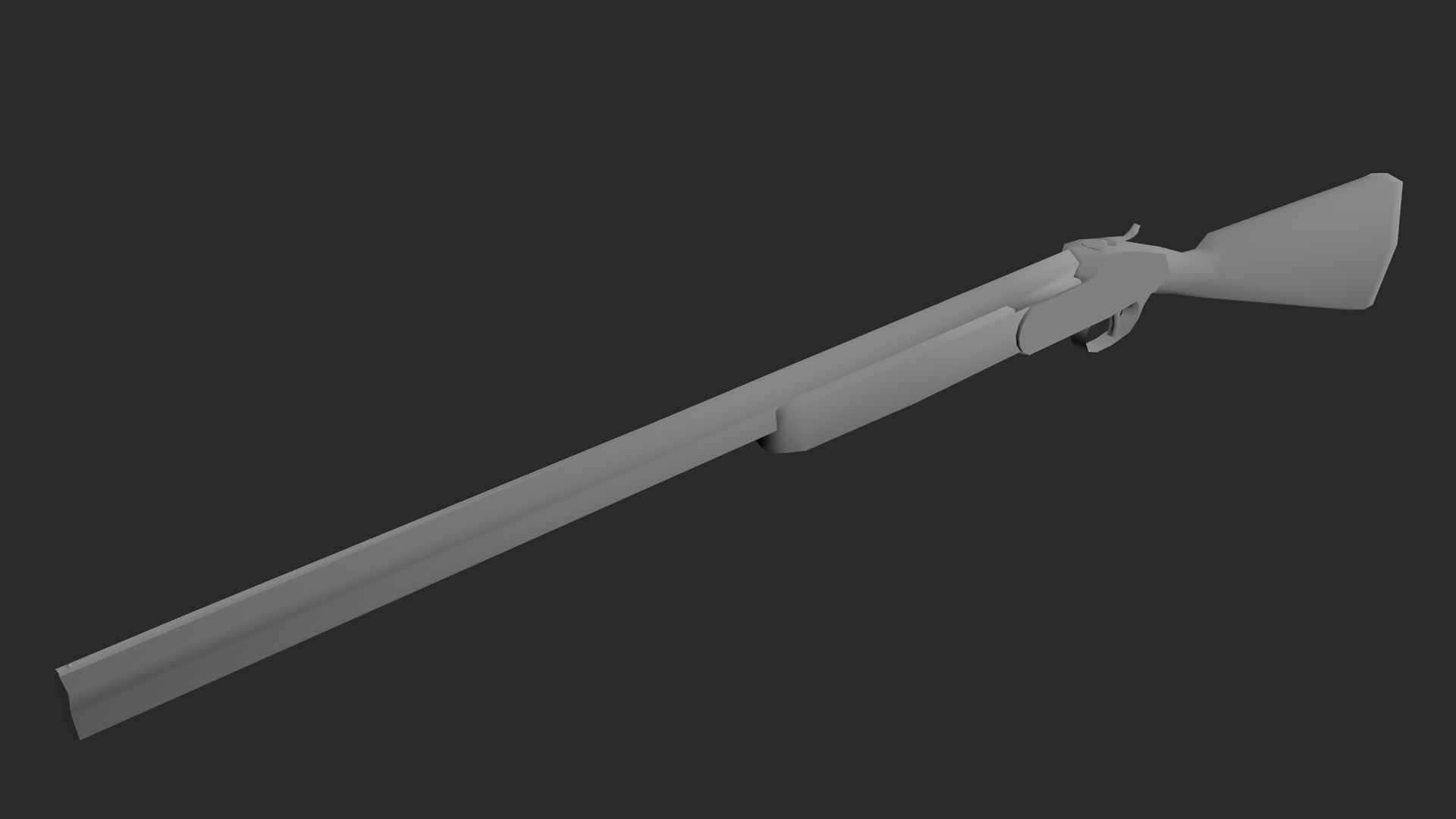
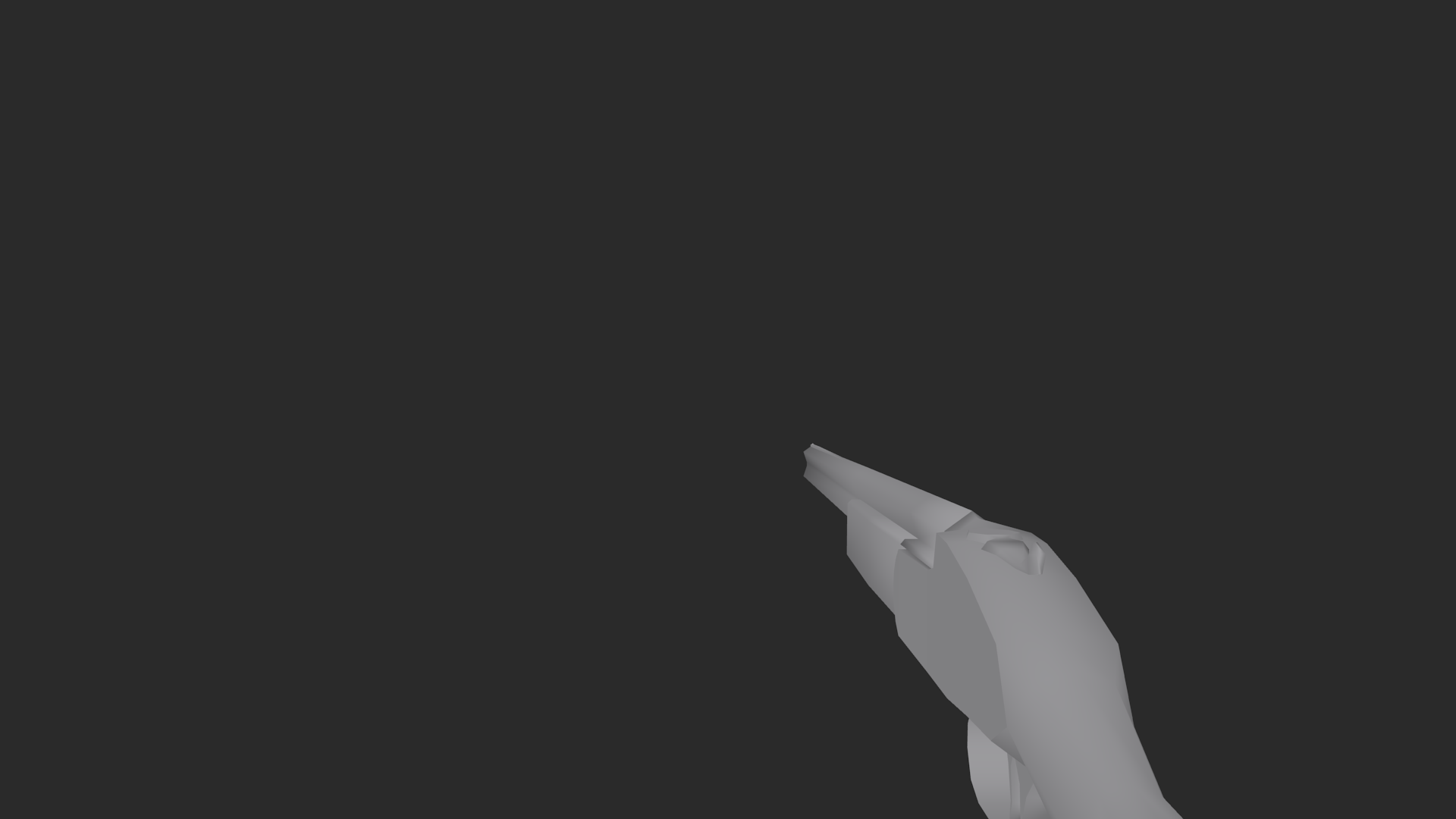
This might be a bit of a stretch for this thread, since I'm not necessarily making them for a game (I'd love to, though and have some vague ideas for a horror-themed adventure with some shooting - so maybe in the future?) and there's sadly no 3D ERA, but I'm trying to make low-poly guns in style of something you would see in a Quake/Q2 era FPP game.
Do you think it might be too detailed for that era? 561 triangles ain't much, but that's more or less how many triangles Quake 2 guns had, hands included.
But then again, I deleted triangles out of view (like Q2 does) and brought it down to 300-something, so maybe I'm just overthinking it and it it's just a design difference of blocky Q2 guns and a sleeker hunting shotgun?
As a bonus, I brought it down to 176 tris for a potential pick-up model. Also would fit Q1 more, but unlike the first one, it doesn't open for reload.
Now UV mapping, texturing and potentially animating - all of which are alien to me since I always did 3D on and off and never got out of modelling stage before dropping it.
Also, hands. Which I tried making and ended up with something I'm not exactly satisfied. :-(
Do you think it might be too detailed for that era? 561 triangles ain't much, but that's more or less how many triangles Quake 2 guns had, hands included.
But then again, I deleted triangles out of view (like Q2 does) and brought it down to 300-something, so maybe I'm just overthinking it and it it's just a design difference of blocky Q2 guns and a sleeker hunting shotgun?
As a bonus, I brought it down to 176 tris for a potential pick-up model. Also would fit Q1 more, but unlike the first one, it doesn't open for reload.
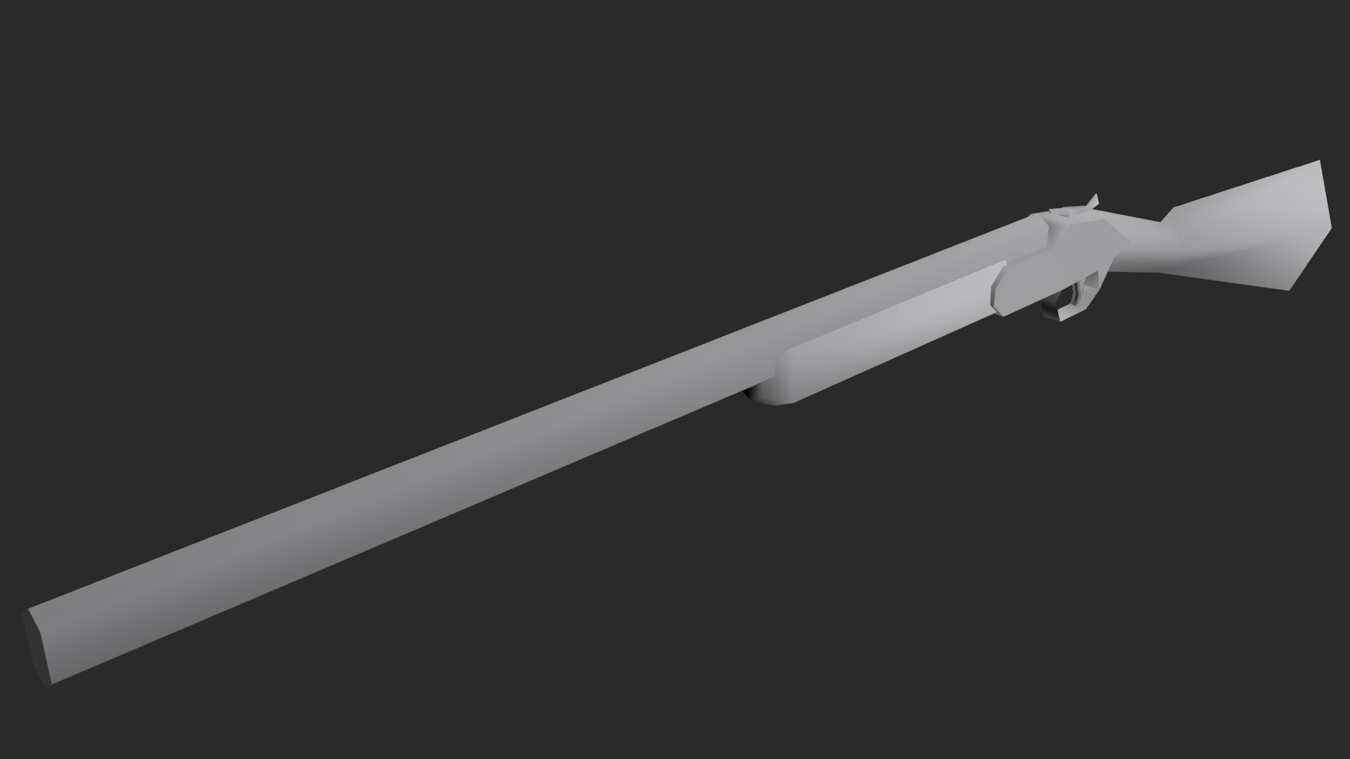
Now UV mapping, texturing and potentially animating - all of which are alien to me since I always did 3D on and off and never got out of modelling stage before dropping it.
Also, hands. Which I tried making and ended up with something I'm not exactly satisfied. :-(
This might be a bit of a stretch for this thread, since I'm not necessarily making them for a game (I'd love to, though and have some vague ideas for a horror-themed adventure with some shooting - so maybe in the future?) and there's sadly no 3D ERA, but I'm trying to make low-poly guns in style of something you would see in a Quake/Q2 era FPP game.
Do you think it might be too detailed for that era? 561 triangles ain't much, but that's more or less how many triangles Quake 2 guns had, hands included.
But then again, I deleted triangles out of view (like Q2 does) and brought it down to 300-something, so maybe I'm just overthinking it and it it's just a design difference of blocky Q2 guns and a sleeker hunting shotgun?
As a bonus, I brought it down to 176 tris for a potential pick-up model. Also would fit Q1 more, but unlike the first one, it doesn't open for reload.
Now UV mapping, texturing and potentially animating - all of which are alien to me since I always did 3D on and off and never got out of modelling stage before dropping it.
Also, hands. Which I tried making and ended up with something I'm not exactly satisfied. :-(
I think what makes it look high-poly is the shading and lack of textures. IIRC, Quake used flat shading rather than interpolated, and adding pixellated textures like the ones of that era will make it look more lo-fi. So once you have those in place it should look a lot more "era-authentic".
Havent posted in awhile. So I was able to get 3Ds Max for free for 3 years under a student trial. Seems much better to use than Blender, from the little ive tried so far. Checking to see if Autodesk offers similar trials with Maya and Photoshop now.
EDIT: Looks like they are all available for 3 year student trials!
Ive been going through some tutorials just to learn the program. Going to start with something simple, like a gun, then im going to work on my character.
Still cant figure out how to create different clothes/armor for characters. I cant even tell what to call them when searching for info lol. Aside from mods for Fallout 4/Skyrim, I cant find any guides or tutorials online for creating new armor sets. Anyone here know what they are called to help me search, or know of any good tutorials?
And finally, can I color my Models in 3Ds Max (or Maya), or do I have to do those weird flat 2d color layouts in Photoshop? Even if its super basic, is there any way to color a model without photoshop?
I'm looking for feedback about the level design of my humble game:
It is a quite simple platformer with 3 levels + 1 hiden. Still have loads of work to do though. This version has no music and has some animation bugs that I'm working on. Here are some images:


Link to the game: https://nonamefornow.itch.io/taodrp
Any feedback at all will be greatly appreciated.
Thank you very much! :)
It is a quite simple platformer with 3 levels + 1 hiden. Still have loads of work to do though. This version has no music and has some animation bugs that I'm working on. Here are some images:
Link to the game: https://nonamefornow.itch.io/taodrp
Any feedback at all will be greatly appreciated.
Thank you very much! :)
<3
I can't download the game at work for obvious reasons so I can't say too much, but I'm curious as to what kind of gameplay it has besides being a platformer. I assume jumping but I can't read much else from the levels in the images.I'm looking for feedback about the level design of my humble game:
Link to the game: https://nonamefornow.itch.io/taodrp
Any feedback at all will be greatly appreciated.
Thank you very much! :)
I can't download the game at work for obvious reasons so I can't say too much, but I'm curious as to what kind of gameplay it has besides being a platformer. I assume jumping but I can't read much else from the levels in the images.
Well, for now is jumping and timing. The only power up in the game ( for now) is the double jump on level 3. As one progresses, there will be more pw ( two are already implemented but there are no levels yet). The idea is challanging the player using his abilities through the level. If he choses not to collect the treasure, it' s quite easy, but if he are willing to collect everything, the path will be difficult.
Yesterday I started working on a new ability for MindSeize. Pretty hyped about this one but lots of work still left.

And finally, can I color my Models in 3Ds Max (or Maya), or do I have to do those weird flat 2d color layouts in Photoshop? Even if its super basic, is there any way to color a model without photoshop?
Pretty sure you have to make the layouts at least. There are tools for painting directly on models, like Substance Painter (Not sure if Max/Maya have anything built-in, but Blender has a few basic brushes at least), but they require the mesh to be unwrapped beforehand. Automatic unwrapping just isn't up to snuff and will have a lot of stretches etc unless you at least give it some seams.
Last edited:
Pretty sure you have to make the layouts at least. There are tools for painting directly on models, like Substance Painter (Not sure if Max/Maya have anything built-in, but Blender has a few basic brushes at least), but they require the mesh to be unwrapped beforehand. Automatic unwrapping just isn't up to snuff and will have a lot of stretches etc unless you at least give it some seams.
Ok, thank you. I noticed you can color things in 3Ds Max and Maya, but it's pretty simplistic. I'll figure out how to do the layouts once I have a model complete.
I'm trying to figure out how to model custom armor pieces, or gear (helmets, boots, chest pieces), but I don't know what they are called. What are they referred too so I can search for guides online? I've seen them called custom meshes, but when I search I only find examples for Fallout 4, or chain link fences lol.
Should be done by the weekend porting my old phone game to pc added way to much more then i should had, but hidden some game cartridge's to unlock a new skin
ps think twitter being funny https://twitter.com/Jump_Button/status/1013105635863547904
ps think twitter being funny https://twitter.com/Jump_Button/status/1013105635863547904
I can't download the game at work for obvious reasons so I can't say too much, but I'm curious as to what kind of gameplay it has besides being a platformer. I assume jumping but I can't read much else from the levels in the images.
I will add this image here too to show a bit more what it has for now:

So:
1) doors activated by buttons (like in prince of Persia)
2) doors activated by levers
3) moving platforms,
4) spikey platforms
5) piranhas
6) underwater gameplay
7) treasures to collect
It is a very simple, standard platformer for now, actually. I have way to much things to learn about game development.
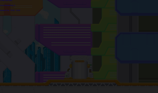
Been working on a world map for single-zone practice, this is fun so far:
Definitely hard to get a sense of the nodes from footage like that:

Definitely hard to get a sense of the nodes from footage like that:
Last edited:
Sounds like you have a solid baseline for a platformer at least. I like that you have focused on challenging the player through the available abilities, that sounds right to me at least. While I still haven't seen the actual game, I work too much, what I'd strive for is making levels that the player more or less easily can "read", as in that the level layout indirectly tells the player what to do and how to do it. Platformers can be seen as a sort of puzzle game, and I personally prefer if there's a hint of a hint so to speak on how to solve it, you know? :) How this can be done is up to you, depending on what kind of gameplay and style you're going for.Well, for now is jumping and timing. The only power up in the game ( for now) is the double jump on level 3. As one progresses, there will be more pw ( two are already implemented but there are no levels yet). The idea is challanging the player using his abilities through the level. If he choses not to collect the treasure, it' s quite easy, but if he are willing to collect everything, the path will be difficult.
Am I understanding you correctly that all these features are already implemented and functional? If so, then your foundation is even stronger, albeit concerned with basic genre tropes. Depending on your goal with the game, I'd consider trying to add something unique to the formula, beyond story and artstyle. I like gameplay, I assume you do too :)I will add this image here too to show a bit more what it has for now:
So:
1) doors activated by buttons (like in prince of Persia)
2) doors activated by levers
3) moving platforms,
4) spikey platforms
5) piranhas
6) underwater gameplay
7) treasures to collect
It is a very simple, standard platformer for now, actually. I have way to much things to learn about game development.
Sounds like you have a solid baseline for a platformer at least. I like that you have focused on challenging the player through the available abilities, that sounds right to me at least. While I still haven't seen the actual game, I work too much, what I'd strive for is making levels that the player more or less easily can "read", as in that the level layout indirectly tells the player what to do and how to do it. Platformers can be seen as a sort of puzzle game, and I personally prefer if there's a hint of a hint so to speak on how to solve it, you know? :) How this can be done is up to you, depending on what kind of gameplay and style you're going for.
Am I understanding you correctly that all these features are already implemented and functional? If so, then your foundation is even stronger, albeit concerned with basic genre tropes. Depending on your goal with the game, I'd consider trying to add something unique to the formula, beyond story and artstyle. I like gameplay, I assume you do too :)
Thank you very much for your post. I'll consider what you have pointed out when I start working on new levels :)
And yes, you did understand correctly. The 4 stages on the demo have all these features. There are more things which are implemented but aren't in the game yet. I'm considering something unique, though I worry to lose my focus.
I think a lot of decisions going forward need to take your goals into consideration. To be frank, you currently have a pretty standard platformer, from a content perspective, you are probably more than aware of this fact. But I sense that you're only doing this to learn the craft right now, not to make a million dollars :) So it's unfair of me to suggest you revamp your entire design document, you know? It's pretty much always a better idea to complete a game project, even if the end result is smaller in scope than you initially wanted it to be, than to leave it unfinished (says I who is creeping ever closer to three years on a multiplayer game as a hobby). So yes, loss of focus is an issue and a high risk, so weigh your current goals carefully :)Thank you very much for your post. I'll consider what you have pointed out when I start working on new levels :)
And yes, you did understand correctly. The 4 stages on the demo have all these features. There are more things which are implemented but aren't in the game yet. I'm considering something unique, though I worry to lose my focus.
I think a lot of decisions going forward need to take your goals into consideration. To be frank, you currently have a pretty standard platformer, from a content perspective, you are probably more than aware of this fact. But I sense that you're only doing this to learn the craft right now, not to make a million dollars :) So it's unfair of me to suggest you revamp your entire design document, you know? It's pretty much always a better idea to complete a game project, even if the end result is smaller in scope than you initially wanted it to be, than to leave it unfinished (says I who is creeping ever closer to three years on a multiplayer game as a hobby). So yes, loss of focus is an issue and a high risk, so weigh your current goals carefully :)
I'm still learning so it is is more about the crafting than making milions (though it would be great to make milions lol).
I will keep my plan and finish it. Thanks again for your input! :)
as someone who will be unemployed in 3 months and 15 minutes, I fully agree haha :D Good luck and feel free to ask more questions, to me and others :)I'm still learning so it is is more about the crafting than making milions (though it would be great to make milions lol).
I will keep my plan and finish it. Thanks again for your input! :)
- Status
- Not open for further replies.