It's a pretty short article, but the gist is that the main designer of Neue Haas Unica has started compiling type specimens of all sorts of classic video games. He finds them really interesting, as they were often hamstrung by technical limitations and were created by artists without any type training And yet, there's a huge range of styles and personal touches, with some opting to go for stylized letters, and others going for things like gradients.
He's putting together a book that'll compile all his research, and I'm definitely looking forward to reading it. He also did a presentation on the subject at this year's Typographics, but it seems that archived footage only gets uploaded a year after the event.
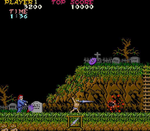
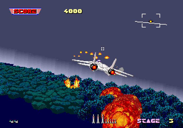
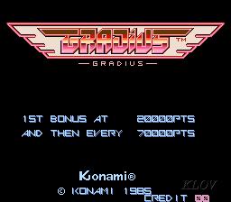
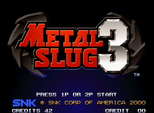
Before the industry changed to high definition graphics in 2004, early game designers had to confine each letter within an 8 x 8 pixel grid, leaving one of those pixels for spacing. Letters had to be legible and light, conserving as much memory as possible for the graphics. Most fonts were made by graphic artists or programmers who hadn't been exposed to the rigorous, technical rules of type design.
What emerged is a canon of ingenious, "wonderfully terrible" solutions, as Omagari puts it. "They were doing whatever they pleased and that's why they're beautiful."
He's putting together a book that'll compile all his research, and I'm definitely looking forward to reading it. He also did a presentation on the subject at this year's Typographics, but it seems that archived footage only gets uploaded a year after the event.