• Ever wanted an RSS feed of all your favorite gaming news sites? Go check out our new Gaming Headlines feed! Read more about it here.
  • We have made minor adjustments to how the search bar works on ResetEra. You can read about the changes here.

Omar310

Member
Oct 27, 2017
1,704
UK
So I don't know if this is weird or not, but man, I LOVE it when alternate/reversible covers still have the system branding and such on them (mostly just the system branding, and preferrably the rating wouldn't be there, but it's not a big deal). I kind of never use reversible covers when they're just art without the system logo/banner - it always just looks really odd to me when placed with my other games.
Holy shit, this. For NieR Automata and FFXV, I ended keeping the original meh cover because of the visual consistency with my other boxes. Really disappointing but I think most people are fine with it so we're probably in the minority here.
Anime ones (save for Atlas games) will never be good. This is just a fact of life.
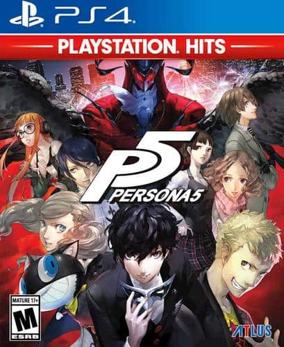
Meet me in the car park for a knife fight.
OP, I sincerely hope that avatar is ironic or something cus if it isn't... Boy.
That's that early 2000s MSN messenger avatar shit. Either that or pictures of Bugs Bunny or Taz tatted up, holding a glock.
 

D.Lo

Member
Oct 25, 2017
4,348
Sydney
ITT:
People posting good box art without stating why.

870950-resident_evil_4_box_pal.jpg


Omnious enough to capture the feel of the game, stylish and simple enough to be good looking in its own right, striking enough to be marketable.

Breath of the Wild ticks the same boxes, but rather than ominous it's something like "A promise of adventure"
This is possibly #1 of all time. So good. Japanese/US ones are disgusting too.

lNKry8a.jpg


Two tone background, and just busy enough embossed imagery, with representative logo and good typeset. It actually looks more like a cover for 90's desktop publishing software more than anything.
This is the most horrible 90s mess...

Please don't mistake "this is my favorite game" / "this is one of my favorite games with ok-ish boxart" for "games with good boxart."

A lot of the busy anime ones are really ugly.

Rime, Gravity Rush, Xenoblade are all nice.
That's how these things always go.
 
Last edited:

Spamlynguist

Member
Oct 27, 2017
1,271
I really like the design they used with the Game of the Year Edition, so much better than the original box-art.
9200000048737719.jpg
 
Oct 25, 2017
4,127
London, UK
I simply don't understand people caring so much about box art.

Yeah it's nicer to have good box art but in the end you open the box and put the disc in. That's the interaction with the box. That's it.

Why so much angst about it?
 

Deleted member 11008

User requested account closure
Avenger
Oct 27, 2017
6,627
55323-Dragon_Quest_III_-_Soshite_Densetsu_e..._(Japan)_(Rev_B)-1.jpg

I like a lot Dragon Quest covers, and certainly the original cover for DQ III for the Famicom is too good. But I think the PS2 cover for the DQ V is the best.

151603-Dragon_Quest_V_-_Tenkuu_no_Hanayome_(Japan)-1.jpg


God bless Toriyama art.
 

samred

Amico fun conversationalist
Member
Nov 4, 2017
2,590
Seattle, WA
how quickly this devolved from "good box art" to "my personal favorite."

I will say, it's interesting to look at older console games' variations between regions, due as much to cultural variances as to orientation differences. Mischief Makers / Yuke Yuke Trouble Makers is my go-to example.

JPN:

USA:


The American one is... cartoony, Anime-ey. Maybe it has '90s "attitude"? I can't say for sure. But it's certainly unclear as to either what's going to happen or why you should strap in. The Japanese one, on the other hand, does two big things: it establishes a huge variety of characters, and it shows the one smiling character holding the rest--thus emphasizing the idea that you'll take control of this plucky young girl who, indeed, picks stuff up as her power in the game.

So when we talk about "good" box art, those are the kinds of elements we're looking for: something that specifically teases and sells the interactive fun/drama/action within, and makes those elements instantly and immediately clear and attractive. In this game's case, clear, white, and stark makes more sense.
 

MrWindUpBird

Banned
Oct 28, 2017
3,686
Because I'm on a 6th-gen kick, here are a few obscure, Japan-exclusive PS2 box arts that are beautiful because they evoke a scene:

15284_front.jpg


91407_front.jpg


43804_front.jpg


je1a8Z0.jpg


82919_front.jpg


42407_front.jpg


And one that was localized for good measure:

84001_front.jpg


They all portray the characters or situations blending into an active scene instead of having them float mindlessly in thin air. The background is interactive rather than passive. For me that's what differentiates a good box art from a bad one.

Personally I never liked box art that features floating faces or simple-colored backgrounds. The art should be cohesive, not jarring...like a painting.
What is that NIS one? I can't tell if it's for Disgaea or La Pucelle Tactics.
 

VinylCassette64

The Fallen
Oct 26, 2017
2,442
Rayman_Origins_Box_Art.jpg


The Rayman Origins boxart is standout for how it packs together the various enemies/bosses of the game into one corner of the screen in a way that makes it colorful and varied, without also looking random or incomprehensible. It also serves great contrast against the rest of the covers, which has the protagonists in an otherwise empty space and with basic soft colors. It's practically oozing with personality, much like the game itself.
 
OP
OP
Metanoia Prime
Oct 26, 2017
4,163
California
Rayman_Origins_Box_Art.jpg


The Rayman Origins boxart is standout for how it packs together the various enemies/bosses of the game into one corner of the screen in a way that makes it colorful and varied, without also looking random or incomprehensible. It also serves great contrast against the rest of the covers, which has the protagonists in an otherwise empty space and with basic soft colors. It's practically oozing with personality, much like the game itself.
This looks nice, digging it.
 

MrWindUpBird

Banned
Oct 28, 2017
3,686
None of the above, actually!

This game:

42407_front.jpg

42407_back.jpg


...is called Tenshi no Present: Marl Oukoku Monogatari (Angel's Present: A Marl Kingdom Story).

It's part of the Marl Kingdom series, AKA the series that started with Rhapsody: A Musical Adventure (the only game localized into English). There was a sequel to Rhapsody that released for the PS1, and this is the 3rd game and conclusion of the franchise.

It's an amazingly fun and heartwarming RPG experience, and one of the hidden gems for the system....but because it was never translated officially (there is a fan translation though!) people just pass it by. So many niche Japanese PS1 and PS2 games just fly under people's radar for some reason.

Basically it's an RPG that's set into six separate chapters featuring heartwarming, emotional stories in the Marl Kingdom world that tie up loose ends. Like one chapter features Cornet from Rhapsody: A Musical Adventure, another chapter is a wistful epilogue to the 2nd game, another chapter takes place thousands of years in the past in the era of the Ancients, another chapter is a finale to the whole series and brings everyone together to say goodbye...it's such a cool little experimental game (it still features lots of music) and it's super charming. It will make you cry!

The entire Rhapsody / Marl Kingdom series has incredible box art.

Here's the box art for Rhapsody: A Musical Adventure:

6726_front.jpg


And second game in the series also has amazing box art!

38757_front.jpg


This too has a fan translation!
Wow, thanks for the detailed break down! I've never had the oppoetunity to play Rhapsody, but I remember the cover art really standing out to me when I was younger. There seems to be three? Artists that worked on Rhapsody so I don't know how is most responsible for the character designs, but I loved the more old school style that Rhapsody and La Pucelle had going for them compared to, say, Disgaea 3-5. I think these just moved up higher on my list of copies to track down sooner rather than later.
 

Deleted member 4037

User requested account closure
Banned
Oct 25, 2017
6,989
5580004_sa.jpg;maxHeight=640;maxWidth=550


Its got everyone represented in a nice arrangement, the art is really good, and its not just one character with his back to you
 

Deleted member 43077

User requested account closure
Banned
May 9, 2018
5,741
Garbage Left/ Good Right:
z4kc84yeb6mz.jpg

Garbage:
86875625.jpg


Good:
god_of_war_ps4_1514806318513.jpg
(its the same image but cropped on the sides)

Garbage:
403626-injustice-2-playstation-4-front-cover.png


Good:
415783-sasas.jpg


essentially if they a) just a face b) a generic dude c) dont show anything about the game, KH for example shows originals characters and disney character so you know what you are getting...Detroit? wtf is that? or b) the same colour pretty much throughout then they are trash.
 

MDSVeritas

Gameplay Programmer, Sony Santa Monica
Verified
Oct 25, 2017
1,028
Been recently playing this and found the cover art very striking

P5677.jpg
 

GenTask

Member
Nov 15, 2017
2,671
Dark Forces (the true story of the final piece of the Death Star plan heist)
Dark_Forces_cover.jpg

Dark Forces II
DarkforcesIIwithmots.jpg

Dark Forces II (first edition)
latest

Mysteries of The Sith (that time Mara Jade got a vidya game)
MOTS_box.jpg

No One Lives Forever
NOLF_PC.jpg

System Shock 2
System-Shock-2-Orriginal-big-box-art.jpg

Shadows of The Empire (N64)
13508-star-wars-shadows-of-the-empire-nintendo-64-front-cover.jpg

Shadows of The Empire (PC)
5638165200_52f8cfb834_b.jpg

The Secret of Monkey Island
87592-the-secret-of-monkey-island-dos-front-cover.jpg

Duke Nukem 3D
DukeNukem3D.jpg

Indiana Jones and The Fate of Atlantis (the better Indy 4)
26971-indiana-jones-and-the-fate-of-atlantis-dos-front-cover.jpg

I like all of these since the artwork is so fantastic; Duke riffing on Evil Dead, early SW games with crisp cgi-like art, monkey island that looks like a book cover, etc.) The Indy one in particular is my fav in the style of a movie poster.
 
Last edited:

Harlequin

Banned
Oct 27, 2017
1,614
Heavy Rain (EU)

csqljxG.png


It perfectly captures the mood of the game, it's relatively simple/not too busy and it makes you want to know more about the game because it has a certain air of mystery and intrigue to it. Not to mention it just looks very nice aesthetically.