• Ever wanted an RSS feed of all your favorite gaming news sites? Go check out our new Gaming Headlines feed! Read more about it here.
  • We have made minor adjustments to how the search bar works on ResetEra. You can read about the changes here.

WesleyShark

Member
Oct 25, 2017
1,589
Pittsburgh, Pennsylvania
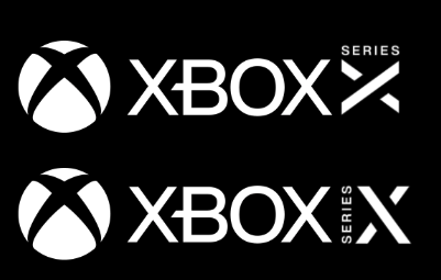
I like it. All Sony did was change a 4 to a 5, so it's not like either company is going out of their way to make super fancy logos.

Aside from that, makes sense to have a new and specific Series X logo, given the potential release of a Series S, and whatever subsequent consoles down the road that will follow.
 

Gay Bowser

Member
Oct 30, 2017
17,708
But...why not have this on the actual console instead of the regular logo ?

Because this isn't replacing the Xbox orb symbol, and we still don't even know in what context this new lockup is going to be used.

Given that the console was already revealed with one logo, it seems likely that this is going to be an ancillary logo for contexts where the "regular" lockup isn't appropriate (such as a small symbol designating compatibility on the boxart banner).

People who are just smooshing this logo up against the Xbox orb/logotype are missing the point, IMO.
 

The Bear

Forest Animal
Moderator
Oct 25, 2017
4,198
I'm interested about how they will brand the physical game packs - if there will be a series x and series s that can play the same games, how will the physical games show this? If Series S doesn't have disc drive, I assume just having Series X on the physical packs makes sense, but if series S does have a disc drive, I wonder how it will work.

The logo itself is pretty bland, but not bad.
 

Allice

Member
Oct 9, 2018
150
Quick, someone bring out those Instagram like counters !!!

I'm not feeling it if this is the final design, though it may grow on me.
 

slsk

Member
Oct 27, 2017
247
Classic Microsoft sticking with the DOS backslash \ instead of using the slash / like everyone else.
 

Edge

A King's Landing
Banned
Oct 25, 2017
21,012
Celle, Germany
Do people really think this logo is as bad/confusing as this legendary misfire (which was retired/replaced)

1185261-ps3_logo.png


giphy-downsized-large.gif


That logo was awesome.
 

Luke88

One Winged Slayer
Member
Dec 29, 2018
2,560
Italy
Because this isn't replacing the Xbox orb symbol, and we still don't even know in what context this new lockup is going to be used.
I think this kind of messaging has to be as straight-forward as possible, it's the name of the console we're talking about, I'm not against updating logos, but if you do so you gotta do it all the way, look at the Switch, big ass logo both on the dock and the back of the console with NINTENDO SWITCH written in bold, it does have Nintendo's company logo but it's in a corner in the back, probably for legal purposes, having an official Series X logo not showcased on the device feels kinda weird, but again, maybe the design for the console isn't finalized, printing a logo on it should be the easiest thing
 

Navid

Member
Oct 26, 2017
2,021
Last edited:

Trup1aya

Literally a train safety expert
Member
Oct 25, 2017
21,374
Looks like a brand... as in a brand you'd stamp on livestock.

Which makes sense for quick, easily distinguishing between multiple series of product.

I don't love or hate it, but it seems highly functional.
 

Big Boy

Member
Oct 25, 2017
2,905
It does look very gamer-ish. Like the sort of logo you see on pc parts targeted at gamers. Which along with the box design, appears to be what they are going for
 

big_z

Member
Nov 2, 2017
7,797
Looks fine and it works well for the tiny logo you stick at the bottom of trailers and commercials.
 

eXistor

Member
Oct 27, 2017
12,304
I came here thinking it's gonna be a typically modern boring, minimalist logo. Well, that's exactly what it is, because of course it is.
 

vestan

#REFANTAZIO SWEEP
Member
Dec 28, 2017
24,636
We're so starved for info that a logo is making the rounds...

7mdCeV2.png


May can't come soon enough.
 

Damn Silly

Member
Oct 25, 2017
7,194
It's fine. Boring but functional, like Insomniac re-design not long ago.

Which is why a few acting like it shat on their grandmother is a little weird.
 

lucionm

Member
Jan 10, 2018
182
The name is even worse than the logo.

The phonetic and "symbolic" appeal of the letter X has already been overused and only has an opposite effect at this point. Almost everything these days with "X" in the logo sounds like a caricature attempt to look futuristic.

Having a different tower design, they really missed the chance to link an original name to the prefix "XBOX".
 

EJS

The Fallen
The Fallen
Oct 31, 2017
9,196
Looks fine to me. Also, even if I hated it, it would not affect my purchase.
 

Issen

Member
Nov 12, 2017
6,820
Logo looks great, but I'm in love with the Xbox Velocity Architecture logo in particular.