People are mistaking boring and simple with worst.
These are boring or simple.
These are worst
These are boring or simple.


These are worst
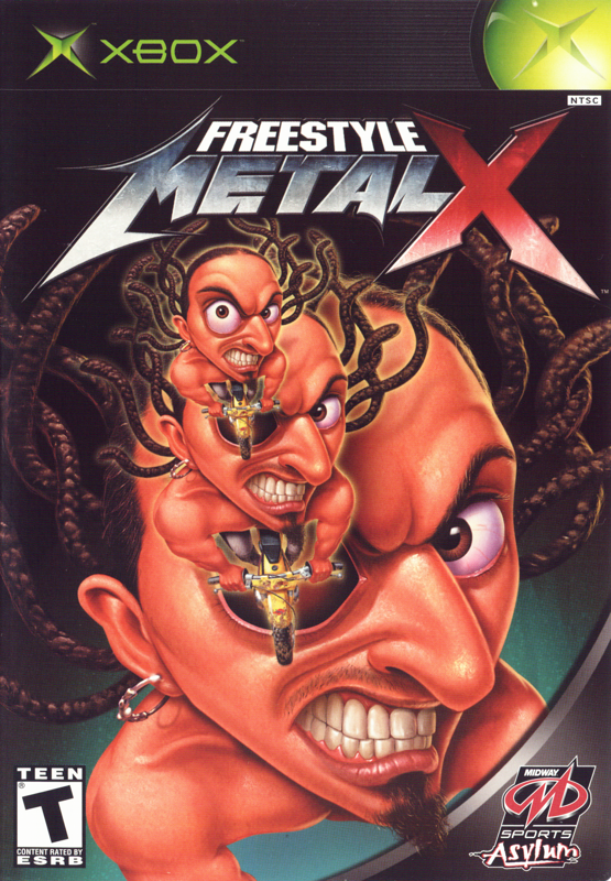
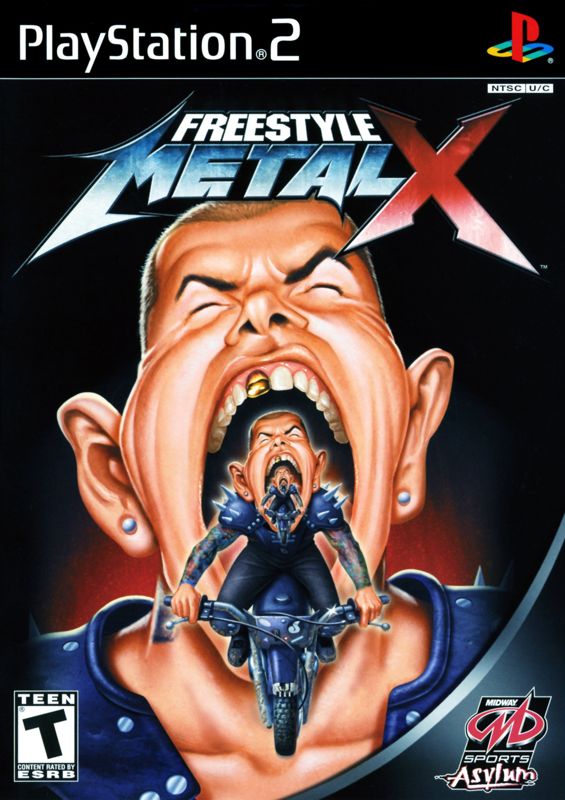
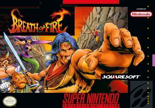
The issue is not them trying to make it look realistic instead of anime. It's just badly drawn. Like the person that did it did not know how to draw at all. It looks like fan art you used to see in 90's gaming magazine with bad proportions and all.

But look at megaman body. Its horrendousI disagree.
Whoever did that American Megaman cover had SOME artistic ability. Look past shitty gun holding Megaman to the castle in the background and the explosions as well as the palm trees...
There's some technique in the coloring (either colored pencil or watercolor) going on. Also look at Megaman's face. There's principles of proper shading and lighting being applied. There's plenty of evidence that whoever did the horrid American box art had artistic skill above the level of what I expect out of someone that doesn't know how to draw.
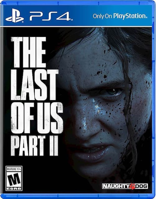
Last of US looks horrible :^S, i think they were going to change that one at least
This one isn't too bad because there aren't many yellow covers i like that
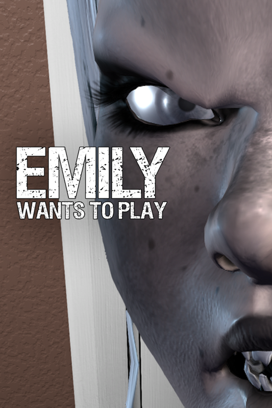
This one is just scary D:
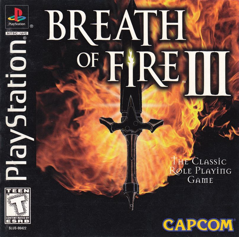
I love the story behind that cover.
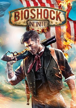
Its funny but I love almost of these. Reminds me of movie covers which most of the games basically are. I do hate DS and Bio tho

This is killing me. Where have I seen this before?
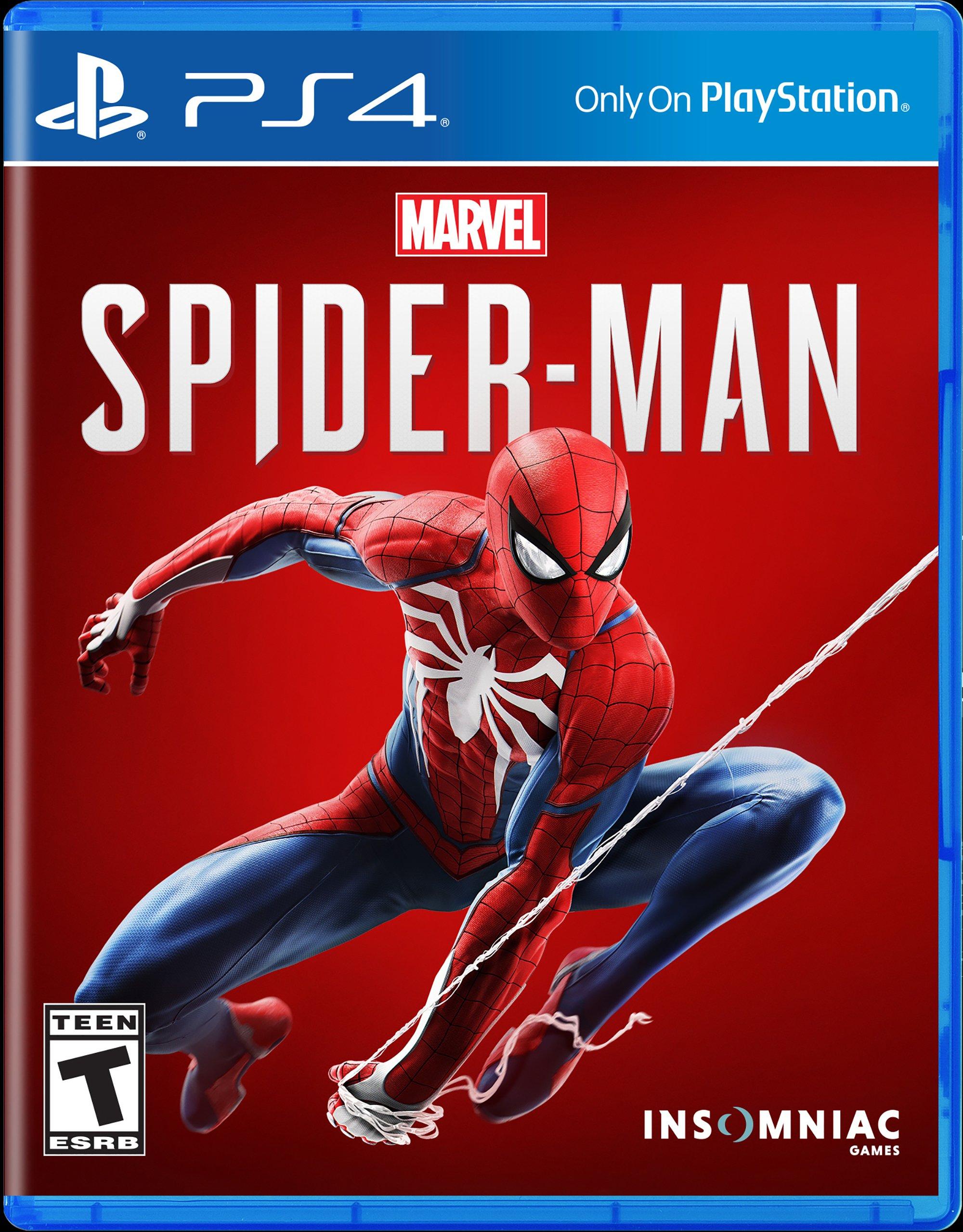
No, because every main character isn't Spiderman.Couldn't you argue that for every game then? Every box art should be a blank background with the main character?

Tony Hawk?
I love this so much that I would hang it on my wall.People keep shitting on Spider-Mans cover, so is this a bad cover also?

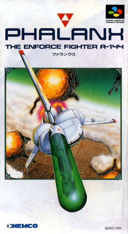
I'm green with envy.So I decided to run my monthly search on Phalanx to see if people were complaining about the American Cover Art for again, and lo and behold I find this thread.
So here's everyone's monthly reminder that the Japanese cover art for Phalanx is literally a Flying Space Penis.
It's a 90's Shmup, a category of games infamous for being filled to the brim with sexual innuendo. The name combined with the ship design betrays any attempt at plausible deniability. Phalanx, Phallus.
The "official" story about it being changed to stand out was Face-Saving PR Fluff. It was changed because there was no way in hell Nintendo of America was letting that get on store shelves with Nintendo's branding on it.
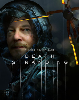
I think its cover is what pushed me over the edge to buy it lol.I'm half convinced Death Stranding underperformed mainly because of its cover. It's absolutely fucking awful.


Come to think of it, outside of the text, this one's surprisingly in line with contemporary cover design.
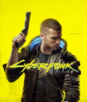
came here to post this. How did they take something so stylish as cyberpunk and turned it into a cover with a generic white guy on yellow background.
I rented the PC-Engine version of this game prior to the US release and loved it (the rental came with the box as well). I was sooooo disappointed with this American cover, but not... really surprised?
They really dropped the ball here. Usually they have nice looking boxarts, at worst some are boring, but these are just bad
That's hardly new. The ST one in particular is deliberately aping the Drew Struzan style of poster very popular from the 70s to 90s.I've never seen someone else complain about the stock "A bunch of characters on the box" thing but I also fucking hate it.
It's like that tired trend in movies and tv where there are so many posters that are just


!
The American Symphony of the Night cover is pretty bad
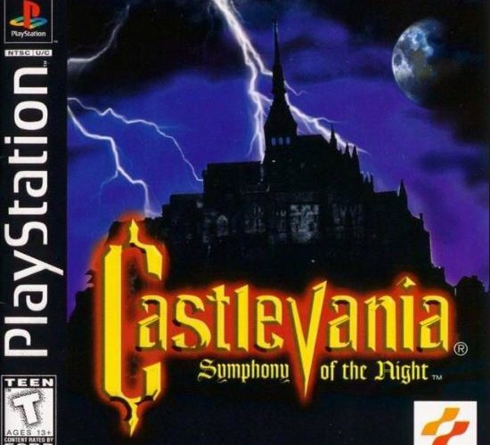
Is that even Dracula's castle? It looks like a stock photo. Why would anyone want to buy this?
Compare that with the Japanese version which got an oil painting by Ayami Kojima.
Wow, it was literally a stock photo. Talk about lazy.Yes, in fact it's mont saint-michel, in france... you also go there in onimusha 3
You know ,i actually like this box art. It gives off that "mysterious and omnimous castle" vibe.The American Symphony of the Night cover is pretty bad
Is that even Dracula's castle? It looks like a stock photo. Why would anyone want to buy this?
Compare that with the Japanese version which got an oil painting by Ayami Kojima.
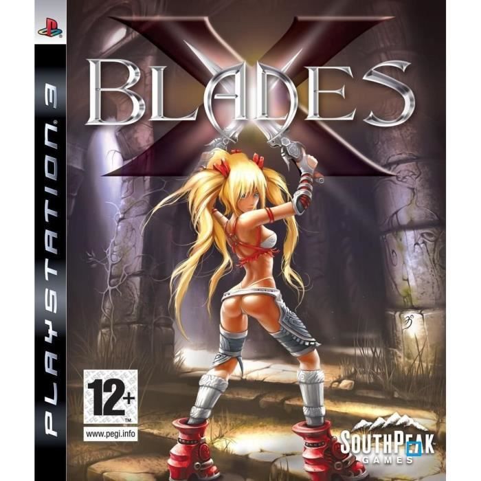
12 age rating? Fuck off.
That cover is both disgustingly creepy and pervy.