I've read the article and agree with both of its premises: first, that fidelity or 'realism' in common modern video game vernacular isn't "real" in the way marketing departments tend to sell, it's a set of aesthetic choices contingent on circumstances in the game design community. Second, Demon's Souls (2009) doesn't adhere to those 'realism' aesthetic cues while the remake does.
The article is a little uneven because it bakes these two premises together, they could and should be differentiated better in the text. I strongly agree with both points once you untangle them.
The Remake is perfectly fine, in some things is more realistic, in others is looks even more "fantasy" than the original. Overall, I'm loving what they did with the areas, they look stunning and feel unique and fresh, imho there's even an improvement compared to the original (Latria is...WOW!)
I will say this: There is a certain feeling of desolation, emptyness and melancholy that comes directly from the limited technical capabilties of old Hardware, wether it´s a conscious artistic choice or not. I also think old PS1 Games often have a certain level of hard-to-replicate creepyness to it when everything that is like 2 meters away fades into complete blackness.
This is something that can basically not be replicated while still looking "graphically impressive" in the modern sense. I don´t think the Problem is that they overdesigned Stuff the way Blizzard does for example (imo) or by going too "high-fantasy", but that any kind of graphical detail diminishes the specific Vibe of old Games.
I also think the atmosphere and aesthetic of the OG Demons Souls is much more obvisouly a product of its technical limits than in SotC for example. Demons Souls feels like FROM were still very much looking for their aesthetic tradmark-style that runs like a very obvious thread from Dark Souls 1 right through to Sekiro.
I've read the article and agree with both of its premises: first, that fidelity or 'realism' in common modern video game vernacular isn't "real" in the way marketing departments tend to sell, it's a set of aesthetic choices contingent on circumstances in the game design community. Second, Demon's Souls (2009) doesn't adhere to those 'realism' aesthetic cues while the remake does.
The article is a little uneven because it bakes these two premises together, they could and should be differentiated better in the text. I strongly agree with both points once you untangle them.
Good post. The article is most certainly sloppy presentation of the ideas but both are valid arguments that are weirdly dismissed in favor of, I don't know, gamer high-fives that a Demon's Souls remake exists now?
You're falsely claiming image quality and art design are one and the same. On top of ignoring that Bluepoint has, in more than one instance on this page even, made significant art design changes. Increasing fidelity can be done without changing designs even if changing designs may make more sense.
Which personally is my problem. The lack of consistency with the changes make some stand out a lot more. Some assets are merely brought into a modern era and some are changed in significant ways.
No I'm not. Increasing image quality requires increasing detail level, which requires some degree of art direction. They clearly tried their best to do what they think the fans of the original would want. It's precisely the issue: what you think the original should look like when enhanced is a matter of personal interpretation for you as well as for them. Even if their own take on it is different to yours, yours doesn't necessarily align either with every single player of the original. The overwhelmingly positive feedback on BP's effort here is proof to me that they did as well as anyone could hope for. Even if it was FromSoft doing the remake some adjustments wouldn't necessarily look as you'd imagined.
To be clear, my personal opinion is they should've given themselves more liberty with it. Romanticizing old games as if they have absolutely 0 flaws, can't be improved upon and must not be changed in any meaningful way is dogmatic and pretty stupid to me.
It's funny you say it seems too "clean" when if you actually look at the original game it wasn't really all that grimy.
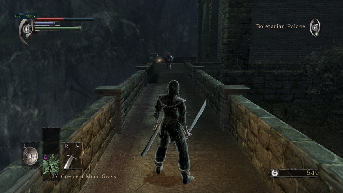
Just for example here is a location that people know well.
Compared to the remake.
In this comparison... the original was actually a lot lot cleaner. There's a little wear on the flooring, the stone looks, well, like stone. But nothing at all that is selling that is grimy or dirty.
Whereas in the remake, not just due to more technical detailing, but a lot has gone in to make it feel more lived in. There's a lot more stuff littered about to indicate that it had one been used by people. But now actually looks more run down, which makes sense considering the world is literally ending.
Not to mention the mausoleum that this path leads to... actually looks like one from the outside now and not just from the inside. Like this is Old King's Doran's place! Why does it look just like anything else in the castle? It wasn't made after everything went to shit.
The PS3/360 gen were notoriously known for having a brown and grey color palette on almost every game that came out. Because back then that's what made games more "realistic." Now that it isn't anymore, we want it back? Lol, I guess we don't need HDR since we don't want color in our games.... 🙄
I honestly don't mind stuff not being faithful to the original, but why is Wander's head so still in the remake? His body is frantically running, so his head should be bobbing with his steps, right?
I do think that it has lost some of its aesthetics, but it's a great remake and a masterpiece game. We don't have to sacrifice art style for realism just because we have crazy powerful consoles and PCs. Some games should be super realistic like TLOU II with some flair and some games should have art style flair like Dark Souls or Shadow of the Colossus.
I get where this article is coming from, but the difference between the SOTC remake and demon's souls is vast.
SOTC felt like a completely different world, it wasn't bad or good it was just a new interpretation that existed separately to the original, I quite liked it but I can see how someone could have the opposite reaction.
demon's souls on the other hand is a largely faithful recreation and pursuit of the original aesthetic goals, yes there are som drastic differences (a few specific enemies largely) but for the most part it's trying to imagine how the world would have felt had it been realized in 2020 the First time around.
I don't think it's perfect, but it's far from the hill but from the drastic departure from fantasy and push towards realism that is being Suggested.
I honestly don't mind stuff not being faithful to the original, but why is Wander's head so still in the remake? His body is frantically running, so his head should be bobbing with his steps, right?
I assume they simply forgot to animate it, just like how his face is always completely blank. His cloth not flapping about as frantically also doesn't help.
I honestly don't mind stuff not being faithful to the original, but why is Wander's head so still in the remake? His body is frantically running, so his head should be bobbing with his steps, right?
I feel like it's impossible to convince people otherwise once they think you're being a contrarian just for holding an unconventional opinon, even after explaining yourself. Is it that hard to accept that there are other perspectives out there or what
Whether you like how it looks or not, WIRED is basically correct. In both SotC and Demon's Souls BluePoint amped up the photoreal factor at the expense of a more fantastical approach. I'm not really a fan of how the original DeSo looks so I don't really mind what BP did one way or another. But SotC is one of my favorite games and I find their changes far more egregious there.
In SotC they got rid of one of the game's signature visual elements because it just wasn't realistic looking, I guess. BP's art team has an aesthetic of their own and they certainly don't care for anyone else's.
This is funny to me since I always though demons souls and the first dark souls looked a little "generic" fantasy when I originally started getting into the games. They both have this sort of muddy brown look to them that always looked kinda shit to me.
The remake definitely does look different than the original but I don't think that's a bad thing. It's made by different people and I think it's fine to allow them a little artistic liberty to design things the way they think they should.
I for one absolutely love the remake (as well as the original) and while there are a few nitpicks I have here and there I am constantly just blown away by the remake.
I honestly don't mind stuff not being faithful to the original, but why is Wander's head so still in the remake? His body is frantically running, so his head should be bobbing with his steps, right?
People seem to just ignore the intricacies of animation like this. Its there in Demon's Souls too. Even if the game feels the same to play, the visual feedback of some attacks are no longer there because they refused to overexaggerate some of the "push and pull" in the animations when they remade them.
Its the same exact problem people have with MK animations compared to other FGs.
It's especially absurd when the opening line of the game is about the fog that has that's swept into this kingdom. Your character is explicitly summoned to venture into that fog, remove the demon responsible, and lift the fog blanketing the kingdom. It's at the heart of the entire game and it's lore, and people are treating it as technical glitch.
Actually it's a lie. Those were all made by the same concept artist. It shows not "generic" design, but the exact opposite- a team of artists with a well-defined style they carry through a bunch of related games.
I think the core of this argument is pretty sound. Demons souls looks gorgeous but they're right that art direction takes a hit. Strip Demons down to just the environment, plop Nathan Drake in there and you'd be forgiven for thinking you're looking at an Uncharted game. Like the article says, twisting vines and overgrowth and rubble all add detail but when every game has that same detail it loses something. The piss filter comments are ridiculous though.
Some of the designs in the original game are so awful. Some models are practically lifted from other games, the glowing eyes and filter look awful. I don't agree with all of the changes, but the idea that the game lost something core to it's identity is silly.
It's funny you say it seems too "clean" when if you actually look at the original game it wasn't really all that grimy.
Just for example here is a location that people know well.
Compared to the remake.
In this comparison... the original was actually a lot lot cleaner. There's a little wear on the flooring, the stone looks, well, like stone. But nothing at all that is selling that is grimy or dirty.
Whereas in the remake, not just due to more technical detailing, but a lot has gone in to make it feel more lived in. There's a lot more stuff littered about to indicate that it had one been used by people. But now actually looks more run down, which makes sense considering the world is literally ending.
Not to mention the mausoleum that this path leads to... actually looks like one from the outside now and not just from the inside. Like this is Old King's Doran's place! Why does it look just like anything else in the castle? It wasn't made after everything went to shit.
In this example you definitely have a point. i mean the general aesthetic of the enemies and bosses, at times i feel like playing a Dragons Age game. for sure Fromsoft wanted to evoke some western RPG flair anyways with the game but i feel that the, lets call it "hazy feverdream" style of the original is completely gone in the remake.
sometimes the somewhat cruder graphics of yesteryear leave more room for own interpretations, thats not a Demon´s Souls remake problem, that is with most of modern gaming. back in the days the games had graphics that were not really good but the player filled it with their own interpretations or imaginations, nowadays all is detailed, looks super clean and because of that there is not much space left for own imaginations. sometimes this is good, sometimes it is not so good.
What big budget 2020 games does it look like? I think it's fair that some people legitimately don't like what's been done with the remake, but so many of the arguments as to why come across as reaching.
The game looks good, but its tantamount to artistic murder when compared to the original. It goes beyond fidelity and "lol 2008 game", the overall mood, aesthetic and type of architecture is flat out different and frankly shows a flat out fundamental misunderstanding of the material. Bluepoint artists and designers have shat the bed on two classic games in a row now.
The game looks good, but its tantamount to artistic murder when compared to the original. It goes beyond fidelity and "lol 2008 game", the overall mood, aesthetic and type of architecture is flat out different and frankly shows a flat out fundamental misunderstanding of the material. Bluepoint artists and designers have shat the bed on two classic games in a row now.
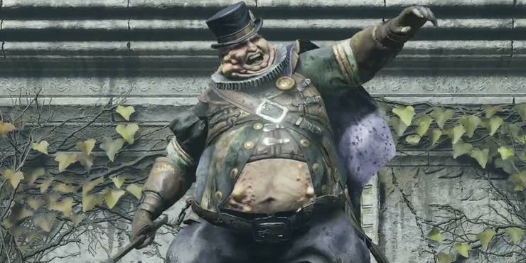
The new model even has buboes all over the body, which conveys their 'beubonic plague' theme (which was the reason for the black faces in the original version) much better IMO. And I'd even argue that the new take on their "fat, corrupt official" aspect contrasts much more with all the mangly half dead human enemies around them and is an actual improvement. It reminds me of how rich city folks (often city officials as well) in medieval times would often gorge so so much on food during festivities to the point they had to throw up... and then just kept going because they could afford it and it showed off their wealth and status. While plenty of common folk were underfed or starving. They look grotesque, but it fits with Boletaria being a corrupted and plague ridden kingdom that is currently collapsing and is already doomed and past the point at which it could be saved. And the new fat officials are still plenty jolly too, something not apparent in the above image.
The only thing that I consider to be a downgrade with the design is the smaller top hats. The old ones are just classy.
Now Satsuki is an actual downgrade (and it should be patched, IMO) and you can argue whether or not the soundtrack is an improvement, but otherwise the Remake is just fantastic, even from an artistic perspective. I mean you just have to compare the old versus new Nexus or the insane effort that went into Latria.
I've never heard one lick of praise of the visual masterpiece of the original Demon Souls, until they remake it... all the sudden it is such a master class in art it should not dare be touched. The Original Demon Souls always looked absolutely poor, even for its time... some very interesting art direction choices, but its execution was never flawless. Apologies.
I've never heard one lick of praise of the visual masterpiece of the original Demon Souls, until they remake it... all the sudden it is such a master class in art it should not dare be touched. The Original Demon Souls always looked absolutely poor, even for its time... some very interesting art direction choices, but its execution was never flawless. Apologies.
THANK YOU! I felt like I had taken crazy pills reading some of the responses in this thread. The only thing that looks a little off to me, is the UI. Aside from that, they did a great job. This article is reaching for a lot.
IMO Bluepoint is so laser focused on technical perfection that most of the times they value it over artistic direction.
One could argue that its their own artistic choice to focus on the tech but then i'd say that they are choosing to ignore the intent of the original game.
There's always "but what if fromsoft had a bigger budget back then?". But those kinds of questions are never fruitful as these games are born out of the limitations of the developers and tech at the time.
There's really no denying that tech is what they prioritize. Its the centerpiece in every other interview with the studio.
It also makes a lot of sense for them to pursue that road as most people want to have a graphical showpiece as a way to justify the jump to next gen tech.
I'd love to hear the developers take on the topic. I do wonder if there was any artistic decision behind all of the visual redesigns they did. I cant help but feel that changes like the one in Boletaria's architecture were justified simply because of how it means that they can cram in even more pixel detail into every other corner. I guess that'd be great if this was a tech demo but when you are reworking a game that is known for its artistic direction then I have to disagree with the change.
I can get behind the new look for the maneaters because of how they are still in line with the lore of the og game but ts when I see designs like the fat official that I start to wonder if there ever was any kind of criteria for art revisions or if there was none and they just got lucky with a couple of creatures.
Its also specially funny that this is a studio so focused on porting the original gameplay feel that they go as far as to reuse the same code that was running the game on ps3. Did they think that the art direction wasnt as important? Hence why they decided to change so much of it? If so then I disagree once more. For as much as people like to focus on difficulty, the souls games never had that much depth to their gameplay and I'd argue that a big percentage of why they are so successful is because of the incredible art direction.
As a side note, I think its in very bad taste how both of these remakes (sotc and des) fail to mention the original developers. I have no idea if it comes down to BP or Sony (I suspect the second), but its shit that they are lifting the original game, down to using the same code, and then avoiding the mention of the original work. It doesnt help in any bit that these games arent called "DES: remake" or "SOTC: remake". They are straight up using the same name and In a way it feels like rewriting history.
EDIT: Nevermind, from is actually mentioned in the credits but this doesnt take away from the fact that they didnt bring up team ico in their SOTC version.
In SotC they got rid of one of the game's signature visual elements because it just wasn't realistic looking, I guess. BP's art team has an aesthetic of their own and they certainly don't care for anyone else's.
This speaks louder than anything else that I cant say
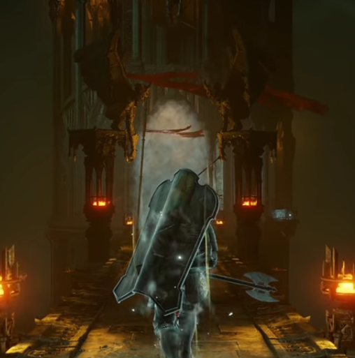
They really went "damn team ico had such bad tech that they had to make blurry ghosts!!! Isnt it great that we now are capable or rendering far more detail? Lets give these ghosts concrete shapes!!!!"
Well you said it yourself. Why are they choosing to ignore those interesting artistic choices in favor of something that looks far more bland and seems to lack any kind of intent other than putting more pixels onscreen?
Nobody is saying that the original game looked great but moreso that the original game had a great art direction while this one doesnt.
There's absolutely nothing atmospheric about that original screenshot. It's literally just a rectangles and stone textures. And this is coming from someone who thinks generally the original Demon's Souls has a decent atmosphere. But in those particular screenshots absolutely show how much care and detail went into every locale, because there's nothing impressive about that particular area in the original at all, and Bluepoint still took the time to add detail to it.
The game looks good, but its tantamount to artistic murder when compared to the original. It goes beyond fidelity and "lol 2008 game", the overall mood, aesthetic and type of architecture is flat out different and frankly shows a flat out fundamental misunderstanding of the material. Bluepoint artists and designers have shat the bed on two classic games in a row now.
It's fine to dislike some of the redesigns, but this is bullshit. This is largely one of the most lovingly crafted remakes out there. And, in most ways, it's a straight visual upgrade. Calling this "artistic murder" is a straight insult to people who clearly went into this project with a lot of love and care for the source material.
I agree with this but the main difference is that From put some thought behind the characters looking a certain way or the castle having a certain style of architecture. Bluepoint just didnt and its clear based on how quickly they changed the look of the Flamelurker when people started complaining about it and how in every other interview they give bad excuses for using a gothic architecture.
If from originally wanted to pursue gothic architecture for Boletaria, they would have done it. The original game had gothic architecture in latria already.
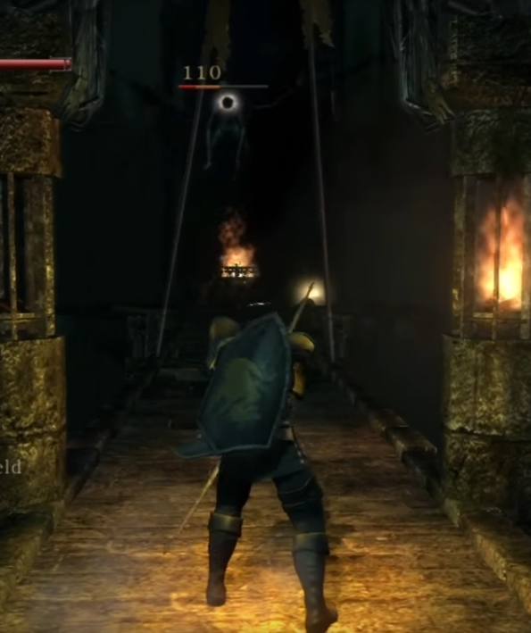
Here's another one:
OG DES had yellow cloth all through 3-2 as a way to foreshadow the Old Monk bossfight. DES remake has red cloth because....?
They are lifting work from a developer who's known for putting a lot of attention to these kinds of details and just choosing to ignore it all.
IMO Bluepoint is so laser focused on technical perfection that most of the times they value it over artistic direction.
One could argue that its their own artistic choice to focus on the tech but then i'd say that they are choosing to ignore the intent of the original game.
There's always "but what if fromsoft had a bigger budget back then?". But those kinds of questions are never fruitful as these games are born out of the limitations of the developers and tech at the time.
There's really no denying that tech is what they prioritize. Its the centerpiece in every other interview with the studio.
It also makes a lot of sense for them to pursue that road as most people want to have a graphical showpiece as a way to justify the jump to next gen tech.
I'd love to hear the developers take on the topic. I do wonder if there was any artistic decision behind all of the visual redesigns they did. I cant help but feel that changes like the one in Boletaria's architecture were justified simply because of how it means that they can cram in even more pixel detail into every other corner. I guess that'd be great if this was a tech demo but when you are reworking a game that is known for its artistic direction then I have to disagree with the change.
I can get behind the new look for the maneaters because of how they are still in line with the lore of the og game but ts when I see designs like the fat official that I start to wonder if there ever was any kind of criteria for art revisions or if there was none and they just got lucky with a couple of creatures.
Its also specially funny that this is a studio so focused on porting the original gameplay feel that they go as far as to reuse the same code that was running the game on ps3. Did they think that the art direction wasnt as important? Hence why they decided to change so much of it? If so then I disagree once more. For as much as people like to focus on difficulty, the souls games never had that much depth to their gameplay and I'd argue that a big percentage of why they are so successful is because of the incredible art direction.
As a side note, I think its in very bad taste how both of these remakes (sotc and des) fail to mention the original developers. I have no idea if it comes down to BP or Sony (I suspect the second), but its shit that they are lifting the original game, down to using the same code, and then avoiding the mention of the original work. It doesnt help in any bit that these games arent called "DES: remake" or "SOTC: remake". They are straight up using the same name and In a way it feels like rewriting history.
This speaks louder than anything else that I cant say
They really went "damn team ico had such bad tech that they had to make blurry ghosts!!! Isnt it great that we now are capable or rendering far more detail? Lets give these ghosts concrete shapes!!!!"
Well you said it yourself. Why are they choosing to ignore those interesting artistic choices in favor of something that looks far more bland and seems to lack any kind of intent other than putting more pixels onscreen?
Nobody is saying that the original game looked great but moreso that the original game had a great art direction while this one doesnt.
Yes, it's quite interesting that this malevolent studio went OUT of their way to, REMAKE this old PS3 title. Blasphemy, they should have just upressed the original version and made sure the framerate is solid, it would have sold and preformed way more solidly. Sorry for this overly sarcastic take, but it is just kind of ridiculous what you are all implying. I completely understand and respect people preferring the original feel of the old Demon Souls, nostalgia and overall feel can definitely play a huge part in preferences. But when you all start trying to speak objectively about these things it quickly falls apart and you are allowing these things to cloud your view of a REMAKE, thats soul purpose is to remake it in a more appealing veneer that more people will enjoy.
The very base of all this is that the original still remains, they never attempted to hide it or cover that up. But remaking it to fit a modern day higher quality aesthetic. When I stated that the original had some interesting art direction choices, I didn't mean they bloomed the hell out of environments to hide their texture issues and lack of lighting, I meant in terms of concept from base shape language to interesting ideas/themes. All of which are still kept in the remake, but improved upon.
Even the Fire Jester guy has a way tighter conceptual idea opposed to, "Put fat man in funny jester clothes".
But I know I'm at odds here, I'm familiar with some parts of society that cherish original versions of things and despise remakes. Which I can completely understand. I do appreciate the conversation though.
From would absolutely make it more dilapidated if they handled the remake. Look at any of the dark souls games. Look at dark souls 3. Debating the environments is pointless because they're fine and follow From's sense of atmospheric design. The character redesign criticism I think has more standing though, but it's entirely up to debate at that point.
I agree with this but the main difference is that From put some thought behind the characters looking a certain way or the castle having a certain style of architecture. Bluepoint just didnt and its clear based on how quickly they changed the look of the Flamelurker when people started complaining about it and how in every other interview they give bad excuses for using a gothic architecture.
If from originally wanted to pursue gothic architecture for Boletaria, they would have done it. The original game had gothic architecture in latria already.
Here's another one:
OG DES had yellow cloth all through 3-2 as a way to foreshadow the Old Monk bossfight. DES remake has red cloth because....?
They are lifting work from a developer who's known for putting a lot of attention to these kinds of details and just choosing to ignore it all.