Exactly.When I play Demons Souls on ps5 it looks exactly like how it looked on ps3 in my memory. The devs did a great job.
-
Ever wanted an RSS feed of all your favorite gaming news sites? Go check out our new Gaming Headlines feed! Read more about it here.
WIRED: The New Demon's Souls Remake Tries Too Hard to Be Realistic
- Thread starter hwarang
- Start date
You are using an out of date browser. It may not display this or other websites correctly.
You should upgrade or use an alternative browser.
You should upgrade or use an alternative browser.
It's a redesign. It may not be everyone's taste but I honestly fail to see what's "bizarre" about it.
I haven't played Demon's Souls or its remake, but I wouldn't want the bloom taken out of Twilight Princess, as an example. It was integrated into the entire aesthetic (twilight) and would look really bland without it.I can't believe now people are defending 2008 era bloom.
Literally the meme of that whole generation.
Overall I think they nailed it with the exception of some enemy designs feeling a little uninspired and weird NPCs faces but even the original game featured some questionable faces. Overall, a better job than SotC for sure.
I'm gonna say that OG Demons Souls' Look felt very much dictated by technical limitations (general art design notwithstanding) while SotC managed to make it feel more like a conscious decision.
Apart from singular examples of wtf redesigns, DS Remake to me feels as much like a "how it was intended to look like to begin with" as the REmake while SotC looses more of its original appeal (graphically).
But that is highly subjective of course.
Apart from singular examples of wtf redesigns, DS Remake to me feels as much like a "how it was intended to look like to begin with" as the REmake while SotC looses more of its original appeal (graphically).
But that is highly subjective of course.
Except Wander, who looks like a neanderthal.Only valid arguments I've heard against the game is some of the bizarre art changes but that's few and far between whereas the rest of the remake seems like a triumph from what I've seen.
SOTC remake was bordering on perfect in all ways.
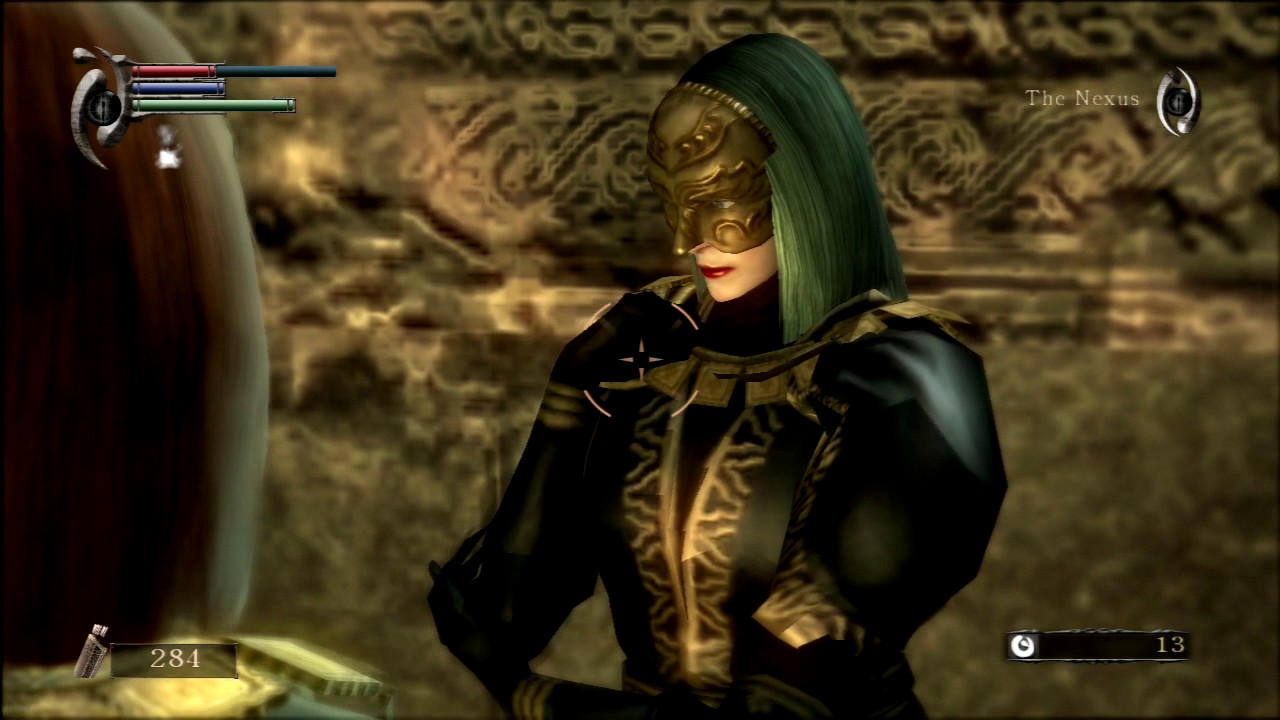
Bizarre that they decided to redesign Mephistopheles so thoroughly to begin with. She's almost unrecognizable.It's a redesign. It may not be everyone's taste but I honestly fail to see what's "bizarre" about it.
When the game was first revealed, and people raised this concern, I felt it was warranted. Now, as I near the end of the full game, I can say with easy certainty: it's not. This remake is perfect.
A lot of strange aggravation and defensiveness in here at what is a pretty uncontroversial argument that someone preferred the aesthetic of an original game versus a remake, because they felt like something was lost in the translation - even if that something was in part dictated by technical constraints of the time.
I prefer the look of the remake, but reading through the article, I was struggling to understand what exactly people were so annoyed by.
It has a 92 on Metacritic - Bluepoint will survive this criticism with their honour intact.
I prefer the look of the remake, but reading through the article, I was struggling to understand what exactly people were so annoyed by.
It has a 92 on Metacritic - Bluepoint will survive this criticism with their honour intact.
Bookmarking this post so I can quote it in the inevitable future threads on this topic.It takes a somewhat tonally different approach in its use of colours, proportions, and design that gives it an overall shifted visual identity towards something more closely resembling dark fantasy over the original's hazy, dreamy mood and aesthetic. I don't dislike it, as it doesn't do away with the original and both can exist comfortably in the same space, and Bluepoint's art direction and technical achievements are still very impressive even if a specific tonal resonance to the imagery is lost in their vision of Boletaria. Some of the more humanised enemy designs, like the Maneater, lose a bit of the unnatural surreality the original had, irrespective of the technical and artistic influence and asset use. And yes, the colour grading (filtering included) is a factor in here too. But I'm not sure I agree with the furthest reaches of this article's claims.
That being said, I think it's sad when we instantaneously handwave at best, actively condemn and bury at worst, a critical approach to the discussion art and aesthetics in creative vision because of technical improvements and generalisation of rendering memes like "piss filter", when we don't want to discuss the tonal nuance achieved with a particular visual direction and arguably lost in another, irrespective of either/or being better or worse so much as an observation and the implications of such. This applies to all expressions of creativity. I adore this remake but admittedly I do not like all of the score changes; there are some bigger, louder, more theatrically orchestral renditions of what were once more sombre compositions, and a handful of tracks (like the new Nexus theme) lose the minimalism of the original's score that I personally prefer. They're less evocative of an interesting presence, place, or tone, and as a result far less memorable and less encompassing of the space and moments they occupy.
These discussions cannot be boiled down to "the technology is better so that makes it better", and that as a response to the criticism is lazy and vapid.
As someone who bought the PS3 version three times, to have all three regions, I don't get the complaints. I love demons souls on PS3. And I think Bluepoint did an amazing job with this.
It looks amazing, and I'd bet if From remade it, they would have changed some of these things too
It looks amazing, and I'd bet if From remade it, they would have changed some of these things too
Stupid sexy hood.This article has so much wrong with it I don't even know where to begin (the Vanguard stuff is especially funny considering the original was a re-used asset), but I do love how someone can apparently think a game can look both "too realistic" and also "too Diablo-like" at the same time. Bluepoints are truly wizards!
???
Demon's Souls was 100% dark fantasy. Always has been.
....Huh?

vs...
What in Boletaria are you talking about....
OP
OP
A lot of strange aggravation and defensiveness in here at what is a pretty uncontroversial argument that someone preferred the aesthetic of an original game versus a remake, because they felt like something was lost in the translation - even if that something was in part dictated by technical constraints of the time.
I prefer the look of the remake, but reading through the article, I was struggling to understand what exactly people were so annoyed by.
It has a 92 on Metacritic - Bluepoint will survive this criticism with their honour intact.
Yeah I think more or less the author was conveying the message that the remake doesn't have the same aesthetic wonder as the original had.
Demon's Souls had a very rough development, to the point higher ups at From and PlayStation considered it a failure and ultimately stopped caring about it, which Miyazaki used that to get on the project and basically take over and made the game he wanted, because worse case scenario it was fucked either way. It's an amazing story, well worth looking into, especially with the legacy it now has.It's like looking at Previs vs. Final CG Render. I swear the OG must've be originally slated as a PS2 game with those textures. Even Dark Souls was a huge leap in terms of texture and geometric detail.
I have my nitpicks, especially with the music, but as a whole it looks great. World 3 and 5 in particular are great recreations without straying away much from the original. The storm should have cleared up and looked like the original after killing the Storm King, but with that being said it looks way better during the fight. Also, they have a little PS3 reference in the game, it's called Rydell's character model. Seriously, why does his model look so poor and oddly smiling?
I guess I'm in the minority who think the original PS3 game is beautiful, warts and all.
The overly bright and colourful aesthetic of the remake was an issue for me but then I noticed the game has a heap of different filters including a classic mode so I don't see the point of complaining. I'm optimistic I will be able to make the game look acceptable to me when I eventually pick up a PS5.
(people should stop cooling it the piss filter btw. If your piss is a green colour like the tone of the original Demons Souls, please go and see a doctor)
I guess I'm in the minority who think the original PS3 game is beautiful, warts and all.
The overly bright and colourful aesthetic of the remake was an issue for me but then I noticed the game has a heap of different filters including a classic mode so I don't see the point of complaining. I'm optimistic I will be able to make the game look acceptable to me when I eventually pick up a PS5.
(people should stop cooling it the piss filter btw. If your piss is a green colour like the tone of the original Demons Souls, please go and see a doctor)
Both have their merits. I love demons souls on PS3. But there's so much more going on here on ps5. And it's beautiful.
The one I'm most interested to see is the Valley of Defilement. That level in the original felt like the developers tried to make the darkest, dingiest, ugliest level in videogame history. I'm keen to see how Blue Point adapted that level with their engine/art style.Both have their merits. I love demons souls on PS3. But there's so much more going on here on ps5. And it's beautiful.
2000 bloom, bad textures and yellow piss filter = Artistic choice
Remove all that above for better quality = Tries too hard to be realistic.
Yeah, no. You are trying too hard. Sure, you can say you like some character design more, for whatever reason. But other than that, nah.
Remove all that above for better quality = Tries too hard to be realistic.
Yeah, no. You are trying too hard. Sure, you can say you like some character design more, for whatever reason. But other than that, nah.
Really bad take, especially if we take into account DS3 which the DeS remake heavily resembles artistically. Bluepoint's work is essentially perfect.
Agree.Strongly agree. The remake has much more fidelity, but it has lost so much character from the original game. Everything except for world 5 looks like it could've come from an Elder Scrolls game.
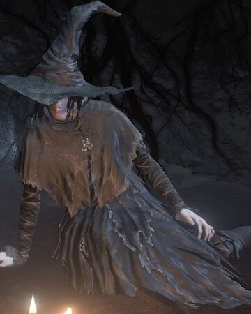
I think it is sorta strange that quite a few characters and armour got fairly drastic redesigns at all. Some changes are small; The Vanguard Demon no longer looks like "Cute alien plushie" but an actual demon, and the Maneater is clearly a chimera instead of a weird gargoyle now, but the Old Ragged Robes went from stereotype witch to, well, old ragged robes.It's a redesign. It may not be everyone's taste but I honestly fail to see what's "bizarre" about it.
Original PS3

This is how the set was updated to look in Dark Souls 3
Demon's Souls
This is how the set was updated to look in Dark Souls 3
Demon's Souls
For the most part everything is as expected. The levels are basically perfect imo. I can actually tell what some parts of it are supposed to be where PS3 was so simple you had to imagine the rest.
Fat Officials are really the only big step back imo. Some of the original atmosphere might be gone, but it's been replaced with a different kind of atmosphere, and it works fantastically for the game
What a dumb take. The original game had a lot going for it, but it was ugly as hell. As was the first Dark Souls. People really have rose tinted glasses in terms of visuals with the early Souls games. The remake is gorgeous and it's definitely not "trying too hard to be realistic."
On the Fat Officials blackened skin and bubos (the lumps the officials have in the remake) were both symptoms of the bubonic plague (aka the black death) which ties in with Boletaria's medievel theme, if that was the original artistic intent. You can catch plague in the game but not from the Fat Officials... I think the appearance of the was more likely a thematic tie to other strong enemies in the area (ending spoiler follows):
Who are covered in a tar like corrupting substance:


It makes sense that before everything went to shit Allant would have used the power he gained from his actions to strengthen his senior officials, knights and Royal Guard (Phalanx).
It makes sense that before everything went to shit Allant would have used the power he gained from his actions to strengthen his senior officials, knights and Royal Guard (Phalanx).
Lololol I laughedPS3's infamous piss filter getting the nostalgia treatment is hilarious tbh
After seeing the DF videos, I'm going to have to say a big no. Bluepoint delivered. And every streamer I've watched so far seem to agree.
I don't agree. I actually really dig the look. It's kind of got a flat-shaded charm to it.nobody in 09 was sitting there appreciating Demons Souls visuals. It was ugly with nice style to it so it was acceptable. Not sure why people are acting like DeS was some type of visual darling at the time. The remake completely makes to OG irrelevant visually.
Fortunately, I still own the PS3 version, so I'm well served by that (other than it being taken offline).
Yeah my bad. More emphasis on the dreary dreamyness.
Demon's Souls looks great. I'm not sure on enemy designs as I never played the OG. I do think Shadow of the Colossus lost a bit of it's art in the remake, but it wasn't like it ruined it or anything.
I never played the OG Demon's Souls but this sucks as true. I do think the remake is absolutely gorgeous but I love interactive shit in the environment. It's one of the things that really enhanced Luigi's Mansion 3.I don't know if it's just me but I don't want games to be more visually impressive if that means they also have to be more static
People saying it's straying from the vision ignore the direction the series went with Dark 1-3. They went to similar style to the remake rather than the original. If anything I bet it's now more similar to Froms vision since the original was clearly limited by technology and budget comparing to where the series went to.
Underrated post. Lmao.
PS3's infamous piss filter getting the nostalgia treatment is hilarious tbh
Just need a MGS4 remake to put the cherry on top.