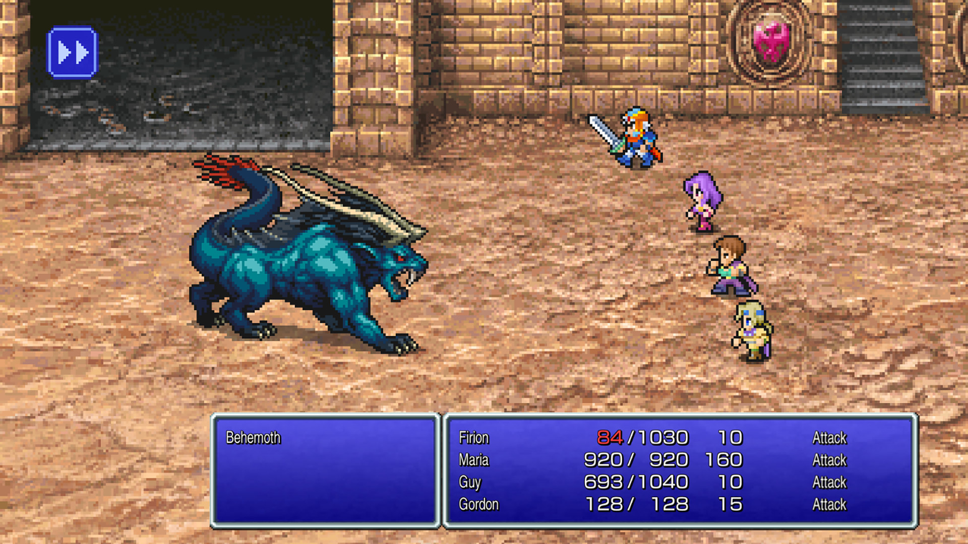
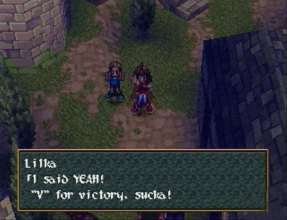
The recent batch of new screenshots for the Pixel Remaster games of the first six Final Fantasy games has underlined how bad Square has been with fonts over the last decade or so with some of their rereleases of old games. So many of them are using this weird generic font that strikingly clash with the pixel art being displayed.
Now, I understand for cheap mobile ports that use emulation. They don't want to throw money at the project, so they resort to whatever free font that's available for mobile games. I get it. But the Pixel Remaster games that were unveiled recently are not cheap cashgrabs. Whatever your opinion is on the artstyle, the fact is that all the assets in these games are brand new. This means that effort and money went into them. And if effort and money went into them, why did the font used in these games not get the same care put into it?
Screenshots of both English and Japanese scripts have been released. Surprisingly, or perhaps more frustratingly, the font used in the Japanese script is actually really good. But not the English font.
So what's the deal? Is it a case of the English localization team having some degree of autonomy and not having to report their work to the art team in Japan for QA or some sort of art uniformity check? I'm struggling to imagine that the art director of these games signed off on the English font. Surely that even if they can't read English, they'd be able to evaluate the look of it and how it fits with the rest of the visual data on screen. Right? You have all that gorgeous pixel art right there in front of you, and then that font just aggressively stares at you. It's just not consistent with the rest of the visual presentation. And it's a distraction. Surely someone noticed, right?
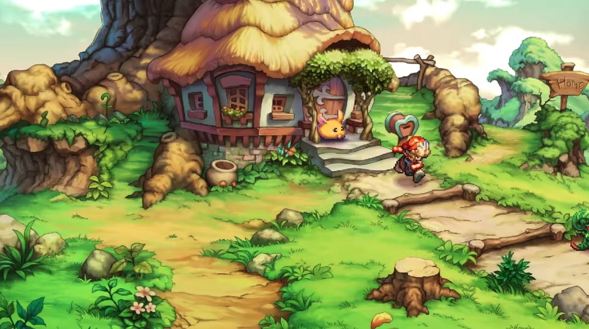
Like, imagine if you went to an art gallery to see beautiful pieces of work, and standing out from the collection is this one otherwise gorgeous painting... stuck in this frame:

It's just a bummer, man. Maybe there's something I'm missing that would explain away all of this nonsense. Maybe everyone who touched the English localization is fully aware of the shit font and they just can't do anything about it for legal or bureaucratic reasons. I dunno.
In any case, the end result remains that the font is ugly, and these classics deserve better. :(
EDIT:
For comparison:
Now, I understand for cheap mobile ports that use emulation. They don't want to throw money at the project, so they resort to whatever free font that's available for mobile games. I get it. But the Pixel Remaster games that were unveiled recently are not cheap cashgrabs. Whatever your opinion is on the artstyle, the fact is that all the assets in these games are brand new. This means that effort and money went into them. And if effort and money went into them, why did the font used in these games not get the same care put into it?
Screenshots of both English and Japanese scripts have been released. Surprisingly, or perhaps more frustratingly, the font used in the Japanese script is actually really good. But not the English font.
So what's the deal? Is it a case of the English localization team having some degree of autonomy and not having to report their work to the art team in Japan for QA or some sort of art uniformity check? I'm struggling to imagine that the art director of these games signed off on the English font. Surely that even if they can't read English, they'd be able to evaluate the look of it and how it fits with the rest of the visual data on screen. Right? You have all that gorgeous pixel art right there in front of you, and then that font just aggressively stares at you. It's just not consistent with the rest of the visual presentation. And it's a distraction. Surely someone noticed, right?
Like, imagine if you went to an art gallery to see beautiful pieces of work, and standing out from the collection is this one otherwise gorgeous painting... stuck in this frame:
It's just a bummer, man. Maybe there's something I'm missing that would explain away all of this nonsense. Maybe everyone who touched the English localization is fully aware of the shit font and they just can't do anything about it for legal or bureaucratic reasons. I dunno.
In any case, the end result remains that the font is ugly, and these classics deserve better. :(
EDIT:
For comparison:
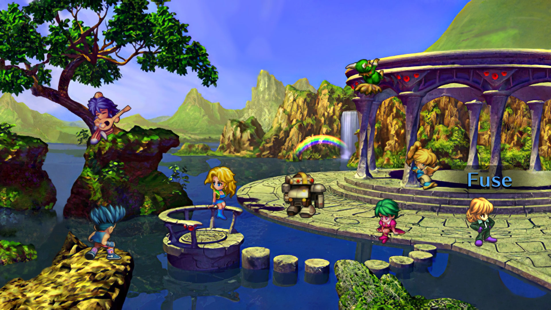
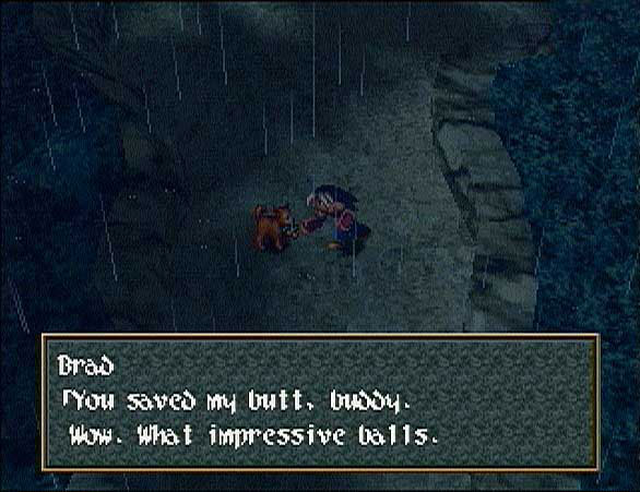
Check out the updated font from the Chrono Trigger PC port:
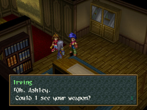
this is how the font looked when the game was released on Steam:

So, clearly, someone somewhere at Square is aware. Why are the same mistakes occuring again? Do the people at Square just not talk to each other? Like what the hell.
Last edited: