-
Ever wanted an RSS feed of all your favorite gaming news sites? Go check out our new Gaming Headlines feed! Read more about it here.
Whats the last game you saw and said "Ugh, the art style/visuals/graphics looks horrendous"
- Thread starter Lightjolly
- Start date
You are using an out of date browser. It may not display this or other websites correctly.
You should upgrade or use an alternative browser.
You should upgrade or use an alternative browser.
Agreed, although the female character is miles better than awful male ones.Character art in Immortals Fenyx Rising. Shame because the game is otherwise quite good looking.
Yeah hope if they ever do an Apex Legends 2 they improve those aspects, i like the gameplay but not the visuals make it more strikingYeah, I'm with you on this. I don't quite think it's "horrendous," but the environments are so boring and the character design is pretty bad.
The Evil Within 1 is as ugly to look at as it is to play.
At least the game gave us Internet Dan:
Good examples in this thread but to me nothing comes close do Drawn to Death, I mean, look at this disgusting mess of a game

At least the game gave us Internet Dan:
Last edited:
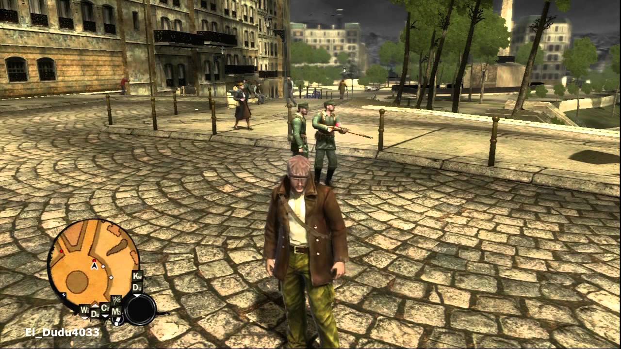
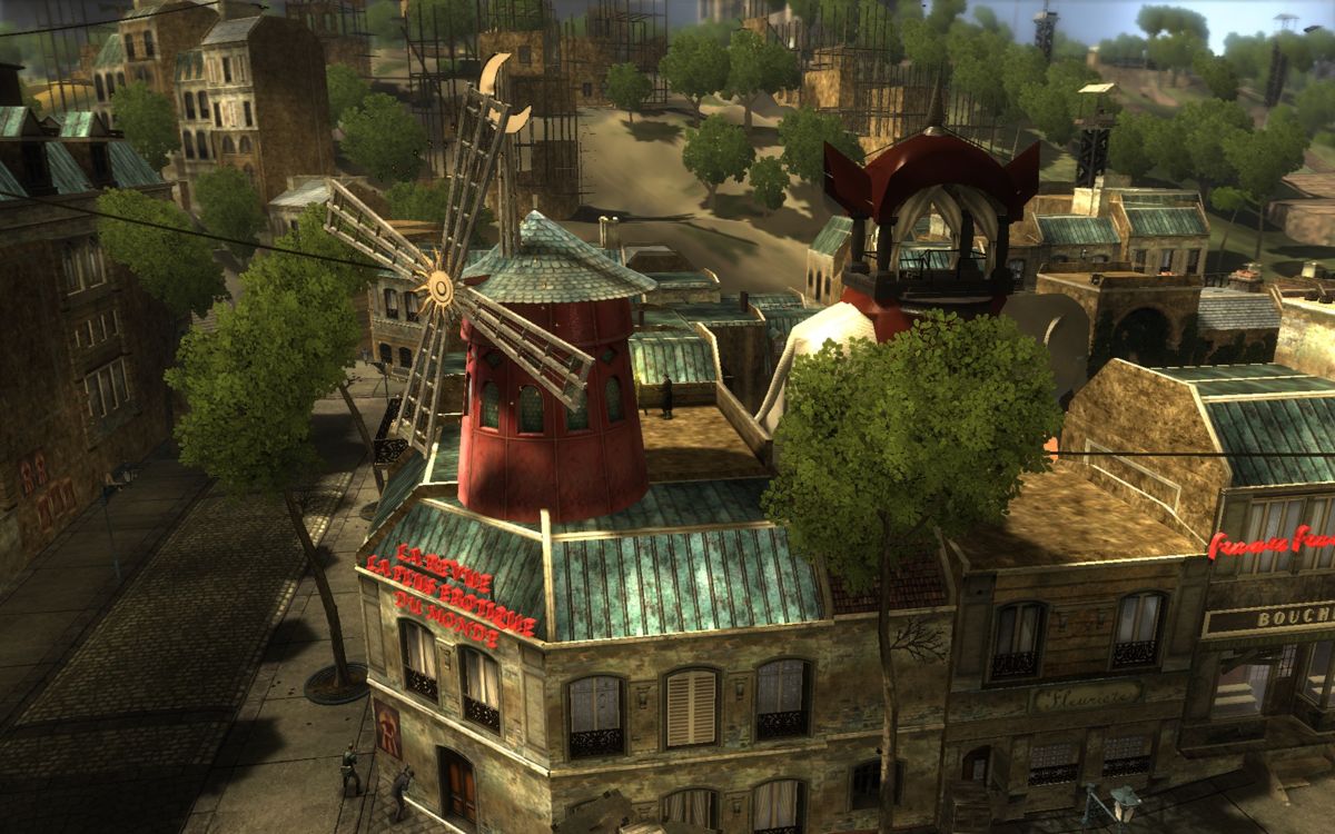
The Saboteur: The game has an in a Sin City esque art style, that represents the Nazi occupation of Paris. When you clear out a area of the map, that area turns to color which represents liberation. I dig what the game was going for, but I found the look of the liberated areas to be ugly.



So absolutely Nihdogg 2.
The original was actually building up a decent head of steam when they released 2, and it was so hideous it killed both games and may well have killed the nascent ultra-minimalist fighting game genre it was building. it wasn't like a competitor came in and ate their lunch; it's just Nihdogg 2 is so fucking ugly everyone stopped playing the games.
The original was actually building up a decent head of steam when they released 2, and it was so hideous it killed both games and may well have killed the nascent ultra-minimalist fighting game genre it was building. it wasn't like a competitor came in and ate their lunch; it's just Nihdogg 2 is so fucking ugly everyone stopped playing the games.
There are few games I'd describe as looking horrendous, but that is how I feel about the mobile/PC port of Final Fantasy VI

lit took me several minutes to convince myself to not report you for introducing this monstrosity into the thread. Literally an all text only version would be preferable to this.
I like the idea of basing it on your high school notebook drawings but the execution just doesn't work.
I think the problem is that it is almost completely impossible to understand what is in the image.
Not to be too shady, but Coral Island, the farming game made by one of our own and just launched a Kickstarter. The character models (not the 2d art) is incredibly off-putting.
Stardew Valley is also ugly.
In general I don't like most AAA shooter things art directions.
Stardew Valley is also ugly.
In general I don't like most AAA shooter things art directions.
Every single Stardew Valley clone thus far.
Stardew Valley is gorgeous.Not to be too shady, but Coral Island, the farming game made by one of our own and just launched a Kickstarter. The character models (not the 2d art) is incredibly off-putting.
Stardew Valley is also ugly.
In general I don't like most AAA shooter things art directions.
Marnie am cryEvery single Stardew Valley clone thus far.
Stardew Valley is gorgeous.
Borderlands saga
Immortals (human characters)
Xenoblade chronicles x (characters)
Bravely default 2
Final fantasy 9
Fallout 3-4 (ugly art)
Jump start (mix of assets)
Bayonetta (main character primcipally :S)
Monster hunter
Psychonauts (main art)
all of this games have ugly character designs or weird art styles and hardly can play them :S
I tried Persona in the PS plus collection. After the opening escape sequence I decided I couldn't handle the style of that game. Everything in the UI is so obnoxiously flashy and non static, I really couldn't stand it.
I
You have to give it a good 50 hours before it melds with your mind and the animations become part of your thoughts. That said p4 transitions and style is much superior to do the stronger editing.
Immortals Fenyx was the most recently released game to come to mind, but I'm sure my brain may have erased some others.
Horrendous would be a bit too strong, but I also didn't like Stardew's aesthetic at all. I never actually saw what it looked like back when everyone was hyping the hell out of it for the first time, and when I finally booted it, I was so utterly disappointed by how much the art style failed to resonate with me. (Didn't help that I ended up hating the gameplay too.)
Horrendous would be a bit too strong, but I also didn't like Stardew's aesthetic at all. I never actually saw what it looked like back when everyone was hyping the hell out of it for the first time, and when I finally booted it, I was so utterly disappointed by how much the art style failed to resonate with me. (Didn't help that I ended up hating the gameplay too.)
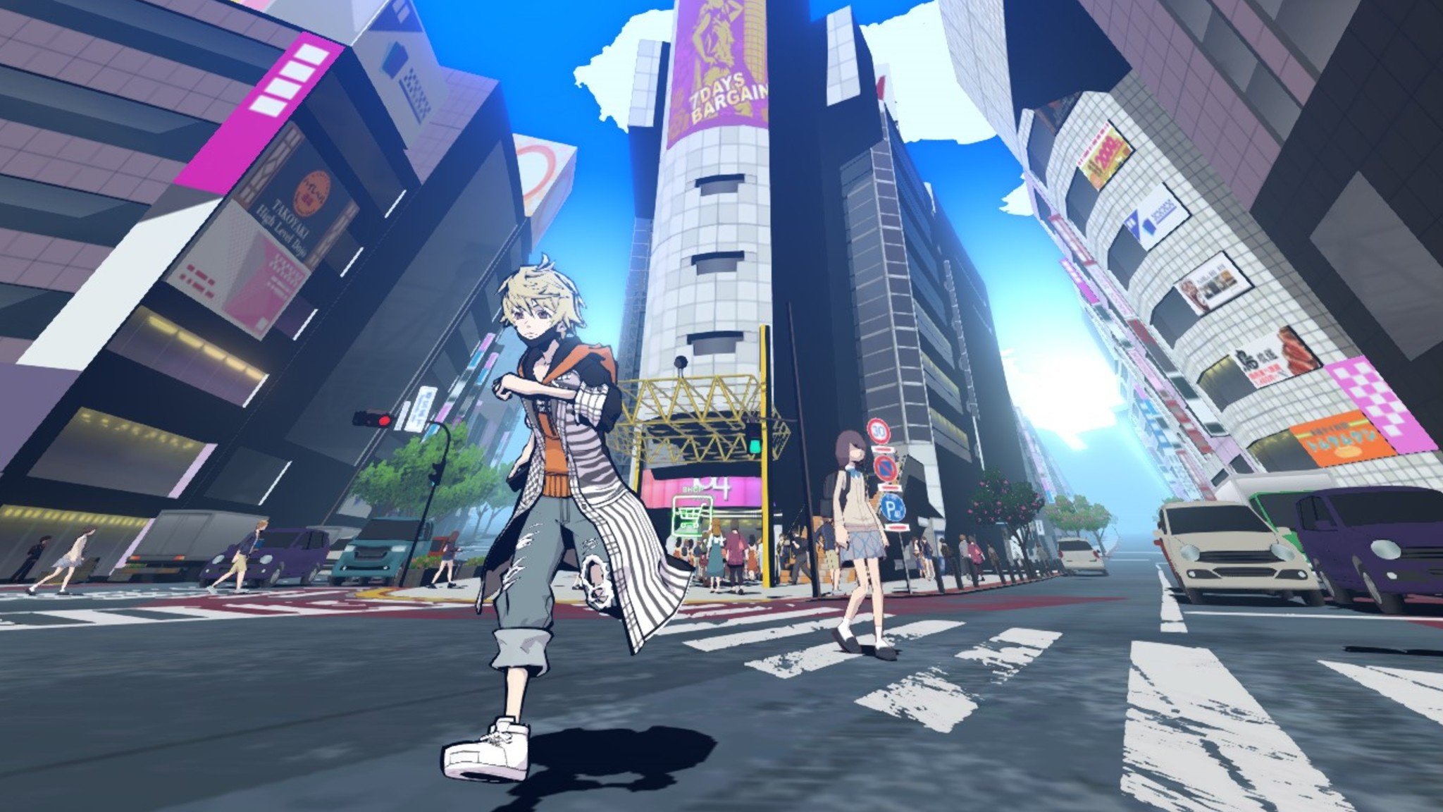
This screenshot of Neo: The World Ends Eith You got me less excited about the game. It may very well be pre-alpha 0.0.1 but judging by what we've got:
- The textures. Look at the asphalt. The zebra lines. They either look low res or half assed.
- Four identical cars at least. Four identical NPCs at least. It's not graphical fidelity but I can't stand stuff like this.
- The camera's perspective is way too skewed. Look at the buildings. It's like they're leaning over the streets. I have no idea why they did this to this extent.
- Game easily looks 15 years old.
I'd deserve it, honestly.lit took me several minutes to convince myself to not report you for introducing this monstrosity into the thread. Literally an all text only version would be preferable to this.
Nah, their gothic inspired artstyle is terrible.

I feel you on this. It's not my cup of tea either.Xenoblade 2. It can look pretty but my main issue with games is if their styles aren't consistent. I can tolerate a lot of weird games, even if they aren't always the most pleasant to look at, if they feel cohesive. Not only do some of the main cast feel like they don't belong in the same game, then you add the guest characters. And then the enemy units are an entirely different style too.
I was never very happy with Ni No Kuni's art style but so many people praised the game so much I thought I'd give it a shot. Barely got past the intro. Just not for me in the end.
unfortunately Burnout Paradise. that game was released smack dab in the middle of the brown filter & bloom era of video games and the remaster looks slightly better but still not great. give me back Burnout 3
I just installed this the other day and yeah, the graphics definitely do not hold up very well.The Saboteur: The game has an in a Sin City esque art style, that represents the Nazi occupation of Paris. When you clear out a area of the map, that area turns to color which represents liberation. I dig what the game was going for, but I found the look of the liberated areas to be ugly.


Pretty standard for a non-AAA open world game in the 360/PS3 era.
You're right that the black+white with small splashes of red and yellow looks cool, but the color areas are rough, as well as the character faces.
Thems fighting words.
Nier Automata. Bland colors and ugly graphics. Only thing that saves the game are the character designs
Nier Automata. It's a fun game, but I cannot take any of these characters seriously, and it's actively distracting.
Where's my resetera.gif
I generally don't like the "living on a junkyard" look of most postapocalyptic environments, like Fallout or Borderlands. Besides that I'm usually more annoyed by recognizing an asset pack being used in like five different games. The current popular one is that set of capital space ships that appears in games like Rebel Galaxy, Battlegroups VR, Star Traders Frontiers and a bunch more I can't remember right now.
I found the character designs to be pretty much atrocious too.Nier Automata. Bland colors and ugly graphics. Only thing that saves the game are the character designs
If I'm being honest:
I was very disappointed in Street Fighter V's style.
Graphics and animation are all very high quality but it's all wasted on weird color palettes and uninspired art direction.
I was very disappointed in Street Fighter V's style.
Graphics and animation are all very high quality but it's all wasted on weird color palettes and uninspired art direction.
My sentiment, i think it looks okayish in some areas while very low quality others, the budget restrictions are palpable.I didn't really like how Bloodstained looked. It felt...I dunno, kinda cheap? And some of the areas were pretty uneven visually as well.
Yeah. Some of those character models were straight-up hideous. The style of that game just didn't work at all.
Good lord. I thought you were making a joke.
I had to google it, that's the actual box cover. What in the phoning it in batman. That's like someone testing out their new iPad's painting capabilities.
Yeah in Sword they had to shift the logo to the right a bit so it wouldn't be in the way for the Parental Warning logos.Good lord. I thought you were making a joke.
I had to google it, that's the actual box cover. What in the phoning it in batman. That's like someone testing out their new iPad's painting capabilities.
How does Rise look horrendous except in direct comparison to World, though?
I think almost any game that tries to capture a 2D art style in 3D fails miserably aside from those guilty gear games where they had to do all kinds of crazy shit to achieve it. Cel shading is fine (jet set radio etc) but specifically trying to capture a cartoon or anime always looks weird to me (ni no kuni, Naruto, old Simpsons games etc)
Probably Jump Force. People like to throw around the term "asset store game" for whatever they don't like the look of but Jump Force truly looks like a game made primarily using assets with conflicting styles and shading.
Jump Force looks so bad it completely put me off from playing. It's just... ugh.
Someone else mentioned it, but Bloodstained isn't great either. Still, I love Igavanias too much to have passed on it.
The Saboteur: The game has an in a Sin City esque art style, that represents the Nazi occupation of Paris. When you clear out a area of the map, that area turns to color which represents liberation. I dig what the game was going for, but I found the look of the liberated areas to be ugly.


Gen 7 piss filter in full effect. If it isn't desaturated, yellow and bloomy it wasn't on the 360/PS3. Lol


