-
Ever wanted an RSS feed of all your favorite gaming news sites? Go check out our new Gaming Headlines feed! Read more about it here.
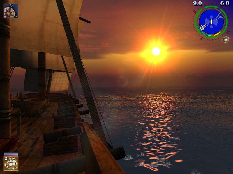
What do you think about the graphics of Ghost of Tsushima?
- Thread starter Gonzito
- Start date
You are using an out of date browser. It may not display this or other websites correctly.
You should upgrade or use an alternative browser.
You should upgrade or use an alternative browser.
Beautiful color palette / art direction, but very last gen when you look at anything from other than a macro POV.
I will say my least favorite thing is the narrow fov. Kind of makes me want to wait for the pc version to play again.
Lol are you kidding.
View: https://i.imgur.com/rK64v4m.jpg
It's the most beautiful game I've ever played.
I am probably a bit biased as it was the first game I played on OLED though.
But seriously it was outstanding.
This image perfectly encapsulates GoT's artistic design, both why it works, and why it may not work for some people.
GoT takes very few assets (compared to your average AAA game) and just copies them a million times over for a given biome. There's way less unique assets than a typical AAA game, but the way they use them is extremely effective.
Also, most AAA games will use super high resolution textures and lots of unique assets, but everything will be static. GoT instead takes very simple assets, but makes it so all (or most) of them are moving in systemic ways that can change, which gives the overall scene a feeling of liveliness.
GoT also has very impactful use of of colour, whereas lots of AAA games can look like a mishmash of every colour of the rainbow, with a single filter laid over top.
So i'd say GoT has incredibly smart visual design, even if it's not the "best".
I'll bet on it looking way better than that trailer. It's almost tradition for PS Studios franchises that the 2nd game sees a sizeable graphical jump over the 1st one that laid the foundation.
Yeah.I'll bet on it looking way better than that trailer. It's almost tradition for PS Studios franchises that the 2nd game sees a sizeable graphical jump over the 1st one that laid the foundation.
I know I shit on the texture quality but I understand it's probably due to memory constraints on PS4. If Ghost 2 is more of the same (gameplay-wise), I will definitely be disappointed but I am excited to see what they can do with graphics now. Hopefully we get some photogrammetry.
Definitely one of the most beautiful games in recent memory. The gorgeous art direction completely makes you forget some minor technical shortcomings.
It was also surreal to see that the game had so few cutscenes throughout the runtime. Not just because it's a PS Studio game but also because SP went into the PS4 generation swinging when it came to performance capture.
There are still PS5 games with low poly objects here and there. The lighting is the real star of that trailer. And also the super good looking water.was referring to the first gameplay reveal in 2018, but even in that video some nice use of fog doesn't cover up the low poly/texture in the environments. also at that point we had already seen better character rendering in an open world game from H:ZD
Yep.Beautiful color palette / art direction, but very last gen when you look at anything from other than a macro POV.
I think it looks lovely as a whole. There may be other games with more technically impressive aspects. Like, the enemies have pre-canned animations with no ragdolls at all which sometimes feels a bit...dated when a body is floating rigidly on a rock... But that art style is just *chefs kiss*
I have confidence in gameplay improvements as Iki Island was pretty much "we heard your open world complaints for the main game" and made noticeable improvements for Iki.Yeah.
I know I shit on the texture quality but I understand it's probably due to memory constraints on PS4. If Ghost 2 is more of the same (gameplay-wise), I will definitely be disappointed but I am excited to see what they can do with graphics now. Hopefully we get some photogrammetry.
Given when a sequel could release, it'll probably be a PS5 only game, so I'm expecting good improvements in the texture quality department as well. But I will say that HFW textures are so detailed I sometimes get eye strain cause all the detail on screen at once lol. Ghost of Tsushima is easy on the eyes in that sense.
I think the game already looks great on on PS4/PS5 and I can't wait to replay in Ultrawide on PC. We all know it is coming, just announce it already Sony...
Great art (even if lacking some punch and atmosphere)
Good graphics, whose flaws are masked when playing at 60fps.
Good graphics, whose flaws are masked when playing at 60fps.
Just played the expansion because of the new PS+ and I get the complaints but I think only RDR2 has delivered such a believable sky for me. Things like that made it really easy to overlook the graphical shortcomings in other areas. I know we're unfortunately getting a sequel soon so hopefully they are able to tighten up the graphics on level 3.
"Art direction is great but textures are just ok/blurry/bad" style of takes are the weirdest to me.
The game has amazing art direction precisely because textures aren't extremely detailed which gives it a very painterly look that doesn't feel busy to the eye. That is an actually intentional choice that enhances the overall look by making you not pay attention to little details and embrace the nature and the use of contrasting colors in different biomes. This is like saying "the cheesecake is very tasty but the lemon zest is just ok, a bit too bitter maybe" - you don't eat the zest separately, the whole point is how the lemon zest enhances the flavour of the cheesecake.
The game has amazing art direction precisely because textures aren't extremely detailed which gives it a very painterly look that doesn't feel busy to the eye. That is an actually intentional choice that enhances the overall look by making you not pay attention to little details and embrace the nature and the use of contrasting colors in different biomes. This is like saying "the cheesecake is very tasty but the lemon zest is just ok, a bit too bitter maybe" - you don't eat the zest separately, the whole point is how the lemon zest enhances the flavour of the cheesecake.
This game and Breath of the Wild are among the few open-world games that get "nature" right. The outdoors feel properly alive in both titles, with tall grasses whispering in the wind, tree canopies rippling amid a gathering storm, etc. Something that deflated me a bit about Death Stranding (a game that was still my GOTY 2019) was how outside of one area where wind was the main gimmick, the rest of the world felt strangely static, as though devoid of even a mild breeze. Wind gives life to a natural space, and both Ghost and BotW capitalize on that wonderfully. Both games also have amazing rainstorms, another thing that makes a natural space feel real.
That's not what people mean when they talk about the weaker aspects of the game's presentation. Because at times those weaker aspects overshadow everything that's good about the art direction.Art direction is great but textures are just ok/blurry/bad" style of takes are the weirdest to me.
The game has amazing art direction precisely because textures aren't extremely detailed which gives it a very painterly look that doesn't feel busy to the eye. That is an actually intentional choice that enhances the overall look by making you not pay attention to little details and embrace the nature and the use of contrasting colors in different biomes.
/cdn.vox-cdn.com/uploads/chorus_asset/file/20074844/Ghost_of_Tsushima_guide___haiku_locations_and_headbands_001.jpg)
I am profoundly curious as to how they arrived at that water shader. Game was gorgeous but there were so many little things that became hard to ignore by the final island.
I mean, that reveal trailer absolutely looked like a PS5 game.
View: https://www.youtube.com/watch?v=MUz539AeC5Y
If anything it's what we should expect the second game to look like.
I'm confused, this seems mostly in-engine but it doesn't seem way better than what's in the game? Maybe I'm not remembering right. It definitely has ugly NPC's / quest givers that big open world games like Spider-Man also have.
The stuff that stood out was definitely the wind / foliage, (took a lot of photos) besides that I wouldn't say it looks as good as Horizon FW but not "bad" either, equal to modern AC games maybe or the Witcher probably?
The art design is good, but the graphics are so bad that they actively distracted from the gameplay, much worse than all the complaints about HFW's 60fps mode. The decision to use a checkerboarding solution that left dithering artifacts everywhere that worked especially poorly with all the grass that was the foudnation of their art style was...a choice. Even in 1800p resolution mode, it artifacts so much you can't make out the details on the archers at their typical engagement distance
That's not what people mean when they talk about the weaker aspects of the game's presentation. Because at times those weaker aspects overshadow everything that's good about the art direction.
I literally don't see any problems with the screenshot example you've posted. Shit's beautiful.
The PS5 version irks me. It has the same sloppy image treatment as the PS4 Pro version which means loads of hideous dithering everywhere.
Other than that (and the incredibly stiff facial animations), it's a gorgeous game and one of the best looking games of the last generation. I really just wish we didn't collectively settle on the idea that checkboard rendering and temporal injection is the best way forward in most cases when all solutions aren't built equally. Something like, say, Insomniac's work in Rift Apart or Miles Morales, that's every bit as sharp as a native presentation. Ghost of Tsushima… not so much.
Other than that (and the incredibly stiff facial animations), it's a gorgeous game and one of the best looking games of the last generation. I really just wish we didn't collectively settle on the idea that checkboard rendering and temporal injection is the best way forward in most cases when all solutions aren't built equally. Something like, say, Insomniac's work in Rift Apart or Miles Morales, that's every bit as sharp as a native presentation. Ghost of Tsushima… not so much.
To be fair, it probably wouldn't be able to run that way. On the base PS4, it chugs down to the 20s when there's particle effects goingFelt like the first reveal looked much better than what we ended up getting.
The main reason I barely played it was disappointment with the graphics. Sometimes it felt like there were no character shadows during gameplay and it was jarring
THANK YOU. For the longest time I thought I was literally the only one who was seeing the dithering.The PS5 version irks me. It has the same sloppy image treatment as the PS4 Pro version which means loads of hideous dithering everywhere.
Other than that (and the incredibly stiff facial animations), it's a gorgeous game and one of the best looking games of the last generation. I really just wish we didn't collectively settle on the idea that checkboard rendering and temporal injection is the best way forward in most cases when all solutions aren't built equally. Something like, say, Insomniac's work in Rift Apart or Miles Morales, that's every bit as sharp as a native presentation. Ghost of Tsushima… not so much.
I do look forward to see if a PC version with DLDSR/DLSS will be able to clean it up.
It's a beautiful game but much simpler looking than mosr other AAA games. It went for a more simple approach to textures and colors. So instead of a realistic, gritty kinda look it has a simpler, almost painted type look. They likely did it for the style but also how well it performs. I don't think the load times and snappiness of the game is an accident. Basically, it looks great but not as nice as some other games, but I feel like it was done on purpose, and I love the game and the look.
I think we have different definitions of beautiful because so many aspects of the game's visuals are held back in that screenshot. This game looks it's best when none of those flaws are apparent, i.e. in the various fields of grass, forests, temples, etc.I literally don't see any problems with the screenshot example you've posted. Shit's beautiful.
People don't want the game to look more realistic and there isn't a misunderstanding when it comes to the art direction. The first Horizon game had similar issues. And then they took that feedback and improved the weaker elements, like the water.
Ghost is a stunning looking game, especially in motion. The wind blowing, trees and grass swaying, the bright colours popping, the art direction is just beautiful.
I think we have different definitions of beautiful because so many aspects of the game's visuals are held back in that screenshot. This game looks it's best when none of those flaws are apparent, i.e. in the various fields of grass, forests, temples, etc.
People don't want the game to look more realistic and there isn't a misunderstanding when it comes to the art direction. The first Horizon game had similar issues. And then they took that feedback and improved the weaker elements, like the water.
We definitely have a different definition of beautiful, because to me the water in both Horizon games is beautiful and the difference is precisely in realism/tech - the ripples and reflections behave more naturally in Forbidden West but it doesn't make Zero Dawn look ugly.
But then again this from 2003 to me is beautiful as well, even though on a technical level it doesn't hold a candle to any of the modern day games now.
I think, overall it's really gorgeous. It is pretty inconsistent though, I'll grant you that. It's overall image is one that looks super beautiful and cinematic but, if you get close, it was some really wonky rock textures and poor up close details.
They found a strong style and went in hard on it though and it paid off.
They found a strong style and went in hard on it though and it paid off.
Definitely looks great, but I'm more drawn to Nioh's aesthetic. While GOT is stunning, it's also rather bland.
Yea it's not just ripples and reflections they massively overhauled the way the water looked in FW compared to the first game, where it was the weakest element of that game's visuals hands down. This compressed as hell gif doesn't do the difference justice.We definitely have a different definition of beautiful, because to me the water in both Horizon games is beautiful and the difference is precisely in realism/tech - the ripples and reflections behave more naturally in Forbidden West but it doesn't make Zero Dawn look ugly.

I think it's also important to remember that games aren't released in isolation and that, other games on the market will inevitably shape their perception of other games. Like after five AC games with amazing looking water, Sea of Thieves, Watch Dogs, Far Cry, etc. any open world game, especially the ones inspired by them, will draw comparisons. And BECAUSE these games look so good at the best of times the times when they don't will stick out. Like arriving at a hot spring after riding through those amazing looking fields of grass with the amazing wind simulation and the lighting hitting just right causes some whiplash.
I mean that was gorgeous for 2003.But then again this from 2003 to me is beautiful as well, even though on a technical level it doesn't hold a candle to any of the modern day games now.
It's the last "big" game I've played and it looked gorgeous on my PS4 Pro. Even after dozens of hours I still couldn't get enough of the game's landscapes with its lush grasslands, flowers and forests. All of that combined with the awesome wind system that makes the treetops sway and the leaves fall down, oh my. The storms that occasionally occur look fantastic, as well the sunsets or the morning fog. The same goes for other aspects like fire effects, the game's wildlife (especially birds), the outfits and so on.
I barely noticed any pop ins and the game runs (or at least feels) smooth 99,9% of times so IMO it is one of the best looking games of last gen.
I barely noticed any pop ins and the game runs (or at least feels) smooth 99,9% of times so IMO it is one of the best looking games of last gen.
Everything has a low res blurry vibe to it. Very colourful and the art style was good and some things were technically good but it just looks muddy somehow
The graphics and the cutscenes were easily the best part of the game.
Combat was pretty good, too.
But the repetitive open world and mission structure caused me to lose interest after like 10 hours or so.
Combat was pretty good, too.
But the repetitive open world and mission structure caused me to lose interest after like 10 hours or so.
I loved how vibrant it was, especially as it was the next big Sony release after TLOU2 - which was grim. Also the lighting and fog effects were incredible. I agree that the world felt a bit stagnant because of the lack of interaction/physics. But that's most third person open world games.
Best looking game I've ever seen. My jaw was on the floor constantly. So many different biomes and areas were represented.
i loved the environment and setting, it looks pretty unique and unlike anything else out there. loved spending time in that world.
character models and animations are a bit rough, (being released right after tlou2 made it stick out more)
especially the wide shot cutscenes with little animations felt off.
guess they didn't had the same budget as top of the top sony studios.
but hopefully sequel will shine even better, now that this game blew up.
I smashed this game and got the Platinum. I would have finished it quicker if I hadn't spent so much time just staring gobsmacked at the beauty of it and mucking around with photo mode. I gotta go do the DLC!
Is the director's cut with PS+ the PS5 version?
Is the director's cut with PS+ the PS5 version?