• Ever wanted an RSS feed of all your favorite gaming news sites? Go check out our new Gaming Headlines feed! Read more about it here.

PaulloDEC

Visited by Knack
Member
Oct 25, 2017
7,408
Australia
This logo rules;
Its a 4-way split to denote the 4 player battle royale gameplay
as well as being an "X-over-O," to denote the theme of Smash being the Ultimate cross(X)-over(O).
It works even better now than it did in 1999, honestly.

Were either of these actually designer's intent? They both sound like a stretch to me.

Even if they're both legit, the logo itself communicates absolutely nothing to a viewer who isn't familiar with the game. Hell, as people in this thread have shown, it's inscrutable even to people who are familiar with the game. It could be the logo for just about anything; a laundry detergent, a government department, a car brand, an employment agency. It's an absolute nothing of a logo; a void of personality.
 

parski

Member
Nov 13, 2017
666
300px-Family_Computer_Disk_System_logo%2C_vector.svg.png


Just about anything from Nintendo is pure 😙👌.
 

Virtua Sanus

Member
Nov 24, 2017
6,492
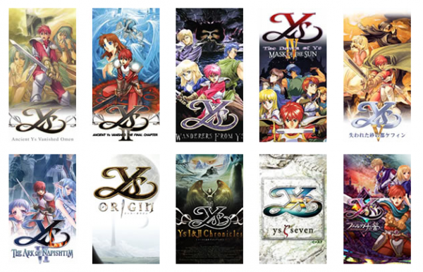
The Mortal Kombat and Sonic & Knuckles logos are my picks, but Ys is up there too. I especially love that they change the material and colors with each game.

Picture-5-19-11-27-e1504546529729.png
 

johan

Member
Oct 29, 2017
1,554
Fighting game logos are often pretty great. One of my favourites is Street Fighter Alpha 3

latest
 

D.Lo

Member
Oct 25, 2017
4,348
Sydney
Fighting game logos are often pretty great. One of my favourites is Street Fighter Alpha 3

latest
But that's a nasty botch job localisation of the actual logo for the game. Two fonts in a single word, gross. And the drop shadow on the A doesn't match the rest of the logo.

535010.jpg


The entire 'Alpha' rebranding was a complete mess. Zero 2 in particular is dominated by a Z motif in-game that's wrecked by renaming the game.
 

Grue

Member
Sep 7, 2018
4,886
Glad I'm not the only one who actively dislikes the original PS logo.

These are also great choices:

But I'm partial to Assassin's Creed, specifically the Syndicate logo:

assassin_s_creed_syndicate_logo_by_amia2172_d8wdxw0-fullview.png


The logo is so simple and so customizable for each era it's amazing

Which-brotherhood-would-you-join-assassinscreed.png
I honestly really love the Switch logo. It's simple, clean, I like the Yin/Yang thing it has going on and the little animation that plays in trailers is pretty satisfying in both visuals and audio.
Nintendo_Switch_logo%2C_square.png
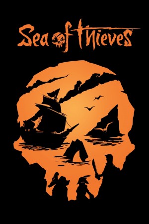
Sea of Thieves is absolutely brilliant. Even as a clean simple logo it works then you see the entire thing filled in and in color and it's just so damn clever.

seaofthieves.jpg

sea_of_thieves1.jpg


Bit obscure but I always though there was something iconic about the dataDyne logo from Perfect Dark. In fact I recognised it instantly when it cropped up in the recent teaser for the new game.


raf,750x1000,075,t,192033:321fc38aa7.jpg


I suppose starting the game right in front of it, I suspect inspired by the Atari logo in Blade Runner, helps cement it in the mind:

340


4342986647_0f598c2f98_b.jpg
 

issa

Banned
Oct 26, 2017
1,030
Riyadh, Saudi Arabia
I expected more Cory Schmitz, I'm pleasantly surprised.

This is not a diss, his top works are unparalleled (Oculus, 17-Bit), it's just that sometimes it feels like he's the only identity designer in the industry.
 

Rover

Member
Oct 25, 2017
5,414
Everything from the Wipeout series

c66e167598ae211de0a46bac50ef5f88.png

The Designers Republic is just too good


The problem with this logo is that it comes up while the console is booting and making all these ugly churning and beeping sounds. Hard to disassociate those two. But great system otherwise!


PsF6OdI.jpg


I wish I had created it. Simple, elegant, instantly recognizable at any size.

Agreed. A lot of the logos in this thread really don't look designed for the long haul.
 

ResidentDante

Member
Nov 2, 2017
1,076
Oslo, Norway
But that's a nasty botch job localisation of the actual logo for the game. Two fonts in a single word, gross. And the drop shadow on the A doesn't match the rest of the logo.

535010.jpg


The entire 'Alpha' rebranding was a complete mess. Zero 2 in particular is dominated by a Z motif in-game that's wrecked by renaming the game.
This so much. Never understood the rebranding from Zero to Alpha.
 

Rover

Member
Oct 25, 2017
5,414
afa67b32a7c968ee6ca2f00c96586fe7.jpg


Love the original Game Boy logo and packaging scheme.

4a22e7920b8a0e3822827007436e6390.gif

Part of this is just about how much of a mark of quality this logo used to be. But it also has so much more style than the rigid, corporate SquareEnix logo. The S feels very fluid and almost like calligraphy.


1200px-SEGA_logo.svg.png

One of the most timeless logos in games. Sure, it's just the CNN font. But CNN didn't make the Genesis or the Dreamcast. Frankly, CNN is using the Sega font.
 

Navidson REC

Member
Oct 31, 2017
3,422
From a design point of view or from a videogame user point of view? Because from a design point of view, all the ones posted so far are straight up garbo tier.
What? The PlayStation logo and Insomniac's (with the moon) have fantastic designs! Simple yet striking. Great colors on the PS logo, too.
 

sweetmini

Member
Jun 12, 2019
3,921
It's crazy, but i was in love with Climax entertainment logo back in the landstalker days.
I remember redrawing it pixel by pixel, by making the game hang up at the logo with custom AR code (takes far more time than it looks)
climax1imkzk.png


The best logos, to me, are Traveller's tales
Traveller%27s_Tales_logo_%281995-2004%29.jpg

and psygnosis full owl
Psygnosis.png
 

Gay Bowser

Member
Oct 30, 2017
17,651
Even if they're both legit, the logo itself communicates absolutely nothing to a viewer who isn't familiar with the game. Hell, as people in this thread have shown, it's inscrutable even to people who are familiar with the game. It could be the logo for just about anything; a laundry detergent, a government department, a car brand, an employment agency.
That's the case for most logo symbols, though. It's not like the Mercedes-Benz logo is a picture of a car. It's not like the Nike swoosh is a picture of a shoe. It's not like most of the console logos people are posting in this thread are pictures of consoles or anything videogame-specific. It's not like the Chase or Mastercard symbols have anything literal to do with finance. Most logo symbols are abstract symbols that we associate with the brand through repeated use. They're designed to be empty vessels that are given meaning by the brand.
 

N64Controller

Member
Nov 2, 2017
8,325
First, I'd like to congratulate OP for making a thread with a question being asked in the thread name, and then making a statement answering that question in their post. This makes the thread about the question, and not about OP's opinion. We see so many threads these days that would be phrased like "IS THE PLAYSTATION LOGO THE BEST LOGO IN GAMING?".

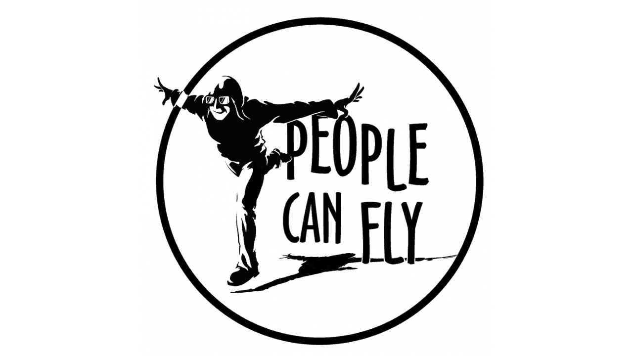
As for me, my current favorite logo is People Can Fly. I don't know why because it's pretty simple, but I love the studio name, love their logo.

b7ig7td7rkrsbilcsjt5
 

PaulloDEC

Visited by Knack
Member
Oct 25, 2017
7,408
Australia
That's the case for most logo symbols, though. It's not like the Mercedes-Benz logo is a picture of a car. It's not like the Nike swoosh is a picture of a shoe. It's not like most of the console logos people are posting in this thread are pictures of consoles or anything videogame-specific. It's not like the Chase or Mastercard symbols have anything literal to do with finance. Most logo symbols are abstract symbols that we associate with the brand through repeated use. They're designed to be empty vessels that are given meaning by the brand.

Sure, but would you pick any of those as your favourite logos, or argue in favour of them as the best? I certainly wouldn't. Those kinds of logo are effective only because the brands they're attached to are successful - that indicates an effective brand, not an effective logo.
 

PaulloDEC

Visited by Knack
Member
Oct 25, 2017
7,408
Australia
Why not, if they're well-designed?

A lot of people 100% would argue in favor of, say, the Nike swoosh being one of the best logos out there.

To each their own. It's a nicely designed shape, but it isn't worthy of any more praise than that, to me.

The best logos in my view are the ones that tell me something or make me feel something. Having a nicely executed design is only one part of the equation.
 

RROCKMAN

Avenger
Oct 25, 2017
10,817
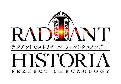
The original radiant historia logo


Which had the i slightly bigger and a silhouette of Stocke, the main character in the i.

When you take into account the negative space of the I, you see its actually the door of time Stocke, steps though every time he uses historia.

It's slightly easier to see with the colors inverted

1-logo.png


Of course, the remake throws all of the subtlety out of the window.

latest
 

Philippo

Developer
Verified
Oct 28, 2017
7,902
I really like the standard Final Fantasy font and underline, and once you had the occasional Amano illustration with it it becomes an instant recognizable classic.
 

Bentendo24

Member
Feb 20, 2020
5,343
Going into this thread: "hmmmm, I gotta think about it"

Sees playstation logo: "oh yeah it's that one"