-
Ever wanted an RSS feed of all your favorite gaming news sites? Go check out our new Gaming Headlines feed! Read more about it here.
We need to talk about Pokemon Carddass art
- Thread starter Forkball
- Start date
You are using an out of date browser. It may not display this or other websites correctly.
You should upgrade or use an alternative browser.
You should upgrade or use an alternative browser.


These were very cool. Back when Pokemon was a genuine take on nature and not a super cleaned up children's thing which ignores logic.
Lol, what?
Actually Pikachu has had that different-colored belly in a handful of pre-release art, as well as its Red/Blue/Green sprites. Seems like they made the change sometime in 97?Yea but he has a white stomach like Marrill. Pikachu never had that, usually he's all yellow


It happened in the period between Gen 2 and 3, his style was slowly approaching the modern look during Crystal.Ken Sugimori was the original designer, right? When did the artstyle move from the watercolor-y look to the more modern look? Are there any gen 2 cards that look like this?


Interestingly enough he did exactly two Pokemon in his old coloring style before changing to the more modern one, same art but redone colors.


Awesome, thanks. Not certain why but I really prefer the use of white space in the coloring...maybe it seems a little more like literal, traditional "art"?

I love the original artwork. It's probably what drew me to Pokemon in the first place back with Red and Blue. I remember being one of the first kids to even know about the games and got a lot of others hooked.
It happened in the period between Gen 2 and 3, his style was slowly approaching the modern look during Crystal.
I wish he would redo all the designs from gen 3 and up in his old style. It was just so damn nice and stood out.
This is fan made, but damn I love it:


Early Pokémon art is the coolest stuff. You get a much more interesting and insightful look into how these creatures behave and fit into their ecosystems. I still love Pokémon but I don't think you really get that anymore. Not as much, anyway.
I think it has to do with how Pokémon was conceived during development and how it turned out after, as some of these drawings(not the cards themselves) were made during development. And obviously things changed further after Red/Green came out.
Also I have no idea why, but for some reason I find this one the creepiest. Partially because I think I always viewed Koffing as this sorta' fleshy thing, but this points it out to be more like a balloon:
Koffing theoritically is full of gas, the reason Weezing is considerably heavier is that it's full of liquids instead.
Wing Attack was supposed to throw feathers? Wowa. (I haven't played anything after B/W so excuse me if they do that in current 3D animations)
From what I recall, as per Pokémon Stadium feathers were involved in some manner, which doesn't really work with things like Golbat of course.

Ken Sugimori was the original designer, right? When did the artstyle move from the watercolor-y look to the more modern look? Are there any gen 2 cards that look like this?
In terms of the TGC I think theres a few. In terms of these 'Carddass' I don't think there is a gen 2 equivalent.
If I knew how much the early TGC stuff is worth sealed these days I'd have plowed all my paper round money into buying sealed boxes and packs D:
Bumping an old thread because it's quite comprehensive.
These cards are pretty hard to buy. 😥
Most of the sellers are expectedly Japanese and the language barrier is hard for both of us. The cards also do not have great documentation so I'm doing my best to piece together information from the available listings.
It seems that Carddass sets were meant to be collected and assembled in what's referred to as a "file system." So the accompanying binders are usually referred to as complete files or file systems and not usually "sets" like we commonly use in English. Some of these file systems are black:

But others still are blue:

It's not clear to me yet which one is related to the 1997 set that is the subject of this thread. There is an even older set from 1996 that uses more traditional Pokémon art and the binder could match to that one instead. I'm still trying to figure that out because from a collector point of view obviously the intention is to have the correct binder.
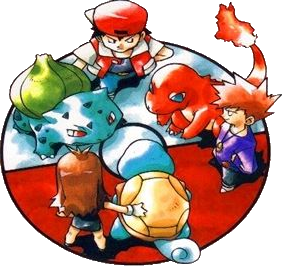
Another wrinkle is that sets advertised as complete are not complete. There are 153 cards in the set: one for each of the original 151 Pokémon and two bonus ensemble cards that depict Red and Blue with the started Pokémon. But the listings provide very, very little information and usually do not have an adequate description. So you have to review the pictures and see if their understanding of "complete" means the 151 Pokémon or the total 153 cards.
Condition is also an issue because condition is not usually described. Sometimes it they'll just say "very good." In one instance, the seller actively discouraged purchasing their listing if you were hoping for a beautiful item:
I've been poking around and trying to keep an eye on this set for a few years now in hopes of picking up the full file system in the correct condition but it sure is hard.
Price is also all over the place. I'd hazard a guess that the cards do not have a market in Japan (where they are less of a novelty) and international sellers are attempting to cash in on their recent Western popularity to see how much they can get for them. That makes total sense but prices range from $200 to $500. That's a huge difference for trading cards. This has been the case for the last few years and I'm surprised they haven't stabilized yet.
These cards are pretty hard to buy. 😥
Most of the sellers are expectedly Japanese and the language barrier is hard for both of us. The cards also do not have great documentation so I'm doing my best to piece together information from the available listings.
It seems that Carddass sets were meant to be collected and assembled in what's referred to as a "file system." So the accompanying binders are usually referred to as complete files or file systems and not usually "sets" like we commonly use in English. Some of these file systems are black:
But others still are blue:
It's not clear to me yet which one is related to the 1997 set that is the subject of this thread. There is an even older set from 1996 that uses more traditional Pokémon art and the binder could match to that one instead. I'm still trying to figure that out because from a collector point of view obviously the intention is to have the correct binder.
Another wrinkle is that sets advertised as complete are not complete. There are 153 cards in the set: one for each of the original 151 Pokémon and two bonus ensemble cards that depict Red and Blue with the started Pokémon. But the listings provide very, very little information and usually do not have an adequate description. So you have to review the pictures and see if their understanding of "complete" means the 151 Pokémon or the total 153 cards.
Condition is also an issue because condition is not usually described. Sometimes it they'll just say "very good." In one instance, the seller actively discouraged purchasing their listing if you were hoping for a beautiful item:
"It becomes an old thing, but the state of the card was in the file, so I think it is a good one, but please refrain from the person who is looking for a beauty productThere are scratches and dirt on the binder"
I've been poking around and trying to keep an eye on this set for a few years now in hopes of picking up the full file system in the correct condition but it sure is hard.
Price is also all over the place. I'd hazard a guess that the cards do not have a market in Japan (where they are less of a novelty) and international sellers are attempting to cash in on their recent Western popularity to see how much they can get for them. That makes total sense but prices range from $200 to $500. That's a huge difference for trading cards. This has been the case for the last few years and I'm surprised they haven't stabilized yet.
The art on those cards is pretty cool - I definitely enjoy seeing stuff from the Pokemon games around the era that I used to play them as a kid, but why is this a "we need to talk about X" thing? We don't need to talk about it - it's just something cool to look at. Which is fine by the way. there's not some deeper discussion needed. I wish people would cool it on the clickbait titles.
There's something about the expressiveness from these pics that I find fascinating. I can see where the Stadium animations took inspiration from, like Golbat being grounded rather than flying.
Bumping an old thread because it's quite comprehensive.
These cards are pretty hard to buy. 😥
Most of the sellers are expectedly Japanese and the language barrier is hard for both of us. The cards also do not have great documentation so I'm doing my best to piece together information from the available listings.
It seems that Carddass sets were meant to be collected and assembled in what's referred to as a "file system." So the accompanying binders are usually referred to as complete files or file systems and not usually "sets" like we commonly use in English. Some of these file systems are black:
But others still are blue:
It's not clear to me yet which one is related to the 1997 set that is the subject of this thread. There is an even older set from 1996 that uses more traditional Pokémon art and the binder could match to that one instead. I'm still trying to figure that out because from a collector point of view obviously the intention is to have the correct binder.
Another wrinkle is that sets advertised as complete are not complete. There are 153 cards in the set: one for each of the original 151 Pokémon and two bonus ensemble cards that depict Red and Blue with the started Pokémon. But the listings provide very, very little information and usually do not have an adequate description. So you have to review the pictures and see if their understanding of "complete" means the 151 Pokémon or the total 153 cards.
Condition is also an issue because condition is not usually described. Sometimes it they'll just say "very good." In one instance, the seller actively discouraged purchasing their listing if you were hoping for a beautiful item:
I've been poking around and trying to keep an eye on this set for a few years now in hopes of picking up the full file system in the correct condition but it sure is hard.
Price is also all over the place. I'd hazard a guess that the cards do not have a market in Japan (where they are less of a novelty) and international sellers are attempting to cash in on their recent Western popularity to see how much they can get for them. That makes total sense but prices range from $200 to $500. That's a huge difference for trading cards. This has been the case for the last few years and I'm surprised they haven't stabilized yet.
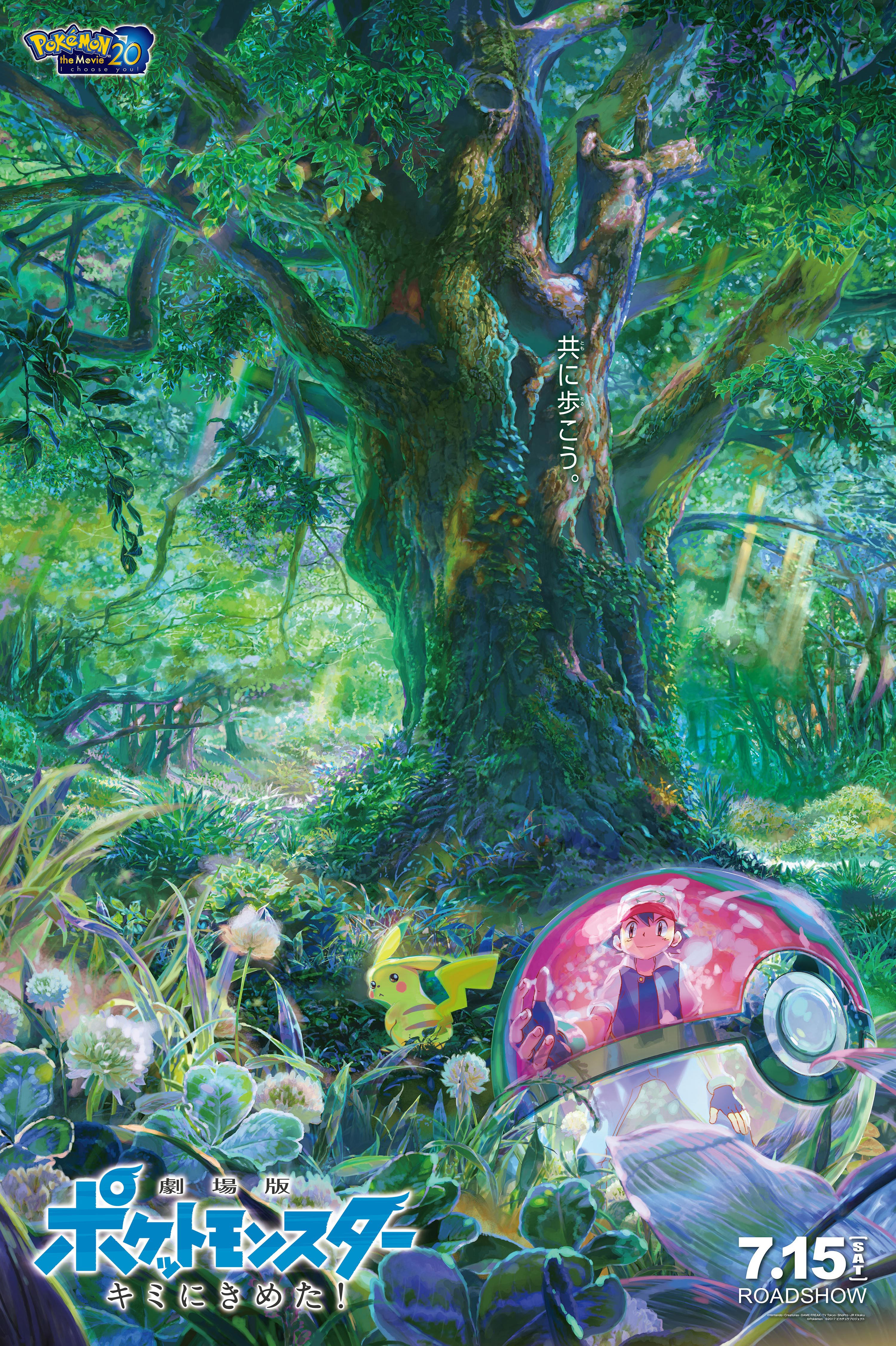
God 90's Pokemon art from all sides were so fucking cool. From Sugimori's timeless style to the crazy stuff you'd see in Japan like the above. Why did Pokemon art get so bland and lifeless in comparison? At least some of the Japanese movie posters are on fucking point at times.
Here's one from I Choose You, holy shit:
Last edited:
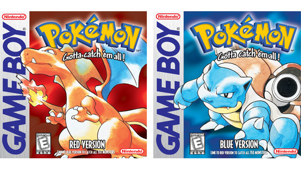
Love this art. For you youngsters, the boxes and original instruction booklets that came with Red/Blue back in the day had some illustrations in it with this style too.

I definitely love this style. It's kind of a bummer that everything got redesigned to match the anime.
I definitely love this style. It's kind of a bummer that everything got redesigned to match the anime.
God 90's Pokemon art from all sides were so fucking cool. From Sugimori's timeless style to the crazy stuff you'd see in Japan like the above. Why did Pokemon art get so bland and lifeless in comparison? At least some of the Japanese movie posters are on fucking point at times.
I love the old Sugimori art. That will always be Pokémon to me. I'm still an avid fan of the series but the first two generations capture and depict an aesthetic I find far more captivating and full of wonder than the more mainstream anime style we have today.
That's why I like the Carddass set. They're a relic from an abandoned world: a world of teeth and claws and angry eyes.
I love the old Sugimori art. That will always be Pokémon to me. I'm still an avid fan of the series but the first two generations capture and depict an aesthetic I find far more captivating and full of wonder than the more mainstream anime style we have today.
That's why I like the Carddass set. They're a relic from an abandoned world. A world of teeth and claws and angry eyes.
Yep. I was always a huge fan of Sugimori's classic style since day 1. 3rd gen as pointed out was the start of the modern look (with Crystal being a neat mix of the two), but I think it was 4th gen when things got odd design-wise, maybe Emerald, since Brendan and May's art in Ruby and Sapphire more greatly resembled Sugimori's classic style than Emerald and onward. Nowadays it's literally night and day.


Edit: Oh right FRLG began the more modern style, not Emerald.
Would love to see the games emulate this watercolour style. It's just so good.
Loving the art on these cards, but the low-fi backgrounds are weird.
Loving the art on these cards, but the low-fi backgrounds are weird.

Would love to see the games emulate this watercolour style. It's just so good.
Loving the art on these cards, but the low-fi backgrounds are weird.
I'd settle for a TCG set with all the art in this style, to be honest. I've been holding out for that for a long time. With all the classic reprints they've done, I wonder if it's occurred to them to just emulate the aesthetic of a classic set - just with new Pokémon too.
Imagine a full set with Pokémon spanning from every generation and all the art looks just like this.
Love this art. For you youngsters, the boxes and original instruction booklets that came with Red/Blue back in the day had some illustrations in it with this style too.
I definitely love this style. It's kind of a bummer that everything got redesigned to match the anime.
Whewwwwww this brings back memories.
If you like the style you would love this book
Let's Find Pokemon! Special Complete Edition (2nd edition) https://smile.amazon.com/dp/1421595796/
Let's Find Pokemon! Special Complete Edition (2nd edition) https://smile.amazon.com/dp/1421595796/
I'd settle for a TCG set with all the art in this style, to be honest. I've been holding out for that for a long time. With all the classic reprints they've done, I wonder if it's occurred to them to just emulate the aesthetic of a classic set - just with new Pokémon too.
Imagine a full set with Pokémon spanning from every generation and all the art looks just like this.
That'd so fucking incredible. I've been waiting for an amiibo Pokemon TCG series to succeed the e-cards. Those were so fun.
Also, one artist long gone from the franchise does not get NEARLY the recognition he deserves; Keiji Kinebuchi:


Base Set vs Aquapolis, his final set. I miss him so much, why did he leave? :(
Last edited:
I remember wondering about the art showing Red and Blue with a girl trainer using Squirtle for the longest time.Love this art. For you youngsters, the boxes and original instruction booklets that came with Red/Blue back in the day had some illustrations in it with this style too.
I definitely love this style. It's kind of a bummer that everything got redesigned to match the anime.
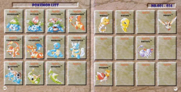
They deliberately left gaps in that Pokédex at the back to leave a sense of mystery. So good. That manual... I can remember the smell of it you know. So good.Love this art. For you youngsters, the boxes and original instruction booklets that came with Red/Blue back in the day had some illustrations in it with this style too.
I definitely love this style. It's kind of a bummer that everything got redesigned to match the anime.
I remember wondering about the art showing Red and Blue with a girl trainer using Squirtle for the longest time.
This one?
Love this art. For you youngsters, the boxes and original instruction booklets that came with Red/Blue back in the day had some illustrations in it with this style too.
I definitely love this style. It's kind of a bummer that everything got redesigned to match the anime.
This literally made my heart skip a beat with happy memories. This whole thread has, actually. Gonna have to fire up the TCG Online later and reminisce...
I had these stickers that were extremely similar to these called シールダス, but I think they may have been from a few years later. Still Pre-GS though.


Love this art. For you youngsters, the boxes and original instruction booklets that came with Red/Blue back in the day had some illustrations in it with this style too.
I definitely love this style. It's kind of a bummer that everything got redesigned to match the anime.
Those were the days...
That'd so fucking incredible. I've been waiting for an amiibo Pokemon TCG series to succeed the e-cards. Those were so fun.
Also, one artist long gone from the franchise does not get NEARLY the recognition he deserves; Keiji Kinebuchi:
Base Set vs Aquapolis, his final set. I miss him so much, why did he leave? :(
Yes! I love his art since I was a kid.
They might not be as detailed as other illustrations but they have a special place in my heart.


Those early watercolour artworks have a special place in my heart, I wish they'd always kept that style but as the franchise got bigger I completely understand them wanting to make everything more unified
Those Keiji Kinebuchi artworks are E V E R Y T H I N G though
I can never forget this Slowpoke card artwork, my Mum used to always find it hilariously funny that it was so simple but I love it

Those Keiji Kinebuchi artworks are E V E R Y T H I N G though
I can never forget this Slowpoke card artwork, my Mum used to always find it hilariously funny that it was so simple but I love it
I have a soft spot for his work, too, but other CGI artists for the TCG were showing greater technical proficiency in like 1998, and 2002 was real late to still be putting out art that looked like this:That'd so fucking incredible. I've been waiting for an amiibo Pokemon TCG series to succeed the e-cards. Those were so fun.
Also, one artist long gone from the franchise does not get NEARLY the recognition he deserves; Keiji Kinebuchi:
Base Set vs Aquapolis, his final set. I miss him so much, why did he leave? :(
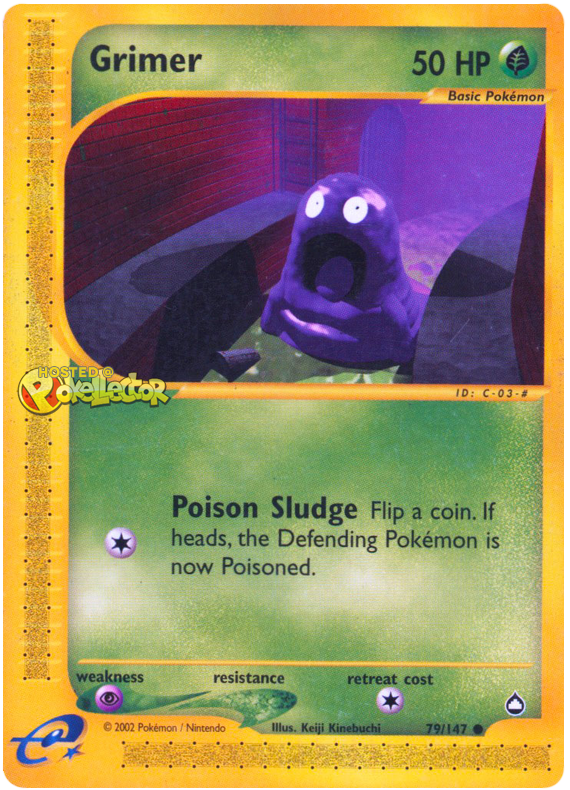
(I love that card.)