Can't wait for an upside down Funky Mode.Marin is almost perfectly located to be replaced by a "new funky mode" sticker
-
Ever wanted an RSS feed of all your favorite gaming news sites? Go check out our new Gaming Headlines feed! Read more about it here.
-
We have made minor adjustments to how the search bar works on ResetEra. You can read about the changes here.
We are approaching the release of FE: Three Houses. Is it too late to raise a stink over the boxart?
- Thread starter StraySheep
- Start date
You are using an out of date browser. It may not display this or other websites correctly.
You should upgrade or use an alternative browser.
You should upgrade or use an alternative browser.

funky marin modeMarin is almost perfectly located to be replaced by a "new funky mode" sticker
No it's a joke based on the Fire Emblem box art and the Luigi's Mansion 3 box art
The idea of the 3 swords clashing is fine but I really dislike the upside down character...it just looks goofy. ;P
Upside down Claude never gets old to me.
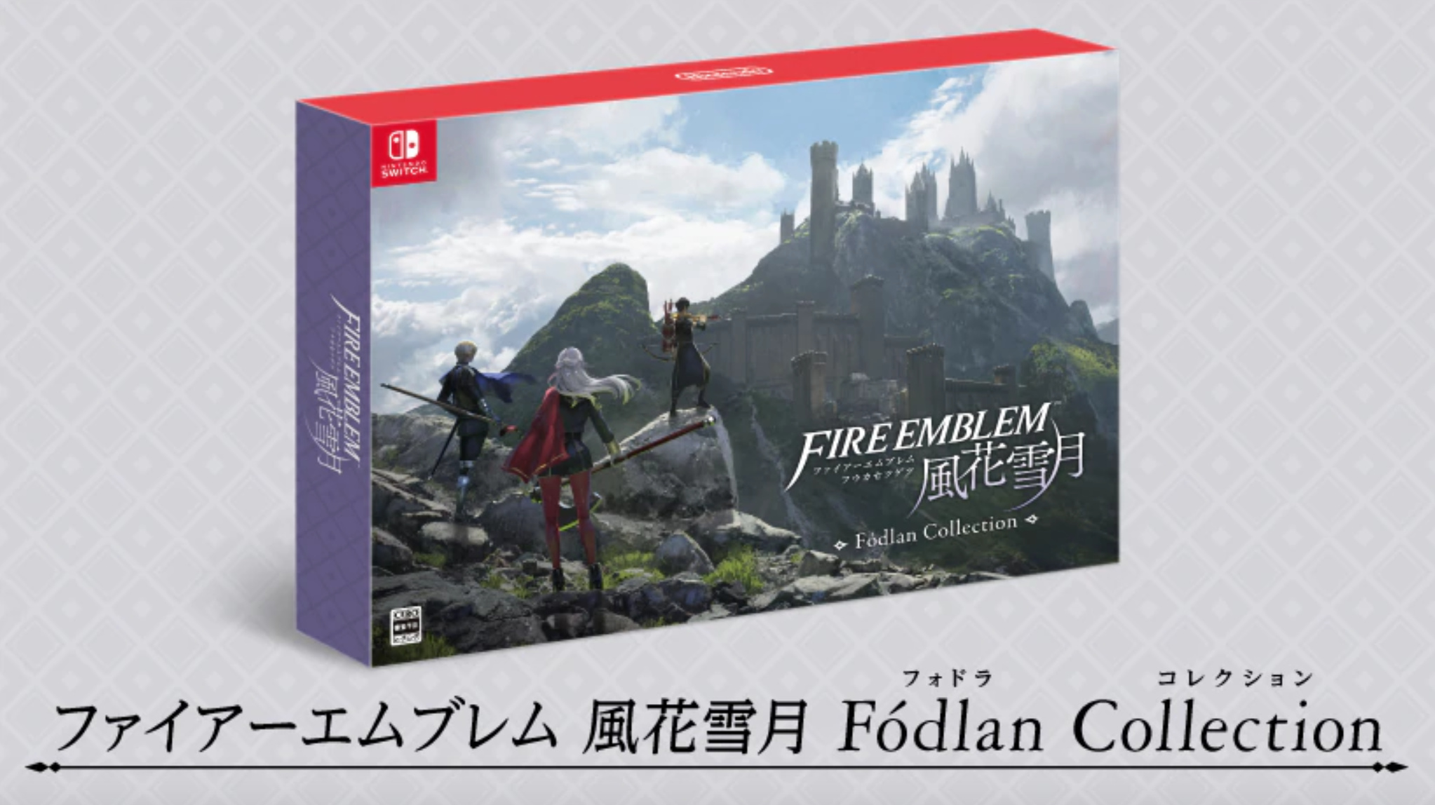
Thank goodness I'm not touching this physical copy. CE box looks nice though.
Thank goodness I'm not touching this physical copy. CE box looks nice though.
this is the first time im seeing the box, and it's the second thing i noticed, after "Hey, that boy is upside down"


Is bad, probably even worse than the Astral Chain cover. I really hope there's a reversible one here.
I hadn't noticed this. The cover was terrible enough as it was, this is now the icing on the cake.
The bow Isn't a straight line like the other two, nor does it curve in a way that makes sense
Won't the home icon be based on the same "art" composition?
Could go 50/50 tbh. Some games do that, whereas others don't. There is still hope.
Its a mediocre but serviceable boxart. The ral question is: why the fuck that guy is upside down
The three primary colors?To those asking what was wrong with it, this is the biggest problem obviously. But I also don't like the dopey position and expressions of the avatars and I think the overall combination of colors is jarring.
Also, petition?
I'm starting to think Nintendo and publishers all have this "thing" with upside down characters. Maybe it's to save space on the front cover?
Plot twist: Switch Game Icon has the upside down Claude.
I can't believe you guys can't appreaciate the sheer beauty of upside-down Claude.
You guys are no fun. You'll take your memes and you'll like them.
You guys are no fun. You'll take your memes and you'll like them.
As long as the icon is better, I generally don't care all that much. I do think it's terrible box art though.
OP hasn't seen the Astral Chain boxart
https:///wp-content/uploads/2019/06/astral-chain-boxart-banner-jun112019-1-1-900x576.jpg
way better than fire emblem's imo
I think it looks great. I really don't get what's wrong with it.OP hasn't seen the Astral Chain boxart
https:///wp-content/uploads/2019/06/astral-chain-boxart-banner-jun112019-1-1-900x576.jpg
The boxart for this game is horrible, specially after the amazing FE Awakening one. Is it the same artist?
I was really hoping at some point we would get a boxart revision after they unveiled it earlier this year. As it is now I still think it is one of the worst Nintendo boxarts I can think of and as a physical gamer I am not looking to having it on my shelf.

Was there ever a petition or anything? I know it is kind of a trivial issue, but come on. Think how the Switch Icon will look Neiteio!
Edit: Mods please feel free to fix the "is is" in my title.
Have you contacted Nintendo about your concerns?
OP
OP
Texted my Uncle. He works there.
Also, do you display your games facing with the front facing outwards rather than just the spine. How long exactly do you intend to spend looking at the cover?
God no. I pray that doesn't happen