-
Ever wanted an RSS feed of all your favorite gaming news sites? Go check out our new Gaming Headlines feed! Read more about it here.
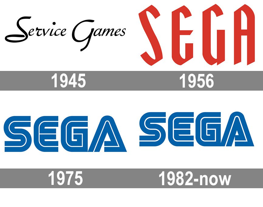
Today in history: SEGA'S iconic logo introduced.
- Thread starter Shard Shinjuku
- Start date
You are using an out of date browser. It may not display this or other websites correctly.
You should upgrade or use an alternative browser.
You should upgrade or use an alternative browser.
Lmfao
"we sought to modernize the logo to better represent our visions as a modern company, but that hint of blue will remind consumers that we're the same old SEGA they knew and loved!"
It's 70s and timeless.
What's crazy is that I have thought it is timeless like many others, but seeing the copyright date and looking at the logo again, it is SO 70s.
Also blown away that Service Games was around in 1945...what kinda games were they even making? Competitors to Nintendo in the playing card biz?
It's '70s and timeless, like the Atari logo.What's crazy is that I have thought it is timeless like many others, but seeing the copyright date and looking at the logo again, it is SO 70s.
and
According to Wikipedia, they were in the slot machine business at that time.Also blown away that Service Games was around in 1945...what kinda games were they even making? Competitors to Nintendo in the playing card biz?
Also, I agree that the logo is both 70s and timeless. It definitely has a 70s aesthetic to it, but compared to most old logos this just holds up. I really hope they don't pull a Namco someday.
Yes, very odd start.
Basically an American company in Hawaii selling slot machines to US army. After being outlawed in 1945, after the war they setup in Tokyo for US bases in Japan and gradually it became Sega that we know today.
Lol I basically went through the exact same thing. I guess it's one of those things that you don't give much thought to since you're so familiar with it.What's crazy is that I have thought it is timeless like many others, but seeing the copyright date and looking at the logo again, it is SO 70s.
I forget how old I was when I learned it was SErvice GAmes. Some random fact I knew as a kid.
I've always found the logo to be great.
I've always found the logo to be great.
get out
There have been dozens of companies out there changing their logos for the worst.
Sega don't need to change a damn thing on theirs, and I applaud them for not chasing the trend.
Sega don't need to change a damn thing on theirs, and I applaud them for not chasing the trend.
I like the lighter blue of the JP version of the logo, it reminds me of the blue skies of 1990s Sega games.
I'm more surprised that it was founded and run by Americans until the mid-'80s, I always assumed it was a purely Japanese company.
Yes, very odd start.
Basically an American company in Hawaii selling slot machines to US army. After being outlawed in 1945, after the war they setup in Tokyo for US bases in Japan and gradually it became Sega that we know today.
I'm more surprised that it was founded and run by Americans until the mid-'80s, I always assumed it was a purely Japanese company.
Hahaha, awesome! Great post for the username!
I recognize that multi line style of font used in a lot of 80's stuff (and I guess 70's), but I never once thought of the Sega logo as retro or old fashion. It just always looked modern to me, no matter when.
It's just timeless
It's just timeless
Thanks batfactsNot only was SEGA founded as an American company, but they were also responsible for importing some of the first Nintendo games to hit the states such as the 1976 version of Wild Gunman.
Gaming history is fun.
Sega, Atari, and Nintendo have perfect logos
Perfect logo. They've probably saved thousands of dollars in rebranding costs by getting it right early.
This and nintendo are perfect logos that should never changed. We know that nintendo slightely have changed colours to represent the era, but they were no major changes and returned to use in red or white now.
And i even enjoy some of their more historical logos for nintendo and service game that predate the now classic ones, but would only use them for anniversaries as a cute historical touch.
And i even enjoy some of their more historical logos for nintendo and service game that predate the now classic ones, but would only use them for anniversaries as a cute historical touch.
Was SEGA secretly the first GaaS, aha.
The Sega logo along with Nintendo are undoubtedly the most iconic logos in gaming. What was futuristic at the time ended up being timeless decades later. As others said, I hope Sega never changes their logo.
Hmm, that's interesting. Might explain why I kept seeing mainly two different shades on the logo in the Forza decal selection. My favorite player-created liveries are the SEGA ones, there's some cool ones out there like Astro City etc.https://segaretro.org/Sega_logo
Some cool info here on the Sega logo, including the fact that they're two different official shades for the Japan and international markets, with Japan's being lighter
if it was released today there'd be people here who suddenly become typeface design experts and nitpick that the letter A looks too separated from the rest and shit
as there is in every new logo thread
as there is in every new logo thread
been said here, but absolutely timeless & to be this good takes AGES
although it was thoughtful of konami to ditch their classic logo when they decided to suck
✊
although it was thoughtful of konami to ditch their classic logo when they decided to suck
✊
Yes, and now the term 'service games' is used widely today and of course now you won't be able to unsee it.


