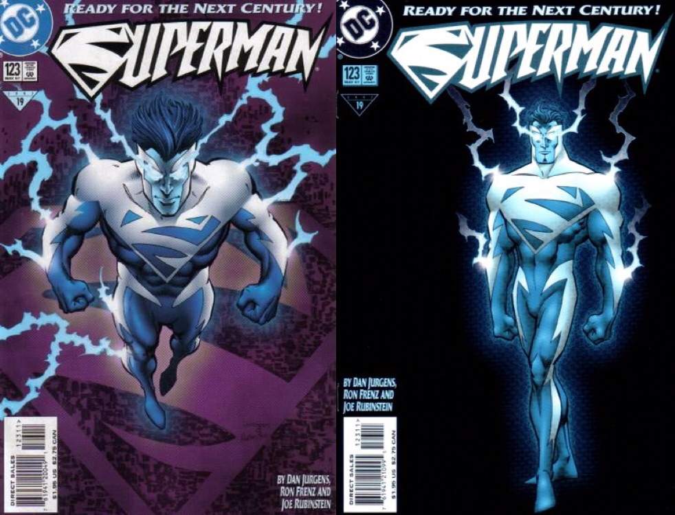
Did he listen to too much Eiffel 65?
-
Ever wanted an RSS feed of all your favorite gaming news sites? Go check out our new Gaming Headlines feed! Read more about it here.
Thoughts on modernizing/updating super hero costumes?
- Thread starter DragonSJG
- Start date
You are using an out of date browser. It may not display this or other websites correctly.
You should upgrade or use an alternative browser.
You should upgrade or use an alternative browser.
It really pops in a good way.I wasn't feeling it at first, but once they stopped using it I started missing it. It really is one of my favorites.
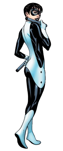
It also works well with all the Batfamily designs and doesn't make him feel too underdesigned/basic as the classic does.
Big Brandon laughs at your feeble attempts to remove the super tights


Random guy from a 90s Gillette advert in a Super Man suit.
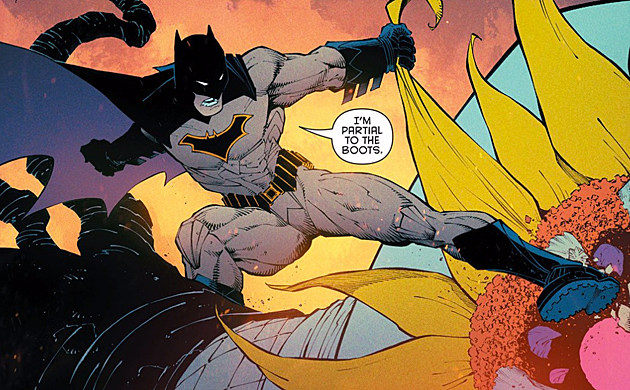
true factsThe Rebirth Batsuit is the best a comic Batsuit can and ever will look


As long as the costume's "to the point", I don't mind a modern update. It's when a designer decides to incorporate all these unneeded textures, piece stitching and seams for the sake of complexity that makes me roll my eyes. This isn't something reserved for comic movie designs, though. It's something that's been soaked into character designs in general from sometime in the 00s to the present day. You see it a lot in video games as well.
I like variations on a costume, not completely different costumes. It should be instantly recognised as the same hero, not debatable that it is a different but similar hero. Colour themes go a long way here, but don't always need completely stick if not much else is changing. The bigger the changes the more colours need stay the same.
Movies should stick to being very near comic accurate, I want to see what is on the page on big screen, not something unrecognisable. The Thor example in OP is close enough.
Movies should stick to being very near comic accurate, I want to see what is on the page on big screen, not something unrecognisable. The Thor example in OP is close enough.
All for it. I'm tired of the 1930s swimsuits and the full body spandex that looks spraypainted on. But also overdesigned characters with a ton of accessories. There's a sweet spot.
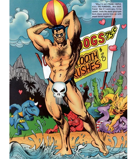
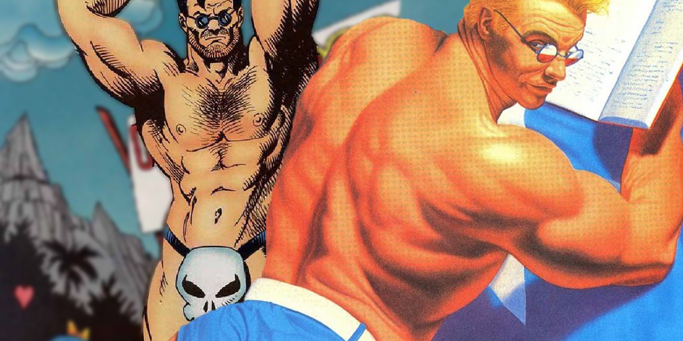
I particularly hate shit like this:
Design a character. Don't just draw them nude and spray paint them goofy colors, with maybe underpants on the outside and/or face masks. Like, great, Finesse is a gymnast. But do try a bit harder. Spider-Man gets a pass on the spraypaint spandex because he's fucking Spider-Man, and little else fits. Ditto a few others.
That said, things have to fit the medium.
Last edited:
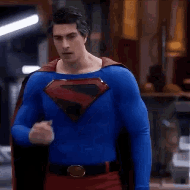
I'm beyond excited for this movie.This is a big reason for why I'm so fond of the suit that we're seeing for Battinson in The Batman, compared to the Batfleck suits in the main DCEU. It takes more creative chances and modernizes Batman in a more interesting way than just trying to make a costume that looks like Frank Miller's Batman from the 80's, all while giving nods and winks to a variety of different depictions of the character over the years.


OP
OP
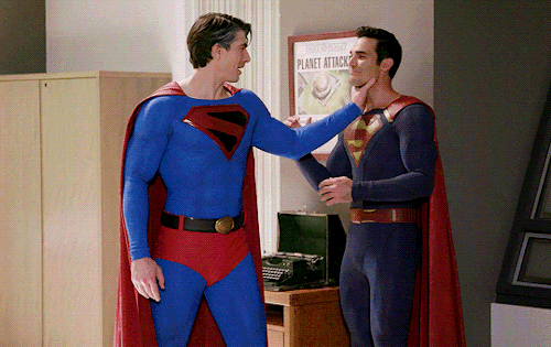
Nah man underwear needs to goThat's awful lmao. Superman needs the red briefs to make the look. Superman returns had the perfect live action costume
That's awful lmao. Superman needs the red briefs to make the look. Superman returns had the perfect live action costume
Woah woah let's slow down now. I'm as pro briefs as anyone but Superman Returns was not the way

Those colors are almost as muted as Cavill's, the shield is tragically small and that neckline is all kinds of jacked up.
It's ok though, he ended up getting the actual best live action supersuit
Let the women wear whatever they want, and put all the men in speedos. Problem solved!
Woah woah let's slow down now. I'm as pro briefs as anyone but Superman Returns was not the way
Those colors are almost as muted as Cavill's, the shield is tragically small and that neckline is all kinds of jacked up.
It's ok though, he ended up getting the actual best live action supersuit
That's also awesome!
I need the Marvel Swimsuit Specials back very badly.
no it didn't lolCaps Avengers costume looks campy intentionally. Colson designed it.
that was definitely a later retcon to acknowledge that people hated it
A later retcon that occurs within that same movie before they even show the suit?no it didn't lol
that was definitely a later retcon to acknowledge that people hated it
Remember that guy who was racially profiled a while back?
He was the editor
Marvel Editor Made Swimsuit Issue 'Gayest Thing You Ever Saw'
Warren Ellis revealed former Marvel editor Chris Cooper made an issue of Marvel's Swimsuit Special "the gayest thing you ever saw."
 screenrant.com
There are two different issues going on here.
Texture/Detail: Imagine creating a costume to literally recreate that comics illustration of Thor, as one-for-one as possible. It would almost certainly look cheap, stagey, "fake" because of how simple it is. This is why film versions of Superman (and Star Trek uniforms!) tend to use textured fabric with visible patterns on it, to break up the clean simplicity and bring a sense of material weight. Note that the Hemsworth Thor outfit in the comparison picture would look insanely busy if you tried to recreate that one-for-one on the comics page, it would be an over-textured mess. Texture and detail are just issues that have different solutions in different media.
Color/Looking "Silly": Contemporary superhero films are often terrified of not being taken "seriously," and in direct consequence choose drab, desaturated, utilitarian aesthetics. Costumes are a major aspect of this. Hawkeye wearing his stupid drab nothing across the entire MCU instead of something purple and exciting is really a symptom of his entire character being a glum, muttering nothing instead of a brash larger-than-life man of braggadocio, or even the more chill but still vivacious "personal life dumpster fire" pizza dog version of the character. You can immediately see how boneheaded most of the arguments in this thread are just by trying to apply the same fear of colorful, skintight, ridiculous costumes to Spider-Man, whose costume is obviously excellent and would in no way be improved by trying to hybridize it with a SWAT uniform for the sake of "tactical realism." I'm convinced that many people were so scarred in their younger years by Batman & Robin's colorful camp squashing of the last pretense of Batman being "serious" that they're still desperately overcompensating, now over twenty years later.
I hate when cartoon characters have costumes that looked like they're designed for live-action. Embrace the medium.
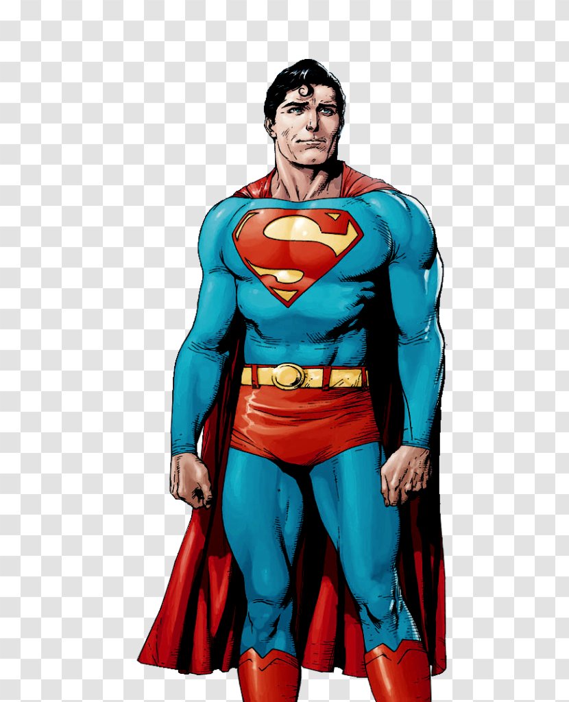
I also haven't seen a Superman redesign without the trunks that isn't a sea of blue. Also, a character shouldn't just wear what you think is cool/what you'd prefer to wear. Clark's a lovable dork that was raised by old folks in the middle of nowhere.
I also haven't seen a Superman redesign without the trunks that isn't a sea of blue. Also, a character shouldn't just wear what you think is cool/what you'd prefer to wear. Clark's a lovable dork that was raised by old folks in the middle of nowhere.
It hard to say honestly. Like Spiderman or Superman when it not their normal outfit just looks off. See underwear less ones above or the PS4 Spidey costume with the white outlights. They are not bad but just don't feel right. That said I vastly prefer the female character not all having to wear the swimsuits costumes now. I mean some like Zantanna are better fit with that design, but others like Captain Marvel or Wonder Woman are better off wearing pants or so. The Wonder Woman design for the upcoming future event looks really good but doubt it will be used permeantly like Captain Marvel.
it was great for supes, no idea why they returned to trunks ( they thought fans would be hype , we honestly don't care, we just want good stories )


OP
OP
Star wars does the same thing with armor/designI think it's kind of dumb and treats a goofy kids medium with too much self-seriousness.
Some costumes really look like they are specific to a decade or time period, not just that they are fantasy. Something like the iconic Luke Cage's outfit with the headband.
I try to imagine Jackman's Wolverine in yellow spandex and...
No. ☹️
Singer's X-Men in black costumes might be dull to others, but it looked cool to me. 🤷
No. ☹️
Singer's X-Men in black costumes might be dull to others, but it looked cool to me. 🤷
ehhhhhh medium has leaned to YAs and adults for like 40 years nowI think it's kind of dumb and treats a goofy kids medium with too much self-seriousness.
These are still somewhat artworks and not exactly final however I think make practical upgrades depends on context of the character.
I dont know anything about Eternals but they are powerful beings and have no relation to earth if I'm correct. With such context I would buy in about them as someone otherworldly if they're design was indeed outlandish or more bright and weird to contrast from what we already saw in MCU. The artwork for movie doesn't portrait them like being from another universe but more like people from earth with weird fashion.
Funnily enough, you got the Marvel Comics and MCU Eternals mixed up. The Marvel Comics Eternals were genetically enhanced homosapiens by the Celestials whilst it's the MCU Eternals who are the aliens.
They're also a case of being Marvel Cosmic characters who have had adventures exclusively on Earth.
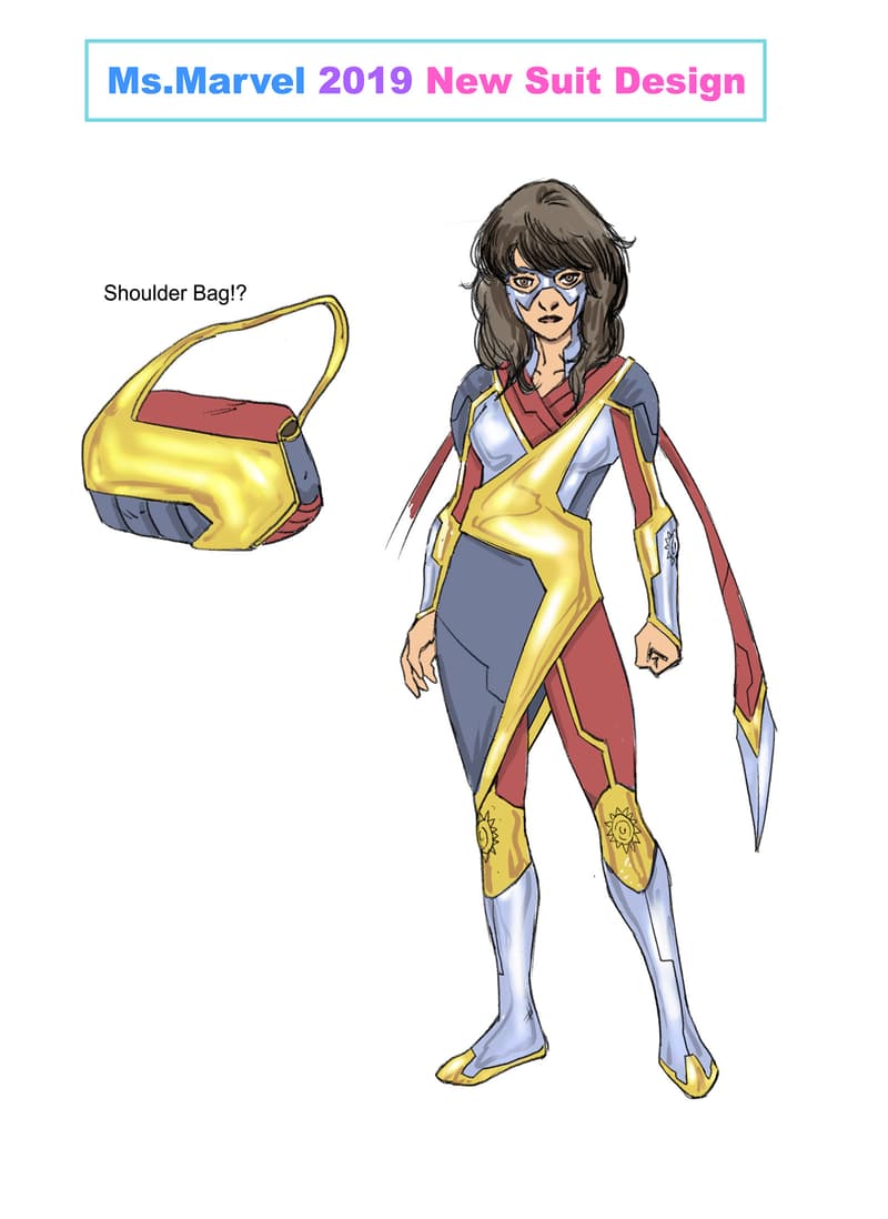
Depends on the costume and what the changes are. Burnside Batgirl was perfect, but then Sean Murphy redesigned her to something worse. Red Hood also got a downgraded costume. Oh and for a bit they gave Ms. Marvel a really bad, overdesigned costume.

:no_upscale()/cdn.vox-cdn.com/uploads/chorus_asset/file/11542483/BatgirlRedesign.jpg)

As for trunks, it depends what they look like to me. If they're just as tight as the rest of the costume, they usually look bad to me, but the looser, actually strongman-esque trunks they can work.
As for trunks, it depends what they look like to me. If they're just as tight as the rest of the costume, they usually look bad to me, but the looser, actually strongman-esque trunks they can work.
The only good designs in Insomniac Spider-man were Doc Ock, Taskmaster and Mr. Negative. Everyone else kinda sucks. Haven't played Miles Morales yet, though.
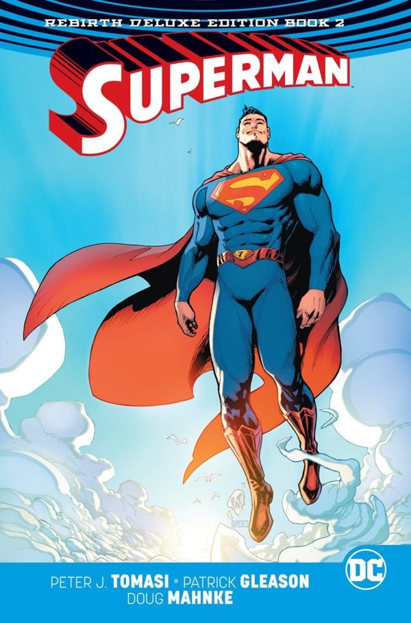
This is almost perfect. Only thing I dislike is that the boots look so metallic.it was great for supes, no idea why they returned to trunks ( they thought fans would be hype , we honestly don't care, we just want good stories )
Last edited:
OP
OP
What's wrong with those designsDepends on the costume and what the changes are. Burnside Batgirl was perfect, but then Sean Murphy redesigned her to something worse. Red Hood also got a downgraded costume. Oh and for a bit they gave Ms. Marvel a really bad, overdesigned costume.
As for trunks, it depends what they look like to me. If they're just as tight as the rest of the costume, they usually look bad to me, but the looser, actually strongman-esque trunks they can work.
The only good designs in Insomniac Spider-man were Doc Ock, Taskmaster and Mr. Negative. Everyone else kinda sucks. Haven't played Miles Morales yet, though.
This is almost perfect. Only thing I dislike is that the boots look so metallic.
Superman feels off to me without the trunks but its no deal breaker. Its when they overcomplicate his costume with armor-lines that gets me. Every time you see one of those costumes, it takes you out with whatever your reading because you're always asking yourself "Why the fuck is Superman wearing armor?" "He is suppose to be invulnerable!"
If they want to add extra details on his costume, i would suggest to just give the spandex a consistent texture.
If they want to add extra details on his costume, i would suggest to just give the spandex a consistent texture.
I hate just putting metal suits on everybody. Amazing Spider-Man 2 did it with Rhino, too. They just lose so much personality. Hell, Electro is just some dude wearing a jacket with bits of metal glued to it.
I am surprised they haven't fully replaced heros with cgi models, like they did with Hulk.

 www.rollingstone.com

The movies have CGI, but you just had green body paint. In the famous early scene where the Hulk wrestles a bear, you can see a little bit of green come off on the bear.
A little bit? You have no idea. The funny thing is, I have a little bit of colorblindness, and it's a red-green color blindness. I don't see green very well. So, when we were at the dailies of the fight with the bear, everybody in the room is falling down laughing, and I'm going what is so funny? Also, we had the problem that the bear liked the makeup, and kept licking it off of him. We had to import this green grease paint from Germany, and it came off on everything. I still have sweatshirts at home where Louie bumped up against me, and it had a green smudge.
How 'The Incredible Hulk' Conquered Seventies TV
Body paint, bodybuilders and bear wrestling: 'Incredible Hulk' producer Kenneth Johnson on the stories behind this pre-'Avengers' TV triumph.
www.rollingstone.com
The movies have CGI, but you just had green body paint. In the famous early scene where the Hulk wrestles a bear, you can see a little bit of green come off on the bear.
A little bit? You have no idea. The funny thing is, I have a little bit of colorblindness, and it's a red-green color blindness. I don't see green very well. So, when we were at the dailies of the fight with the bear, everybody in the room is falling down laughing, and I'm going what is so funny? Also, we had the problem that the bear liked the makeup, and kept licking it off of him. We had to import this green grease paint from Germany, and it came off on everything. I still have sweatshirts at home where Louie bumped up against me, and it had a green smudge.
God that suit looks so bad.Instead we got motocross pads and a dorky cowl.
The Nolan suits sucked.
This guy's not scaring anybody.

All black on Batman looks real rough, it needs contrasts to work.
Imagine if movie Batman looked as awesome as this.

I wonder if any Batman movie will ever try the white eyes. The Dark Knight briefly had large white lenses for one scene as a nod, but that's obviously not the same as making them actually part of the main design. The make up around the eye these movie cowls use really bothers me.
He presses a button and then the outfit automatically hugs the user's body. It's meant to be a sci-fi suit.
How does he get in and out of that fucking thing. Is there a zipper on the back? In the butt crack area perhaps? Does he have an ass-flap for when he has a number two emergency?
He presses a button and then the outfit automatically hugs the user's body. It's meant to be a sci-fi suit.
Last edited:
There are two different issues going on here.
Texture/Detail: Imagine creating a costume to literally recreate that comics illustration of Thor, as one-for-one as possible. It would almost certainly look cheap, stagey, "fake" because of how simple it is. This is why film versions of Superman (and Star Trek uniforms!) tend to use textured fabric with visible patterns on it, to break up the clean simplicity and bring a sense of material weight. Note that the Hemsworth Thor outfit in the comparison picture would look insanely busy if you tried to recreate that one-for-one on the comics page, it would be an over-textured mess. Texture and detail are just issues that have different solutions in different media.
Color/Looking "Silly": Contemporary superhero films are often terrified of not being taken "seriously," and in direct consequence choose drab, desaturated, utilitarian aesthetics. Costumes are a major aspect of this. Hawkeye wearing his stupid drab nothing across the entire MCU instead of something purple and exciting is really a symptom of his entire character being a glum, muttering nothing instead of a brash larger-than-life man of braggadocio, or even the more chill but still vivacious "personal life dumpster fire" pizza dog version of the character. You can immediately see how boneheaded most of the arguments in this thread are just by trying to apply the same fear of colorful, skintight, ridiculous costumes to Spider-Man, whose costume is obviously excellent and would in no way be improved by trying to hybridize it with a SWAT uniform for the sake of "tactical realism." I'm convinced that many people were so scarred in their younger years by Batman & Robin's colorful camp squashing of the last pretense of Batman being "serious" that they're still desperately overcompensating, now over twenty years later.
This is good
It depends on the individual suit design for me. I'm not against modernizing.
Now, the takes:
Iron Man suits were best when they felt mechanical in the movies.
All movie Cap suits rocked, except 2012 Avengers somewhat.
Spider-Ben suit was incredible. Best modernization, I think. Besides Miles, that is.
Almost every Spidey suit introduced under Slott's reign was trash. Second Superior excepted.
"Stealth" suit with glowing neon Tron lights was especially stupid. Also ugly.
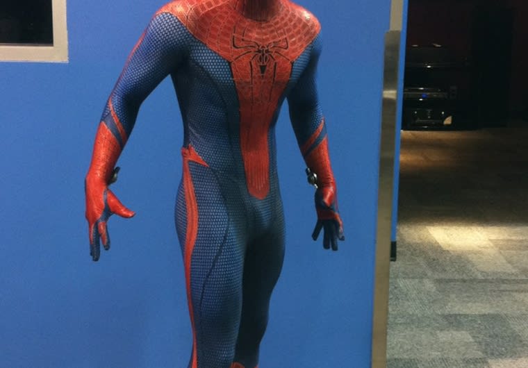
My favorite movie Spidey suit so far is the red and black from Far From Home. All the previous, more faithful movie suits have their individual issues. Stark suit was too much tech to be faithful. Tobey and Garfield suits both had raised webbing--fucking why? Of those, I'd prefer Tobey's suit with Garfield's eyes.
Netflix's Daredevil black outfit was awesome. The actual daredevil suit sucked though, it took all the terrible TDK Batman armor design cues, and, most importantly/offensively, fucked up the mask something awful. It looked like some kind of angry bulldog face instead of the face of Daredevil. They changed it each season, but they never got it right.
Yeah, BB/TDK suits sucked. BB was better though. TDK went all tacti-cool and kind of forgot the whole "fear" theme of the previous film.
I liked the Batfleck suits as faithful comic adaptations, maybe too faithful in the case of BvS. The end battle JL suit he wore grew on me once I saw the toys.
However, I maintain that the all-time best live-action batsuit is still Batman Returns. I'm biased though, I dig the whole aesthetic of that film, it's gorgeous.
Comic batsuits for me really depend on the artist. The right art can make pretty much any of them look awesome.
When I played Arkham Knight, I found myself using literally every suit except the ones from the actual game story. Way way way too much tech, to the point of ridiculousness and ugliness. Movie suits, comic-inspired suits, fine.
I agree with MarcelloF that Superman's trunks look great when they're looser trunks, like shorts. They're also necessary to break up all that blue. I had the same issue with the first Amazing Spider-Man movie suit (also the yellow eyes, wtf). They didn't quite include the red "belt" part of the design, and it looked like a naked blue dude running around with a red bib.
Just look at it:
Naked bottomless blue skinned blue dude letting all his junk hang out while wearing a big penis-shaped red bib.
Now, the takes:
Iron Man suits were best when they felt mechanical in the movies.
All movie Cap suits rocked, except 2012 Avengers somewhat.
Spider-Ben suit was incredible. Best modernization, I think. Besides Miles, that is.
Almost every Spidey suit introduced under Slott's reign was trash. Second Superior excepted.
"Stealth" suit with glowing neon Tron lights was especially stupid. Also ugly.
My favorite movie Spidey suit so far is the red and black from Far From Home. All the previous, more faithful movie suits have their individual issues. Stark suit was too much tech to be faithful. Tobey and Garfield suits both had raised webbing--fucking why? Of those, I'd prefer Tobey's suit with Garfield's eyes.
Netflix's Daredevil black outfit was awesome. The actual daredevil suit sucked though, it took all the terrible TDK Batman armor design cues, and, most importantly/offensively, fucked up the mask something awful. It looked like some kind of angry bulldog face instead of the face of Daredevil. They changed it each season, but they never got it right.
Yeah, BB/TDK suits sucked. BB was better though. TDK went all tacti-cool and kind of forgot the whole "fear" theme of the previous film.
I liked the Batfleck suits as faithful comic adaptations, maybe too faithful in the case of BvS. The end battle JL suit he wore grew on me once I saw the toys.
However, I maintain that the all-time best live-action batsuit is still Batman Returns. I'm biased though, I dig the whole aesthetic of that film, it's gorgeous.
Comic batsuits for me really depend on the artist. The right art can make pretty much any of them look awesome.
When I played Arkham Knight, I found myself using literally every suit except the ones from the actual game story. Way way way too much tech, to the point of ridiculousness and ugliness. Movie suits, comic-inspired suits, fine.
I agree with MarcelloF that Superman's trunks look great when they're looser trunks, like shorts. They're also necessary to break up all that blue. I had the same issue with the first Amazing Spider-Man movie suit (also the yellow eyes, wtf). They didn't quite include the red "belt" part of the design, and it looked like a naked blue dude running around with a red bib.
Just look at it:
Naked bottomless blue skinned blue dude letting all his junk hang out while wearing a big penis-shaped red bib.
God that suit looks so bad.
All black on Batman looks real rough, it needs contrasts to work.
I really wish the live action film Batsuits would go with the blue/gray or black/gray suits from the comics. The Zack Snyder films came close, but the gray is so dark that it's almost black.
Look, drawing is hard. Drawing people doing tons of complicated action poses is very hard. So, you're gonna need to study reference photos of real people. Those real people are going to be athletes or nude models; they're not going to be wearing the specific, complicated costume you've put on your character. So, you're going to have to painstakingly figure out how this complex costume would look from every conceivable angle, vastly increasing your work time, in an industry that has to produce a book every month.All for it. I'm tired of the 1930s swimsuits and the full body spandex that looks spraypainted on. But also overdesigned characters with a ton of accessories. There's a sweet spot.
I particularly hate shit like this:
Design a character. Don't just draw them nude and spray paint them goofy colors, with maybe underpants on the outside and/or face masks. Like, great, Finesse is a gymnast. But do try a bit harder. Spider-Man gets a pass on the spraypaint spandex because he's fucking Spider-Man, and little else fits. Ditto a few others.
That said, things have to fit the medium.
That's why 95% of all superheroes are just nude with lines and a maybe a few bits of flare. And that's also why a lot of 90s characters from Liefeld or McFarlane look off-model in every single panel. Those designs look cool on a cover or a splash page, but it really sucks to draw them over and over.
Look, drawing is hard. Drawing people doing tons of complicated action poses is very hard. So, you're gonna need to study reference photos of real people. Those real people are going to be athletes or nude models; they're not going to be wearing the specific, complicated costume you've put on your character. So, you're going to have to painstakingly figure out how this complex costume would look from every conceivable angle, vastly increasing your work time, in an industry that has to produce a book every month.
That's why 95% of all superheroes are just nude with lines and a maybe a few bits of flare. And that's also why a lot of 90s characters from Liefeld or McFarlane look off-model in every single panel. Those designs look cool on a cover or a splash page, but it really sucks to draw them over and over.
Drawing is hard, but designs like Finesse are just dumping the rest of the workload onto the inkers and colorists, innit.
I never argued for complex designs at all times, but if Finesses and Supermans are the only things don't kill artists, then that's more of an issue with the industralized nature of cape comics more than anything else. Also drawing is about using shapes, and there are more options than just a regular human body with spraypaint on it that don't require extranenous lines and details.
Don't be ridiculous. Ascots are just as impractical as capes.

That's the point though: cape comics looks like that so that they don't kill artists. Burnout is still an issue for the industry, but superheroes are designed to be easy to draw in lots of different poses, quickly and efficiently, by lots of different artists. If you give your character some kind of weird helmet that only you understand how to draw, how are other people going to do anything with them? How is someone going to take over that story when you move to something else?Drawing is hard, but designs like Finesse are just dumping the rest of the workload onto the inkers and colorists, innit.
I never argued for complex designs at all times, but if Finesses and Supermans are the only things don't kill artists, then that's more of an issue with the industralized nature of cape comics more than anything else.
That is one sexy Superman, lol!it was great for supes, no idea why they returned to trunks ( they thought fans would be hype , we honestly don't care, we just want good stories )