There was a major update for this game and they brought this abomination of an icon back.
What's the deal here?
Is this the first time someone's reverted to a bad icon before? That's...very bizarre.
There was a major update for this game and they brought this abomination of an icon back.
What's the deal here?
Is this the first time someone's reverted to a bad icon before? That's...very bizarre.
Snakepass did it IIRC.Is this the first time someone's reverted to a bad icon before? That's...very bizarre.
Snake Pass was the thread starter, because it began day 1 with a good icon, then switched to an iOS style junk one.
The Burnout Paradise Remastered icon is super sloppy.
Firstly it's quite low-res at actual size, but secondly it has something weird going on round the edges.
Take a look!
https://img-eshop.cdn.nintendo.net/...90655e4fe080df3268fc170fcf70ba05e35578294.jpg
GrrrrrrrThe Burnout Paradise Remastered icon is super sloppy.
Firstly it's quite low-res at actual size, but secondly it has something weird going on round the edges.
Take a look!
https://img-eshop.cdn.nintendo.net/...90655e4fe080df3268fc170fcf70ba05e35578294.jpg
Really? I think it's looking fine.

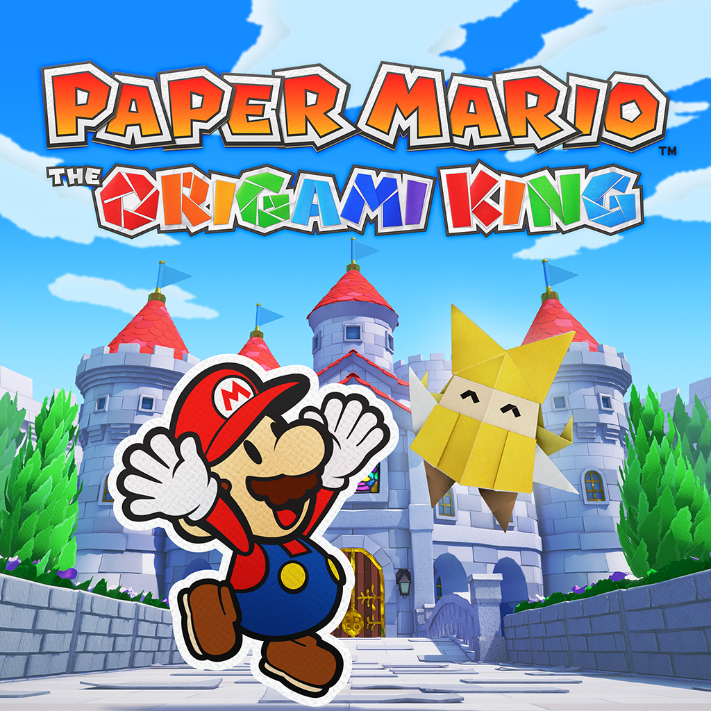
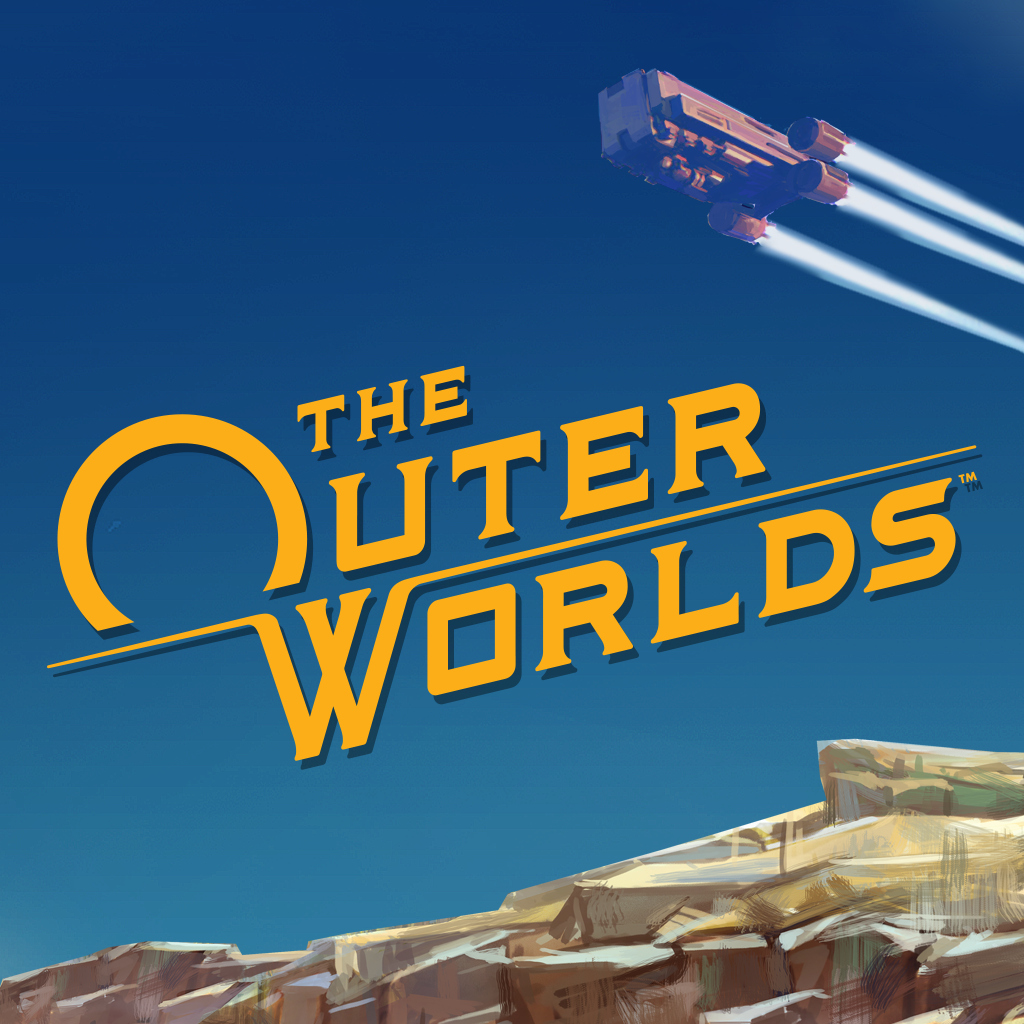
It's fine.Not quite the gorgeous key art for The Outer Worlds, but at least it's a title.
They seem to be changing it:Meanwhile I've got a DL code for Lonely Mountains: Downhill and... Oooof
http://www.switchiconshowdown.com/images/3836.png
I wrote to them on Twitter and the publisher (Thunderful) told me they would send the feedback to devs. Yeah, I'm not holding my breath on this one
That's ... okay. Reaaally boring, though. Blandness 129%Not quite the gorgeous key art for The Outer Worlds, but at least it's a title.
bummer :(
Wish I was still working next to these guys, I would've definitely passed on the message!
Wish I was still working next to these guys, I would've definitely passed on the message!
Update: feel free to tweet about the icon to the main guy in the studio.
wait..so he already wrote back to me. He said just let him know what it needs and he'll add it to the to do list.Okay! I tweeted at him and will post if he gives any sort of update about it.

Yeah, he's a very nice dude!wait..so he already wrote back to me. He said just let him know what it needs and he'll add it to the to do list.
Tim Garbos on Twitter
“@SuperNintendad Rabbit hole. Let me know what the icon needs to be good and I’ll add it to our todo. I think it’s a quite a process to change logo, but I’ll look I to it”twitter.com
Tell him all it needs is to take the website icon and use it straight.wait..so he already wrote back to me. He said just let him know what it needs and he'll add it to the to do list.
Tim Garbos on Twitter
“@SuperNintendad Rabbit hole. Let me know what the icon needs to be good and I’ll add it to our todo. I think it’s a quite a process to change logo, but I’ll look I to it”
Weird that it seems so hard to apply the same rule for the console UI itself.We can now safely say Nintendo doesn't allow shitty icons (any icon without the title) on their website. You can be sure the website icon has art AND title pretty guaranteed.
yeesh that's kinda weak, no?
Unless they just did it with the website oneyeesh that's kinda weak, no?
it's better than trying to squeeze the composition from the box into a square though I suppose
huh. That's way better, no?
That looks miles better than the other one. Damn, missed opportunity.
Props, Bethesda!So Elder Scrolls Blades is out today, finally, and the icon is the same one we saw at E3 last year, as expected.

Even worse, the title above the icon is just "Blades".
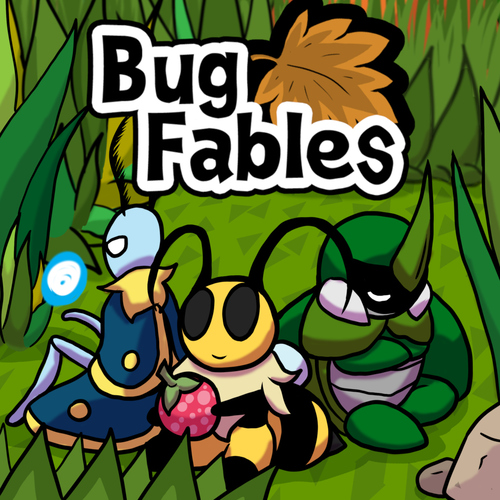
Anyone got a Bug Fables icon? Watiing to see it before I preload lol.
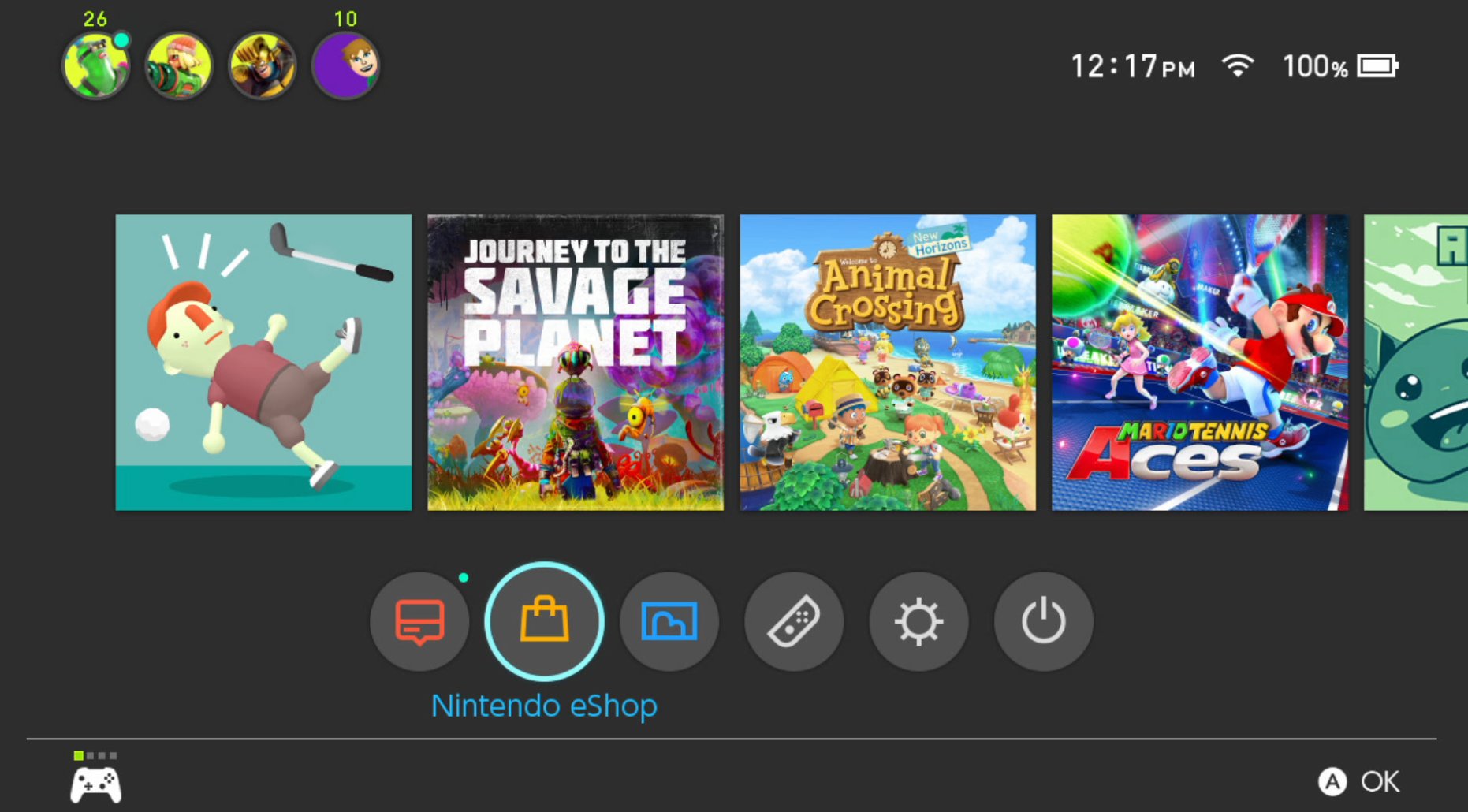
Journey to the Savage Planet:
Chris Becker on Twitter
“Journey to the Savage Planet got the memo on Game icons. It's out now https://t.co/wB2yjjkqUJ”twitter.com
So Elder Scrolls Blades is out today, finally, and the icon is the same one we saw at E3 last year, as expected.
Even worse, the title above the icon is just "Blades".
Journey to the Savage Planet:
Chris Becker on Twitter
“Journey to the Savage Planet got the memo on Game icons. It's out now https://t.co/wB2yjjkqUJ”