• Ever wanted an RSS feed of all your favorite gaming news sites? Go check out our new Gaming Headlines feed! Read more about it here.
  • We have made minor adjustments to how the search bar works on ResetEra. You can read about the changes here.

.exe

Member
Oct 25, 2017
22,233
3663.png

(http://www.switchiconshowdown.com/detail.php?id=3663)

So sad...

Edit: As usual, the website icon is perfect :
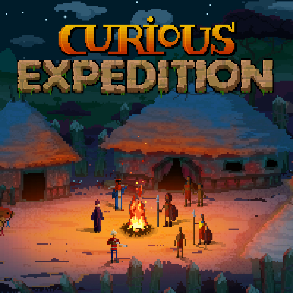
SQ_NSwitchDS_CuriousExpedition.jpg

I would love to read someone asking a developer about this. Do they mix them up accidentally? Clearly, an effort was made to create an icon for the site at least. Or they think it looks good despite being different from the majority of other titles, or something else entirely.

So many questions!
 

Garf107

Member
Oct 27, 2017
193
I would love to read someone asking a developer about this. Do they mix them up accidentally? Clearly, an effort was made to create an icon for the site at least. Or they think it looks good despite being different from the majority of other titles, or something else entirely.

So many questions!
Well at least they're fixing it :
 

.exe

Member
Oct 25, 2017
22,233
Who do we @ on Twitter from CDPR to ask the same about Thronebreaker 😭

56RLDiR.png
 

Gay Bowser

Member
Oct 30, 2017
17,707
Of course.

This is such a weird phenomenon. Why do games keep getting terrible icons despite excellent versions existing on official sites?

I think it has to be the terminology Nintendo must use for the submission. Devs are probably required to submit an "icon" and they think it has to be some small textless thing, when really it's basically the game's cover. That's why so many devs just port their iOS icon or something.

It sort of shows a lack of familiarity with the Switch's UI design ethos.
 

//ARCANUM

Member
Oct 25, 2017
2,404
I think it has to be the terminology Nintendo must use for the submission. Devs are probably required to submit an "icon" and they think it has to be some small textless thing, when really it's basically the game's cover. That's why so many devs just port their iOS icon or something.

It sort of shows a lack of familiarity with the Switch's UI design ethos.

this has been my guess for the longest time. they submit an icon, not realizing what it's actually for, and then when the game gets released they finally see it.
 

.exe

Member
Oct 25, 2017
22,233
Did you folks notice this in the news feed? See if you can find what's wrong before opening the spoiler.

EosKJmH.png


It's the Sonic Mania icon in the bottom left. Nintendo changed it to have a logo in it.

Nintendo is judging you. Fix those icons! :D
 
Last edited:

Tunesmith

Fraud & Player Security
Verified
Oct 25, 2017
1,937
Did you folks notice this in the news feed? See if you can find what's wrong before opening the spoiler.

EosKJmH.png


It's the Sonic Mania icon in the bottom left. Nintendo changed it to have a logo in it.

Nintendo is judging you. Fix those icons! :D
+ Skryim, Gris.

They're using the website icons.
 

xch1n

Member
Oct 27, 2017
603
I have zero insider knowledge, I'm just saying this off of hunch and pattern matching, but based on the fact it so often looks like either the a.) mobile app icon or b.) the Windows taskbar icon, I'd imagine that whatever toolset or engine these games are made it takes some default icon and uses that if there isn't a Switch override. Now why they ship even after seeing the icon on a Switch, who knows, maybe it's something in submission that seems like it'll be taken care of, but that's the only explanation for the pattern I'm seeing.
 

SirNinja

One Winged Slayer
Member
Did you folks notice this in the news feed? See if you can find what's wrong before opening the spoiler.

EosKJmH.png


It's the Sonic Mania icon in the bottom left. Nintendo changed it to have a logo in it.

Nintendo is judging you. Fix those icons! :D
Noticed Skyrim and Sonic, didn't realize Gris also fucked it up. Guessing that game's logo is just the pic of the woman's head? [EDIT: yep :-/ ]

I have zero insider knowledge, I'm just saying this off of hunch and pattern matching, but based on the fact it so often looks like either the a.) mobile app icon or b.) the Windows taskbar icon, I'd imagine that whatever toolset or engine these games are made it takes some default icon and uses that if there isn't a Switch override. Now why they ship even after seeing the icon on a Switch, who knows, maybe it's something in submission that seems like it'll be taken care of, but that's the only explanation for the pattern I'm seeing.
I've been thinking something along those lines as well. The problem is far too widespread for it to feasibly be anywhere else.
 

TheMoon

|OT|
Member
Oct 25, 2017
18,778
Video Games
I have zero insider knowledge, I'm just saying this off of hunch and pattern matching, but based on the fact it so often looks like either the a.) mobile app icon or b.) the Windows taskbar icon, I'd imagine that whatever toolset or engine these games are made it takes some default icon and uses that if there isn't a Switch override. Now why they ship even after seeing the icon on a Switch, who knows, maybe it's something in submission that seems like it'll be taken care of, but that's the only explanation for the pattern I'm seeing.
I've been thinking something along those lines as well. The problem is far too widespread for it to feasibly be anywhere else.
dunno if this was in the old thread or this one but this is how it works. I've posted about this before in the first year of icon drama, citing a dev on twitter.
 

Imitatio

Member
Feb 19, 2018
14,560
Did you folks notice this in the news feed? See if you can find what's wrong before opening the spoiler.

EosKJmH.png


It's the Sonic Mania icon in the bottom left. Nintendo changed it to have a logo in it.

Nintendo is judging you. Fix those icons! :D
Maaan, that Skyrim icon would've been slick. The current one is simply ... ugh.
 

xch1n

Member
Oct 27, 2017
603
dunno if this was in the old thread or this one but this is how it works. I've posted about this before in the first year of icon drama, citing a dev on twitter.
Oh thanks for confirmation. I tried some brief searching but I figured it was secret per Nintendo dev agreements or something.
 

PCK

Member
Oct 26, 2018
281
A new update for Exit The Gungeon changed the icon to the website one, and it's much better.
 

TechMetalRules

▲ Legend ▲
Member
Sep 11, 2019
2,211
United States
Did you folks notice this in the news feed? See if you can find what's wrong before opening the spoiler.

EosKJmH.png


It's the Sonic Mania icon in the bottom left. Nintendo changed it to have a logo in it.

Nintendo is judging you. Fix those icons! :D
Sonic Mania is the one icon on my Switch that bugs me the most, and this is just twisting the knife!
 

Jessie

Member
Oct 27, 2017
9,921
Bravely Default II's icon is so beautiful compared to Octopath Traveler's. Come on Square Enix.
 

AndrewGPK

Member
Oct 27, 2017
3,827
Octopath is my least favorite icon, even though it has the game title. It just sticks out like a sore thumb on the all games view.
 

Imitatio

Member
Feb 19, 2018
14,560
Octopath is my least favorite icon, even though it has the game title. It just sticks out like a sore thumb on the all games view.
OT's and Skyrim's icons are the most distracting ones on my homescreen. Everything else is colourful, has proper artwork, and a logo incorporated.
Ugh. And it could have been so easy to have great icons for both of them.
 

Deleted member 51691

User requested account closure
Banned
Jan 6, 2019
17,834
Well that's literally what people were asking nintendo to do before the switch came out. do a VC sub but offer a "buy" option. this is basically that.
Yep, but now NSO and the various collections on Switch have shown us the light

NSO just needs to expand its selection more often and get on with that N64 support
 

Kolibri

Member
Nov 6, 2017
1,997
If I was releasing a small indie game I would first release it with a very hastily made, shitty icon, before adding the actual one. Just so people see I listen to fan feedback and to get some more tweets talking about the game, even if it's literally just a couple.
 
Oct 25, 2017
3,201
Edit: Panic over. The below icon for Kingdom Two Crowns was purely pre-launch and was likely never meant to be seen. The released game has a proper icon.

1540.png

There's no OT to complain in, but this thread might be even better;
There was a major update for this game and they brought this abomination of an icon back.

What's the deal here?