-
Ever wanted an RSS feed of all your favorite gaming news sites? Go check out our new Gaming Headlines feed! Read more about it here.
-
We have made minor adjustments to how the search bar works on ResetEra. You can read about the changes here.
The Switch Icon Watch Thread [~] No Logo, No Buy
- Thread starter Kyuuji
- Start date
You are using an out of date browser. It may not display this or other websites correctly.
You should upgrade or use an alternative browser.
You should upgrade or use an alternative browser.

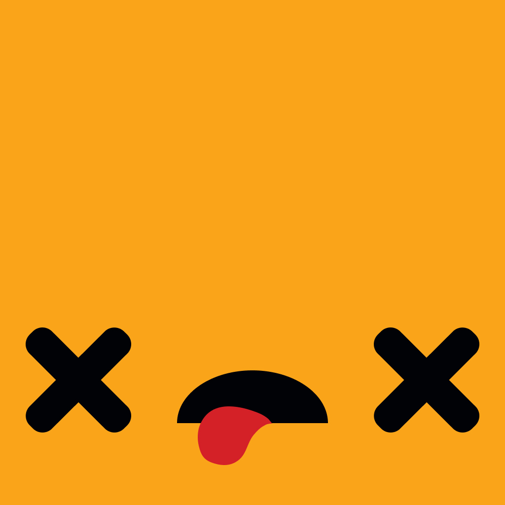
They captured how I feel about the icon in the icon itself. :OWith Exit the Dungeon being thrown up, gotta see what the icon is, right? It's.. not good.
I legit thought of this thread the second that popped up
I almost want it to have a terrible icon just because that'd be completely inexplicable in a really funny way
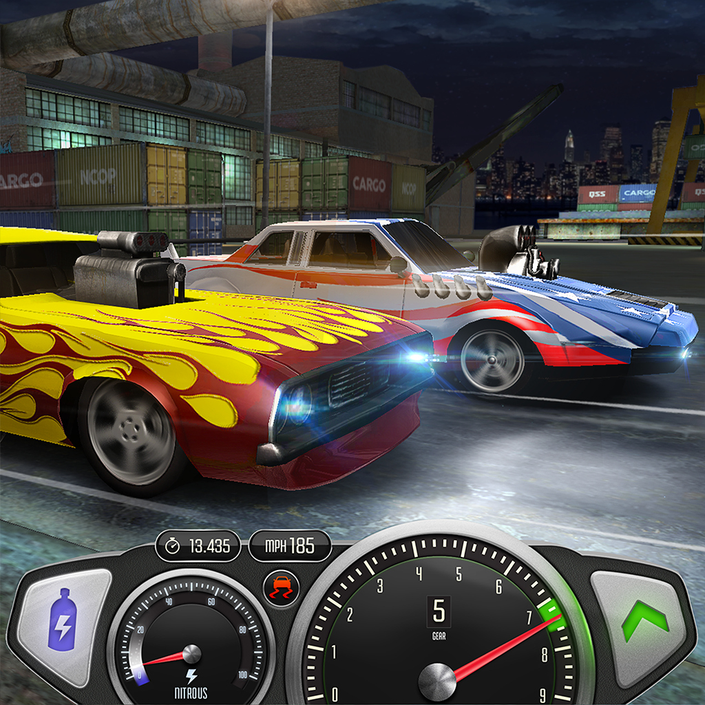
lmaooo, this is fucking hilarious.Top Speed: Drag & Fast Racing is the first icon I've seen to include a HUD.
This is legit great! Nice! Take my money.

Looks good as well, encapsulates the atmosphere I got from the trailer as well.
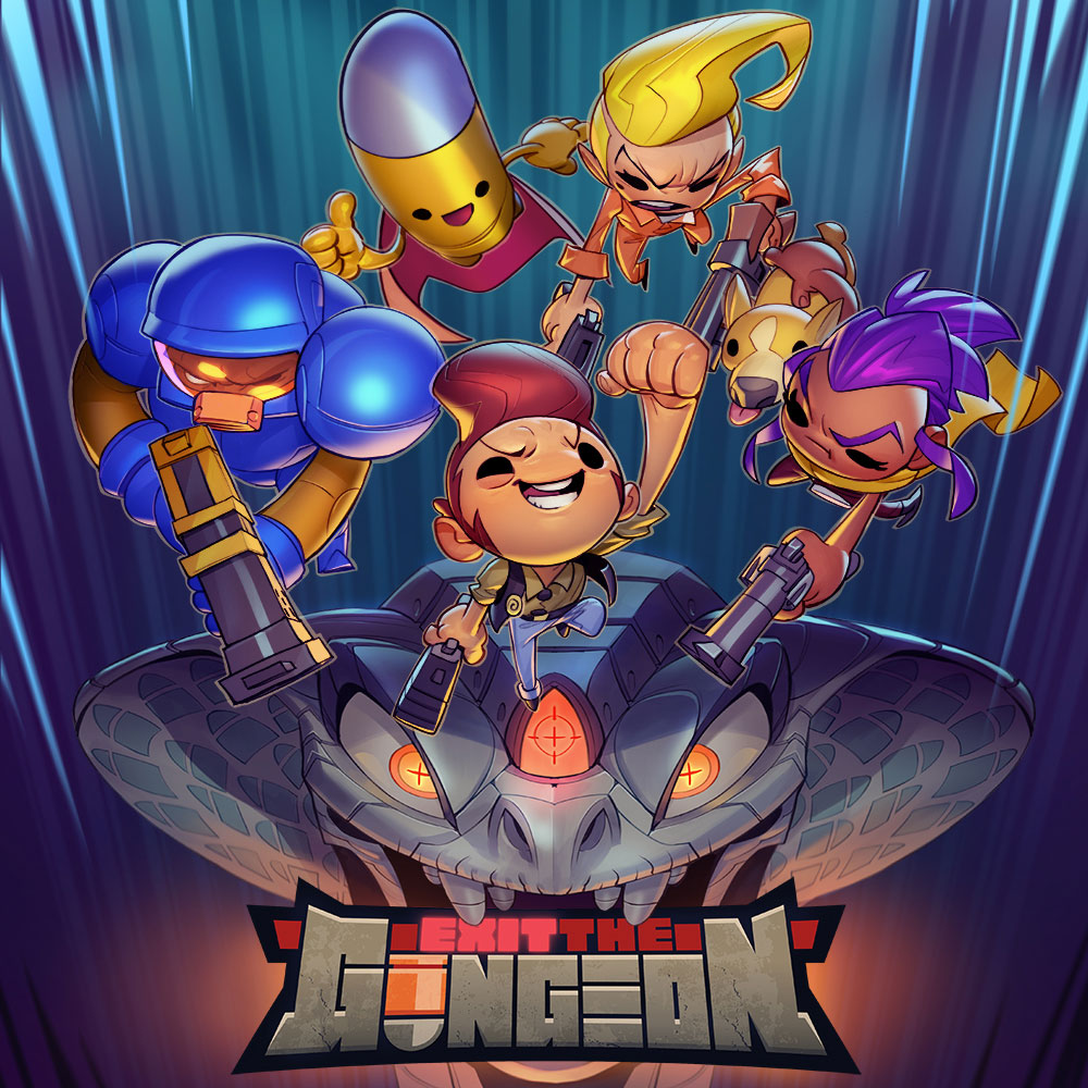
The exit the gungeon icon is copy-paste of the Apple Arcade one.
Even after making a really good one for the website that would've worked.. URRGGGhhhhh
Sometimes i think Nintendo should make by default the switch home icon fetch the web one. The number of cases where the web icons looks 100% better than the home icons is huge.Even after making a really good one for the website that would've worked.. URRGGGhhhhh
I have an uncanny feeling that that's the website icon. Who knows if it'll be on the actual Switch.
*Earlier*
Me: Oh wow, Exit the Gungeon is dropping today! I wonder how the-
Me: Oh... I can wait a while.
Me: Oh wow, Exit the Gungeon is dropping today! I wonder how the-
With Exit the Dungeon being thrown up, gotta see what the icon is, right? It's.. not good.
Me: Oh... I can wait a while.
4/10With Exit the Dungeon being thrown up, gotta see what the icon is, right? It's.. not good.
I can't get used to see devs do this…Even after making a really good one for the website that would've worked.. URRGGGhhhhh
/facepalm
I'm gonna be tinfoil hat and say they purposely do this for little attention towards their game then they put the original 'better' icon later to entice buyers.
Tinfoil hat off.
Tinfoil hat off.
not for the 12.5 people who base their purchasing decision on this. they headlined a nintendo indie showcase with a shadowdrop.I'm gonna be tinfoil hat and say they purposely do this for little attention towards their game then they put the original 'better' icon later to entice buyers.
Tinfoil hat off.
Negative.
wait...people don't like the Exit the Gungeon icon? I think its great, especially right next to Enter the Gungeon.
edit: oh i guess the original enter the gungeon icon changed...
edit: oh i guess the original enter the gungeon icon changed...
you know what thread you're in, right? :)wait...people don't like the Exit the Gungeon icon? I think its great, especially right next to Enter the Gungeon.
edit: oh i guess the original enter the gungeon icon changed...
With Enter the Gungeon's icon looking so great, I didn't think twice to buy Exit. Fucking tricked me good. I can't BELIEVE how bad it is. Already left a message to them on twitter about it.
I fell for it too. So disappointing.With Enter the Gungeon's icon looking so great, I didn't think twice to buy Exit. Fucking tricked me good. I can't BELIEVE how bad it is. Already left a message to them on twitter about it.
Y'all could have waited for the instantaneous Robin's update, but you didn't.
Arturo At this point, I think this is Nintendo's fault, they just don't bother in the slightest. They did guidelines and boy, they must be full in place nowadays because when you go to the website every damn icon is fine af.
Why don't tell publishers: "Ok, you messed around enough. Remember those guidelines for how your game's icon should be? Now apply the same shit to the home menu icon"
It's just so, so baffling
I've always thought it may have something to do with the documentation? I mean, some of the games' pages icons are fantastic (Exit the Gungeon i. e.). Why do devs decide to use those mobile version icons instead? It's baffling indeed…Y'all could have waited for the instantaneous Robin's update, but you didn't.
Arturo At this point, I think this is Nintendo's fault, they just don't bother in the slightest. They did guidelines and boy, they must be full in place nowadays because when you go to the website every damn icon is fine af.
Why don't tell publishers: "Ok, you messed around enough. Remember those guidelines for how your game's icon should be? Now apply the same shit to the home menu icon"
It's just so, so baffling
It's a pretty silly reason to miss out on a game imo 🤷🏼♂️sometimes i feel bad not buying a game because the icon is garbage
but then i dont
sometimes i feel good for buying a game in spite of the icon being garbagesometimes i feel bad not buying a game because the icon is garbage
but then i dont
but then i dont
:(
Robin64
I purchased Flat Heroes and, luckily enough, icon is not the one I see on your site but it's the website one (much better imho). I don't know if they updated it or what, maybe you have the US one and it's different?
It has indeed been updated. Thanks for the heads up!
silly sure, but I'm never in that dire of a need for a new game to play when it comes down to it
The secret is there's always ten million games to buy. $10 I don't spend on Exit the Gungeon because the icon offends me is $10 I probably spend on another game in like a week lol.
Any word if the developers are going to update the Exit the Gungeon icon? They fixed the original Gungeon icon, so I would hope so...
Apparently a patch has been submitted with "lots of feedback" addressed, but we'll have to wait and see if that includes the icon.
So.
(Plenty more new ones in the usual place, and yes I've checked every single game that just got announced, so if it's not there, it's not up yet.)
(Plenty more new ones in the usual place, and yes I've checked every single game that just got announced, so if it's not there, it's not up yet.)
Last edited:

So.
(Plenty more new ones in the usual place, and yes I've checked every single game that just got announced, so if it's not there, it's not up yet.)
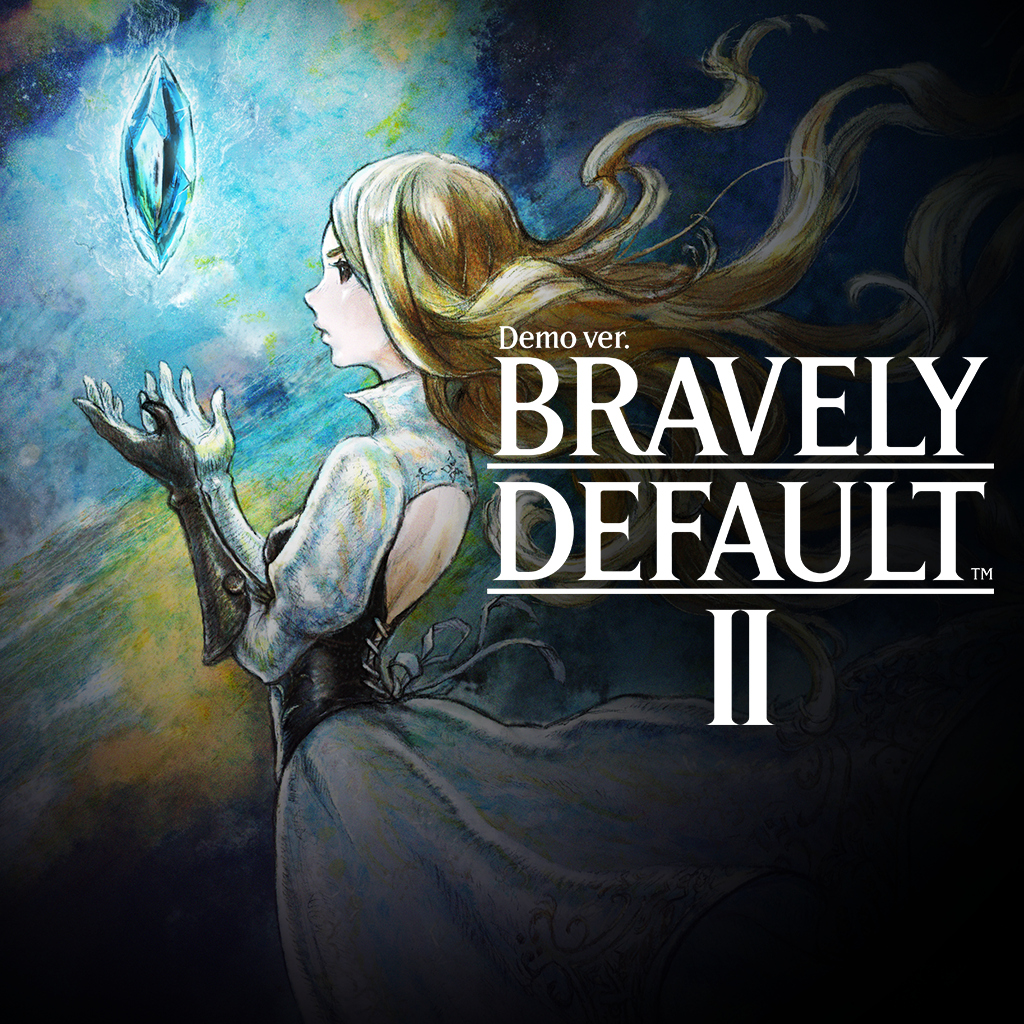
Oh, shit. I had totally forgotten Bravely Default II was a thing. Nice.
Both are lovely icons.So.
(Plenty more new ones in the usual place, and yes I've checked every single game that just got announced, so if it's not there, it's not up yet.)
For those curious:

Could be better, but it's fine. From your comment I thought it was gonna be a dragon with no logo.

This is so bad, I kinda like it.
We should have a contest to replicate this icon.
This is the style Octopath Traveler's icon should have had. Can't believe it will never be updated.
For real. Such a missed opportunity.This is the style Octopath Traveler's icon should have had. Can't believe it will never be updated.
I'm gonna be tinfoil hat and say they purposely do this for little attention towards their game then they put the original 'better' icon later to entice buyers.
Tinfoil hat off.
I think the percentage of gamers who actively don't purchase a game they want to play because an icon isn't up to their liking is way, way, way lower than you're thinking.
Oh Robin64, I can't access switchiconshowdown.com, are you aware of the issue?
Not sure if there was a problem before, but I am able to access it now.
Yep, it works now. ThanksNot sure if there was a problem before, but I am able to access it now.

(http://www.switchiconshowdown.com/detail.php?id=3663)
So sad...
Edit: As usual, the website icon is perfect :
Last edited: