Icons of the week
-
Ever wanted an RSS feed of all your favorite gaming news sites? Go check out our new Gaming Headlines feed! Read more about it here.
-
We have made minor adjustments to how the search bar works on ResetEra. You can read about the changes here.
The Switch Icon Watch Thread [~] No Logo, No Buy
- Thread starter Kyuuji
- Start date
You are using an out of date browser. It may not display this or other websites correctly.
You should upgrade or use an alternative browser.
You should upgrade or use an alternative browser.


Oh boy this is SO DAMN CLOSE to being a great icon, they even put Wormmon and Betamon on it.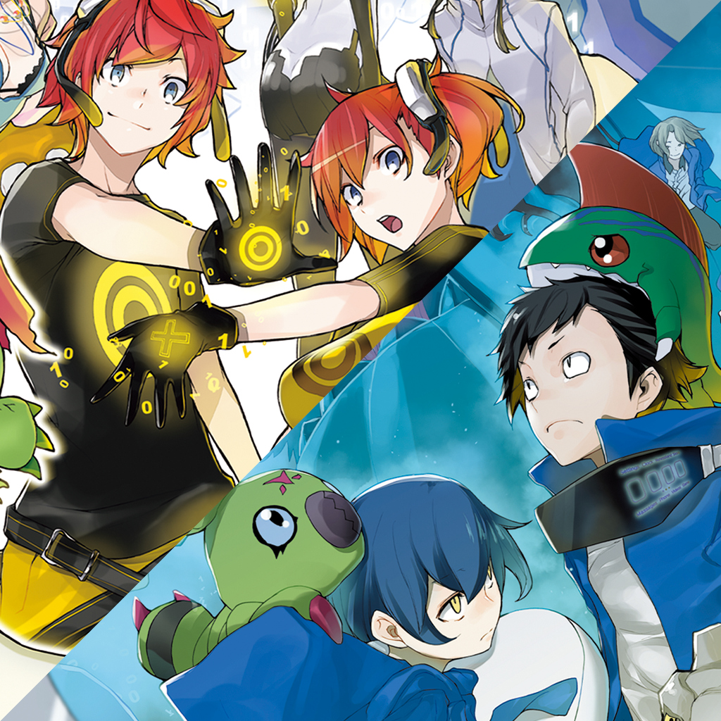
Digimon Story Cyber Sleuth Hacker's Memory
Another game on my wishlist that have no logo :(
Maybe the objective is to write LINE in Morse code.I hope they keep releasing these Lines games (first X and now Infinite) so we can have a dash full of their dots.
Still hate the ACA NEOGEO icons on Switch (and PS4). Why can't I have the beautiful Xbox/W10 icons using original artwork but in red? Hamster, please. 😩

Last edited:
LOL! We don't deserve you…While I agree the artwork Hamster title icons are better, I really hope they don't change them at this point for my own sanity.
Digimon Story Cyber Sleuth Hacker's Memory
Another game on my wishlist that have no logo :(
They really should've just chosen one or the other.
Yeah, it's just two icons fused together without any transition.


OP
OP

German efficiency is very low these days.

Thank you for asking about this game, because I had never heard of it before, and now I absolutely must buy it.

you mean.... behold? ...............
What? The game is called "Beholder 2".
Icons of the week


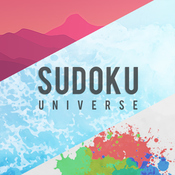
- No Logo


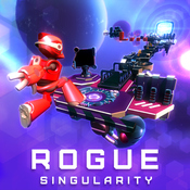
Escape from the Universe
Beholder 2
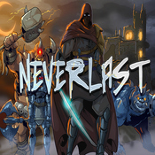
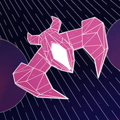
Never Give Up
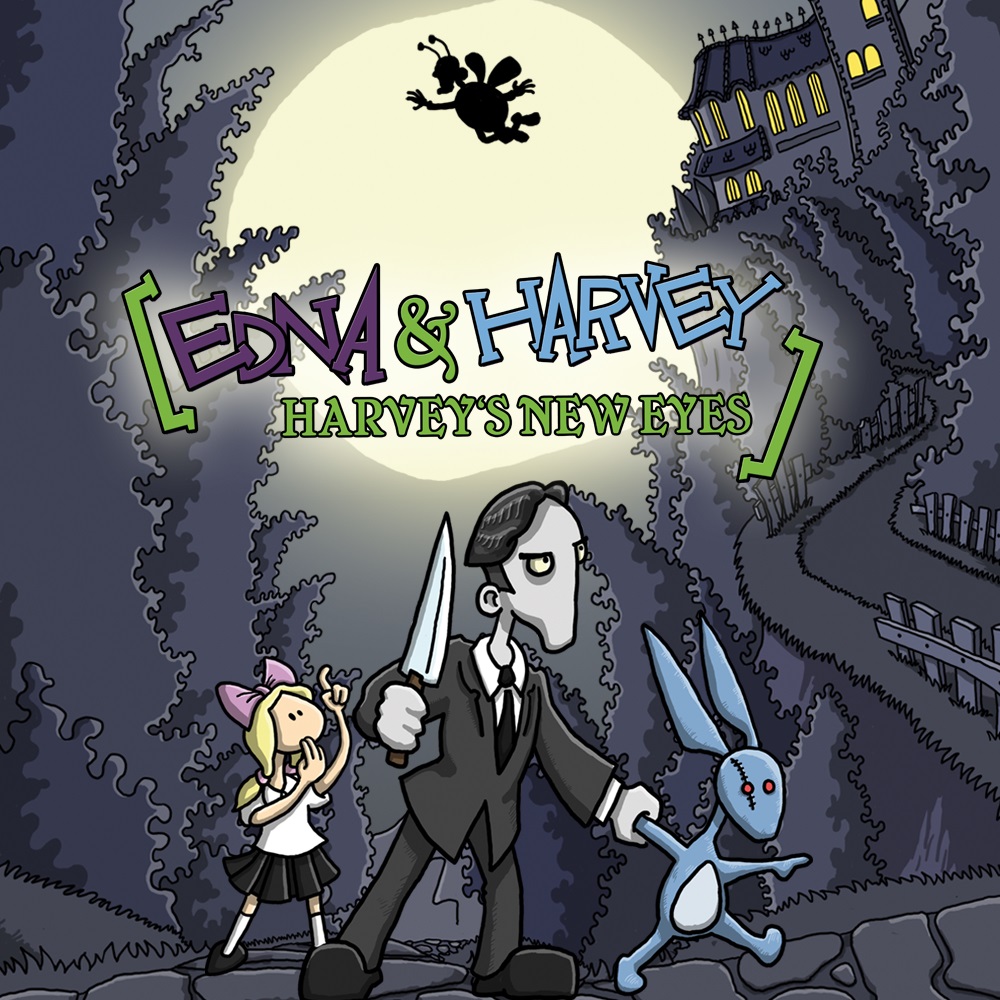
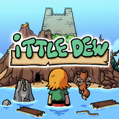
Edna & Harvey: Harvey's New Eyes
PC Building Simulator
Last edited:
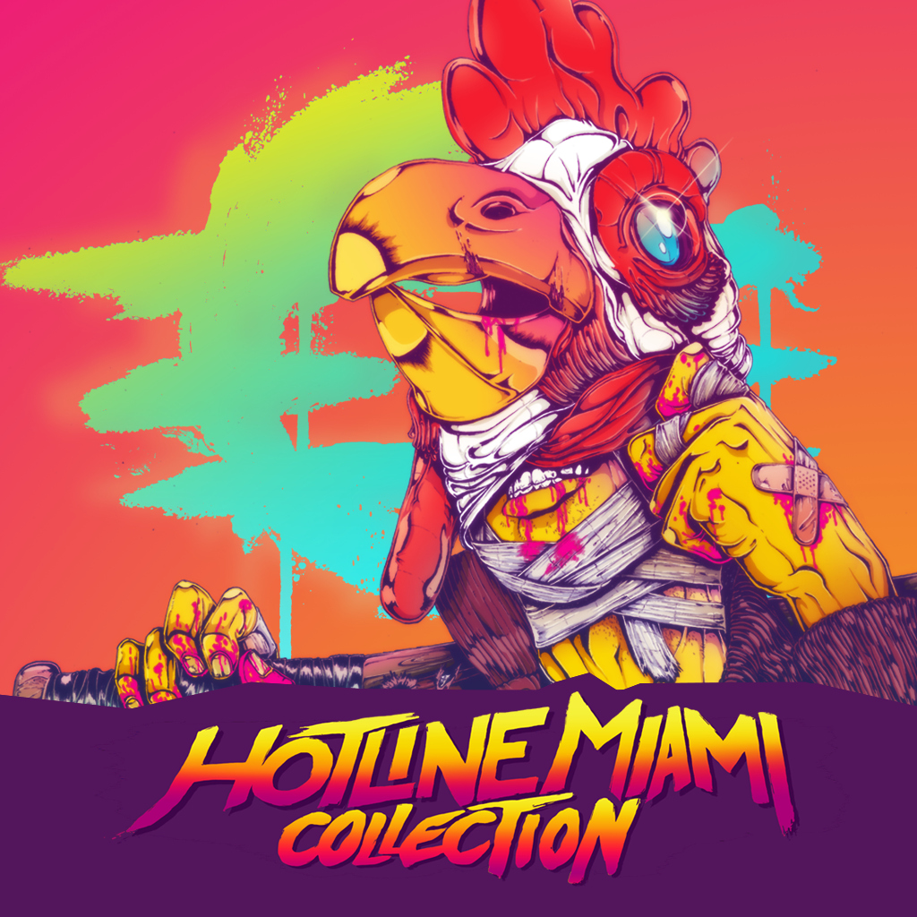

*clicks on this thread knowing Hotline Miami Collection and Super Hot are dropping today*
Please have good icons, please have good icons...
Phew!
Please have good icons, please have good icons...
Phew!
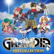
Have you already discussed how crappy the Grandia HD icon is? It had so much potential...and we got crap.
just like the remaster itself.Have you already discussed how crappy the Grandia HD icon is? It had so much potential...and we got crap.
How does everyone get the full size images of the icons? I just preloaded Creature in the well and the icon isn't great.
Well, I think the HD update works well enough considering the constrains of the base code/version (PS1), and the nature of 2019 expectations (16:9, good performance, high res, filtered assets, multiple languages, etc).
I give it an 8.5/10
I will give the icon a 3/10 though. Its just crap.
G1 looks atrocious with that filter.Well, I think the HD update works well enough considering the constrains of the base code/version (PS1), and the nature of 2019 expectations (16:9, good performance, high res, filtered assets, multiple languages, etc).
I give it an 8.5/10
I will give the icon a 3/10 though. Its just crap.
noooooooooo!!!!!
WHY
WELL, that's a bummer...
Any sign of the Witcher 3 icon?
Oh wow, where'd you find this?Link's Awakening is exactly as we expected, which I am thankful for.
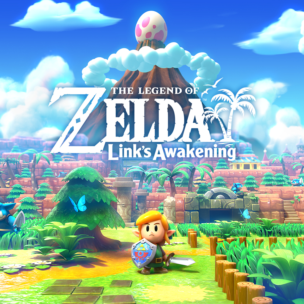
It's up for pre-purchase in Europe now.
https://www.nintendo.co.uk/Games/Nintendo-Switch/The-Legend-of-Zelda-Link-s-Awakening-1514327.html
is the icon for DQXI out yet?Link's Awakening is exactly as we expected, which I am thankful for.
Sadly not.
if there's one misstep nintendo has made with switch covers/icons, it's botw having two different covers and icons. the NA/JP one is perfect, i have no idea why they felt the need to make a different one for other regions.Really wish I could change my EU Botw icon to the NA one. It looks incredible
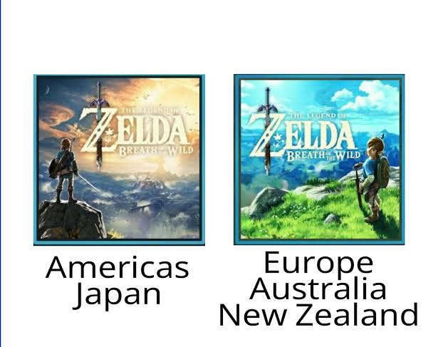
if there's one misstep nintendo has made with switch covers/icons, it's botw having two different covers and icons. the NA/JP one is perfect, i have no idea why they felt the need to make a different one for other regions.
Gonna guess that there was focus testing that supported those cover choices. Like how Kirby is always angry on NA covers.
if there's one misstep nintendo has made with switch covers/icons, it's botw having two different covers and icons. the NA/JP one is perfect, i have no idea why they felt the need to make a different one for other regions.
I'm just thankful this is a rather rare practice in general, though I do wonder why Nintendo did it for their launch game then dropped it.
Australians really got the worst deal here. We got the NA/JP art on the cover, but the EU art on the actual Switch home menu.if there's one misstep nintendo has made with switch covers/icons, it's botw having two different covers and icons. the NA/JP one is perfect, i have no idea why they felt the need to make a different one for other regions.
I actually like both; but what I would've liked is some consistency.
imagine being part of a focus testing group and preferring link's awkward pose with the over shoulder look...Gonna guess that there was focus testing that supported those cover choices. Like how Kirby is always angry on NA covers.