When you're starved for info, hundreds of posts over literally anything is guaranteed.This thread is going to get over 500 posts easy lol
Unbelievably fire logo
-
Ever wanted an RSS feed of all your favorite gaming news sites? Go check out our new Gaming Headlines feed! Read more about it here.
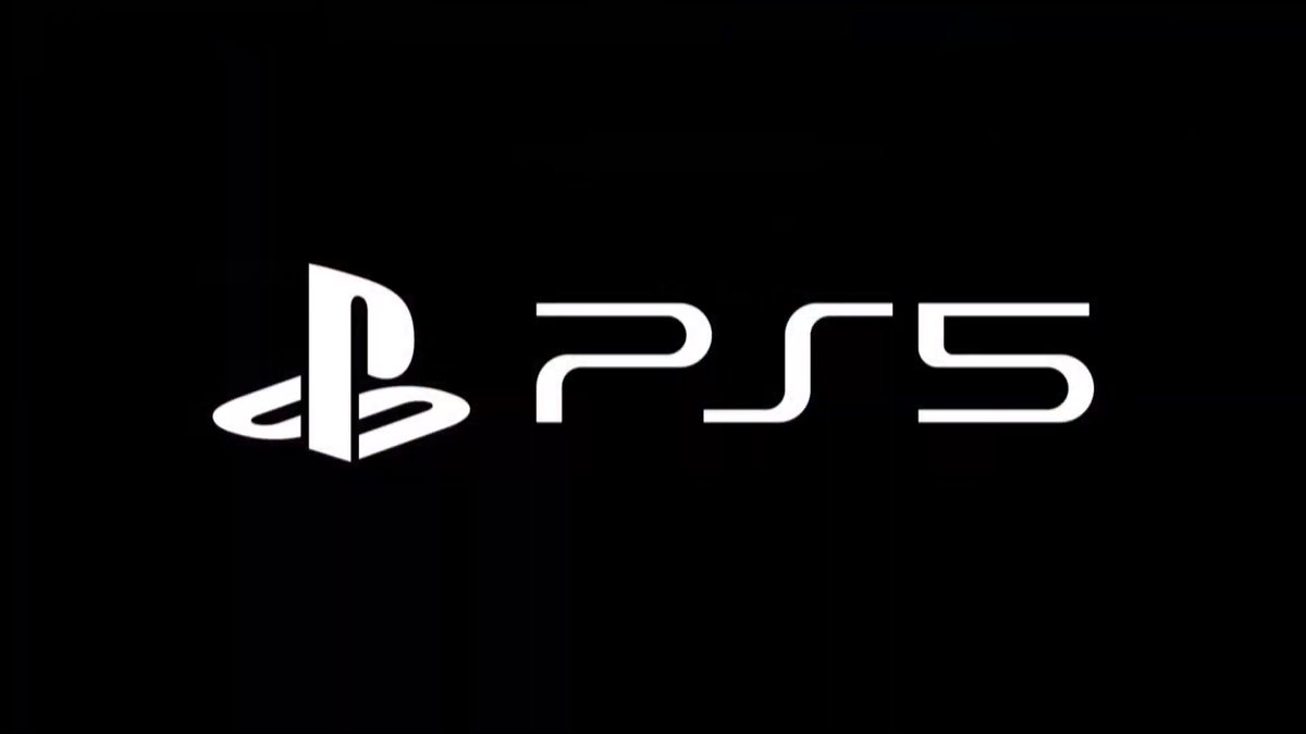
Sony share the new PlayStation 5 logo at CES 2020
- Thread starter Deleted member 18944
- Start date
You are using an out of date browser. It may not display this or other websites correctly.
You should upgrade or use an alternative browser.
You should upgrade or use an alternative browser.

OP
OP
The PlayStation 5 Logo is derived from film noir, as the black background is a motif that there's nothing but darkness after life (what the thin white font represents) finally gives out.
Typeface analysis by Hobbes.
Typeface analysis by Hobbes.
It literally looks like some amateur photoshop, replacing the 4 with a 5.
This isn't great PR for Sony, this will get meme'd on and not in a good way.
This isn't great PR for Sony, this will get meme'd on and not in a good way.

Does the hard edge look odd to anybody else? I feel like it would look better slightly rounded like so.

(shitty edit)
(shitty edit)
OP
OP
"If it ain't broke, break it" - People that just want change for the sake of change and then get mad when it happens
The effort is barely worth it for them anyway. It's not like it will change the PS marketshare a lot whether Sony decide to do it or not. Also, if the latest SoC specs are true it kinda confirms that Sony once again went with hardware B/C route so I wouldn't expect any software emulator at all.It would be insane if Microsoft is able to claim OG Xbox backwards compatibility and these jokers can't even manage a PS1 emulator. For fuck's sake.
for about 5 minutesIt literally looks like some amateur photoshop, replacing the 4 with a 5.
This isn't great PR for Sony, this will get meme'd on and not in a good way.
GOD DAMN right
first day purchase
Sonnnyyyyyyyyyyyy PS5(potentially my last console)

Thank you!I understand it's the typeface and it's for differentiation so as not to make the 5 look like an alternative "S" character in the library, but holy FUCK does that 5 look like shit next to those other two characters. That hard angle on the top-left looks like a mistake.
The typeface was designed for the PS3, with the "3" clearly designed alongside the rest of the letters, with all curves and no corners. Once they kept the typeface for the PS4 - and the "4" of the logo has nothing but corners and a low profile - the type falls apart. They should have redesigned the typeface to accommodate the edged "5" instead of retrofitting another number on an almost decade-old logo.
They're going to cancel the PS5 next week after they saw your post here.A++ show. so much playstation 5 news i can't handle it .
I guess this is the start of a series of a dissapointment to come in 2020. way to go

Allow me to save y'all some time 5-10 years from now with the time-travelling future reveal... of the PS6 LOGO!!

...It literally looks like some amateur photoshop, replacing the 4 with a 5.
This isn't great PR for Sony, this will get meme'd on and not in a good way.
Rofl..
Kinda like it wasn't good PR when all they did was change the 2 to a 3? And 3 to a 4? You think 4 to a 5 is any different? It's a logo that hundreds of millions know. It would be incredibly stupid of them to change it for no reason.
I mean, I'll assume you were joking and the joke flew over my head or something.
Last edited:
I wish they'd just use the PS logo plus a standalone five or whatever. The logo is so cool that it makes whatever's next to it look like shit.
We need to check if Sony has taken out a life insurance policy on the PS5.The black background means it's gonna be a disappointment especially when MS is holding the golden key and Nintendo is holding the diamond key not to mention Gaben ushering in the golden age of gaming along with Geoff "D. Pope" Keighley. I smell doom and gloom and they'll probably sell off all of their businesses outside of insurance.
The black background means it's gonna be a disappointment especially when MS is holding the golden key and Nintendo is holding the diamond key not to mention Gaben ushering in the golden age of gaming along with Geoff "D. Pope" Keighley. I smell doom and gloom and they'll probably sell off all of their businesses outside of insurance.
lol.They're going to cancel the PS5 next week after they saw your post here.
lol lets keep it going, PS7!Allow me to save y'all some time 5-10 years from now with the time-travelling future reveal... of the PS6 LOGO!!

Thank you!
The typeface was designed for the PS3, with the "3" clearly designed alongside the rest of the letters, with all curves and no corners. Once they kept the typeface for the PS4 - and the "4" of the logo has nothing but corners and a low profile - the type falls apart. They should have redesigned the typeface to accommodate the edged "5" instead of retrofitting another number on an almost decade-old logo.
WAit, do you think sony (a multimillion dolar company) just "retrofitted" another number on their most successful brand?
Thats not how it works.
lmao
Yes, like the One X has.
Sony is elderly confirmed.Microsoft folks made a good step when they decided to reveal the look of the console at TGA. This makes Sony look incredibly slow and cumbersome, at least from psychological point of view.

...
Rofl..
Kinda like it wasn't good PR when all they did was change the 2 to a 3? And 3 to a 4? You think 4 to a 5 mean is any different? It's a logo that hundreds of millions know. It would be incredibly stupid of them to change it for no reason.
I mean, I'll assume you were joking and the joke flew over my head or something.
People already losing their minds over a frickin' logo, imagine when they finally reveal the console...
The power that that has, the intelligence that that has, the clearance that that has, the impact that that has, the access that that has, the influence that that has, the profile that that has, the international implications that that has.