-
Ever wanted an RSS feed of all your favorite gaming news sites? Go check out our new Gaming Headlines feed! Read more about it here.
-
We have made minor adjustments to how the search bar works on ResetEra. You can read about the changes here.
Sonic Boom vastly improved the series' character designs
- Thread starter Biestmann
- Start date
You are using an out of date browser. It may not display this or other websites correctly.
You should upgrade or use an alternative browser.
You should upgrade or use an alternative browser.
Completely agree. The designs (as well as the characterizations / tone) are definitely a change from the norm, but I thought it was a welcome one. I didn't watch a ton of the show but from what I saw the characters were more likable than they had been in ages.
Lol, I came here ready to start my reply exactly like that.
The Boom designs are something I've tolerated, rather than enjoyed. Modern Sonic and Co. are the best they've ever looked and Boom reeks of meddling for the sake of it. Only Eggman looks 'good' and even then I still prefer his game look.
Lanky Sonic looks goofy to me. Sonic Mania and OVA style will always be the superior Sonic IMO.
We've had this thread before so I'll just repost what I said last time.
No it didn't improve them and let's analyze why:
Sonic: The best way to describe this redesign is "cluttered". The messy extra tufts of spikes in his "hair" ruin his iconic three-spike profile, the sports tape on his shoes looks comically excessive and is overkill compared to the simple white stripe that worked fine before, and the brown scarf dulls up his otherwise striking blue and red color scheme. Lastly, having blue arms is not necessarily a bad change... but it's not a good one either.
Tails: Tails has changed the least, but I still hate this redesign as it only further pigeonholes Tails into the boring "tech guy" archetype that has slowly begun to dominate his character ever since Unleashed. There is no reason he needs goggles and a toolbelt on him all the time. Just let him be a cute little fox.
Knuckles: Like Tails, this exaggerates one characteristic of Knuckles (his strength) to make it his only trait. It also fails on a fundamental level by putting his spiky knuckles - you know, that thing that he's named after - on the back of his hands, making them completely worthless for digging or fighting.
Amy: This is probably the only one that isn't a straight downgrade, but like Sonic it unnecessarily clutters up a fairly simple design.
Jesus, those non-core character designs are atrocious.
I really do hope we see a return to the Sonic Boom universe, despite the games being failures, the show was a commercial success.
THIS FOREVER. TOP CHARM.The buffness of Knuckles is sort of the only change I can get behind? The additions of scarfs, goggles and bandages feel like such 'boring' additions however.
IMO the characters never looked better than
(Unfortunately no Amy ¯\_(ツ)_/¯)
Eh, the designs were hit and miss for me.
The show really make them work and it frikking rocked though.
The show really make them work and it frikking rocked though.
I'd love to see a side scroller with this art style. Show Tyson Hesse some love and let em do it!The buffness of Knuckles is sort of the only change I can get behind? The additions of scarfs, goggles and bandages feel like such 'boring' additions however.
IMO the characters never looked better than
(Unfortunately no Amy ¯\_(ツ)_/¯)
Nah. The only designs that worked were tails and shadow. And the reason those work is that they are so similar to the orginals. Eggman also works but he's the only character design departure that does really.
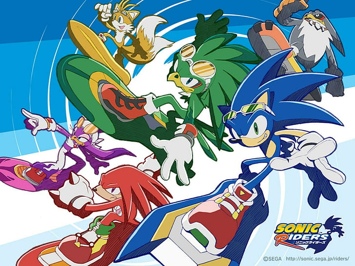
The best interpretation of modern sonic design wise for me. Is the Ukewa art , and the sonic battle and Sonic riders stuff personally. Mania is cute but doesn't do anything for me.
The best interpretation of modern sonic design wise for me. Is the Ukewa art , and the sonic battle and Sonic riders stuff personally. Mania is cute but doesn't do anything for me.
This isn't true at all.
Both statements are untrue. The design would work now , and worrying about something's age in that way is sort of irrelevant especially now how we sell recycled media. Along with their being plenty of things that work because it is of its time.
I've been bottling this up for forever, but I finally must say the truth: Boom's rendition of Sonic's cast adds a ton of personality to the characters and marks an improvement on all fronts. This is leaving aside your feelings for the shoddy-ass games - the character designs just are better.
Sonic looks better with blue arms and lankier features, Tails is a mechanic at heart, something his new design emphasizes well, and Amy's new outfit is a great modern update to her old, worn-out clothes. Knuckles in particular gains tons of of personality with the change to his body structure, and it looks great to boot. Even the ladies would agree:
I think it's a bummer these design are unlikely to make a comeback, because they're really damn good.
I'll concede on the bandages though, it's hard to see a point in those.
Man, I could not possibly disagree more. Other than Knuckles, these are basically just the standard 3D Sonic character designs but with added accessories. With Tails, it's cute. With Sonic, it's pointless. And Knuckles is just... awful.
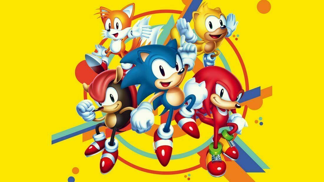
And I guess the truth of the matter is that Sonic character designs have never been better than the classic versions.

This isn't true at all.
Both statements are untrue. The design would work now , and worrying about something's age in that way is sort of irrelevant especially now how we sell recycled media. Along with their being plenty of things that work because it is of its time.
She would stick out like a sore thumb between the rest of the cast, it's just aged and its design isn't great.
(The timestamp should be at 1:03)
I was felt lukewarm in response to the character designs of sonic boom. They did a fair job of making a unique rendition of each character but it never 'wow'-ed me. The real star of thee show was the spot on writing and voice acting. Some of the jokes and quips they made just had me in stitches. It's really a shame that the cartoon was connected to that terrible video game of the same name.
The buffness of Knuckles is sort of the only change I can get behind? The additions of scarfs, goggles and bandages feel like such 'boring' additions however.
IMO the characters never looked better than
(Unfortunately no Amy ¯\_(ツ)_/¯)
Yeah, these are simple and stand out against each other because of that. The Boom designs in OP have too many extra pointless little flourishes and frankly look awkward in practice compared to the render.
Riders designs would literally be fine and people would enjoy themShe would stick out like a sore thumb between the rest of the cast, it's just aged and its design isn't great.
The art style is really good. Would not complain if a game used it.Riders designs would literally be fine and people would enjoy them
I like that the latest Mario and Sonic had Rouge with her Riders costume.
Sonic characters? Goofy?!
Oh no
Hey look its cool and fine abd works and they should give characters outfits more often. Like in the mobile gameThe art style is really good. Would not complain if a game used it.
I like that the latest Mario and Sonic had Rouge with her Riders costume.

Unleashed Sonic is still the best design, imo. Perfection, in my eyes. The Boom designs were fine for their respective universe, but I couldn't see them translating well outside of it. The show, especially season 2 with that meta as hell writing, was incredible, though.