-
Ever wanted an RSS feed of all your favorite gaming news sites? Go check out our new Gaming Headlines feed! Read more about it here.
-
We have made minor adjustments to how the search bar works on ResetEra. You can read about the changes here.
So what's the problem with Bloodstained's visuals?
- Thread starter lazygecko
- Start date
You are using an out of date browser. It may not display this or other websites correctly.
You should upgrade or use an alternative browser.
You should upgrade or use an alternative browser.
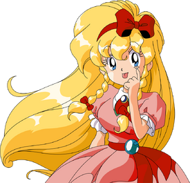
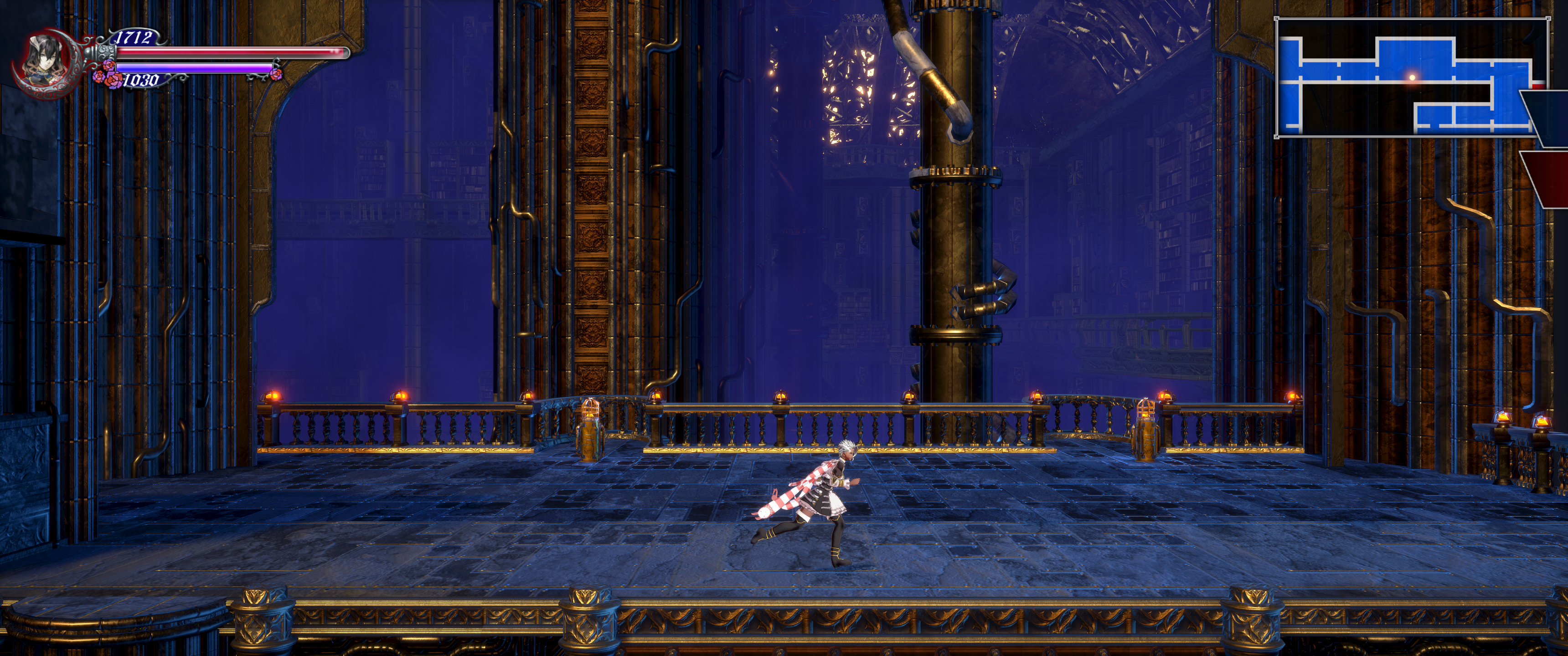
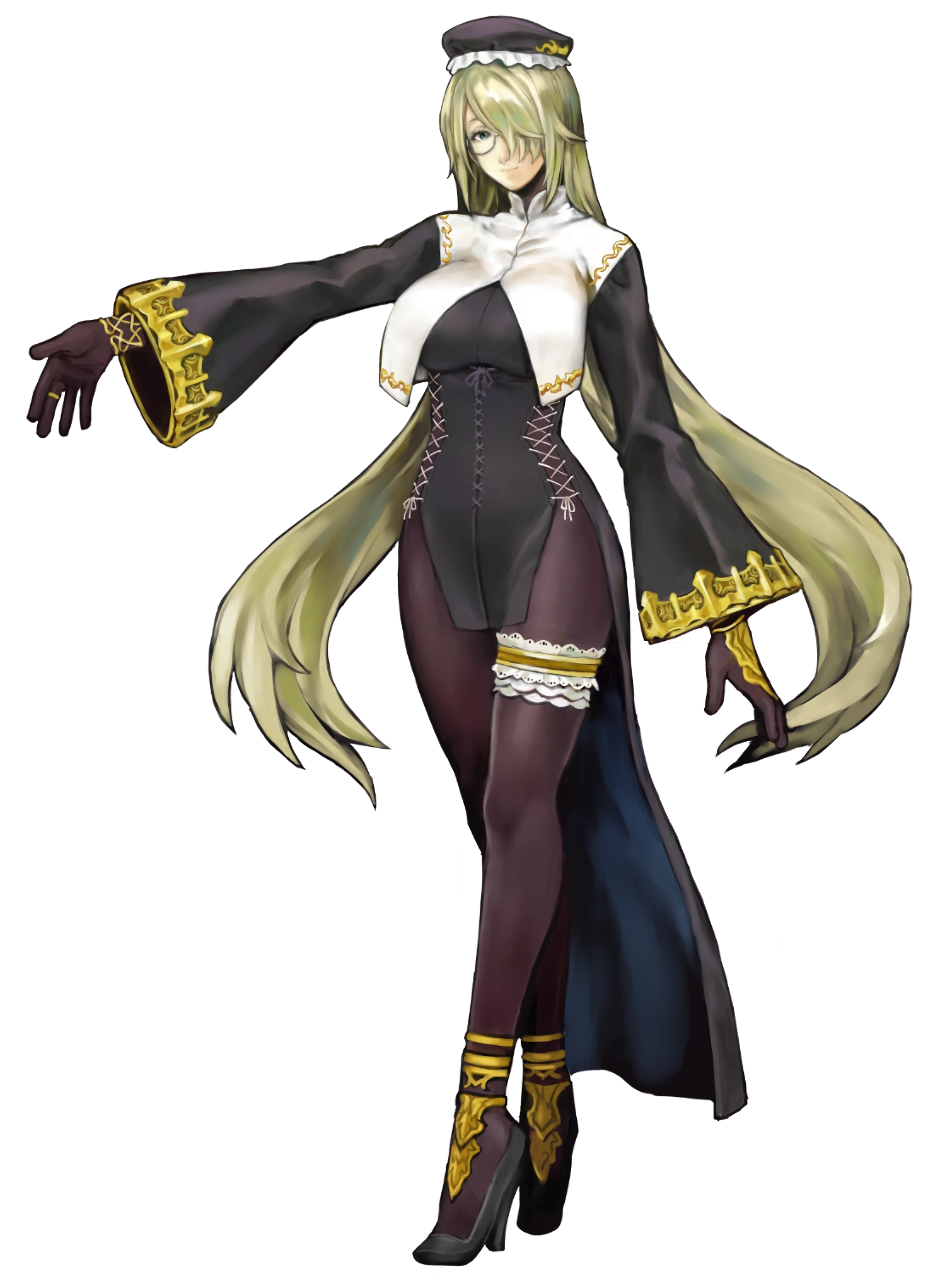
I mean this is the main character
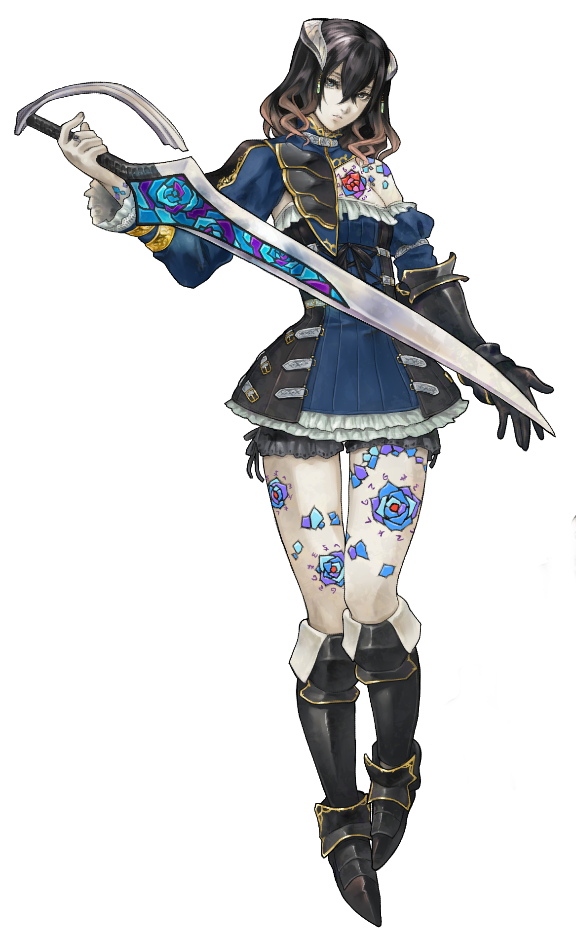
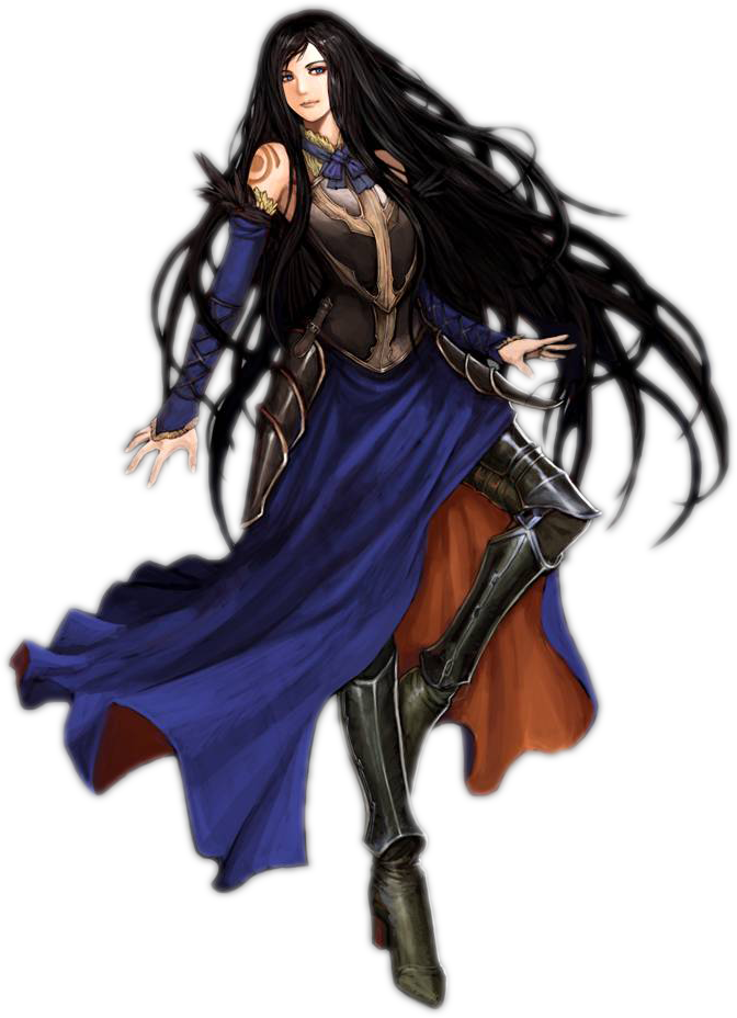
Compare her to Shanoa
The art direction is just rotten from the core out.
They should just rehire the OOE artist and call it a day.
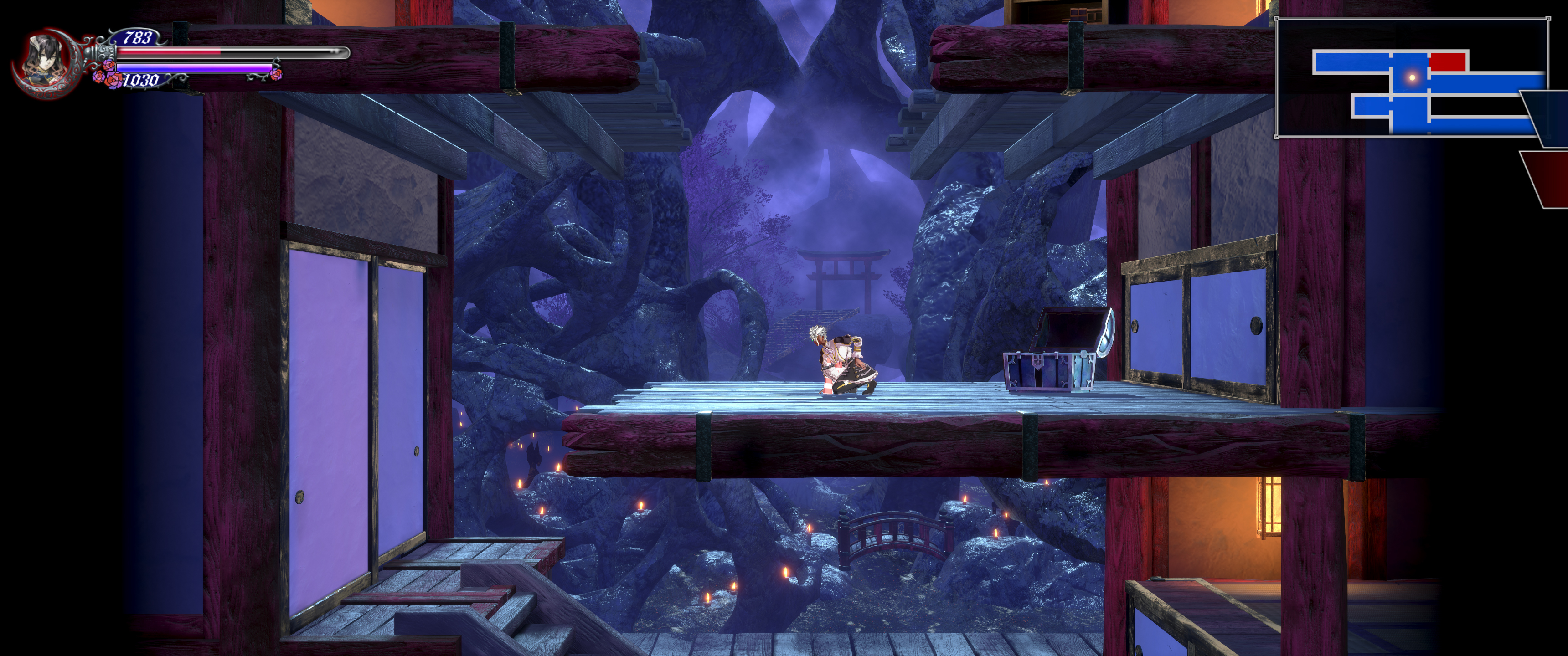
I mainly dislike the 3D models and levels implementation, I believe that the core art is not terrible, but, yeah compared to the previous Castlevanias it looks like a fan created character. Some points I remember thinking on the reveal date:
- Her body and dress are not proportionate to each other.
- Why all the belts? Is this Nomura's early 2000s?
- The flower tatoos. It looks like someone was trying to cover the skin with something random
- The asymetric flap on the left, is it part of the dress or is it an extra piece?
- What is that on her head? Horns or a crown?
The flowers are a disease that spread. The runes tattooed around them are magical containment to prevent further spread.I mainly dislike the 3D models and levels implementation, I believe that the core art is not terrible, but, yeah compared to the previous Castlevanias it looks like a fan created character. Some points I remember thinking on the reveal date:
- Her body and dress are not proportionate to each other.
- Why all the belts? Is this Nomura's early 2000s?
- The flower tatoos. It looks like someone was trying to cover the skin with something random
- The asymetric flap on the left, is it part of the dress or is it an extra piece?
- What is that on her head? Horns or a crown?
Some don t have them...
She can have a holly armor that rids her of them
edit: forgot to add during commute that she's not a demon, this is a headpiece she quickly changes to something else better.
Last edited:
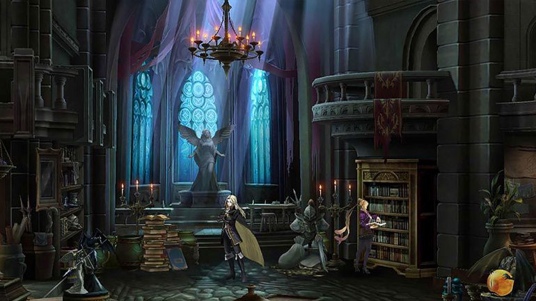
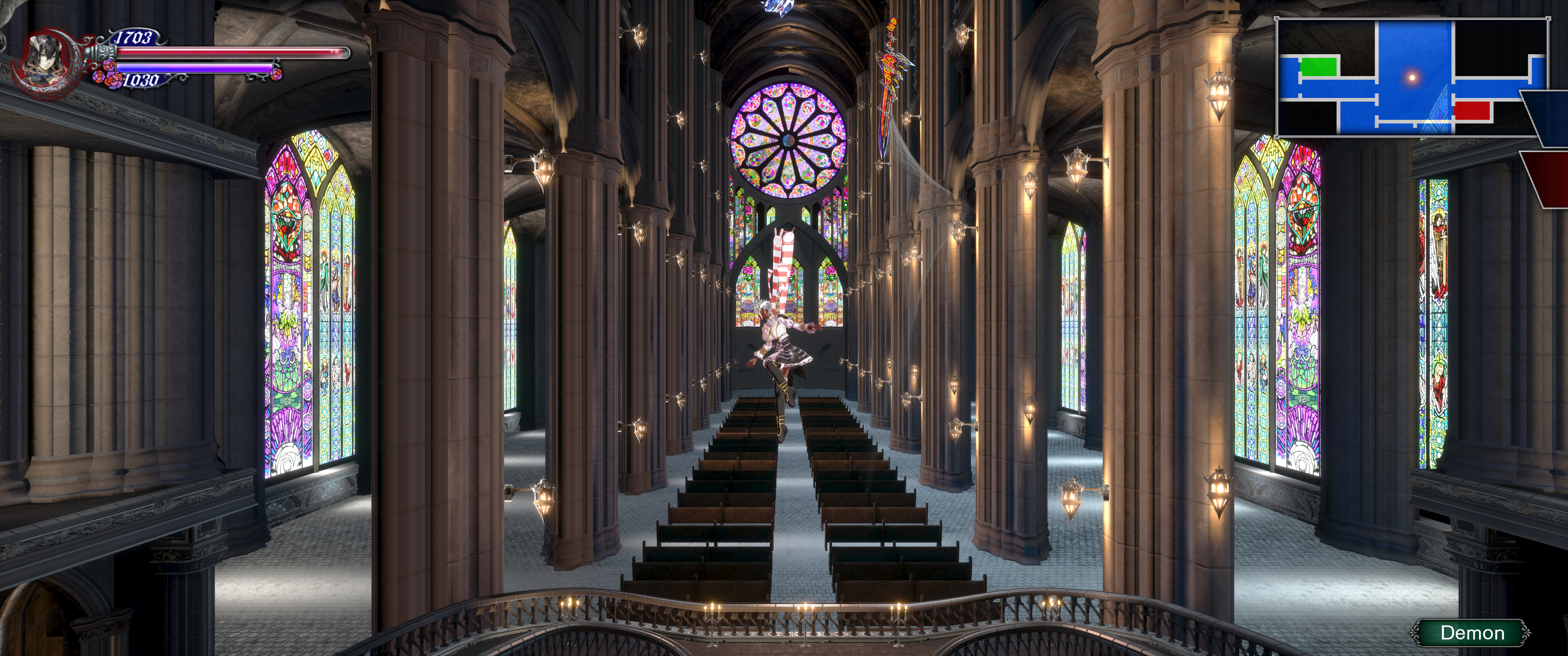
I don't have a problem with how 99% of the game looks (on PS4 at least), but one thing I CANNOT stand, are the paintings on the walls. Which are clearly backers, or devs. Or whatever. But they're just so out of place and bad looking (especially the intentionally goofy ones). And it's like the first thing you see when entering the castle. Put that type of thing in a special separate room like Shovel Knight, not littered across the main game.
OP
OP
I just realized. There are no skeleton enemies in this game. Wtf...
There are skeletons but they're covered in amorphous black goo. It took me a while to spot the actual bone elements in them.
Like I said, the models have some major readability issues.
Gooooood!They already said that bloodstained 2 will not be a crowdfunded game ;) (official statement in the kickstarter comments)
Music to my ears.
There's a few good ones. The cat and lady with a flower over her eye. Other than that, a lot of them are inoffensive. Some are trash though.I don't have a problem with how 99% of the game looks (on PS4 at least), but one thing I CANNOT stand, are the paintings on the walls. Which are clearly backers, or devs. Or whatever. But they're just so out of place and bad looking (especially the intentionally goofy ones). And it's like the first thing you see when entering the castle. Put that type of thing in a special separate room like Shovel Knight, not littered across the main game.
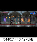
I can't really put my finger on it but every time I look at the game, be it gameplay or screenshots, I get the feeling that something just looks off.
It's really off-putting and the only reason why I still haven't picked it up. It bothers me way more than it should. I thought it was just me because everyone is gushing over how great the game is and I have no doubt that it plays great
but I never noticed other people having issues with the graphics / art style so I just thought it was me.
They made monsters out of cats and dogs that look out of place.
That's because it was one of the Kickstarter rewards:
UNLEASH THE HOUNDS OF HELL
The development team will turn your pet (or an animal of your choice) into an in-game enemy!
The development team will turn your pet (or an animal of your choice) into an in-game enemy!
Similarly, 30 people pledged to have portraits of them created (which cost anything between $1,500 and $1,600):
ANCESTRAL BLOODLINE
The development team will create a digital portrait of YOU and hang it somewhere in the game's castle!
The development team will create a digital portrait of YOU and hang it somewhere in the game's castle!
Heck, some individuals didn't even provide real photographs, so you have a few of the portraits depicting regular people (wearing glasses and everything), others that look like paintings of cosplayers, and a handful that are straight up anime characters drawn in a different art style from the game itself.
I was hoping that the developers would come up with a cohesive art direction and apply that to everything, including the enemies and portraits promised as rewards, but I guess they were afraid of the backlash or even of getting sued afterwards, if they altered the pictures in any significant way.
Last edited:
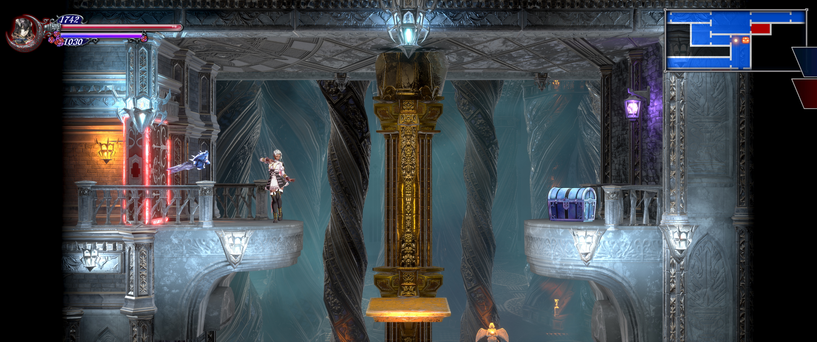
My problem with Bloodstained's visuals feel really picky even to me, but the game feels like it could've used one more detail pass, or something. It occasionally looks garish with its colors, sparse with its environments, lighting sometimes comes across a little flat...
Not always. There are places that are genuinely beautiful, but in some places you can feel the budget more than others.
I won't complain too loudly, though, because this is probably about as nice as it would ever look, given the circumstances.
Not always. There are places that are genuinely beautiful, but in some places you can feel the budget more than others.
I won't complain too loudly, though, because this is probably about as nice as it would ever look, given the circumstances.
I just wish the villiagers would put out the damn fires in the village before they try to do "farming". Stuff like that bothers me a little.
But I agree with the people saying that it's almost a miracle that this game more or less came together in the end. A troubled development clearly shows here and I long for an honest post mortem of the game.
But I agree with the people saying that it's almost a miracle that this game more or less came together in the end. A troubled development clearly shows here and I long for an honest post mortem of the game.
Hollow Knight was made by 3 people, 4 if you include the composer. Nobody forced them to go 2.5DConsidering the smaller studio and smaller budget I think it looks amazing. I don't get why some folks can't get that smaller games look worse and that's okay. Using the latest Unreal doesn't magically make it look awesome. I fully expect these kinds of gripes to show up with every major release by small teams, especially since Shenmue 3 is already basically impossible to discuss on this forum because of people's incredibly bizarre expectations.
That all said, some consistency in art direction would be nice. As others have pointed out, it can feel a little wonky at times. Still, it's not something I cared about too much while in the middle of playing.
Hollow Knight was made by 3 people, 4 if you include the composer. Nobody forced them to go 2.5D
While that's true, my comments are about the 3D we have rather than a hypothetical 2D approach. I agree that well designed 2D would be much nicer and probably more cohesive for a Castlevania-styled game, but for the 3D they did I don't think it turned out that bad considering the scope, budget, and team size.
The 2.5D reminds me of cheap XBLA trash like Turtles in Time Re-Shelled or Blade Kitten, that strange disconnect between the characters and the backgrounds, the way that certain textures stand out like a sore thumb for being ultra detailed and pristine, the doll house look to the areas, the janky animations. It's hard to find a particular way to describe it other than disjointed and amateur.
Here's an example of 2.5D executed extremely well, Shantae Half Genie Hero:
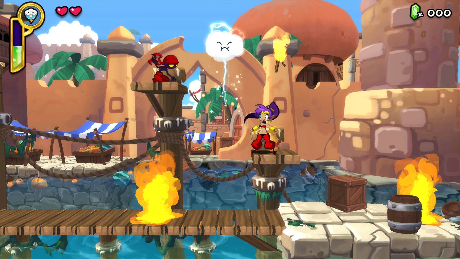
See how cohesive the style is? Beautiful hand drawn characters, 3D levels on a 2D plane, yet in motion it all blends together and you only notice the 3D when the game wants you to. Now, how much did Bloodstained make in the Kickstarter? 5.5 million dollars. How much did Shantae make? Just shy of 800k.
Here's an example of 2.5D executed extremely well, Shantae Half Genie Hero:
See how cohesive the style is? Beautiful hand drawn characters, 3D levels on a 2D plane, yet in motion it all blends together and you only notice the 3D when the game wants you to. Now, how much did Bloodstained make in the Kickstarter? 5.5 million dollars. How much did Shantae make? Just shy of 800k.
I'm glad they kept this from Curse of the Moon. Skellies are chill now. No need to fight 'em.I just realized. There are no skeleton enemies in this game. Wtf...

The 2.5D reminds me of cheap XBLA trash like Turtles in Time Re-Shelled or Blade Kitten, that strange disconnect between the characters and the backgrounds, the way that certain textures stand out like a sore thumb for being ultra detailed and pristine, the doll house look to the areas, the janky animations. It's hard to find a particular way to describe it other than disjointed and amateur.
Here's an example of 2.5D executed extremely well, Shantae Half Genie Hero:
See how cohesive the style is? Beautiful hand drawn characters, 3D levels on a 2D plane, yet in motion it all blends together and you only notice the 3D when the game wants you to. Now, how much did Bloodstained make in the Kickstarter? 5.5 million dollars. How much did Shantae make? Just shy of 800k.
Yeah, I think the person in charge of the art direction didn't really know what he wanted to do, and/or how he wanted to do it. When I look at Bloodstained, I see something basic, and by that I mean something without direction or goal. Here, with Shantae, they wanted to give a comic style to the game, so that's what they've done.
For Bloodstained, we have cell-shaded character; realistic backgrounds and areas; realistic effects (look at the flame in the picture above and compare it to those present in Bloodstained). And besides, when I look at the game, especially the sceneries, it gives me a feeling of being generic, especially the textures used. In some way, Bloodstained is like those DBZ games, with cell-shaded characters and with a realistic background. In those games, the impression of being generic is mitigated by the fact that the backgrounsd are really poor in details, but in Bloodstained, they're rich. There's a lot of details, which make them stand out more.
And there's also some kind of ugly slimy effect going on. Or should I say, the slimy effect present on some things (the Mortes, the first boss) is just plain ugly.
In the end, the game is not that bad visually, but it could have been so much better. So, if there's a 2 being prepared, I hope that they take note of some the critics about the appearance of the game to create something more beautiful and more coherent.
I haven't played much Bloodstained so far but the backgrounds especially look awful, really cheap and bland with no cohesion or consistent art direction. It's incredibly distracting, not enough for me to not enjoy what I've played so far, but enough for it to bother me.
I don't have a firm grasp on budgeting for designing games like these, but what I don't understand is the comments that say there was not enough money for sprites. I look at other indie games like Shovel Knight, Ori, Hollow Knight, Dead Cells, etc. and they are all visually much better than this game. Sotn was a much better looking game from visuals to soundtrack than Bloodstained. Bloodstained is seriously way off the mark from it's initial ambitions.
Also I agree with the comment another person in this thread. 2.5D just about never looks good. I can't think of one 2.5D game I played where I thought "I'm glad they went this direction instead of sprites."
Some of the games you have listed are based on skeleton animation. Pixel art (think of sprites) 2D is different than skeleton animation based 2D (think of same kind of characters as a 3D game, with skeletons and such, but flat).
The former is much higher budget than the latter in HD or even 4K. If you're interested you can find a thread about pixel art budgeting (about Skullgirls DLC characters afaik) in the old site.
meanwhile, strider a game from 2014, looks vastly superior with excellent 2.5D graphics with really cool cell shading effects and art direction.
Yeah I was actually thinking Strider 2014 and Mirror of Fate as good 2.5D Metroidvanias with which to compare.
Granted I don't know the relative budgets these games had, so comparison may well be skin deep, and I won't say that those games didn't also have some dud areas. Can't fault them for consistency though.
Technically it looks highly competent. Aesthetically it just looks bland, nothing really stands out and the overall art design of the castle is forgettable. WayForward (or whoever) polished it as much as they could though. It's a fine looking game overall, but it's not exciting or interesting to look at.
This is how that mobile Konami Castlevania game looks
Somebody at Konami was REALLY good at art, and he didn't migrate along with IGA.
This actually looks really nice. Yeah art is the problem with Bloodstained. Just look at the main character design. Horrendous.
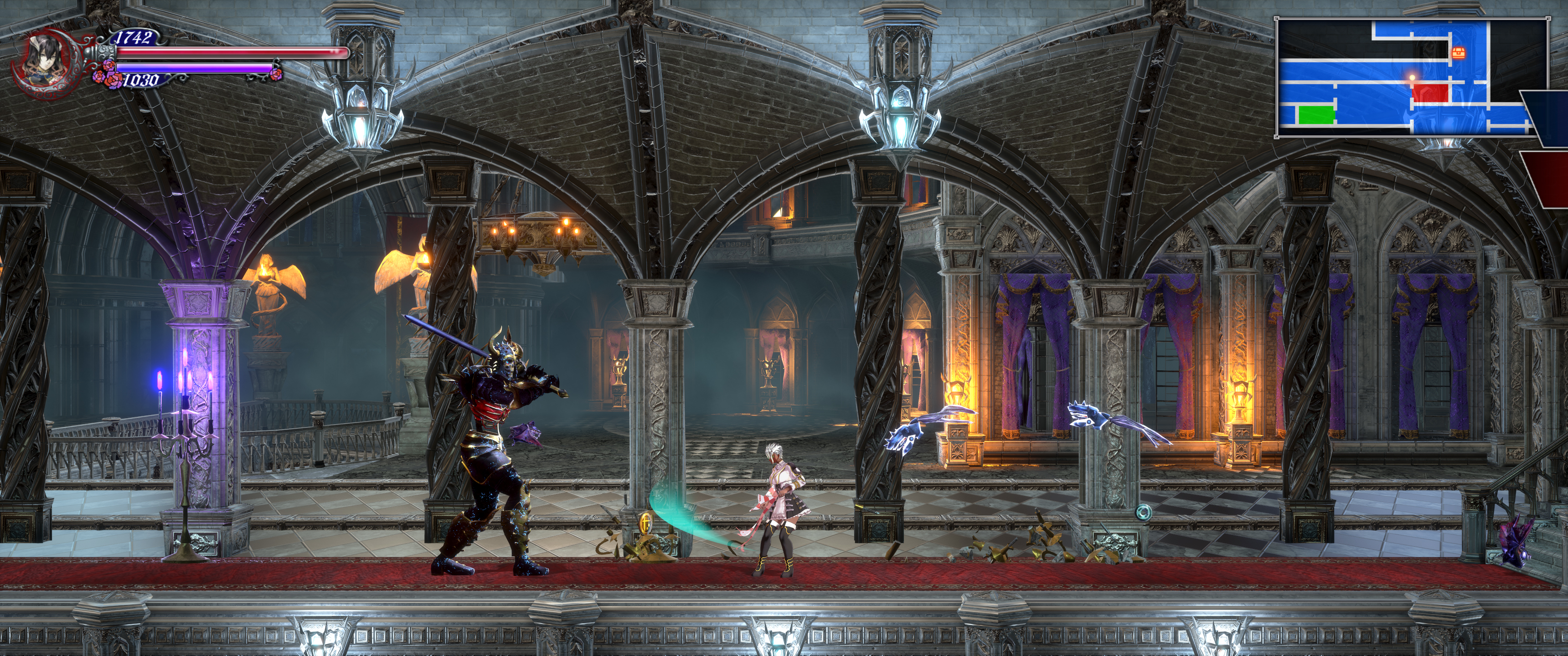
I think it's an inconsistently good looking game. There's definitely some stuff that stands out in a bad way but I think calling it an ugly or a bad looking game is way overly harsh. To be honest, my biggest visual issue with the game is the design of the main character. From the neck down I can't help but think "this is really what you guys came up with?" Obviously with the way the armor/equipment works it feels weird to care about how she looks since she's just going to look like a dumb goth pirate anyway at the end of the day but even then, I might care about the look of armor/equipment if I cared more about her base outfit.
Last edited:
I've seen enough of the game at this point to just say...shit is uneven. Some areas look really good...others just look sparse as fuck and look unfinished. Like they forgot to put detail in or something.
Huh, plenty of 2.5D games look great.
Well, the 2 first DS games had the same problem with "gothic horror ambientation with anime characters", while OoE was a good return to a more cohesive artsyle. What I've experienced from the game looks good enough, I don't like the cell shaded enemies and how contrast with the detailed backgrounds, but considering that is the first time in decades a Igarashi Castlevania has introduced lots of new enemy designs, I think the results are quite good.
I expect the 2nd Bloodstained to polish the visuals a lot, while re-using lots of enemy designs/models.
I expect the 2nd Bloodstained to polish the visuals a lot, while re-using lots of enemy designs/models.
Last edited:
Well, the 2 first DS games had the same problem with "gothic horror ambientation with anime characters", while OoE was a good return to a more cohesive artsyle. What I've experience from the game looks good enough, I don't like the cell shaded enemies and how contrast with the detailed backgrounds, but considering that is the first in decades a Igarashi Castlevania has introduced lots of new enemy designs, I think the results are quite good.
I expect the 2nd Bloodstained to polish the visuals a lot, while re-using lots of enemy designs/models.
The first two DS games basically only used anime art for character portraits. The environments looked largely similar to SotN. Besides, the games were pixel art. It's not as if you could look at Soma's sprite in AoS then DoS and pinpoint some drastic change in artstyle. Portrait of Ruin had some really ugly, clashing areas (the circus stands out), but that wasn't because of the anime portraits. From what I've seen with Bloodstained, the 2.5D-ness highlights all the various influences in a way that pixel art helped smooth over for previous games.
After playing so much of it I've come to find some charm in the incongruous mess of the game's design.
Whilst I instantly found these enemies totally absurd and hilarious because of it if I were to pledge a huge amount of cash to get my pet featured in a game as an enemy I'd expect the team to take some liberties and make my dog look like it was some kind of unholy hell mutt that belonged in the game world. To be honest I'd be pretty disappointing if I saw what they action did; it just feels lazy. So I don't think that backer reward in particular's to blame.
They had six backers pledge at that level - five for $3,000, and one for $3,500.UNLEASH THE HOUNDS OF HELL
The development team will turn your pet (or an animal of your choice) into an in-game enemy!
Whilst I instantly found these enemies totally absurd and hilarious because of it if I were to pledge a huge amount of cash to get my pet featured in a game as an enemy I'd expect the team to take some liberties and make my dog look like it was some kind of unholy hell mutt that belonged in the game world. To be honest I'd be pretty disappointing if I saw what they action did; it just feels lazy. So I don't think that backer reward in particular's to blame.
This is my number one issue with the game as well. I really hope someone can make a mod for this, if it's even possible.I love Bloodstained's visuals.
Except the fact that the dialogue and inventory character renders are limited to 1080p even when you render the rest of the game at 5120x2880.
So that's the problem with Bloodstained's visuals.
And it's an unfathomable problem, because it really shouldn't take any time to fix.
The game looks SOOOO good during gameplay with UE4's 200% resolution scaling. I really wish I could look at the characters with that same image quality, without having to equip the zoom in glasses.
The game also addresses this. When Miriam talks about not being able to reach certain areas, and Dominique tells her Zangetsu uses certain techniques for that, she also explains that this is a Demon Castle, and as such was never made to be traversed by humans, and should not be interpreted using our logic.I think that's great, though. Grounding a 2D action game too much in reality would absolutely damage the level design. Castlevania, whether Metroidvania or classic, has never been about this.
Sure, that's a really easy excuse to write into the game, but at least it sets the expectations right. You shouldn't be surprised to see nonsensical connections and areas that don't look like they belong, on the contrary, you should expect that.
But I'm not sure if that was an optional dialogue, I always keep checking on the NPCs whenever I get the chance because I enjoy the dialogue.
Agreed, but this was mostly a consequence of the low resolution of the DS screen, if the games were HD I can see the character sprites contrasting against the gothic-style backgrounds. And Castlevania games are not strange at all with anime designs, I still remember the original Maria Renard design and it's not gothic at all:The first two DS games basically only used anime art for character portraits. The environments looked largely similar to SotN. Besides, the games were pixel art. It's not as if you could look at Soma's sprite in AoS then DoS and pinpoint some drastic change in artstyle. Portrait of Ruin had some really ugly, clashing areas (the circus stands out), but that wasn't because of the anime portraits. From what I've seen with Bloodstained, the 2.5D-ness highlights all the various influences in a way that pixel art helped smooth over for previous games.
I still prefer the style in SotN, the RoB remake or OoE, but is not like the Bloodstained art style for the characters is something new for these games.
About PoR, these areas were meant to be different, as they were the world inside portraits, my main problem is how the game re-uses all of them.
It's just very inconsistent. They've had different ideas and different styles at different points of development but being on a budget they've just had to build a game out of the various pieces and somehow tie it all together to varying degrees of success.
Like it's night and day to a game designed from the ground up with a strong unified art direction on even a smaller budget like Hollow Knight.
Like it's night and day to a game designed from the ground up with a strong unified art direction on even a smaller budget like Hollow Knight.
Agreed, but this was mostly a consequence of the low resolution of the DS screen, if the games were HD I can see the character sprites contrasting against the gothic-style backgrounds. And Castlevania games are not strange at all with anime designs, I still remember the original Maria Renard design and it's not gothic at all:
I still prefer the style in SotN, the RoB remake or OoE, but is not like the Bloodstained art style for the characters is something new for these games.
About PoR, these areas were meant to be different, as they were the world inside portraits, my main problem is how the game re-uses all of them.
I largely agree with this, but I'll also say that anime in 2019 and anime circa Rondo of Blood are two very different styles, the former which I find charming and the latter I can't stand. I'd argue Bloodstained dips a toe into "animu" territory. And Portrait of Ruin is just ugly to my eyes *shrug*
But this is just nostalgia IMO, like all these people complaining about how JRPGs nowadays are filled with anime tropes (they are), while some of the same people enjoy the 30 year old tropes that series like DQ are yet to change.I largely agree with this, but I'll also say that anime in 2019 and anime circa Rondo of Blood are two very different styles, the former which I find charming and the latter I can't stand.
To me all of this sounds like "old is always better", and for example in this case I don't think that the style in RoB is any more fitting to a gothic terror game, I'd even say that it looks even more comedy-oriented and out of place.
About PoR, I did like the main character art (not the vampires), but I can't say the same about DoS, maybe because the first Soma game in the GBA had a more fitting art.
It may not be some high-end AAA game, but I think it looks good. Sure, there's some inconsistencies with the fidelity of some assets, but it's a kickstarter project with a modest budget.
Many of the complaints have me wondering if people played any of the previous games on GBA/DS.
They're not serious games trying to have a cohesive bestiary or castle design. They put things in because they're fun. Those dog/cat enemies are not out of place, if you had played those games.


I'm surprised to see complaints about cel-shading when it seems like it's barely there?
Many of the complaints have me wondering if people played any of the previous games on GBA/DS.
They're not serious games trying to have a cohesive bestiary or castle design. They put things in because they're fun. Those dog/cat enemies are not out of place, if you had played those games.
I'm surprised to see complaints about cel-shading when it seems like it's barely there?
I completely agree!It may not be some high-end AAA game, but I think it looks good. Sure, there's some inconsistencies with the fidelity of some assets, but it's a kickstarter project with a modest budget.
Many of the complaints have me wondering if people played any of the previous games on GBA/DS.
They're not serious games trying to have a cohesive bestiary or castle design. They put things in because they're fun. Those dog/cat enemies are not out of place, if you had played those games.
I'm surprised to see complaints about cel-shading when it seems like it's barely there?
It wouldn't be too hard to mod.This is my number one issue with the game as well. I really hope someone can make a mod for this, if it's even possible.
The game looks SOOOO good during gameplay with UE4's 200% resolution scaling. I really wish I could look at the characters with that same image quality, without having to equip the zoom in glasses.
I just hope they fix it before I play the game. Because it would be even easier (by far) for the devs to fix.
(Or someone else mods it., of course)
I also agree.
Look it may not look great, or even good...
but this is the best castlevania game I've played so far. One of the top, so much fun and care went into the game. And I cannot wait for the DLC of co-op and the other three playable characters and other modes even when I've already platinumed the game.
but this is the best castlevania game I've played so far. One of the top, so much fun and care went into the game. And I cannot wait for the DLC of co-op and the other three playable characters and other modes even when I've already platinumed the game.
I think Dominique just looks so bad. Can't really put my finger on why, but it's just so generic generic. Miriam at least has her tattoos and belts etc (which I don't like) but at least she has something going on, Dominique on the other hand:
She's gonna be a playable character, right? Urg...
She's gonna be a playable character, right? Urg...
im not sureI think Dominique just looks so bad. Can't really put my finger on why, but it's just so generic generic. Miriam at least has her tattoos and belts etc (which I don't like) but at least she has something going on, Dominique on the other hand:
She's gonna be a playable character, right? Urg...
she is a villain