• Ever wanted an RSS feed of all your favorite gaming news sites? Go check out our new Gaming Headlines feed! Read more about it here.

Deleted member 2620

User requested account closure
Banned
Oct 25, 2017
4,491
While I'm impressed at what they've managed to do given the game's budget and lack of years of predecessors to gank assets from, I have to agree that overall it doesn't look as good as Symphony of the Night.

The progression of modern tech, both in terms of what the end user's console/PC can do and in terms of game development workflow, can help make up for gaps like this, but not in every scenario. "Big sprawling 2D action game with a shitload of enemy variety" is a tough one to tackle.

I think about this a lot, with all sorts of games, and it's one of the reasons I don't like seeing posters suggest that all kinds of old games have perfectly suitable and obsoleting modern equivalents.
 
Last edited:

QisTopTier

Community Resettler
Member
Oct 25, 2017
13,712
fffffff1.png

Ee5qgAo.jpg


Like it's not the greatest looking thing in the world but I feel the shittalk is pretty overkill
 

Morrigan

Spear of the Metal Church
Member
Oct 24, 2017
34,308
Didn't play Death's Gambit, but can't say I disagree about the rest.

However, I think all of the games I'm familiar with that you mentioned look amazing. I don't think Hollow Knight and Ori look "good for an indie game", or that Symphony of the Night looks "good for an old game", I seriously think they're visually incredible.
Agreed~
fffffff1.png

Ee5qgAo.jpg


Like it's not the greatest looking thing in the world but I feel the shittalk is pretty overkill
If those screenshots are intended to look flattering... šŸ˜
 

Host Samurai

Member
Oct 27, 2017
12,159
Doesn't look bad, doesn't look great. It's serviceable, but they should have definitely used sprites. I really hope Iga uses it for the inevitable sequel.
 

NediarPT88

Member
Oct 29, 2017
15,081
The art direction is bad enough for me to not even want to play the game. I don't think I've ever felt this way regarding another title.

Also what I saw from the game regarding other aspects like attack animations and bosses didn't help.

I never played a Castlevania title so maybe I'm missing something.
 
Oct 25, 2017
9,089
Bad art direction in my opinion. It's not a lack of resources, but bad and directionless use of those resources. It looks extremely amateurish.
I really enjoyed the game and will probably play it again, even, but "amateurish" is indeed the word that comes to mind when I consider the overall look of the game. Many of the individual parts are fine, character movement, FX, enemy animations, but when you put everything together it just doesn't seem coherent like other well-art-directed games are.

I feel a bit unfair for criticizing its looks without being able to articulate exactly what I don't like. It's just one of those "I know it because I'm seeing it" kinda things.
 

MajesticSoup

Banned
Feb 22, 2019
1,935
The game looks like CG, from the 90s. And everything animates like a playstation 1 game.

Its like they skipped 2 decades worth of lighting and graphical effects.

7H3SCl2.png
 

Strangelove_77

Attempted to circumvent ban with alt account
Banned
Oct 25, 2017
13,392
You really can't complain about inconsistent art when it comes to Bloodstained. Iga's Castlevanias have everything thrown in them seemingly at random. Not to mention that even the DS games had sprites from SNES games. It was all mixed together into a wonderful mess.
 
EA Artist weighs in

XaviConcept

Art Director for Videogames
Verified
Oct 25, 2017
4,900
I feel like I can contribute a bit here ...

Its not a new opinion, however, its the most important factor. CONTINUITY IN ART DIRECTION

From playing the game, its very obvious that it went through a lot of changes. That includes development houses, that includes game design, that includes budget, that includes engine improvements. All of these things have a cost and all of these things need to come together in some sort of way in order to ship a game.

Symphony of the Night is not a "better" looking game but at the same time it IS a "better looking game. Its consistent, everything looks like t belong in the same universe with the same level of craft so, years later, when you think back on it you do so with a positive outlook because its was a consistently pleasant experience. It was a game made with experienced developers at the peak of their powers with a strong backing from their studio, that makes a difference.

Why is there a random ass Japanese village, with caves, in the top left of a CASTLE? Because as it has been said in the past, this game was about traveling to different locations once, so the assets were made and then when it became a different game entirely well shit, you aint gonna scrape all that work, youre on a budget! It looks good! Make it fit somehow! This is how a LOT of this game was made, its shows and it makes the player go "oh, ok? thats weird, whatever"

You get a ton of examples of this throughout the game, very early on when you are in the galleon it looks one way, then you step outside in the rain and the lighting, rendering and normal maps make it look like the Gears of War rain level, its a COMPLETE shift in art direction meaning that each scene was built by two different places, or they spent so much time on getting those shaders working that they just overdid it and never had the time to go back and tune it.

Same thing happens with the more 2.5 D scenes like the tower, its pulling more polygons than the flatter scenes but it looks worse because you are not able to hide your budget as well in areas like that with a spiraling camera. This post, for instance

The look in general has really grown on me. I actually like the "diorama" approach it has with the general presentation of the graphics and the environment design.

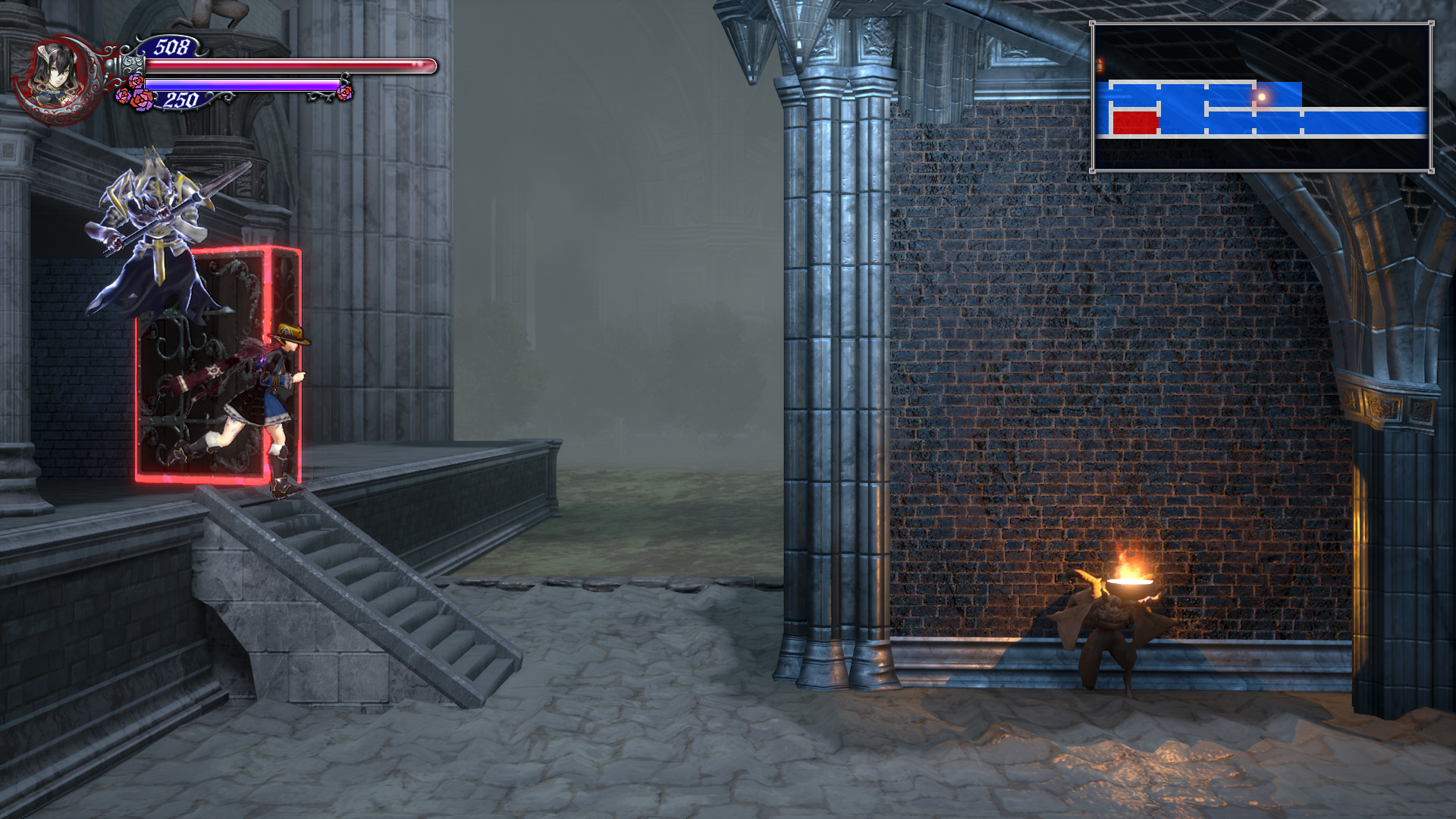
One of the biggest issues that you touch on that is that, taken as a whole, it doesn't feel cohesive or consistent. Look at something like the two ground floor entrances to the Tower of Dragons:

Tower-of-Twin-Dragons-Tower-Exterior.jpg


What is going on here with the design? The background is a flat grass texture with low-poly trees. The walls are naked. There's...a torch.

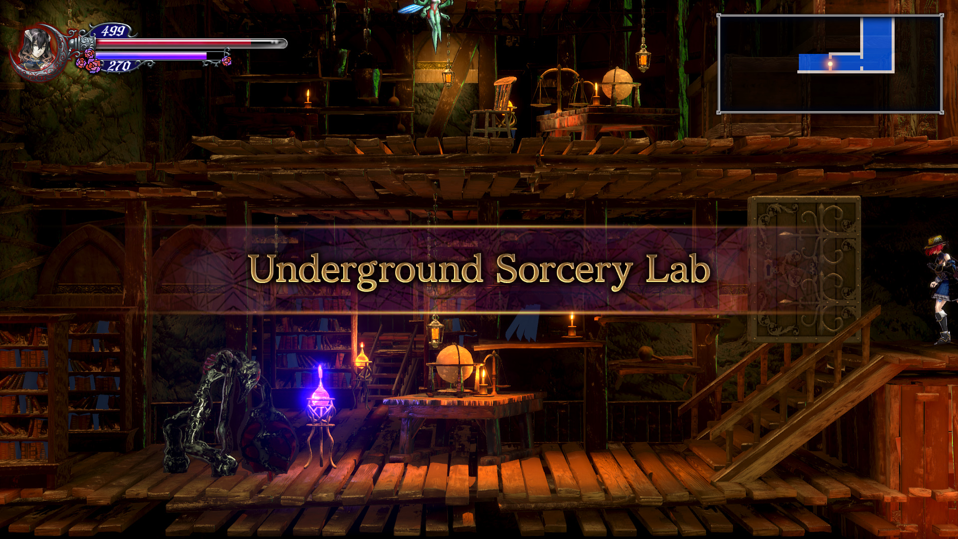
Compare it with something like the Underground Sorcery Lab:
Underground-Sorcery-Lab-guide.jpg

There might be more polygons in this one screen than in the entirety of the outside area of the Tower. There's so much little detail in the background and in the environment. It feels populated, over-crowded (appropriately) even. It's just so visually dense and rich. Where's this kind of attention in the previous environment?

I'm also not a huge fan of the goofier enemy designs (giant fluffy dog head?) either.

I guarantee the first screenshot is more expensive budget wise than the second. On the second shot you can bake lighting, fake everything with textures since theres minimal camera work and give the impression that its more expensive whereas the tower segment actually causes slowdown on a PS4pro which is crazy! However, it was built, they probably decided it was good enough to ship and that the camera movement was cool so they decided to focus on something else ... and they did, they decided to make the screens you see the most often as good as possible

1560871562_bloodstained-ritual-of-the-night.jpg


how_to_fast_travel_in_bloodstained_ritual_of_the_night_title.png


And I dont blame them, I would do the same! If you cant make the whole game look like this ... then at least get the important places done

They also made the substantial last minute decision to overhaul their lighting and rendering, you've all seen the before and after video so no need to rehash it but that actually made the game even more inconsistent when it comes to visuals because it made some areas look great and then ones that didnt benefit from the overhaul were left behind.

The KS nature of the game also has to leave room for a lot of concessions such as a place to fit all those damn portraits. It hurts the visuals and it hurts the level design (how many empty rooms with a portrait and a treasure chest?) I havent looked at the rewards in a bit but my impression when I saw giant cats and dog heads was "that must be a kickstarter reward or someshit) Those are elements that, once again, make a user stop thinking about the game experience and cause friction.

Enemy design and implementation is also a mess, a lot of the stuff from Curse of the Moon makes its way here and they are NOT good fits, that Headless Knight from the beginning that looks like he belongs in Starcraft should NOT be anywhere near this game, same with a lot of others. Same thing with a lot of the bosses, they looked cool in Curse but here they seem very out of place and just jammed in forcefully. Look at a game like Dark Souls, or Persona, or BotW, or Hollow Knight or ... hell, Castlevania. Look at how everything there helps build the world and its lore, here they throw whatever the fuck they want to do under the "Demon" tab and hope it fits ... most of the time it doesnt, at all, then you look at the lore at it was hastily written, at best.

At the end of the day you still had talented people doing good work. Slightly rushed work, the game desperately needs polish ... but good work regardless. What you are seeing here is the visual manifestation of development hell and what the costs of making a game with a lot of unconnected people for a lot of years without a lot of money looks like. Even the soundtrack suffers because you can tell she tried to make good music that could fit "generic space" not something really made to fit a consistently told narrative. Thats not how you get legendary Castlevania level music, its how you get something that looks close but doesnt quite "get there".

Hopefully Iga's next game gets the consistent development this game desperately needed. He certainly deserves it as shipping this game with this level of quality is close to a miracle in terms of game development. Whenever Shenmue 3 ships and it disappoints everyone and people on ERA make threads like "what went wrong with Shemue 3?" you will be able to look at this game and be amazed they were able to pull it off.
 

Deleted member 41651

User-requested account closure
Banned
Apr 3, 2018
1,981
My biggest problem is the art direction. I had a hard time understanding what vibe this game was trying to communicate with me. There's the typical gothic Iga stuff but then really light fantasy elements. There's some blood but scarce horror elements. There are a few bosses that look rather sci-fi to me. The Oriental Lab or whatever was none of the above, etc. Then there are total blank slates like the Ice Tombs. It's really all over the place.

I'll still give the game's graphics a pass though because I'm partial to 90s CG jank and games like Abyss Odyssey.
 

SixelAlexiS

Member
Oct 27, 2017
7,720
Italy
Simple: illumination.

There is none of it in most cases, in other it doesn't make any sense.
Illumination just sucks and their art department probably isn't able to make any good out of it, since the backgrounds are decent enough but yeah... illumination sucks hard.
 

Eumi

Member
Nov 3, 2017
3,518
Personally for me, it's the constant use of low quality models in situations that you really need them to either be high quality or just designed differently.

Stop zooming in on Miriam and the rest of the cast. From far away the characters look great, they're all distinctive and their key features come through clearly. But up close they look like bad action figures.

Although thinking about it, yeah, the cohesion every else is mentioning is probably also a big issue.
 

Peterc

Banned
Oct 28, 2017
370
It's for me the best game of the year. I understand what you are saying about the design but it still really looks good. It's not to much anim style.
Beside that, the gameplay, music and story are aswesome. It's twice as good as for example red redemption 2. I really enjoying this one and feel more for hardcore gamers instead as for the mainstream gamers. I hope they will bring even much more castlevania like games.
 

batfax

One Winged Slayer
Member
Oct 25, 2017
7,392
Considering the smaller studio and smaller budget I think it looks amazing. I don't get why some folks can't get that smaller games look worse and that's okay. Using the latest Unreal doesn't magically make it look awesome. I fully expect these kinds of gripes to show up with every major release by small teams, especially since Shenmue 3 is already basically impossible to discuss on this forum because of people's incredibly bizarre expectations.

That all said, some consistency in art direction would be nice. As others have pointed out, it can feel a little wonky at times. Still, it's not something I cared about too much while in the middle of playing.
 

Ruffy666

Member
Oct 27, 2017
259
Then we get to the character/enemy models which I find lacking as well. Overall the visual style doesn't feel very "readable", especially for smaller enemies where I frequently have problems making out just what the hell I'm even looking at. I don't think the older, low res pixel art games had nearly as much problems visually communicating things to that degree. Almost feels like the models were not designed with the ingame camera distance in mind. The bats just feel like indistinct blobs, and I couldn't even begin to guess what the Dulahammer (the medusa head substitute) is supposed to be without taking a long hard look at it inside the monster encyclopedia.
Most enemies also seem to have this very pronounced gelatinous reflection to them, which reminds me of the early days of specular/bumpmapping when devs just pushed that effect to 11 due to the novelty factor. It just doesn't look good and also ties into the whole readability issue.

I was going to make a similar comment in the OT. I should note, OVERALL I am perfectly happy with this game but I really do think the character models all suffer from TOO MUCH syndrome. Too many details , too many bells and whistles in too small of a space which causes things to look blurry and generally unreadable at a distance. Some of the character designs are quite strange and complex which makes them even more difficult to parse when the details aren't crystal clear. That said, it appears that 4k helps alleviate this issue somewhat as many of the elements I have a problem with on PS4 Pro seem to look noticeably better on the X.
 

Ryuhza

Avenger
Oct 25, 2017
11,427
San Diego County
The look in general has really grown on me. I actually like the "diorama" approach it has with the general presentation of the graphics and the environment design.

One of the biggest issues that you touch on that is that, taken as a whole, it doesn't feel cohesive or consistent. Look at something like the two ground floor entrances to the Tower of Dragons:

Tower-of-Twin-Dragons-Tower-Exterior.jpg


What is going on here with the design? The background is a flat grass texture with low-poly trees. The walls are naked. There's...a torch.

Honestly, the thing that bothers me the most here is that bumpy floor pattern. Like, lumpy brickwork/stonework exists, but it doesn't look anything like that. That looks like some jumanji sinking floor special effects.

jumanji-quicksand.jpg


It looks like they made some kind of mistake with the texture/mapping assets there and never corrected it.
 
Last edited:

hikarutilmitt

Member
Dec 16, 2017
11,404
My only real issue with how it looks is that it seems like there are too many light sources and it just looks super overblown a lot. If this were made a generation ago there would have been bloom everywhere and it would have looked even worse.

That and, frankly, there are part of the packer demo footage I've seen that I kind of prefer? Like it looks simpler to its benefit at times, like they just kept adding shit to respond to the constant feedback about how it looks like crap but they didn't know when to stop. I have to wonder if any of this crap that was added on later is some of the source of the game's issues like the crashes.
 

pswii60

Member
Oct 27, 2017
26,666
The Milky Way
I love the way it looks and moves on my PC.
Well, it certainly looks smooth and shiny on my 2080 Ti, but the game's art and design is so inconsistent just moving from one screen to the next. Like they polished one area and then couldn't be arsed polishing the next. It's all a bit weird.

Unfortunately it means that I've been struggling to get immersed in the world in the same way I did with other Metroidvanias like Ori, HK, AV etc. The soundtrack is a bit meh too.

But I still need to put more time in to it, to be fair.
 

Dark1x

Digital Foundry
Verified
Oct 26, 2017
3,530
The game looks like CG, from the 90s. And everything animates like a playstation 1 game.

Its like they skipped 2 decades worth of lighting and graphical effects.

7H3SCl2.png
You may have figured out WHY I like the look of it so much.

...but you're wrong about skipping 2 decades worth of lighting and visual effects. They're all there.
 

Durante

Dark Souls Man
Member
Oct 24, 2017
5,074
I love Bloodstained's visuals.

Except the fact that the dialogue and inventory character renders are limited to 1080p even when you render the rest of the game at 5120x2880.
So that's the problem with Bloodstained's visuals.

And it's an unfathomable problem, because it really shouldn't take any time to fix.
 

Whittaker

Member
Jun 21, 2018
806
The game has grown on me and I think gothic styles tend to lead themselves to a bit of visual busy-ness. The low-budget character models/cutscenes are fineā€”as somebody else said: 'You wanted AA? Here it is.'

Hopefully, because the game turned out well, reviewed well, and seems to be selling well, they'll make another one without the compromises borne from this funding model and its subsequent development issues. Next time they can work on making the art design more cohesive.
 

Tygre

Member
Oct 25, 2017
11,100
Chesire, UK
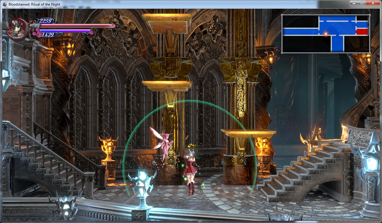
Okay, so having never seen it before, I googled "Bloodstained" and looked at the first gameplay screenshot I found:

bloodstained-4.jpg


Okay, wow.

The perspective on the floor and background bears no relation to the stairs or the pillars.
The level of detail and textures on the stairs and pillars are way higher than the rest of the background.
The shadows make no sense, and some things just don't have a shadow.
The enemies have rim lighting and nothing else does.
The art style of the player character and the enemies it totally different to anything else.
The player HP/MP HUD and the minimap hud are totally inconsistent.

More importantly than any of that, it just looks bad to me. It is aesthetically unpleasant. My eyeballs just don't want to look at it.

This game is ugmo. It makes something like Nidhogg 2 look good, if only because at least that game was visually consistent.
 

Dark1x

Digital Foundry
Verified
Oct 26, 2017
3,530
Okay, so having never seen it before, I googled "Bloodstained" and looked at the first gameplay screenshot I found:

bloodstained-4.jpg


Okay, wow.

The perspective on the floor and background bears no relation to the stairs or the pillars.
The level of detail and textures on the stairs and pillars are way higher than the rest of the background.
The shadows make no sense, and some things just don't have a shadow.
The enemies have rim lighting and nothing else does.
The art style of the player character and the enemies it totally different to anything else.
The player HP/MP HUD and the minimap hud are totally inconsistent.

More importantly than any of that, it just looks bad to me. It is aesthetically unpleasant. My eyeballs just don't want to look at it.

This game is ugmo. It makes something like Nidhogg 2 look good, if only because at least that game was visually consistent.
That is not from the final game. From that same basic area...

http:///LW2d.jpg
 

Kieli

Self-requested ban
Banned
Oct 28, 2017
3,736
I really want to buy this game, but it just looks like buttcheeks. Dead Cells, Celeste, Hollow Knight, Momodora, they all look better. :\
 

Sub Boss

Banned
Nov 14, 2017
13,441
I feel like I can contribute a bit here ...

Its not a new opinion, however, its the most important factor. CONTINUITY IN ART DIRECTION

From playing the game, its very obvious that it went through a lot of changes. That includes development houses, that includes game design, that includes budget, that includes engine improvements. All of these things have a cost and all of these things need to come together in some sort of way in order to ship a game.

Symphony of the Night is not a "better" looking game but at the same time it IS a "better looking game. Its consistent, everything looks like t belong in the same universe with the same level of craft so, years later, when you think back on it you do so with a positive outlook because its was a consistently pleasant experience. It was a game made with experienced developers at the peak of their powers with a strong backing from their studio, that makes a difference.

Why is there a random ass Japanese village, with caves, in the top left of a CASTLE? Because as it has been said in the past, this game was about traveling to different locations once, so the assets were made and then when it became a different game entirely well shit, you aint gonna scrape all that work, youre on a budget! It looks good! Make it fit somehow! This is how a LOT of this game was made, its shows and it makes the player go "oh, ok? thats weird, whatever"

You get a ton of examples of this throughout the game, very early on when you are in the galleon it looks one way, then you step outside in the rain and the lighting, rendering and normal maps make it look like the Gears of War rain level, its a COMPLETE shift in art direction meaning that each scene was built by two different places, or they spent so much time on getting those shaders working that they just overdid it and never had the time to go back and tune it.

Same thing happens with the more 2.5 D scenes like the tower, its pulling more polygons than the flatter scenes but it looks worse because you are not able to hide your budget as well in areas like that with a spiraling camera. This post, for instance


I guarantee the first screenshot is more expensive budget wise than the second. On the second shot you can bake lighting, fake everything with textures since theres minimal camera work and give the impression that its more expensive whereas the tower segment actually causes slowdown on a PS4pro which is crazy! However, it was built, they probably decided it was good enough to ship and that the camera movement was cool so they decided to focus on something else ... and they did, they decided to make the screens you see the most often as good as possible

1560871562_bloodstained-ritual-of-the-night.jpg


how_to_fast_travel_in_bloodstained_ritual_of_the_night_title.png


And I dont blame them, I would do the same! If you cant make the whole game look like this ... then at least get the important places done

They also made the substantial last minute decision to overhaul their lighting and rendering, you've all seen the before and after video so no need to rehash it but that actually made the game even more inconsistent when it comes to visuals because it made some areas look great and then ones that didnt benefit from the overhaul were left behind.

The KS nature of the game also has to leave room for a lot of concessions such as a place to fit all those damn portraits. It hurts the visuals and it hurts the level design (how many empty rooms with a portrait and a treasure chest?) I havent looked at the rewards in a bit but my impression when I saw giant cats and dog heads was "that must be a kickstarter reward or someshit) Those are elements that, once again, make a user stop thinking about the game experience and cause friction.

Enemy design and implementation is also a mess, a lot of the stuff from Curse of the Moon makes its way here and they are NOT good fits, that Headless Knight from the beginning that looks like he belongs in Starcraft should NOT be anywhere near this game, same with a lot of others. Same thing with a lot of the bosses, they looked cool in Curse but here they seem very out of place and just jammed in forcefully. Look at a game like Dark Souls, or Persona, or BotW, or Hollow Knight or ... hell, Castlevania. Look at how everything there helps build the world and its lore, here they throw whatever the fuck they want to do under the "Demon" tab and hope it fits ... most of the time it doesnt, at all, then you look at the lore at it was hastily written, at best.

At the end of the day you still had talented people doing good work. Slightly rushed work, the game desperately needs polish ... but good work regardless. What you are seeing here is the visual manifestation of development hell and what the costs of making a game with a lot of unconnected people for a lot of years without a lot of money looks like. Even the soundtrack suffers because you can tell she tried to make good music that could fit "generic space" not something really made to fit a consistently told narrative. Thats not how you get legendary Castlevania level music, its how you get something that looks close but doesnt quite "get there".

Hopefully Iga's next game gets the consistent development this game desperately needed. He certainly deserves it as shipping this game with this level of quality is close to a miracle in terms of game development. Whenever Shenmue 3 ships and it disappoints everyone and people on ERA make threads like "what went wrong with Shemue 3?" you will be able to look at this game and be amazed they were able to pull it off.
what would ERA do withou your wisdom <3
 

T.Slothrop

Member
Jan 21, 2018
176
I think the takeaway here is that Castlevania just works better with an illustrated art style. There's an UE3 shiny-ness to this I'm not in love with. While screenshot to screenshot it looks bad, in motion I kind of get over it and think everything works together pretty well. But the cohesive gothy anime vibe that they got from the sprite work in previous games is totally lost here.

I'm hoping now that they got a game out they can start to refine a bit.
 

sweetmini

Member
Jun 12, 2019
3,921
I liked the game very much in regards of what happened to it, like in all games, some areas felt great and some felt more plain.

I feel and see budget constraints and life cycles all the time in my head because we all suffer from it.
It was the same when i played SOTN the first time... entrance was wow... and then corners cuts creeped in, with deja-vu feeling on enemy sprites, and some lesser layers, some lesser enemies.

7rc8o7je.png


It sure never lessened my feelings toward the games and loved my time with it. In fact it's the same story in every game.

The Twintowers tried to be saved by the rotating thing and the boss... not that effective.

You can definitely feel the historic baggage of the first version Iga pitched to publishers, in what forms the coherence issue.
The castle just makes no damn sense xD

Okay, so having never seen it before, I googled "Bloodstained" and looked at the first gameplay screenshot I found:

Okay, wow.
....
More importantly than any of that, it just looks bad to me. It is aesthetically unpleasant. My eyeballs just don't want to look at it.

This game is ugmo. It makes something like Nidhogg 2 look good, if only because at least that game was visually consistent.

This is not from the released game, it's from last year's beta... you shouldn't base your impressions for backgrounds on alphas and betas screenshots.
A good point for you: at least there's no downgrade.

ud9x3xxy.jpg
 

Sankara

Alt Account
Banned
May 19, 2019
1,311
Paris
  • lighting is flat
  • character models are rendered incorrectly during dialogue sequences
  • cutscenes are straight out of a student project
  • art direction is incoherent
 

Dark1x

Digital Foundry
Verified
Oct 26, 2017
3,530
Kind of stunned by how harsh people are being. I'd hate to have worked on this game for years and read through this. It's not useful commentary at all. It definitely has some issues and it's pretty clear why but all this black and white thinking (if it's not amazing, it's GARBAGE) doesn't sit well with me.

The castle just makes no damn sense xD
I think that's great, though. Grounding a 2D action game too much in reality would absolutely damage the level design. Castlevania, whether Metroidvania or classic, has never been about this.
 

Pancracio17

ā–² Legend ā–²
Avenger
Oct 29, 2017
18,699
I feel like I can contribute a bit here ...

Its not a new opinion, however, its the most important factor. CONTINUITY IN ART DIRECTION

From playing the game, its very obvious that it went through a lot of changes. That includes development houses, that includes game design, that includes budget, that includes engine improvements. All of these things have a cost and all of these things need to come together in some sort of way in order to ship a game.

Symphony of the Night is not a "better" looking game but at the same time it IS a "better looking game. Its consistent, everything looks like t belong in the same universe with the same level of craft so, years later, when you think back on it you do so with a positive outlook because its was a consistently pleasant experience. It was a game made with experienced developers at the peak of their powers with a strong backing from their studio, that makes a difference.

Why is there a random ass Japanese village, with caves, in the top left of a CASTLE? Because as it has been said in the past, this game was about traveling to different locations once, so the assets were made and then when it became a different game entirely well shit, you aint gonna scrape all that work, youre on a budget! It looks good! Make it fit somehow! This is how a LOT of this game was made, its shows and it makes the player go "oh, ok? thats weird, whatever"

You get a ton of examples of this throughout the game, very early on when you are in the galleon it looks one way, then you step outside in the rain and the lighting, rendering and normal maps make it look like the Gears of War rain level, its a COMPLETE shift in art direction meaning that each scene was built by two different places, or they spent so much time on getting those shaders working that they just overdid it and never had the time to go back and tune it.

Same thing happens with the more 2.5 D scenes like the tower, its pulling more polygons than the flatter scenes but it looks worse because you are not able to hide your budget as well in areas like that with a spiraling camera. This post, for instance


I guarantee the first screenshot is more expensive budget wise than the second. On the second shot you can bake lighting, fake everything with textures since theres minimal camera work and give the impression that its more expensive whereas the tower segment actually causes slowdown on a PS4pro which is crazy! However, it was built, they probably decided it was good enough to ship and that the camera movement was cool so they decided to focus on something else ... and they did, they decided to make the screens you see the most often as good as possible

1560871562_bloodstained-ritual-of-the-night.jpg


how_to_fast_travel_in_bloodstained_ritual_of_the_night_title.png


And I dont blame them, I would do the same! If you cant make the whole game look like this ... then at least get the important places done

They also made the substantial last minute decision to overhaul their lighting and rendering, you've all seen the before and after video so no need to rehash it but that actually made the game even more inconsistent when it comes to visuals because it made some areas look great and then ones that didnt benefit from the overhaul were left behind.

The KS nature of the game also has to leave room for a lot of concessions such as a place to fit all those damn portraits. It hurts the visuals and it hurts the level design (how many empty rooms with a portrait and a treasure chest?) I havent looked at the rewards in a bit but my impression when I saw giant cats and dog heads was "that must be a kickstarter reward or someshit) Those are elements that, once again, make a user stop thinking about the game experience and cause friction.

Enemy design and implementation is also a mess, a lot of the stuff from Curse of the Moon makes its way here and they are NOT good fits, that Headless Knight from the beginning that looks like he belongs in Starcraft should NOT be anywhere near this game, same with a lot of others. Same thing with a lot of the bosses, they looked cool in Curse but here they seem very out of place and just jammed in forcefully. Look at a game like Dark Souls, or Persona, or BotW, or Hollow Knight or ... hell, Castlevania. Look at how everything there helps build the world and its lore, here they throw whatever the fuck they want to do under the "Demon" tab and hope it fits ... most of the time it doesnt, at all, then you look at the lore at it was hastily written, at best.

At the end of the day you still had talented people doing good work. Slightly rushed work, the game desperately needs polish ... but good work regardless. What you are seeing here is the visual manifestation of development hell and what the costs of making a game with a lot of unconnected people for a lot of years without a lot of money looks like. Even the soundtrack suffers because you can tell she tried to make good music that could fit "generic space" not something really made to fit a consistently told narrative. Thats not how you get legendary Castlevania level music, its how you get something that looks close but doesnt quite "get there".

Hopefully Iga's next game gets the consistent development this game desperately needed. He certainly deserves it as shipping this game with this level of quality is close to a miracle in terms of game development. Whenever Shenmue 3 ships and it disappoints everyone and people on ERA make threads like "what went wrong with Shemue 3?" you will be able to look at this game and be amazed they were able to pull it off.
Great post, thank you for the insight.
 

NeroPaige

Member
Jan 8, 2018
1,708
It looks like a Vita game. I mean from character models to textures to animations, everything feels like it was made for a handheld and then scaled up to full console spec. There's just a distinctly "cheap" feel to basically everything and a lot of that comes from the budget handheld-game art style and production values.
exactamundo.
 

Deleted member 35204

User requested account closure
Banned
Dec 3, 2017
2,406
The art direction is subpar 90% of the time in my opinion, technically is ok but the look just doesn't work.
Also what the hell is wrong with Miriam's character model? look at that shoulder, how could they not notice how messed up it was?

But this is the start of a new franchise and some of this stuff could be excused so i'll give them another chance for sure.
 

Leo-Tyrant

Member
Jan 14, 2019
5,081
San Jose, Costa Rica
My thoughts below. As a 2D Castlevania fan I would normally be all over this game, but the art style and actual implementation made me dislike the final product:

The overall art design is not....fantastic. It doesn't feel as polished as 90s Castlevanias. Still, its not "bad".

However, the actual 3D implementation (backgrounds, character models, some of the animations) look amateur to me, compared to most other examples in the industry.

The character proportions create a mismatch compared to some pieces of the BG. Some enemies dont even look connected to the stage, shaders are ugly to me (a plastic look with hard black lines, some very garish choices in ambient color) . The final product composition at any given frame, can look ... quite messy. Unprofessional even?

As an example, the 3DS version of Mirror Of Fate looked more aligned with my 3D side-scrolling Castlevania expectations. And this was not a beautiful game:

410JelaNhQL.jpg
 
Oct 25, 2017
22,378
I don't think I ever stopped and thought "man this looks really good" but I also never thought it looked that bad as well.It's okay, but nothing special.
I'm just not sure what 2,5D ads to a game, but that's just personal preference
 
OP
OP
lazygecko

lazygecko

Member
Oct 25, 2017
3,628
I feel and see budget constraints and life cycles all the time in my head because we all suffer from it.
It was the same when i played SOTN the first time... entrance was wow... and then corners cuts creeped in, with deja-vu feeling on enemy sprites, and some lesser layers, some lesser enemies.

7rc8o7je.png

SotN's environments felt more like a case of different artists with different stylistic quirks to me (like in terms of palette/tone use, outlines or the lack of them, etc). Most of the different areas still set a high enough bar IMO and I don't think those isolated screenshots really do them justice (especially the flame cave one which I'm pretty sure has some cool 3D effects in motion).

The DS games was when I really started noticing a drop in quality on the 2D assets, as if they really didn't have the time or skill to polish them up properly. Some areas looked closer to what I'd expect from an upper tier fangame.
 

Deleted member 4093

User requested account closure
Banned
Oct 25, 2017
7,671
Honestly, the thing that bothers me the most here is that bumpy floor pattern. Like, lumpy brickwork/stonework exists, but it doesn't look anything like that. That looks like some jumanji sinking floor special effects.

jumanji-quicksand.jpg


It looks like they made some kind of mistake with the texture/mapping assets there and never corrected it.
Oh is that not supposed to be water there? Thats confusing
 
OP
OP
lazygecko

lazygecko

Member
Oct 25, 2017
3,628
Honestly, the thing that bothers me the most here is that bumpy floor pattern. Like, lumpy brickwork/stonework exists, but it doesn't look anything like that. That looks like some jumanji sinking floor special effects.

jumanji-quicksand.jpg


It looks like they made some kind of mistake with the texture/mapping assets there and never corrected it.

It looks like the ground mesh was originally supposed to be a different material (like dirt or gravel or something?) and was replaced with an improper texture during the visual overhaul process.
 

CommodoreKong

Member
Oct 25, 2017
7,695
Why is there a random ass Japanese village, with caves, in the top left of a CASTLE? Because as it has been said in the past, this game was about traveling to different locations once, so the assets were made and then when it became a different game entirely well shit, you aint gonna scrape all that work, youre on a budget! It looks good! Make it fit somehow! This is how a LOT of this game was made, its shows and it makes the player go "oh, ok? thats weird, whatever"

That area really bothered me when I reached it, it felt so out of place. Maybe they should have made it so you go through a portal so you get to that area so it's location on the map didn't really matter.
 

PlanetSmasher

The Abominable Showman
Member
Oct 25, 2017
115,526
That area really bothered me when I reached it, it felt so out of place. Maybe they should have made it so you go through a portal so you get to that area so it's location on the map didn't really matter.

I like how they try to handwave it in a conversation with Johannes. "Oh, the castle kind of absorbed part of the Alchemists' Guild so there's some weird shit in there that's kind of out of place."

Okay, Johannes, that still doesn't explain how a literal village is suspended in midair near the top of a gigantic castle and it also can't be seen from outside.
 

Leo-Tyrant

Member
Jan 14, 2019
5,081
San Jose, Costa Rica
Kind of stunned by how harsh people are being. I'd hate to have worked on this game for years and read through this. It's not useful commentary at all. It definitely has some issues and it's pretty clear why but all this black and white thinking (if it's not amazing, it's GARBAGE) doesn't sit well with me.


I think that's great, though. Grounding a 2D action game too much in reality would absolutely damage the level design. Castlevania, whether Metroidvania or classic, has never been about this.

You may be taking this too personally John. You liked the look, some may have not liked it as much.

I was initially very hyped for this project, even when seeing the Beta, as I thought that another year of polish could actually make it look good. But for my particular preferences: It looks bad. There is a fantastic post by Raging Spaniard that provides a theory as to what may have happened, and I fully understand the effort and project constraints that could have caused this...

But I also know that I wished the game looked better. More "Actual Castlevania polished-aesthetics - like".