I feel like I can contribute a bit here ...
Its not a new opinion, however, its the most important factor. CONTINUITY IN ART DIRECTION
From playing the game, its very obvious that it went through a lot of changes. That includes development houses, that includes game design, that includes budget, that includes engine improvements. All of these things have a cost and all of these things need to come together in some sort of way in order to ship a game.
Symphony of the Night is not a "better" looking game but at the same time it IS a "better looking game. Its consistent, everything looks like t belong in the same universe with the same level of craft so, years later, when you think back on it you do so with a positive outlook because its was a consistently pleasant experience. It was a game made with experienced developers at the peak of their powers with a strong backing from their studio, that makes a difference.
Why is there a random ass Japanese village, with caves, in the top left of a CASTLE? Because as it has been said in the past, this game was about traveling to different locations once, so the assets were made and then when it became a different game entirely well shit, you aint gonna scrape all that work, youre on a budget! It looks good! Make it fit somehow! This is how a LOT of this game was made, its shows and it makes the player go "oh, ok? thats weird, whatever"
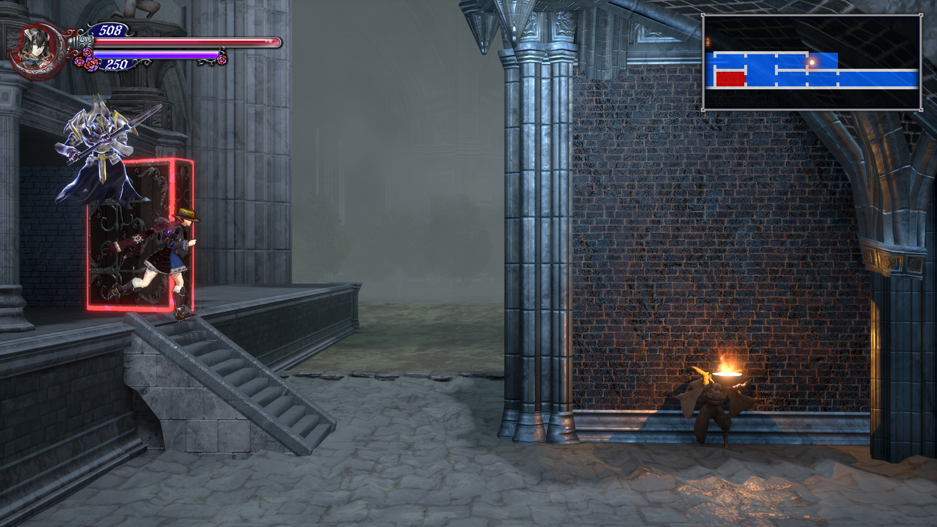
You get a ton of examples of this throughout the game, very early on when you are in the galleon it looks one way, then you step outside in the rain and the lighting, rendering and normal maps make it look like the Gears of War rain level, its a COMPLETE shift in art direction meaning that each scene was built by two different places, or they spent so much time on getting those shaders working that they just overdid it and never had the time to go back and tune it.
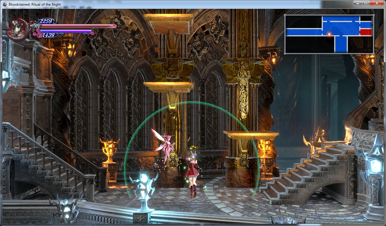
Same thing happens with the more 2.5 D scenes like the tower, its pulling more polygons than the flatter scenes but it looks worse because you are not able to hide your budget as well in areas like that with a spiraling camera. This post, for instance
I guarantee the first screenshot is more expensive budget wise than the second. On the second shot you can bake lighting, fake everything with textures since theres minimal camera work and give the impression that its more expensive whereas the tower segment actually causes slowdown on a PS4pro which is crazy! However, it was built, they probably decided it was good enough to ship and that the camera movement was cool so they decided to focus on something else ... and they did, they decided to make the screens you see the most often as good as possible
And I dont blame them, I would do the same! If you cant make the whole game look like this ... then at least get the important places done
They also made the substantial last minute decision to overhaul their lighting and rendering, you've all seen the before and after video so no need to rehash it but that actually made the game even more inconsistent when it comes to visuals because it made some areas look great and then ones that didnt benefit from the overhaul were left behind.
The KS nature of the game also has to leave room for a lot of concessions such as a place to fit all those damn portraits. It hurts the visuals and it hurts the level design (how many empty rooms with a portrait and a treasure chest?) I havent looked at the rewards in a bit but my impression when I saw giant cats and dog heads was "that must be a kickstarter reward or someshit) Those are elements that, once again, make a user stop thinking about the game experience and cause friction.
Enemy design and implementation is also a mess, a lot of the stuff from Curse of the Moon makes its way here and they are NOT good fits, that Headless Knight from the beginning that looks like he belongs in Starcraft should NOT be anywhere near this game, same with a lot of others. Same thing with a lot of the bosses, they looked cool in Curse but here they seem very out of place and just jammed in forcefully. Look at a game like Dark Souls, or Persona, or BotW, or Hollow Knight or ... hell, Castlevania. Look at how everything there helps build the world and its lore, here they throw whatever the fuck they want to do under the "Demon" tab and hope it fits ... most of the time it doesnt, at all, then you look at the lore at it was hastily written, at best.
At the end of the day you still had talented people doing good work. Slightly rushed work, the game desperately needs polish ... but good work regardless. What you are seeing here is the visual manifestation of development hell and what the costs of making a game with a lot of unconnected people for a lot of years without a lot of money looks like. Even the soundtrack suffers because you can tell she tried to make good music that could fit "generic space" not something really made to fit a consistently told narrative. Thats not how you get legendary Castlevania level music, its how you get something that looks close but doesnt quite "get there".
Hopefully Iga's next game gets the consistent development this game desperately needed. He certainly deserves it as shipping this game with this level of quality is close to a miracle in terms of game development. Whenever Shenmue 3 ships and it disappoints everyone and people on ERA make threads like "what went wrong with Shemue 3?" you will be able to look at this game and be amazed they were able to pull it off.