Nope, they're right. Evil Within 1 is infinitely better looking.
Evil Within 2 has some great looking parts, but most of it is bland as shit. Evil Within 1 looks incredibly and is aesthetically WAAAAAYYY betted.
The second game looks a little too clean and simple, so even if it might have a bit better graphics it doesn't look as good to me.
Nope, they're right. Evil Within 1 is infinitely better looking.
Evil Within 2 has some great looking parts, but most of it is bland as shit. Evil Within 1 looks incredibly and is aesthetically WAAAAAYYY betted.
no, they`re really not. The Evil Within 2 is way more beatiful. The first one looks like hot shit in a lot of times, especially during the city.
No way. Not even close. Artistically, 2 is astronomically worse and waaaaay more boring. The city parts of 1 are a very small part of the game, while the ugly boring parts of 2 are the vast majority of it.
I disagree. 1 has a great art direction, but it is such a mess technically that 2, even though it is less inspired at moments, looks better.
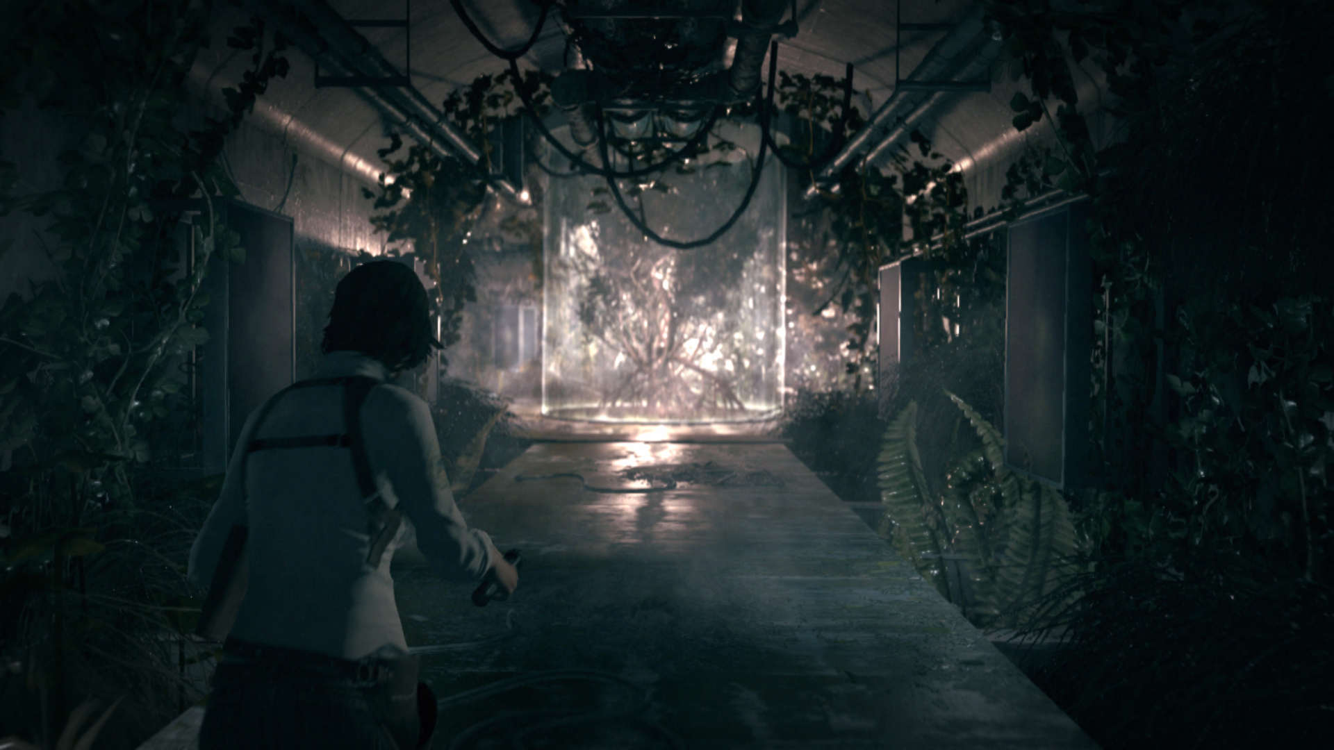
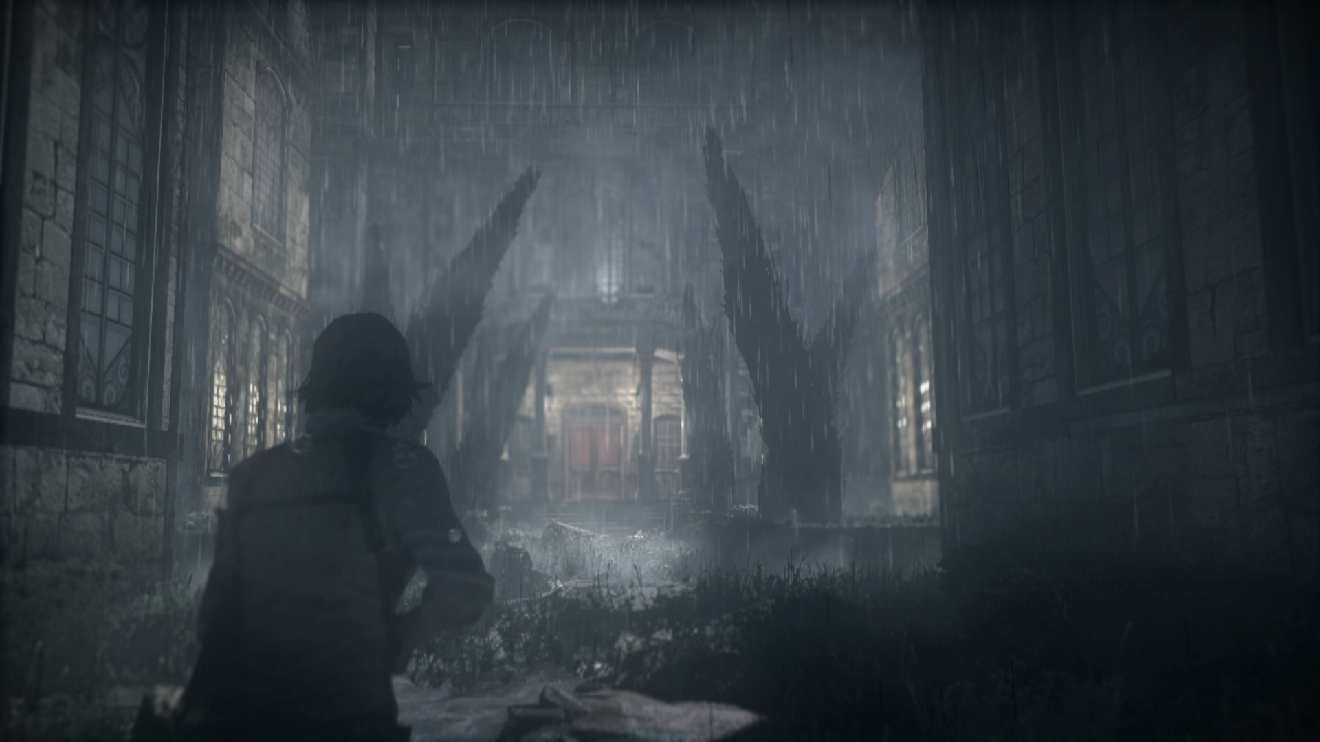
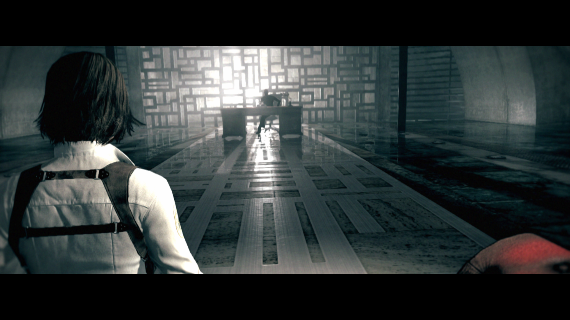
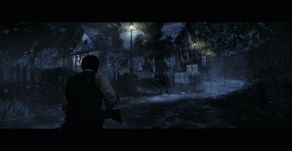
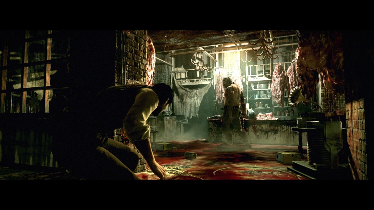
evil within 1 was such an incredible game artistically. Huge shame that the second game was so drab and uninspired, really not sure what they were thinking.eh I think it's a pretty good looking game actually, even if it's not the strongest graphics engine. The first game looks better due to better lighting, art direction and processing effects like all that film grain and fog and dust particles. It makes the game look sort of like moving concept art at times.
The second game looks a little too clean and simple, so even if it might have a bit better graphics it doesn't look as good to me.
Art style yes, graphics no.
Art style yes, graphics no.
The art style in Reach is definitely my favorite in the Halo universe. it's very futuristic-cool but still grounded in today unlike 343's take on the universe lol
it was definitely more colorful and had more going on in the lighting department than 5, which was going for an intentionally desaturated lookI absolutely despise 6 but I don't think I agree with this. I played through every campaign in 6 just to, well hell I don't know, I guess I just felt like I had to beat it, but the whole time I distinctly remember being consistently impressed with the visuals and what they were able to get out of a last gen game, despite how much I hated everything else about the game. I think the game looks quite nice on current gen ports and on PC maxed out, I just wish the game wasn't an absolute slog to get through.
Pokémon began incorporating 3D from the moment it hit the DS. By Gen 5 everything was 3D except for the trainers and Pokémon (outside of cutscenes) themselves.Its much better to think of Pokemon X and Y as the FF7 of Pokemon games whilst sun and moon is the FF8, it was GF's 1st 3D game
Mega Man 6
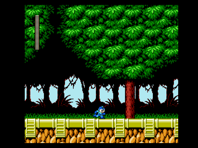
Mega Man 9
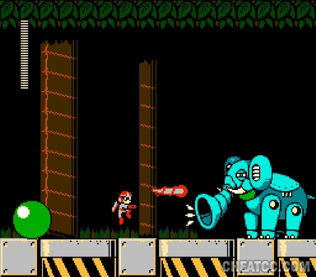
The inti-creates retro MM games are such basic-ass looking games.
Same, but I think it was more the art direction.I always thought Halo 2 looked worse than Halo: Combat Evolved in a lot of respects.
Really don't agree with all the Dark Souls 2 mentions.
The worst-looking parts of Dark Souls 2 do look worse than the better-looking parts of Dark Souls 1, sure. The lows are, well, really low, unfortunately. (These would include Shaded Woods/Ruins, Harvest Valley, and possibly Earthen Peak.)
But, overall, the game looks better. The best-looking parts of Dark Souls 2 (Majula, Dragon Aerie/Shrine, Iron Keep, Brume Tower, Heide's Tower, No Man's Wharf with all the sconces lit, Shrine of Amana) obliterate the best-looking parts of Dark Souls 1. The torch lighting is beautiful, and more advanced than the lighting in even Bloodborne (with dynamic shadows) despite being a generation earlier. It has nice cloth/cape physics. The lava is infinitely better on the eyes, too.


No way. Not even close. Artistically, 2 is astronomically worse and waaaaay more boring. The city parts of 1 are a very small part of the game, while the ugly boring parts of 2 are the vast majority of it.
What?! KZ3 looked way better. Better textures and geometry. I think you might just like 2 because it's dark.It seemed like Killzone 3 didn't looke quite as good as 2, as if the postprocessing wasn't as good or as strong or something. Maybe they compromised or scaled things back to incorporate the 3D mode? I dunno, anyone else feel that way about KZ3?
They dialed back the post processing significantly and I always figured it was because they didn't want to cripple the controls.It seemed like Killzone 3 didn't looke quite as good as 2, as if the postprocessing wasn't as good or as strong or something. Maybe they compromised or scaled things back to incorporate the 3D mode? I dunno, anyone else feel that way about KZ3?
First of all.....the GBA Fire Emblems are 2D perfection. NONE of the Fire Emblems....right after it and presently look as good if you ask me
Fire Emblem Shadow Dragon is ugly as sin ... it is uglier both to Radiant Dawn

and even uglier to the GBA ones

Which one might say it is pretier even than radiant dawn
I think the issue with KZ3 was that it had quite a few "day time" levels. The lighting engine in that game can't really do high intensity lights well because all the lighting in those two game had LDR precision, what this meant was that even when it was day time the level looked like it was lit from a lightbulb rather than sun light. KZ2 avoided that by not having any level except the opening level and shanty town level set in day time.What?! KZ3 looked way better. Better textures and geometry. I think you might just like 2 because it's dark.

You are a good person.
Like people were more impressed with frame rates than the move from 2D to 3D 20 years go. Sure mate.Ocarina of Time.
From crisp, colorful graphics at 60/50 FPS to blurry, muddy at 20/17 FPS.
I always thought Halo 2 looked worse than Halo: Combat Evolved in a lot of respects.