-
Ever wanted an RSS feed of all your favorite gaming news sites? Go check out our new Gaming Headlines feed! Read more about it here.
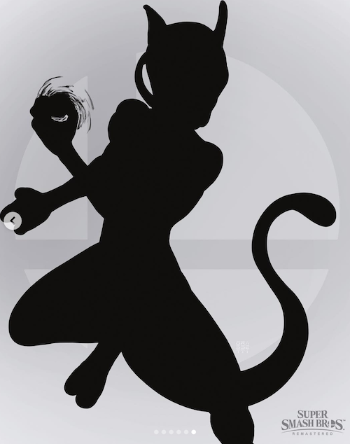
Raf Grassetti, art director at Sony Santa Monica, is doing a series of fan art for Smash Bros. characters (UPDATE: Waluigi is here, post #1,399)
- Thread starter Deleted member 10737
- Start date
You are using an out of date browser. It may not display this or other websites correctly.
You should upgrade or use an alternative browser.
You should upgrade or use an alternative browser.
Threadmarks
View all 20 threadmarks
Reader mode
Reader mode
Recent threadmarks
Ganondorf Dark Samus Wario Bowser Jr. Pac-Man Luigi Mario Waluigi
Your answer lies a few posts farther down.That looks amazing. What is it about it that you find so unbelievably unappealing?
The Sonic doesn't look bad all things considered, far as a "real" take goes.
Excited to see Mewtwo.
Excited to see Mewtwo.
I think that I'm just not used to seeing them with so much detail, once the shock value passed I actually began to like the designs. I want to see Mario though.
I don't get these sort of comments. I mean, can you guys picture Samus in her suits from Prime or Super? They don't exactly look feminine to me either, which makes sense as they're just robotic suits, nothing form fitting
Nah, without the big ass shoulders it just looks generic.
This is off topic, but you asked. On a purely technical level I feel like so much of it is effects for effects sake. They've pushed the roughness maps so low, killing any real tangible feeling to the materials, in favour of prioritising reflections. There's a distinct lack of texture, go look at any good substance materials on artstation and it should be clear what I mean. Marble shouldn't have a pronounced normal map or anything, but everything is so artificially flat and lacking.
All of that is based around what I imagine the artist was going for, which is a realistic material interpretation of the temple of time. I think if you're willing to rebuild the temple from a design standpoint, that could look cool (referencing something like Westminster abbey or whatever you wanted) but what they seem to have done is gone halfway and ultimately stopped, retaining the vast majority of the N64 layout, and more than that, it's detailing. Naturally the N64 environment was designed to adhere to the platform limitations, and is therefore a really boxy space - so rendering all of this up with "realistic" materials without adding significant geometry changes or additional details feels like it's just giant slabs of marble cubes. Because that's exactly what it is. There's a wonderful example of "temple of time" architecture in a ruin in Tintern in Wales, the kind of thing that would look amazing if realistically rendered as a temple of time. If your comeback is "it's just a fan art project, don't overthink it." Or "not everyone is a professional artist", then what's even the fucking point. I think that's such a poor, patronising way to treat amateur work, like it's made by kids and put on fridges. Nobody is going into some students portfolio and shitting on them personally. These ue4 works have been shared millions of times and champion led as "the way the next Zelda should look". If people are "allowed" to make positive comments to the point of suggesting it should lead the franchise, people are allowed to say why it really shouldn't, if that's how they feel.
I think that illustrates why I don't like those works, and if you're looking for a "justification" of my opinion on the artwork in the thread, I've done that twice, I'm not doing it again. If you disagree, not only am I okay with that, I encourage you to explain why you like these things. I encourage anyone to talk about art to whatever level they feel able to, and criticise whatever they want, celebrate whatever you want, and simply bring discussion to the table. In my opinion, "lol I hate this" and "lol Nintendo hire this guy" are both as equally empty as one another.
The thing is, right now Zelda games, even BotW, already have simplistic geometry and bland texture work, so I don't really understand how your complaints regarding that particular example or those points hold up in comparison.
The lighting, shadows, texture work, materials, shaders and reflections in current Zelda games are all far less impressive, not necessarily out of art direction, but technical limitation. I can understand you thinking that fan example has too many reflections, but I don't understand how you can complain about the texture work, geometry or whatever else, whilst not simultaneously disliking what Zelda games have thus far showcased. At least in the fan example the marble work, geometric make up, lighting, shadows etc looks somewhat true to form, in BotW some of the textures etc just look like a blurry mish mash.
Last edited:
Because current zelda games don't adopt realistic materials. There is parity between their artistic direction and their geometrical/ texture choices. If you're going to attempt to render marble as marble, metal as metal, PBR and all, then slapping it on a half-assed interpretation of the N64s geometry looks terrible. I don't think it has "too many reflections", i think its prioritised reflections to the point of robbing its realistic materials of any realism. Nobody is saying an 8k texture isn't less blurry than BOTW's textures and their obvious limitations, but its cohesive. Again, this is just a case of people thinking Minecraft 4k texture packs look good. I don't think they do. Technically impressive doesn't mean artistically cohesive. "How can you complain"? is this a joke? All this looks like to me is that in your mind, more numbers, more draw distance = more art. If you really want my opinion simplified, its this: Zelda games don't force awkward hyper realistic textures onto limited geometry, because it looks bad. With your line of logic, Okami just needs a fur shader and real-time shadows and dynamic GI to look better, right?The thing is, right now Zelda games, even BotW, already have simplistic geometry and bland texture work, so I don't really understand how your complaints regarding that particular example or those points hold up in comparison.
The lighting, shadows, texture work, draw distance and reflections in current Zelda games are all far less impressive, not necessarily out of art direction, but technical limitation. I can understand you thinking that fan example has too many reflections, but I don't understand how you can complain about the texture work, geometry or whatever else, whilst not simultaneously disliking what Zelda games have thus far showcased. At least in the fan example the marble work, geometric make up etc looks somewhat true to form, in BotW some of the textures etc just look like a blurry mish mash.
The small waist, long legs and overall design of the game's suits have a feminine look to me. Here it just doesn't have it, the art style its great but like I said, personally I can't picture Samus in it.I don't get these sort of comments. I mean, can you guys picture Samus in her suits from Prime or Super? They don't exactly look feminine to me either, which makes sense as they're just robotic suits, nothing form fitting
I'll give you the small waist but, outside of that, it always looked like the sort of suit anyone could be inThe small waist, long legs and overall design of the game's suits have a feminine look to me. Here it just doesn't have it, the art style its great but like I said, personally I can't picture Samus in it.
That might be because of the lack of those shoulder orbs...and because it looks kinda generic

I loved both Fox and Sonic designs, although maybe it's the furry in me that's speaking.
Bowser looks neat, like he belongs in a nightmarish version of the Mario Universe.
The only complaints I have is on Link and Samus, they look generic and in the case of link the realistic style looks way off. Like he would be more suited for a LOTR movie than a zelda game.
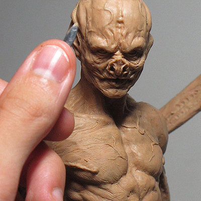
He's honestly the best character artist in the industry. And the speed in which he can do things is honestly insane, I've sat and watched him model a flawless torso out of clay in minutes.I never realised how ridiculously good some of this guys sculpts and models are. He's insanely talented.


Because current zelda games don't adopt realistic materials. There is parity between their artistic direction and their geometrical/ texture choices. If you're going to attempt to render marble as marble, metal as metal, PBR and all, then slapping it on a half-assed interpretation of the N64s geometry looks terrible. I don't think it has "too many reflections", i think its prioritised reflections to the point of robbing its realistic materials of any realism. Nobody is saying an 8k texture isn't less blurry than BOTW's textures and their obvious limitations, but its cohesive. Again, this is just a case of people thinking Minecraft 4k texture packs look good. I don't think they do. Technically impressive doesn't mean artistically cohesive. "How can you complain"? is this a joke? All this looks like to me is that in your mind, more numbers, more draw distance = more art. If you really want my opinion simplified, its this: Zelda games don't force awkward hyper realistic textures onto limited geometry, because it looks bad. With your line of logic, Okami just needs a fur shader and real-time shadows and dynamic GI to look better, right?
See I don't find BotW's visuals particularly cohesive at all, unless being cohesively bland, boring and flat looking counts. So much of it is overly simplistic or basic looking, a lot has a washed out look to it, IQ is poor, there's an overt haziness and repetition to many of the shrines etc, the lighting, shadows and reflections are often really dull or flat looking, textures often blurry and undefined, materials and shaders lacking and so on.
I get these things are down to technical limitations, but I don't think there's a parity between the art and technical limitations at all, instead it just seems like the stripped down art and assets are hampered directly as a result of those technical limitations. I actually found many of the past Zelda games to have better art directions, since the colourful, contrasty, geometrically simpler and cartoony nature suited the hardware limitations. BotW is this weird halfway house that isn't fully successful in either imo.
Last edited:
Guy seems to have a problem NOT using human proportions. Not a hedgehog and not a fox, for sure.
Bowser looks straight out of God of war, no doubt, but this is a very unique take on link. He also managed to make Samus looks like a dude, without showing anything from his face, amazing.
Will keep watching.
Bowser looks straight out of God of war, no doubt, but this is a very unique take on link. He also managed to make Samus looks like a dude, without showing anything from his face, amazing.
Will keep watching.
That's absolutely fine. You're in the camp of people who don't think BOTW looks good because of its technical limitations, I'm in the camp of people who think it looks great and cohesive despite them. I wish they had pushed some of the colour choices, particularly at night when things can absolutely look drab and washed out (primarily for gameplay and readability reasons, although I still think colour grading would have really helped). But to me its ten times better than the aforementioned unreal projects, for the reasons i've already explained. I'm not going to derail further.See I don't find BotW's visuals cohesive at all, well, unless being cohesively bland and flat looking counts. So much of it is overly simplistic or basic looking, a lot has a washed out look to it, IQ is poor, there's an overt haziness and repetition to many of the shrines etc, the reflections are often really basic looking, textures often blurry and undefined, materials and shaders lacking and so on.
I get these things are down to technical limitations, but I don't think there's a parity between the art and technical limitations at all, instead it just seems like the stripped down art and assets are hampered directly as a result of those technical limitations. I actually found many of the past Zelda games to have better art directions, since the colourful, contrasty and cartoony nature suited the hardware limitations. BotW is this weird halfway house that isn't fully successful in either imo.
"Samus looks too masculine/like a guy" is some real bullshit and a symptom of how gamers have been conditioned to expect unrealistic proportions/impractical armor to denote "femininity."
He just gave you the non-technical reasons he didn't like BOTWThat's absolutely fine. You're in the camp of people who don't think BOTW looks good because of its technical limitations, I'm in the camp of people who think it looks great and cohesive despite them. I wish they had pushed some of the colour choices, particularly at night when things can absolutely look drab and washed out (primarily for gameplay and readability reasons, although I still think colour grading would have really helped). But to me its ten times better than the aforementioned unreal projects, for the reasons i've already explained. I'm not going to derail further.
You know what I kinda like it.
For some reason this style works better for the anthro characters for me. Maybe because it's still needs to keep some of the stylization while the human characters lean more to the realism.
Kinda wanna see their take on Incineroar and Wolf now.
Calling Samus' design "too masculine" is some suspect shit tbh.
Agree. that's some stupid complaint, astronauts irl wear the same suit so what is even a "masculine armor""Samus looks too masculine/like a guy" is some real bullshit and a symptom of how gamers have been conditioned to expect unrealistic proportions/impractical armor to denote "femininity."
Calling Samus' design "too masculine" is some suspect shit tbh.
I think it looks masculine but can't tell why
Can't unsee this.
The "Samus is too masculine" is straight up garbage posting.
In the first game, the fact that you were playing a woman the whole game was a surprise since her armor wasn't sexualised at all.
Armor isn't supposed to show your body curves, it's supposed to protect it.
In the first game, the fact that you were playing a woman the whole game was a surprise since her armor wasn't sexualised at all.
Armor isn't supposed to show your body curves, it's supposed to protect it.
I'm seeing technical limitations, art limited by technical limitations, and other games looked better for being more cartoony.He just gave you the non-technical reasons he didn't like BOTW
Perfectly valid opinion, I don't share it. Happy days.
Sonic actually looks pretty decent because it somewhat embraces his cartoony origins by maintaining the huge eyes and the pose feels like it fits the character much better than the others. Mewtwo's pose looks like a better fit than the initial batch too
Lots of games with worse technical options don't look flat and washed out. That was an artistic choice.I'm seeing technical limitations, art limited by technical limitations, and other games looked better for being more cartoony.
Perfectly valid opinion, I don't share it. Happy days.
I'm just repeating myself again, because you're not interested in reading the part where I said "I wish they had pushed some of the colour choices, particularly at night when things can absolutely look drab and washed out (primarily for gameplay and readability reasons, although I still think colour grading would have really helped)." My opinion hasn't changed in the past 15 minutes, I still think that BOTW could have benefited from some nice colour correction and particularly a push towards a few richer, darker hues. I don't know what else you want me to say. I still think it looks better than the unreal fan stuff. I'm done talking about this.Lots of games with worse technical options don't look flat and washed out. That was an artistic choice.
Wtf am I reading? Samus suit not feminine enough? This is some terrible take.The small waist, long legs and overall design of the game's suits have a feminine look to me. Here it just doesn't have it, the art style its great but like I said, personally I can't picture Samus in it.
The point is, don't dismiss people who don't like BOTW's style as simply being slaves to technology. There are perfectly legitimate artistic reasons to not be a fan of BOTW.I'm just repeating myself again, because you're not interested in reading the part where I said "I wish they had pushed some of the colour choices, particularly at night when things can absolutely look drab and washed out (primarily for gameplay and readability reasons, although I still think colour grading would have really helped)." My opinion hasn't changed in the past 15 minutes, I still think that BOTW could have benefited from some nice colour correction and particularly a push towards a few richer, darker hues. I don't know what else you want me to say. I still think it looks better than the unreal fan stuff. I'm done talking about this.